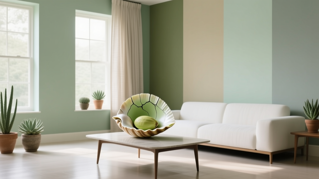
Best Pistachio Paint Colors - The Decor Mag
Pistachio is one of those rare paint colors that feels both fresh and grounding. It sits in the green family, but with a soft yellow undertone that reads gentle, sunlit, and welcoming rather than bold or moody. For homeowners who love calming interiors but don’t want another predictable beige or gray, pistachio paint colors offer a satisfying middle ground: soothing, optimistic, and surprisingly versatile across design styles.
Why does pistachio matter right now? Because interior color design has shifted toward “quiet color”—shades that bring personality without overwhelming a space. Pistachio can play that role beautifully. It supports wellness-focused design (think: restorative bedrooms, serene bathrooms, approachable kitchens) while still pairing well with today’s popular materials like white oak, travertine, brass, and warm whites.
If you’re searching for the best pistachio paint colors, you’ll get the most success by understanding undertones, light behavior, and how to build a cohesive color scheme around this soft green. Let’s make pistachio feel intentional—never minty, never sickly, never “baby room” unless that’s exactly the vibe you want.
What Makes a Paint Color “Pistachio” (and Why Undertones Matter)
Pistachio paint colors typically live in the light-to-mid range with a yellow-green base. The defining trait is softness: less blue than mint, less gray than sage, and less intensity than apple green. The undertone is where the magic (or mistakes) happen.
Common pistachio undertones
- Yellow-leaning pistachio: Warm, sunny, cozy. Works beautifully with creams, warm whites, and brass.
- Muted/gray-washed pistachio: More sophisticated and “designer,” reads calmer in open-plan homes.
- Blue-leaning pistachio: Can drift toward mint or seafoam, especially in cool north light.
Color psychology: why pistachio feels good to live with
Green is associated with balance and restoration, while pistachio’s yellow influence adds a gentle lift. The result tends to feel:
- Comforting: Ideal for spaces you want to unwind in.
- Clean and fresh: Great for kitchens, laundry rooms, and baths.
- Friendly and approachable: A smart choice for entryways and family spaces.
How to Choose the Right Pistachio for Your Home
Before picking a specific paint color name, narrow your options with a few design principles. Pistachio is sensitive to lighting and surrounding finishes, so this step prevents expensive repaints.
1) Match pistachio to your light exposure
- North-facing rooms: Light is cooler; pistachio can look more minty or gray. Choose a slightly warmer pistachio to keep it inviting.
- South-facing rooms: Warm, strong light intensifies yellow undertones. Opt for a muted pistachio if you want sophistication.
- East-facing rooms: Bright mornings, flatter afternoons. Pistachio feels crisp early and calmer later—great for kitchens and breakfast nooks.
- West-facing rooms: Warm late-day glow can turn pistachio golden. Choose a balanced shade if you don’t want it to skew too yellow at sunset.
2) Consider fixed finishes (the non-negotiables)
Pistachio is especially influenced by nearby materials. Check it against:
- Countertops and tile (white marble vs. creamy quartz vs. beige stone)
- Wood tones (white oak, walnut, honey oak, painted cabinets)
- Metals (brass warms it up; chrome cools it down; black adds contrast)
- Existing wall colors in adjacent rooms (open floor plans need a coordinated palette)
3) Choose sheen strategically
- Matte/flat: Soft, modern, forgiving—best for living rooms and bedrooms.
- Eggshell: A touch more wipeable—great for hallways and family spaces.
- Satin: Ideal for kitchens, baths, and trim-adjacent walls needing durability.
- Semi-gloss: Use for trim/doors if you want a crisp frame around pistachio walls.
Best Pistachio Paint Colors (Designer-Approved Picks)
Below are standout pistachio paint colors from trusted brands. Always test with peel-and-stick samples or large brush-outs—pistachio shifts quickly from charming to “too mint” depending on lighting.
Benjamin Moore Pistachio Paint Colors
- Benjamin Moore Pale Avocado (2146-40): A more saturated pistachio-leaning green with warmth and personality. Works well in kitchens, dining rooms, and creative spaces where you want color that still feels livable.
- Benjamin Moore Honeydew (OC-96): A soft, airy green that can read pistachio in warm light. Beautiful as a whole-home soft color, especially with warm whites and light woods.
- Benjamin Moore Soft Fern (2144-40): A gentle green that often lands in pistachio territory—fresh without looking neon. Great for bedrooms and bathrooms with white tile.
Sherwin-Williams Pistachio Paint Colors
- Sherwin-Williams Livable Green (SW 6176): A muted green that can read pistachio depending on light and pairing. Excellent for open-plan living, hallways, and rooms with beige or greige elements.
- Sherwin-Williams Eco Green (SW 6739): A brighter, more playful pistachio-green. Best as an accent, cabinetry color, or a sunny laundry room where a little cheer is the point.
- Sherwin-Williams Softened Green (SW 6177): A lighter companion to Livable Green that can lean pistachio with warm bulbs. Lovely for bedrooms and nurseries when paired with creamy trim.
Farrow & Ball Pistachio-Adjacent Greens
- Farrow & Ball Vert de Terre (No. 234): Earthy, muted, and refined—often interpreted as a sophisticated pistachio in daylight. Strong choice for period homes, classic millwork, and calm kitchens.
- Farrow & Ball Cooking Apple Green (No. 32): A historic, cheerful green that can skew pistachio in certain lighting. Ideal for pantries, breakfast rooms, and charming cottage-style spaces.
Behr Pistachio Paint Colors
- Behr Pale Pistachio: A direct pistachio-inspired option that’s light and bright. Works best in rooms with plenty of natural light and warm accents to keep it from feeling too cool.
- Behr Jojoba: A softer, more muted green that can read pistachio when styled with cream, oak, and brass. Great for relaxed, modern interiors.
Real Room Examples: Where Pistachio Shines
Pistachio kitchens: fresh, not sterile
Pistachio is a natural fit for kitchens because it suggests freshness and cleanliness without the harshness of pure white. Consider these applications:
- Cabinetry: Pistachio lower cabinets with warm white uppers for balance.
- Walls: Pistachio walls with white cabinets to soften the contrast of stainless appliances.
- Island accent: A pistachio island brings color without committing to full cabinetry.
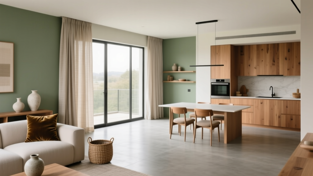
Style it with: creamy white backsplash (zellige or subway), unlacquered brass pulls, warm white walls (not icy), and natural wood stools.
Bedrooms: soft green that supports rest
Pistachio has a “quiet optimism” that suits bedrooms—especially if you want calm without going fully neutral.
- Use pistachio on all walls for a cocooning feel, paired with warm white trim.
- Create a subtle accent wall behind the bed if your room is small or low-light.
- Layer textiles in oatmeal, ivory, and pale terracotta for warmth.
Bathrooms: flattering and spa-like
Pistachio is especially flattering with white tile and warm metals.
- With bright white tile: Choose a muted pistachio to avoid looking too candy-colored.
- With cream or bone tile: You can go slightly clearer/brighter and still feel cohesive.
- With marble: Pick a pistachio that doesn’t fight the marble veining—usually a softer, gray-washed version.
Living rooms: a flexible backdrop for many color schemes
In living spaces, pistachio works as a background color that supports both modern and traditional decor.
- Pair with warm white ceilings and trim to keep it airy.
- Add contrast through charcoal accents, black picture frames, or deep walnut furniture.
- Bring in texture: boucle, linen, woven shades, and natural rugs keep the look elevated.
Entryways and hallways: welcoming without overwhelming
Pistachio can make transitional spaces feel intentional—especially if you’re tired of stark white hallways.
- Use eggshell for durability.
- Anchor with a runner that includes olive, cream, and a touch of rust or navy.
- Repeat pistachio subtly in art or accessories so it feels connected to adjacent rooms.
Winning Color Combinations for Pistachio Color Schemes
These pairings help pistachio feel curated rather than accidental. Use them across paint colors, furniture, textiles, and decor.
Classic and warm
- Pistachio + warm white: Try creamy whites (not icy) for trim and ceilings.
- Pistachio + brass: Adds glow and sophistication.
- Pistachio + natural oak: A timeless, organic pairing.
Modern and crisp
- Pistachio + bright white + black accents: Clean lines, high contrast, very current.
- Pistachio + pale gray stone: Works well in bathrooms and kitchens with contemporary finishes.
Earthy and elevated
- Pistachio + terracotta: Warm, Mediterranean energy without being theme-y.
- Pistachio + camel leather + walnut: Rich, cozy, and grown-up.
- Pistachio + muted clay pink: Soft, romantic, and flattering in bedrooms.
Bold accents (use sparingly)
- Pistachio + navy: A classic complementary contrast that feels tailored.
- Pistachio + plum: Dramatic and artistic—best in accessories and artwork.
Common Pistachio Paint Mistakes (and How to Avoid Them)
- Choosing a pistachio that’s too minty for the room’s light: In north-facing rooms, blue-leaning pistachios can turn icy. Fix it by choosing a warmer shade or using warm LED bulbs (2700K–3000K).
- Ignoring the trim color: Bright, cool white trim can make pistachio look sour. Pair with a warmer white trim for a smoother transition.
- Overusing pistachio in one space: Pistachio walls, cabinets, and tile all together can feel like a monochrome wash. Break it up with warm neutrals, wood, or a grounding accent color.
- Forgetting about adjoining rooms: Pistachio can clash with pink-beige or cool gray nearby. Create a simple whole-home palette: one white, one neutral, one green family color, and one deeper accent.
- Testing with tiny swatches only: Pistachio shifts by time of day. Use large samples on multiple walls and observe morning, afternoon, and night.
Practical Tips for Sampling and Painting Pistachio
- Sample at least 3 options: one warmer, one more muted, one slightly brighter.
- View next to your finishes: hold samples against countertops, flooring, and upholstery.
- Check it under your bulbs: swap to warmer bulbs if the color looks too cool or sterile.
- Use the “white paper test”: tape plain white paper next to the sample; undertones reveal themselves quickly.
- Pick a coordinating white: matching pistachio with the right white paint color is half the success.
FAQ: Best Pistachio Paint Colors
Does pistachio paint look good in low light?
It can, but choose a warmer, slightly clearer pistachio so it doesn’t turn gray or minty. In dim rooms, pair it with warm white trim and layered lighting (sconces, lamps, and ceiling fixtures) to keep it lively.
What’s the difference between pistachio, sage, and mint?
Pistachio is a lighter yellow-green with a fresh, sunny softness. Sage is typically greener with more gray (more muted and earthy). Mint leans bluer and cooler, often reading more “aqua” in certain lights.
What trim color works best with pistachio walls?
Warm whites and soft off-whites are the most forgiving. If you prefer bright white trim, choose a more muted pistachio so the contrast doesn’t make the walls look overly yellow-green.
Is pistachio a good whole-house paint color?
Some pistachios can work whole-house, especially lighter, muted options (think “soft green-neutral”). The key is continuity: use a consistent white for trim and a coordinating neutral in connecting spaces so pistachio doesn’t feel isolated.
What accent colors pair best with pistachio?
Reliable choices include warm white, oat, tan, natural wood, brass, terracotta, navy, and charcoal. For a softer palette, try pistachio with muted blush or clay pink in textiles and artwork.
Can pistachio work with gray floors?
Yes—choose a pistachio with a touch of gray or a cooler balance so it relates to the flooring. Then warm it up with creamy textiles, wood furniture, and warmer lighting to prevent the space from feeling cold.
Next Steps: Bring Pistachio Into Your Home with Confidence
Start with a short list of three pistachio paint colors, sample them on multiple walls, and evaluate them across the day. Then build a simple color scheme: pistachio as the soft statement, a warm white for trim, a grounding neutral for balance, and one deeper accent for contrast. Whether you’re painting a kitchen, refreshing a bedroom, or brightening a hallway, pistachio can deliver that fresh-but-livable look that makes a home feel cared for.
For more paint color ideas, color schemes, and room-by-room guidance, explore the latest color guides on thedecormag.com.
More Articles
 Best Cucumber Paint Colors - The Decor Mag
 How to Use Color to Create Contrast - The Decor Mag
 Best Sustainable Solutions: Proven, Scalable, and Impact-Driven Approaches for 2024
 Best Fire Engine Red Paint Colors - The Decor Mag
 Placement Safety Tips: Preventing Falls, Injuries, and Equipment Failure in Industrial and Residential Settings
 Monochromatic Color Scheme Design Guide - The Decor Mag
 Best Wine Red Paint Colors - The Decor Mag
 How to Use Color to Change Room Perception - The Decor Mag
 Best Black Paint Colors for Dramatic Spaces - The Decor Mag
 Cohesive Color Flow Between Rooms | The Decor Mag