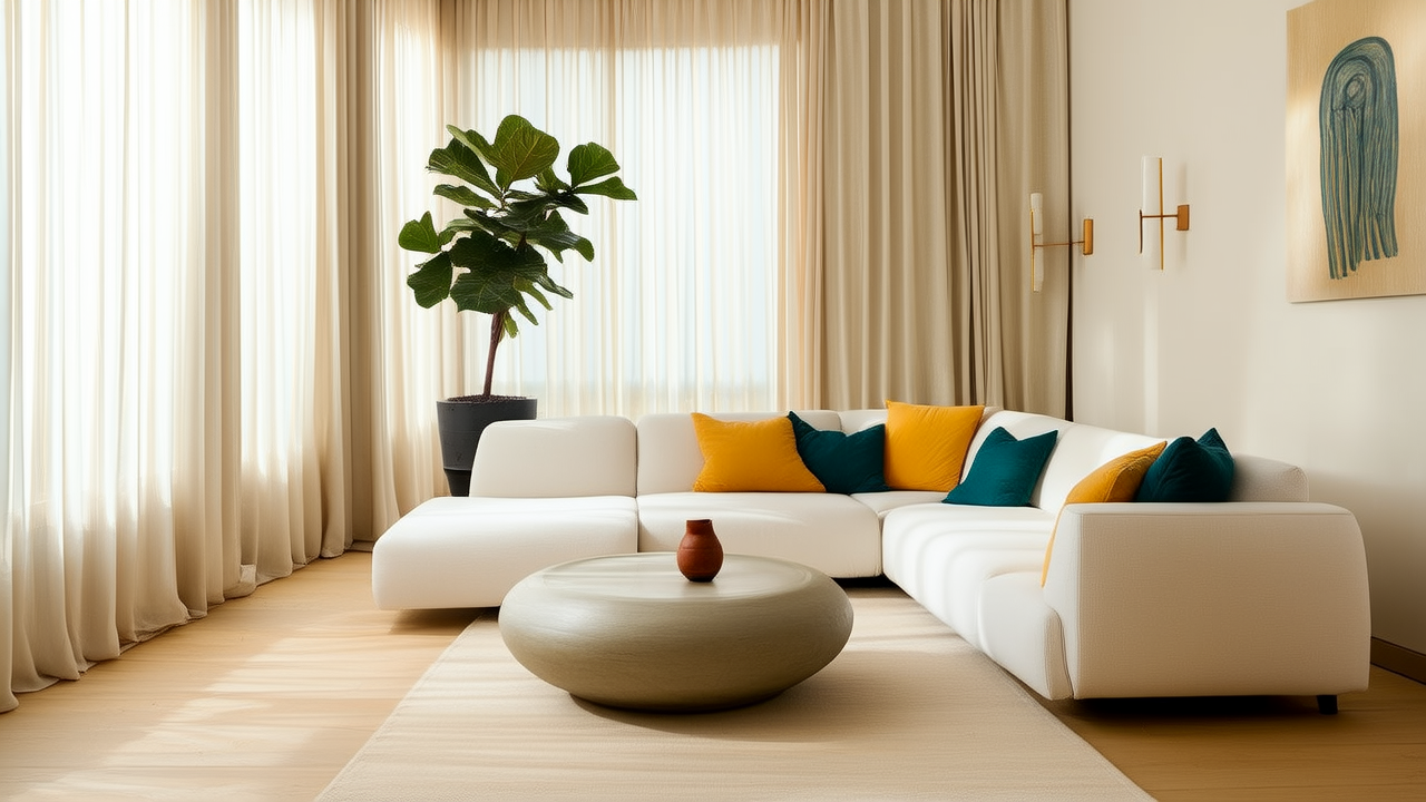
Living Room Design From Life, Not Moodboards
Stylish alternatives to inspiration are practical design approaches that replace copied moodboards with your routines, rooms, and real preferences. Instead of chasing Pinterest-perfect living rooms, you can build a space from how you wake up, entertain, work, and rest. This article explains how to move beyond saved images and create interiors that feel curated but not performative, using measurement, material selection, furniture scale, lighting layers, storage rhythm, and lifestyle audits. Brands like Herman Miller, Vitra, Muji, Hay, Frama, and West Elm can help translate ideas into pieces, but the method matters more than logos. The result is a home that supports daily life while remaining visually intentional.
From Moodboards To Meaningful Rooms
Inspiration is often treated as a shortcut to taste. A person saves thirty images of neutral sofas, brass lamps, and linen curtains, then tries to assemble a room from fragments that were never designed to coexist. That process can produce a space that looks familiar but feels borrowed. The most stylish living rooms usually start with a question about behavior, not a picture of furniture. What happens in this room between 7 am and 8 pm? Who uses it, what do they need to reach, and what does the room have to hide? Those answers create a stronger design brief than any saved image.
The problem is not images themselves. Images are useful references for proportion, color, and texture. The issue is using them as substitutes for judgment. A beautiful room in a magazine may depend on a 12 ft ceiling, a large window, a specific floor plan, and a budget for hidden storage. If your room has a 8 ft ceiling, a radiator cover, and a doorway behind the sofa, copying that image will likely create friction. Alternatives to inspiration mean moving from visual desire to spatial logic, then letting style emerge from what fits, functions, and ages well.
Why Saved Images Can Distort Taste
Saved images are convenient because they present a finished idea without exposing the decisions behind it. You see the final arrangement, but you do not see the cord routing, the stain sample, the delivery date, or the compromise made when the rug was too small. That missing information can make people feel that their rooms are failing when the real issue is scale, storage, or daily maintenance. When taste is measured only by what looks beautiful in a thumbnail, it becomes fragile and easy to chase.
When you use saved images as the starting point, you may also ignore the difference between a photograph and a lived-in space. Cameras can flatten texture, brighten color, and make a room feel larger than it is. A sofa that reads airy in an image may feel bulky when placed 18 inches from a coffee table. A pale wall color that looks soft under studio lighting may turn cool and stark in north-facing daylight. Designing from life means visiting the room at different hours, checking the door swings, and considering what the room must absorb on an ordinary Tuesday.
Measure The Room Before Buying Furniture
Before any style decision, measure the room like a problem solver, not a dreamer. Start with the overall footprint, then measure window widths, door swing paths, radiator or vent locations, electrical outlets, and ceiling height. In a living room, the most common mistake is choosing a sofa length that fills the wall but blocks circulation. A room can feel expensive when furniture is placed with enough air around it, even if the pieces are modest. In contrast, a room with expensive furniture can feel cramped when every inch is used.
| Living Room Type | Typical Size | Sofa Length | Coffee Table Clearance | Rug Size |
|---|---|---|---|---|
| Apartment lounge | 11 ft by 13 ft | 72 to 84 in | 14 to 18 in | 6 ft by 9 ft |
| Open-plan family room | 15 ft by 18 ft | 84 to 108 in | 16 to 20 in | 9 ft by 12 ft |
| Reading nook | 8 ft by 10 ft | 60 to 72 in | 12 to 16 in | 5 ft by 7 ft |
| Entertaining space | 14 ft by 20 ft | 96 to 120 in | 18 to 24 in | 10 ft by 14 ft |
A 12 ft by 15 ft living room often works well with an 84-inch sofa, a 42-inch by 24-inch coffee table, and two 30-inch accent chairs. Leave 36 inches for a main walkway when possible, and 24 inches for a secondary path. If the sofa is 38 inches deep and the room is 15 feet wide, the sofa will consume more than a quarter of the depth before any circulation is considered. That is why floor plans are more reliable than images. A tape measure can tell you whether a Hay Tray Table can work as a side surface without forcing guests to turn sideways.
Use Doorways And Walkways As Hidden Constraints
In smaller homes, doorways are design assets and obstacles at the same time. A door that swings into the living room can eliminate a good chair location or make a console table impractical. Before ordering a sectional, tape the outline on the floor with painter's tape and walk the route with a laundry basket, a laptop bag, and a glass of water. If the path feels tight, the room will feel tight daily. This simple test prevents expensive returns and helps you choose a layout that respects movement rather than forcing movement around furniture.
Measure vertical too. In rooms with 8 ft ceilings, low furniture and tall plants can make the space feel compressed if they are not balanced. A 36-inch sideboard may overwhelm a small room if placed under a low window, while a 30-inch media cabinet from IKEA or Muji can keep sightlines open. If you have 9 ft ceilings, a taller bookcase, such as a 72-inch Frama or Design Within Reach unit, can use the height without making the room feel cavernous. Vertical proportions are often the difference between stylish and simply full.
Use Lifestyle Data Instead Of Trend Data
Trend reports tell you what many people are buying. Lifestyle data tells you what your household actually needs. A 2024 interior survey from Houzz found that storage and organization remain among the most requested features in home renovations, and that sentiment has remained steady for years. That tells designers something important: the public is not only seeking aesthetics, but relief from clutter. A living room that solves storage, supports comfort, and remains easy to clean will outperform a room that only photographs well.
- Where do you sit first after entering the room, and what is within reach from that spot?
- What time of day does the room feel most alive, and how can lighting support that hour?
- How many people regularly use the room, and what is their minimum comfortable seating distance?
- What objects accumulate on surfaces, such as remotes, chargers, kids' art, books, or coffee mugs?
- How long can you maintain the room before it feels stale, and does the design allow changes?
- What cleaning habits does the room need to support, including vacuum paths, floor protectors, and pet hair?
A lifestyle audit can be completed in one evening. Walk through the room and note the five objects that move most often. If a laptop, a throw blanket, a remote, a glass, and a pair of headphones are constantly in use, the room needs surfaces and storage near seating. If a pet bed, a vacuum, or a basket of toys must be stored daily, the design should include closed storage. These observations create a more personal standard of style than a trend board because they reveal what the room is actually for.
For example, a household with young children may prefer a Ligne Roset Togo-style modular sofa, a West Elm performance velvet sectional, or a durable Crate and Barrel family sofa because the forms are low, forgiving, and easy to reconfigure. A remote worker may prioritize a Herman Miller Embody chair or a Vitra work chair at a compact desk, with a 27-inch monitor arm and cable channels. The stylish alternative is not hiding life; it is designing the room so life has a place to land.
Build A Material Palette With Constraints
Many stylish rooms fail because the material palette is too broad. There are too many finishes competing for attention: brushed brass, matte black, warm oak, white marble, walnut, linen, boucle, leather, and rattan. Each may be attractive alone, but together they create visual noise. A useful alternative to inspiration is a constraint. Choose a limited number of materials, repeat them across the room, and allow one or two accents to stand out. This method creates cohesion without requiring a designer to spend heavily on custom pieces.
Choose Three Materials And Stick To Them
Pick one dominant material for large surfaces, one secondary material for seating and storage, and one accent material for hardware, lamps, and small tables. In a calm apartment living room, the dominant material might be a soft neutral wall with an eggshell or matte sheen, the secondary material might be a linen sofa and wool rug, and the accent might be blackened steel or unlacquered brass. This simple framework keeps the room unified while giving the eye a few points of interest.
For a warm minimal room, consider oak or ash from brands like Frama or Hay, paired with off-white boucle, cream plaster, and a blackened metal frame. For a mid-century living room, walnut veneer, tan leather, and smoked glass can work well with pieces influenced by Vitra, Gubi, or Artemide. For a small family room, a light oak floor, charcoal upholstery, and white storage cabinets from Muji or IKEA can make the space feel orderly without being cold. The exact brand matters less than the consistency of the palette.
Textural contrast is often more important than color contrast. A room with three shades of beige can still feel rich if it combines nubby wool, smooth plaster, polished wood, and matte ceramic. If every surface is flat, the room can feel expensive but lifeless. If every surface is rough, it can feel busy. Aim for two dominant textures and one quiet texture. A 5 ft by 7 ft jute rug from CB2 or a 9 ft by 12 ft wool flatweave from Ferm Living can anchor a room without adding visual weight.
Design Lighting In Layers, Not Statements
Lighting is often the first thing people notice and the last thing they plan. A living room with one central ceiling fixture can feel flat, even if the furniture is excellent. Stylish spaces usually have at least three light sources: ambient, task, and accent. Ambient lighting provides general illumination, task lighting supports reading and working, and accent lighting reveals texture, art, or architectural depth. This layered approach is an alternative to copying a single statement lamp from an inspiration image.
- Set ambient lighting to about 20 to 30 lumens per square foot for general living room use.
- Add task lighting near seating with a floor lamp that places light at 36 to 42 inches above the seat.
- Use accent lighting on shelves, plants, or artwork with 120-degree beam angles and dimmable fixtures.
- Install dimmers or smart bulbs so the same room can shift from bright cleaning to relaxed evening.
- Choose bulbs in the 2700K to 3000K range for warmth, with a color rendering index of 90 or higher.
For a 250 square foot living room, a practical target is 5,000 to 7,500 total ambient lumens, distributed across ceiling, floor, and table lamps. A 150-lumen candle can feel atmospheric at night, while a 400-lumen reading lamp may be ideal beside an armchair. If the room has large windows, reduce overhead lighting during daylight and rely on reflection from pale walls, glass, and metal. The goal is not to make every corner bright; it is to make the room feel adjustable.
Use 2700K to 3000K bulbs for living rooms where comfort matters, because cooler 4000K light can make upholstery and wood look clinical. If you choose a sculptural piece, such as a Gubi Beetle lamp, an Artemide Tolomeo floor lamp, or a Hay Mags lamp, let it serve a function. A statement light that sits in a dark corner and does not illuminate anything becomes an expensive object. A simple fixture that improves the room at the hour you actually use it is a better design investment.
Replace Inspiration With Editable Rules
Rather than asking whether a room looks like a saved image, ask whether it follows editable rules. A good rule is specific, measurable, and easy to change. For example, keep 60 percent of the room in a neutral base, 30 percent in secondary materials, and 10 percent in accents. Another rule could be that every seating area must have one surface within 18 inches. These rules help you make decisions quickly and prevent the room from drifting into decoration for decoration's sake.
An editable rule might be that artwork hangs 57 to 60 inches from the floor to its center, but can drop to 52 inches above a low sofa back. A console rule might say that only two decorative items remain on display at once, while everything else rotates. A lighting rule could require at least three independent switches or outlets so the room can be used without extension cords. Style becomes easier when you can edit a system, not when you chase a perfect picture.
If a rule fails, change the rule instead of blaming taste. Maybe the room needs a smaller rug because the 8 ft by 10 ft piece blocks the doorway. Maybe the leather sofa needs a throw because it is too cold for the local climate. Maybe the open shelving from Muji is stylish but impossible to keep tidy. These are not personal failures. They are design feedback. The room should teach you what your lifestyle can sustain.
Create Alternatives To Saved Images
Instead of building another board, create a physical or digital system that captures your own preferences. Keep a small box of materials: a wood sample, a fabric swatch, a paint chip, a metal finish, a ceramic tile, and a photo of your own window light. This box is more honest than a moodboard because it contains things that will exist in your home. When you choose a West Elm sofa, a Crate and Barrel coffee table, or a Muji shelf, you can test whether the pieces feel related without relying on a filtered image.
Keep a material box and a light journal. Note the time when your room feels best, the colors that look most natural in your walls, and the surfaces that feel good to touch. If morning light turns a sage green wall into gray, that is useful information. If evening lamp light warms a dark blue sofa, that is a decision. Alternatives to inspiration are not about rejecting references; they are about building a personal evidence base that leads to rooms that work in real conditions.
Use a room recipe card. Write down the five non-negotiables for a living room: enough seating, clear walkways, hidden storage, layered lighting, and one comfortable surface for daily use. Then add three style notes: a preferred wood, a preferred fabric, and a preferred color. The recipe card prevents you from buying a beautiful item that breaks the function. If a piece does not support the recipe, it needs a very strong reason to enter the room.
The goal is not to stop looking at beautiful spaces. The goal is to stop letting images make decisions for you. Stylish alternatives to inspiration come from measurement, lifestyle observation, material restraint, lighting intelligence, and editable rules. They help you create living rooms that feel calm, personal, and useful. A room built from these principles will not look like everyone else's saved image, and that is exactly the point.
More Articles
 Best Family Checklist System for Modern Homes (2026)
 How to Style a Round Coffee Table - The Decor Mag
 Living Room Elevated Casual Design - The Decor Mag
 Transitional Living Room Design Guide - The Decor Mag
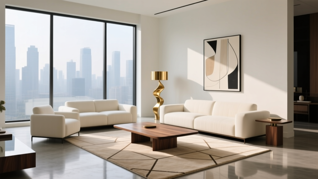 Luxury Living Room Design Trends - The Decor Mag
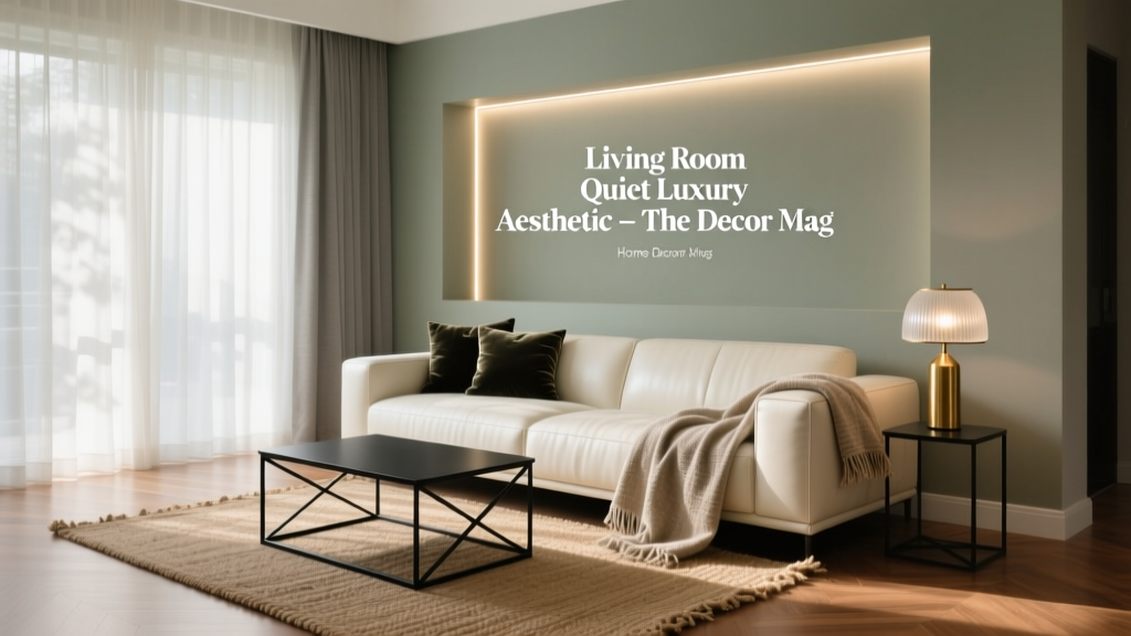 Living Room Quiet Luxury Aesthetic - The Decor Mag
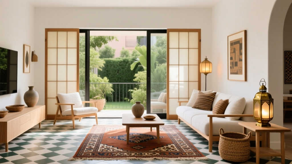 Living Room Global Bazaar Style - The Decor Mag
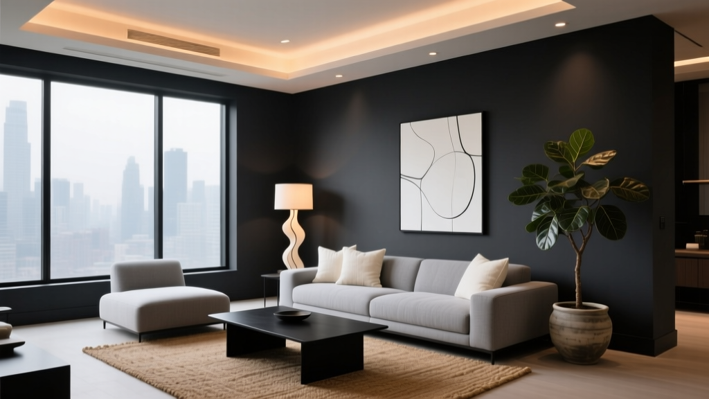 How to Style a Living Room with Dark Walls - The Decor Mag
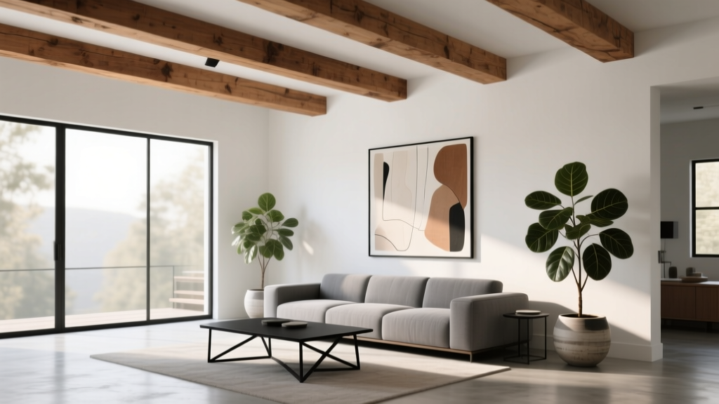 Exposed Beams Living Room Decor (2026)
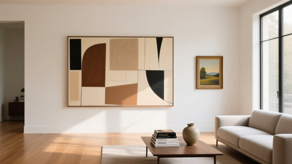 Art Scale for Living Rooms: How to Choose (2026)