Art Scale for Living Rooms: How to Choose (2026)
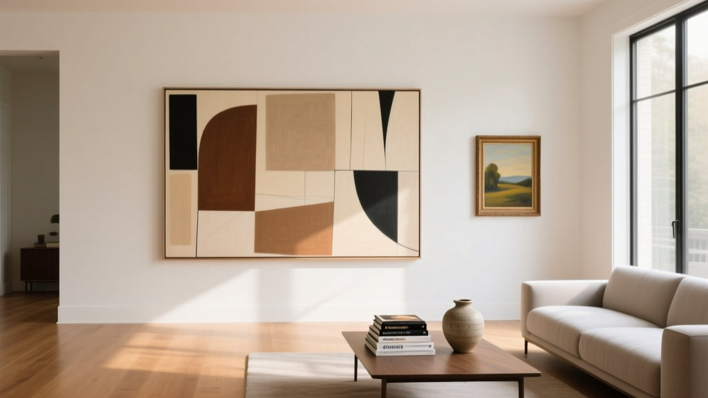
Art can make a living room feel finished faster than almost any other decor choice. But when it’s the wrong size, even a beautiful piece can look awkward—like it’s floating on the wall, squeezed into a corner, or competing with the sofa instead of complementing it. Scale is the quiet design principle that separates a “nice room” from one that feels polished and intentional.
The good news: choosing the right scale of wall art isn’t about guessing or following rigid rules. It’s about a few reliable measurements, a little planning, and knowing what effect you want—airy and minimal, bold and dramatic, or layered and collected. This guide walks you through practical sizing formulas, hanging heights, layout options (single statement piece, diptych/triptych, and gallery walls), plus real-life scenarios, common mistakes to avoid, and trend-forward ideas that still feel timeless.
Whether you’re a renter styling with removable hooks or a homeowner investing in original art, you’ll leave with a clear plan—and the confidence to choose art that actually fits your living room.
Why Scale Matters in Living Room Design
Living rooms are visual “high-traffic” spaces. Your eyes scan the sofa wall, fireplace, and primary seating area first. Art that’s correctly scaled anchors these focal points and creates balance among large elements like sofas, sectionals, media consoles, and rugs.
- Too small: The wall looks empty; the art feels accidental and underwhelming.
- Too large: The room can feel crowded; art may overwhelm furniture and sightlines.
- Just right: The art integrates with the furniture, defines the style, and makes the room feel cohesive.
The Core Rule: Use Furniture Width as Your Art-Sizing Guide
The most dependable rule for choosing the right scale of art for living rooms is based on the width of the furniture below it—usually the sofa, console, or mantel.
The 2/3 to 3/4 Rule (Your Best Starting Point)
A piece of art (or grouping of art) should typically be about 2/3 to 3/4 the width of the furniture it hangs above.
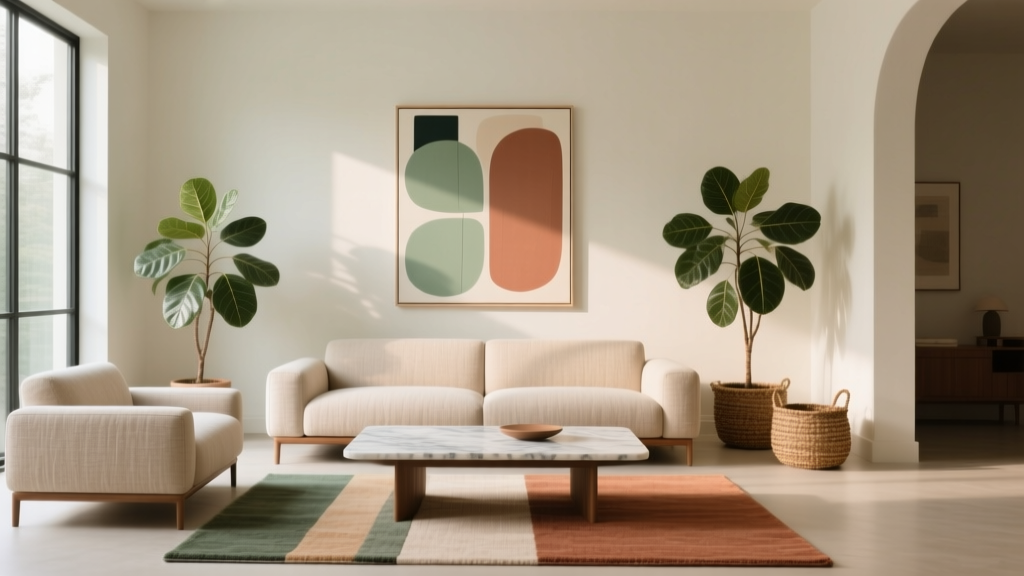
- For a 84" sofa: aim for art that’s roughly 56"–63" wide.
- For a 72" sofa: aim for art that’s roughly 48"–54" wide.
- For a 60" console: aim for art that’s roughly 40"–45" wide.
This is why a single 18" x 24" print often looks lost above a full-size sofa—it simply can’t carry the visual weight.
How Wide Should a Gallery Wall Be?
Think of a gallery wall as one “large piece.” Measure the total outer width of the arrangement (from the left edge of the leftmost frame to the right edge of the rightmost frame) and apply the same 2/3 to 3/4 guideline.
Hanging Height: The Measurement That Changes Everything
Even perfectly sized art can look wrong if it’s hung too high (a very common living room decorating mistake). Use these guidelines to get the height right.
Use Eye Level as Your Default
For most living rooms, the center of the artwork should sit around 57"–60" from the floor (gallery standard). This works best when art is the primary focal point on a wall without furniture directly beneath it.
Above a Sofa: Mind the Gap
When hanging art over a sofa, the distance between the top of the sofa and the bottom of the frame matters more than eye-level rules.
- Leave 6"–10" between the top of the sofa and the bottom of the art.
- If you have tall ceilings, resist the urge to push art upward; keep the connection to the furniture.
Above a Mantel: Keep It Close (But Not Cramped)
- Start with 4"–8" above the mantel shelf.
- If you’re layering (art + objects), keep the largest piece closest to the wall and let decor overlap slightly for depth.
Choosing the Right Art Format for Your Wall
Scale isn’t only about size—it’s also about shape and orientation. The right format makes the room feel proportionate and tailored.
Single Large Statement Piece
Best for: modern living rooms, minimalist spaces, open-concept layouts, and anyone who wants a calm, high-impact focal point.
Recommended sizes (common and easy to find):
- 40" x 60" (great above 84" sofas)
- 36" x 48" (works above 72" sofas)
- 30" x 40" (better for loveseats, small sofas, or layered with sconces)
Trend meets timeless: Oversized abstract art, textured neutrals, and soft landscape photography remain popular because they add presence without feeling busy.
Diptych or Triptych (Two or Three Panels)
Best for: wide sofa walls where you want impact but prefer a lighter feel than one massive frame.
- Diptych: Two panels, often tall and narrow. Ideal if you have lamps, side tables, or architectural elements that benefit from a little spacing.
- Triptych: Three panels, perfect for long walls and large sectionals.
Spacing tip: Keep gaps between panels consistent, usually 2"–4".
Gallery Wall (Collected, Flexible, Renter-Friendly)
Best for: eclectic living rooms, transitional styles, and renters who want to build a look gradually.
Smart formula for gallery wall scale:
- Measure the furniture width (sofa/console).
- Multiply by 0.66 to 0.75 for your target gallery width.
- Plan the layout on the floor first, then trace with painter’s tape on the wall.
Current trend: Mixing frame finishes (light oak + black + brass) with a consistent mat color (like warm white) keeps the look curated rather than chaotic.
Step-by-Step: How to Choose the Right Art Size for Your Living Room
- Identify the focal wall (usually behind the sofa, above the mantel, or over a media console).
- Measure the furniture width in inches.
- Choose your target art width using the 2/3 to 3/4 rule.
- Decide on a format: one large piece, 2–3 panels, or a gallery wall.
- Mock it up:
- Use kraft paper, newspaper, or gift wrap cut to size and tape it to the wall.
- Or use painter’s tape to outline the exact dimensions.
- Confirm sightlines: sit on the sofa—can you see the center of the art comfortably without tilting your head?
- Hang with intention:
- Keep 6"–10" above the sofa.
- Use proper anchors for plaster/drywall.
- Consider picture-hanging strips for lightweight frames (great for rentals).
Real-World Living Room Scenarios (What Works and Why)
Scenario 1: Small Apartment Living Room with a 72" Sofa
Challenge: You want impact without making the room feel tighter.
Solution: Choose a 36" x 48" statement piece or a diptych totaling 48"–54" wide. Keep the frame slim (black metal or light oak) and the palette soft to maintain an open feel.
Budget range: $80–$300 for a large-format print + frame; $300–$900 for a framed canvas or limited-edition print.
Scenario 2: Large Sectional (110"–130") in a Family Room
Challenge: The wall needs strong visual weight to match the scale of the seating.
Solution: Go oversized: 48" x 72" or larger, or a triptych that spans 75"–95". Consider durable materials like canvas or acrylic glazing (more shatter-resistant than glass).
Budget range: $250–$800 for large canvas art; $800–$2,500+ for original or custom pieces.
Scenario 3: Fireplace Wall with Built-Ins
Challenge: Art competes with architectural details.
Solution: Choose art that’s proportional to the mantel opening—often a piece that fills 60%–80% of the mantel width. If built-ins are visually busy, keep art simpler: one strong piece with a calm composition.
Pro tip: If you’re styling the mantel with decor, slightly smaller art can work because objects add visual mass.
Scenario 4: Media Console + TV Wall
Challenge: The TV dominates; art can feel secondary or cluttered.
Solution: Use larger-scale art on adjacent walls or incorporate art-like elements near the TV:
- Oversized framed photography on a nearby wall
- Textural wall panels or sculptural objects
- A slim picture ledge with layered frames (kept low and wide)
Material and Frame Choices That Affect Perceived Scale
Two pieces with the same dimensions can feel very different depending on materials, matting, and frame style.
Frames and Mats
- Wide mats (2"–4") make art feel more elevated and can visually “expand” a smaller print.
- Thin frames (metal or slim wood) feel modern and lighter.
- Thicker frames add weight and presence—helpful if your living room has substantial furniture.
Glass vs. Acrylic vs. Canvas
- Glass: crisp and classic, but heavier and reflective. Best for controlled lighting.
- Acrylic glazing: lighter, safer for family spaces, often less reflective in premium versions.
- Canvas: great for large-scale art on a budget; minimal glare; adds softness and texture.
Texture Is a Trend That’s Sticking Around
Textural art—plaster-style pieces, linen-wrapped panels, woven wall hangings—adds depth that reads “bigger” on the wall. It’s especially effective in neutral living room decor where color contrast is minimal.
Product Recommendations (Easy Wins at Different Budgets)
These are categories and price expectations to help you shop confidently for living room wall art at the right scale.
- Budget-friendly ($30–$150): downloadable prints (then print large), poster-sized art with oversized mats, lightweight frames, peel-and-stick hanging systems for rentals.
- Mid-range ($150–$700): large framed prints, canvas art in 36" x 48" or 40" x 60", curated diptych/triptych sets.
- Investment ($700–$3,000+): original paintings, limited editions, custom framing, oversized photography with acrylic glazing.
Shopping tip: When you find a print you love but it’s too small, buy the largest available version and add a wider mat and larger frame to reach your target width.
Common Mistakes to Avoid
- Choosing art that’s too small for the sofa wall. If your art is under half the sofa width, it will usually feel underscaled.
- Hanging art too high. Keep the bottom edge 6"–10" above the sofa to maintain connection.
- Using lots of tiny frames with huge gaps. Gallery walls need cohesive spacing (typically 2"–3" between frames).
- Ignoring the room’s visual weight. A bulky sectional wants bolder scale; a petite sofa can handle lighter compositions.
- Not accounting for lighting and glare. Avoid placing glossy, glass-front art opposite bright windows unless you’re using anti-reflective glazing.
- Forgetting color and contrast. Low-contrast art on a similarly toned wall can disappear—use frame contrast or add a mat to define edges.
FAQ: Choosing the Right Scale of Art for Living Rooms
How big should wall art be above a couch?
Aim for art (or a group of art) that’s about 2/3 to 3/4 the width of the couch. Hang it so the bottom edge sits roughly 6"–10" above the sofa back.
Is one large piece better than multiple smaller pieces?
One large piece feels clean and modern and is often the easiest way to get scale right. Multiple smaller pieces work beautifully if they’re arranged as a gallery wall with a total width that matches the sofa and consistent spacing.
What size art works best for high ceilings?
High ceilings can handle taller art, but don’t automatically hang it higher. Choose larger dimensions (like 40" x 60" or 48" x 72") and keep the art visually connected to the furniture with the same 6"–10" spacing above the sofa.
How do I choose art size if I’m renting and can’t make many holes?
Go for fewer, larger lightweight pieces (like canvas or acrylic-glazed frames), use high-quality removable hanging strips rated for the frame weight, or lean oversized art on a picture ledge or mantel for a no-nail look.
Should art be centered on the wall or centered over the sofa?
In most living room layouts, center art over the sofa (or the furniture grouping) rather than the wall. This keeps the arrangement grounded and prevents the art from feeling disconnected.
What’s the best spacing between frames in a gallery wall?
Keep it consistent—typically 2"–3" between frames. Tighter spacing reads more modern and cohesive; wider spacing can feel scattered unless the frames are very large.
Actionable Next Steps for a Living Room That Feels Finished
- Measure your sofa or console width and write down your target art width (2/3–3/4 rule).
- Pick a format: statement piece, diptych/triptych, or gallery wall.
- Mock it up with paper or painter’s tape before you buy or hang.
- Hang at the right height: 6"–10" above the sofa, or center at 57"–60" for standalone walls.
- Choose materials that suit your lifestyle: canvas or acrylic for high-traffic family rooms, glass for a crisp, classic look.
Art should feel like it belongs in your living room—not like an afterthought. With a tape measure, a simple width formula, and a layout plan, you can choose wall art that elevates your space instantly.
Want more living room decor ideas, layout tips, and trend-forward inspiration? Explore the latest guides and styling edits on thedecormag.com.
More Articles
 Best Console Styling for Behind Couch - The Decor Mag
 Living Room Design: Functional + Stylish Framework (2026)
 How to Style a Living Room for the Holidays - The Decor Mag
 Budget Living Room Furniture 2026: Style & Durability
 Bohemian Living Room Decor Ideas - The Decor Mag
 Paint Safety Tips for Health & Environment in 2026
 Best Sideboard Storage for Living Rooms - The Decor Mag
 How to Create a Living Room Color Story - The Decor Mag
 Smart Living Spaces on a Budget in 2026
 Living Room Refined Rustic Charm - The Decor Mag