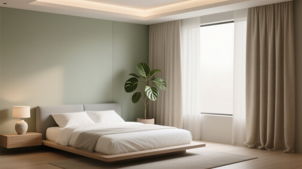
Best Bedroom Color Palettes for Relaxation - The Decor Mag
A relaxing bedroom isn’t just a style preference—it’s a sleep strategy. Color influences how your nervous system responds to a space, affecting stress levels, heart rate, and how quickly your brain shifts into “rest mode.” When your bedroom color palette feels soothing and cohesive, your mind has fewer visual signals to process at night, which can support faster sleep onset and deeper rest.
The good news: you don’t need a full renovation to create a calmer sleep environment. A well-chosen palette, paired with the right bedding materials, lighting temperature, and a thoughtful layout, can make a noticeable difference. Whether you own your home or rent an apartment, the best bedroom colors for relaxation can be achieved with paint, textiles, curtains, and a few well-placed decor upgrades.
Below are sleep-friendly bedroom color palettes—plus practical design tips, common mistakes to avoid, and a simple plan to pull everything together.
How Color Affects Sleep (and What “Relaxing” Really Means)
When people search for a calming bedroom, they’re usually chasing a mix of softness, visual quiet, and warmth. From a sleep wellness perspective, relaxing colors tend to have:
- Low to medium saturation (muted rather than vivid)
- Balanced undertones (either consistently warm or consistently cool)
- Comfortable contrast (enough definition to feel designed, not so much that it feels busy)
For most sleepers, the most restful bedroom color palettes sit in the range of:
- Soft neutrals (warm whites, greiges, mushroom)
- Nature-based hues (sage, dusty blue, clay)
- Deep, enveloping shades (ink, forest, charcoal) used intentionally
Color alone won’t fix poor sleep, but it can reduce bedtime overstimulation—especially when paired with dimmable lighting, breathable bedding, and clutter control.
Best Bedroom Color Palettes for Relaxation
1) Soft Warm Neutrals: Cream, Oat, and Beige
This is one of the most timeless relaxing bedroom palettes. Warm neutrals reflect light gently, feel clean without being stark, and support a “cocoon” effect when layered with textured fabrics.
- Wall color ideas: creamy white, warm ivory, light oat, soft beige
- Accent colors: camel, warm taupe, muted terracotta, brushed gold
- Best for: north-facing rooms, smaller bedrooms, renters using textiles to shift mood
Design pairing tips:
- Furniture: light oak, ash wood, upholstered headboard in linen or bouclé
- Bedding: white/ivory cotton percale for crispness, or washed linen for softness
- Lighting: warm bulbs at 2700K; choose fabric or parchment shades to diffuse glare
Budget range: $50–$250 for a cohesive refresh using duvet cover + two pillow shams + throw (no paint required). Full paint-and-textile update: $200–$900 depending on room size and curtain needs.
2) Sage Green + Warm White: A Nature-Calm Classic
Sage is a go-to color for a sleep-friendly bedroom because it reads as natural, quiet, and restorative. Pair it with warm white rather than bright white for a softer contrast.
- Wall color ideas: muted sage, eucalyptus, soft olive-gray
- Accent colors: creamy white, sand, light wood, aged brass
- Best for: anyone craving a grounded, spa-like bedroom design
Design pairing tips:
- Furniture: wood bed frame (oak or walnut), minimal nightstands with rounded edges
- Bedding: cotton sateen in warm white for a smoother feel, or linen in bone/ivory
- Decor: one large landscape print; keep wall art to 1–2 pieces to avoid visual noise
Wellness boost: add a plant only if it doesn’t trigger allergies and you can keep it healthy. A stressed, drooping plant can add subtle mental clutter.
3) Misty Blue + Driftwood Neutrals: The “Exhale” Palette
Soft, gray-leaning blues can feel cooling and quiet—ideal for people who run warm at night or live in bright, sunny climates. The key is choosing a muted blue rather than a saturated primary blue.
- Wall color ideas: mist blue, faded denim, blue-gray
- Accent colors: greige, weathered wood, soft white, pewter
- Best for: hot sleepers, coastal-inspired decor, busy minds that need a calmer visual field
Design pairing tips:
- Furniture: driftwood tones, painted nightstands in warm white, matte black hardware for gentle contrast
- Bedding: breathable cotton percale (especially for hot sleepers); add a light quilt for layering
- Lighting: avoid cool “daylight” bulbs that fight the calming vibe—stay warm and dimmable
Budget range: $30–$120 to shift the palette with pillow covers + throw + curtains. $150–$600 with paint and upgraded lamps.
4) Lavender Gray + Soft White: Quietly Soothing Without Feeling Sweet
Lavender is often misunderstood as overly feminine or too playful. In a gray-leaning, dusty form, it becomes a sophisticated relaxing bedroom color palette that can feel especially soothing for anxiety-prone sleepers.
- Wall color ideas: pale lavender gray, lilac fog, smoky mauve
- Accent colors: soft white, warm gray, light oak, muted plum (sparingly)
- Best for: bedrooms that need softness without looking beige
Design pairing tips:
- Furniture: upholstered headboard in oatmeal or light gray; simple lines to keep it serene
- Bedding: matte cotton (percale or brushed cotton) to avoid shine; texture reads calmer than gloss
- Rug: low-pile wool or wool-blend in a pale neutral to reduce echoes and footstep noise
5) Terracotta + Sand: Warmth That Still Feels Restful
Warm palettes can be deeply relaxing when the tones are earthy rather than bright. Terracotta, clay, and sand create a cozy, grounded bedroom design that feels welcoming at night.
- Wall color ideas: soft clay, muted terracotta, warm sand, peachy-beige
- Accent colors: bone, caramel, cocoa, olive (as a small accent)
- Best for: cooler climates, shaded rooms, anyone who finds cool colors too stark
Design pairing tips:
- Furniture: walnut, acacia, or darker oak; woven accents (rattan, cane) in moderation
- Bedding: linen duvet cover in natural flax or warm white; add a chunky knit throw for softness
- Lighting: warm, low lamps with amber-toned shades; consider wall sconces to free nightstand space
Sleep-friendly tip: warm colors feel cozy, but overly saturated orange or red can feel energizing. Keep terracotta muted and balance with plenty of soft neutral textiles.
6) Deep Moody Calm: Charcoal + Warm Taupe + Soft White
Dark colors can be surprisingly sleep-supportive because they reduce reflected light and create a cave-like feel—especially helpful for light-sensitive sleepers. The secret is warm undertones and layered lighting.
- Wall color ideas: charcoal with warm undertone, smoky brown-gray, deep taupe
- Accent colors: soft white, camel, matte black, aged bronze
- Best for: bedrooms with good natural light, people who prefer hotel-like coziness
Design pairing tips:
- Furniture: upholstered bed in a mid-tone neutral; avoid too many black pieces (can feel heavy)
- Bedding: high-contrast white sheets with a taupe/charcoal duvet for a tailored look
- Lighting: use at least two light sources (bedside + overhead) and dimmers whenever possible
Budget range: Paint + lighting upgrade tends to be the biggest cost here. Expect $250–$1,200 depending on fixture choices and whether you add dimmers or sconces.
How to Build a Relaxing Bedroom Palette (A Simple Formula)
If choosing colors feels overwhelming, use this three-part approach:
- Base color (60%): walls + large surfaces (warm white, greige, soft sage)
- Secondary color (30%): bedding, rug, curtains (oatmeal, misty blue, sand)
- Accent color (10%): small decor, art, one pillow, a vase (brass, charcoal, muted terracotta)
Quick renter-friendly shortcut: keep walls neutral and shift the palette with a duvet cover, curtain panels, and a rug—these three items do most of the visual work in a bedroom.
Sleep-Friendly Design Recommendations Beyond Color
Choose Bedding Materials That Regulate Temperature
- For hot sleepers: cotton percale sheets, lightweight cotton blanket, breathable duvet insert (look for cotton shell)
- For cold sleepers: brushed cotton or flannel sheets (seasonal), wool throw, mid-weight duvet
- For a luxury feel without overheating: linen duvet cover + cotton percale sheets
Budget guide: solid, sleep-friendly sheet sets typically run $40–$120; premium linen duvet covers often $120–$300+. A quality pillow that matches your sleep position is usually $40–$150 and can improve sleep comfort more than decor ever will.
Use Layered Lighting to Protect Your Wind-Down Routine
Light has a direct connection to your circadian rhythm. Make your bedroom lighting feel gentle at night:
- Bulb temperature: 2700K (warm) or 2200K (extra warm) for bedtime lighting
- Dimmers: ideal for overhead fixtures; plug-in dimmers work for many lamps
- Bedside setup: two lamps or sconces for balanced light (helps the room feel calmer and more “complete”)
- Avoid: exposed clear bulbs and harsh ceiling-only lighting
Layout Tweaks That Make a Bedroom Feel More Restful
- Keep the bed visually anchored: place it on the longest wall when possible; add a headboard for structure
- Create a clear pathway: at least 18–24 inches on each side if space allows
- Reduce “busy” zones: contain work items in a closed cabinet or basket; if you must have a desk, keep it out of direct sight from the bed
- Sound softening: add a rug (even over carpet), curtains, and upholstered elements to reduce echo
Common Mistakes That Make Bedrooms Feel Less Relaxing
- Choosing bright, highly saturated paint colors and expecting them to feel soothing at night
- Mixing clashing undertones (cool gray walls + warm beige bedding) which creates subtle tension
- Overdecorating the bed with too many pillows; it looks pretty but becomes nightly clutter
- Relying on one overhead light instead of layered, dimmable lighting
- Ignoring window treatments; lack of light control can undermine sleep quality
- Picking decor before textiles; bedding and curtains set the tone more than small accessories
Practical Shopping List (Choose 3–5 to Start)
- Paint: 1–2 gallons for most bedrooms (budget $40–$140 per gallon depending on brand/finish)
- Duvet cover: cotton percale or linen (budget $60–$300+)
- Sheet set: breathable cotton (budget $40–$150)
- Blackout or lined curtains: especially for streetlights or early sunrise (budget $40–$200 per window)
- Two matching lamps or wall sconces: for symmetry and softer light (budget $60–$300 for a pair)
- Area rug: low-pile wool or washable rug for renters (budget $100–$600+ depending on size)
FAQ: Bedroom Color Palettes for Better Sleep
What are the best bedroom colors for relaxation?
Muted, nature-inspired tones tend to work best: warm whites, soft beiges, sage green, misty blue, and dusty lavender gray. These shades feel visually quiet, which supports a calmer sleep environment.
Are dark bedroom colors bad for sleep?
Not necessarily. Deep charcoal, warm taupe, or inky blue can feel very restful and reduce light reflection—helpful for light-sensitive sleepers. Balance dark walls with soft textiles and layered warm lighting so the room doesn’t feel gloomy.
What paint finish is best for a bedroom?
Matte or eggshell are popular for bedrooms. Matte hides wall imperfections and feels soft; eggshell is slightly easier to wipe clean. Avoid high-gloss on large wall surfaces because it reflects light and can feel more stimulating at night.
How can renters change a bedroom color palette without painting?
Focus on high-impact textiles: a new duvet cover, curtain panels, a rug, and pillow covers. Choose a consistent undertone (warm or cool) and repeat your main color in at least two items to make the palette feel intentional.
Do blackout curtains really help sleep quality?
They can. Reducing light exposure at night supports melatonin production and can improve sleep continuity. If full blackout feels too dark during the day, try lined curtains or layering sheers with heavier panels.
How many colors should be in a relaxing bedroom palette?
Usually 2–4 colors is enough. A base neutral + one calming color + one small accent keeps the space cohesive and reduces visual clutter—especially helpful if you’re sensitive to busy environments.
Next Steps: Create Your Calm, One Layer at a Time
Start by choosing one of the palettes above that matches your natural light and your temperature preferences at night (cooling blues, grounding greens, cozy warm neutrals). Then build outward: bedding first, lighting second, decor last. When your bedroom design supports your wind-down routine—soft light, breathable materials, and calm color—better sleep becomes easier to access.
If you’re ready for more soothing bedroom decor, space planning ideas, and sleep-friendly upgrades, explore more bedroom inspiration on thedecormag.com.
More Articles
 How to Choose Bedroom Bedding Weight - The Decor Mag
 How to Create a Bedroom That Feels Luxurious - The Decor Mag
 Bedroom Layout Common Mistakes: What 92% of Homeowners Get Wrong (And How to Fix Them)
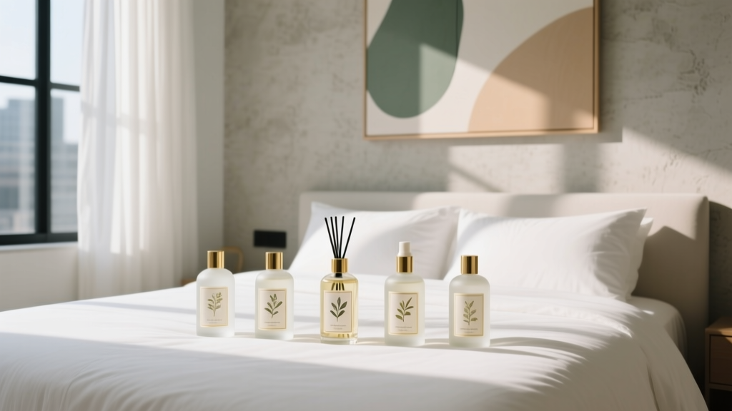 Best Bedroom Sleep Spray Collection - The Decor Mag
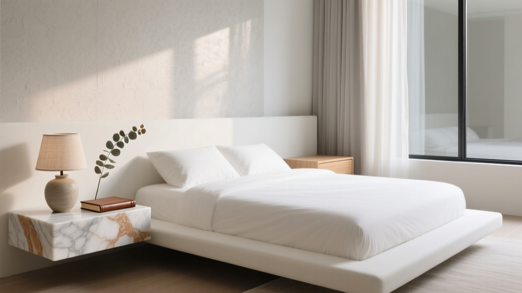 Bedroom Natural Stone Bedside Tray - The Decor Mag
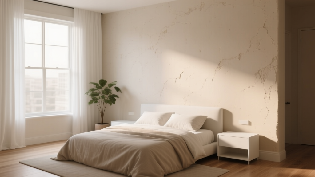 Bedroom Limewash Paint Wall Trend - The Decor Mag
 How To Start Living Room Ideas: A Practical, Step-by-Step Framework for Real Homes
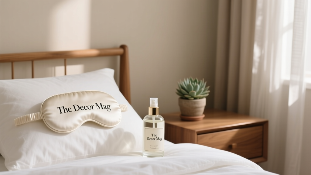 Best Bedroom Sleep Mask and Pillow Spray - The Decor Mag
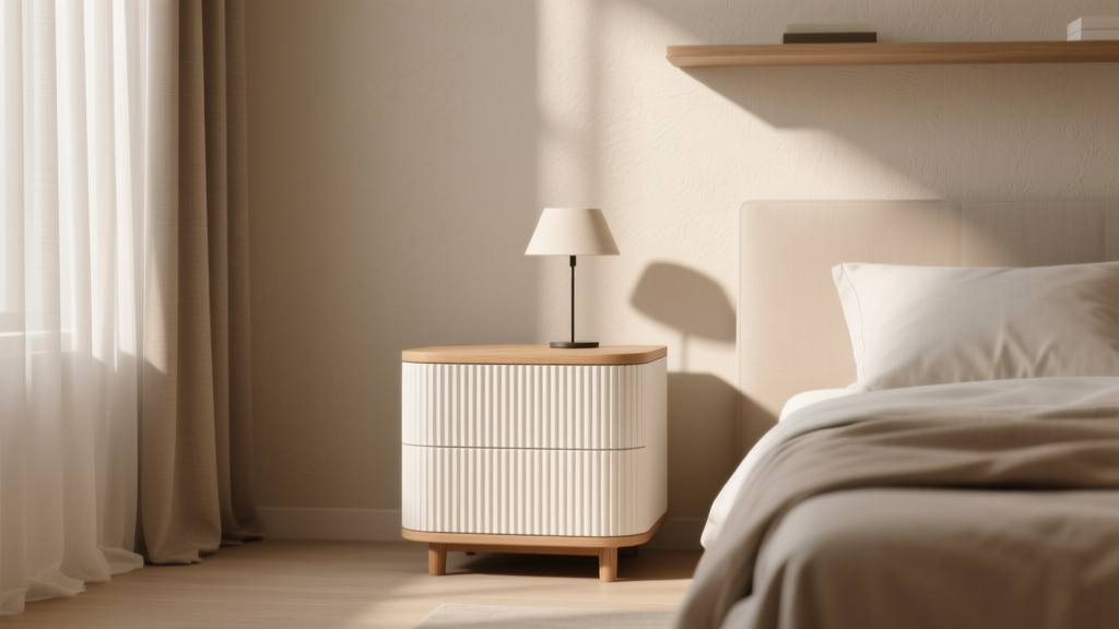 Bedroom Fluted Nightstand Design - The Decor Mag
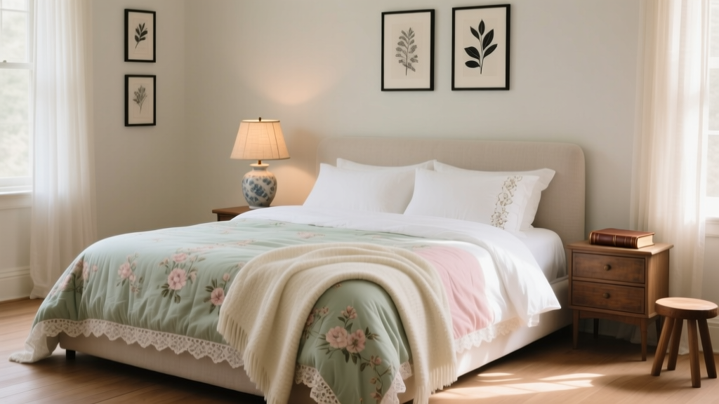 How to Incorporate Vintage Linens in Bedroom - The Decor Mag