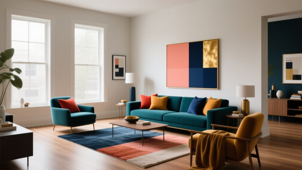
Complementary Color Pairing Ideas - The Decor Mag
Complementary colors—those that sit opposite each other on the color wheel—have a reputation for being bold, high-energy, and a little intimidating. That reputation is deserved… and also wildly useful. When you understand how complementary color schemes work, you gain a reliable shortcut to rooms that feel intentional, balanced, and visually alive.
Homeowners often struggle with color because they’re trying to solve two problems at once: choosing shades they love and making them work together in a cohesive interior color design. Complementary pairings solve the “work together” part. They create contrast, highlight architectural details, and help a room feel layered rather than flat—especially when you control saturation, value (lightness/darkness), and where each color shows up.
This guide breaks down how to use complementary color pairing ideas in real rooms—from paint colors to textiles—so you can create color schemes that feel elevated, not chaotic.
What Are Complementary Colors (and Why They Work in Interiors)?
Complementary colors are direct opposites on the traditional color wheel:
- Blue + Orange
- Red + Green
- Yellow + Purple
They “work” because they intensify each other. In color psychology terms, this creates energy and alertness—great for social spaces like living rooms and kitchens, and surprisingly effective in bedrooms when you soften the contrast with dusty, muted versions.
The Design Principle Behind the Magic: Contrast With Control
Complementary schemes succeed when you control at least one of these variables:
- Value: Pair a light version with a deeper version (e.g., pale blue walls with burnt orange accents).
- Saturation: Use one color as muted/earthy and the other as cleaner/brighter (e.g., terracotta with crisp teal).
- Proportion: Use one color as the “field” (walls/large rug) and the complement as the accent (pillows/art).
- Temperature: Balance warm and cool so the room feels comfortable, not tense.
How to Use Complementary Color Schemes Without Overwhelming the Room
Start With a Simple Ratio
A practical approach for complementary paint colors is a variation on the classic 60-30-10 guideline:
- 60% dominant color (often walls or a large rug)
- 30% supporting neutral or softened version of one color
- 10% complementary accent (pillows, art, lampshades, a painted vanity)
This ratio keeps the contrast readable while preventing the “sports team colors” effect.
Pick One Color to Quiet Down
If both colors are equally saturated (think primary blue and primary orange), the room can feel visually loud. A better move for most homes:
- Keep the larger surfaces (walls, sofa, drapery) in a muted, complex version.
- Use the complementary color in smaller hits with texture—velvet, wool, ceramics, wood tones.
Use Neutrals as a Buffer
Neutrals make complementary color palettes livable. Choose neutrals that support the temperature of your scheme:
- Warm complementary schemes (orange/blue with terracotta): add creamy whites like Benjamin Moore White Dove or warm greiges.
- Cool complementary schemes (purple/yellow with violet): add crisp whites like Sherwin-Williams Pure White or cool stone grays.
Complementary Color Pairing Ideas (With Paint Color Recommendations)
Below are room-friendly complementary combinations, including specific paint color names that designers reach for again and again. Treat these as starting points—always sample paint colors in your lighting.
Blue + Orange: Classic, Welcoming, and Surprisingly Flexible
Color psychology: Blue reads calm, trustworthy, and expansive. Orange adds warmth, sociability, and optimism. Together, they create a balanced energy—serene with a lively edge.
Paint pairings to try:
- Walls: Sherwin-Williams Sea Salt (SW 6204) (soft blue-green)
- Accent color: Benjamin Moore Terra Cotta Tile (2090-30) or Sherwin-Williams Cavern Clay (SW 7701)
- Alternative deeper blue: Benjamin Moore Hale Navy (HC-154) with burnt orange textiles
Real room scenario: A living room with Sea Salt walls, a natural linen sofa, and a vintage-inspired rug that includes rust, clay, and indigo. Add orange through:
- Two rust velvet pillows
- A terracotta table lamp base
- Framed art with warm ochre notes
Pro tip: Orange looks richer when you repeat it at least three times around the room (pillow, art, accessory) so it feels intentional.
Red + Green: Grounded, Traditional, and Modern When Done Right
Color psychology: Red is stimulating and appetite-boosting, which is why it works well in dining spaces. Green signals restoration and balance. Together, they can lean holiday if too literal—so aim for earthy reds and complex greens.
Paint pairings to try:
- Green walls: Benjamin Moore Saybrook Sage (HC-114) or Sherwin-Williams Evergreen Fog (SW 9130)
- Red accent: Farrow & Ball Preference Red (No. 297) or Benjamin Moore Caliente (AF-290) used sparingly
- Earthy alternative: Muted brick + olive (instead of true red + true green)
Real room scenario: A dining room painted in Saybrook Sage, paired with a walnut table and off-white linen drapery. Bring in red with:
- Oxblood leather dining chairs (or seat cushions)
- A deep red vase or centerpiece
- Artwork featuring warm crimson tones
Pro tip: If you want red on walls, flip the scheme—keep walls a muted red-brown and add green in plants, upholstery, or cabinetry.
Yellow + Purple: Creative, Elevated, and Great for Accents
Color psychology: Yellow reads cheerful and energizing. Purple reads imaginative and luxurious. Used together, this pairing can feel playful or refined depending on the shade selection.
Paint pairings to try:
- Soft yellow wall: Benjamin Moore Hawthorne Yellow (HC-4) (warm, historic gold)
- Purple accent: Sherwin-Williams Plum Brown (SW 6272) or Benjamin Moore Shadow (2117-30) (moody violet-blue)
- Modern approach: Pale buttercream with aubergine accents
Real room scenario: A home office with Hawthorne Yellow walls and built-in shelves in a deep plum. Finish with brass hardware and a cream rug. This reads “collected and confident” rather than loud.
Pro tip: Keep one color closer to neutral. A golden yellow can act like a warm neutral, while deep purples behave like sophisticated darks.
Room-by-Room Complementary Color Applications
Living Room: Make the Pairing Feel Layered
- Wall color: Choose the calmer color (often blue or green) for large surfaces.
- Anchor with texture: Use a neutral rug (wool, jute blend) to buffer contrast.
- Accents: Introduce the complement in 3–5 smaller elements (pillows, throw, art, ceramics).
Example: Benjamin Moore Hale Navy built-ins + creamy walls (e.g., White Dove) + warm orange leather ottoman and brass lighting.
Kitchen: Use Cabinets as the Color Moment
- Try green cabinets with red-brown accents through stools, rugs, or Roman shades.
- Or pair navy lower cabinets with copper/orange via pendants and accessories.
Example: Sherwin-Williams Evergreen Fog on cabinetry + clay-toned backsplash tile + white quartz counters to keep the palette bright.
Bedroom: Go Muted for Restful Contrast
- Choose dusty versions: slate blue + terracotta, or olive + blush-leaning red.
- Limit high contrast near the bed; place bolder complements across the room (bench, art wall).
Example: Sherwin-Williams Sea Salt walls + terracotta linen bedding accents + warm wood nightstands.
Bathroom: High Contrast in Small Doses Looks Custom
- Paint a vanity in the dominant color.
- Use the complement in towels, a framed print, or patterned tile.
Example: Benjamin Moore Hale Navy vanity + soft white walls + a small terracotta-toned vintage rug.
Exterior or Front Door: A Low-Risk Place to Try Complements
- Blue-gray house color + orange-toned wood door
- Soft greige siding + deep green door + copper lighting
Example: A classic blue door (navy) against warm brick—built-in complementary contrast that feels timeless.
Common Complementary Color Mistakes to Avoid
- Using equal saturation in equal amounts: Two bright complements on large surfaces can vibrate visually. Soften one color or reduce its footprint.
- Ignoring undertones: A purple that leans blue won’t complement a lemony yellow the same way a red-leaning purple will. Compare undertones in daylight.
- Forgetting the fixed elements: Countertops, flooring, and large furniture already “vote” in the color scheme. Test paint colors against them, not alone.
- Skipping samples: Complementary color schemes shift dramatically under warm vs cool bulbs. Sample boards in morning, afternoon, and evening light.
- Placing contrast everywhere: You need visual rest. Use neutrals and solids so the complementary moments feel special.
Practical Tips for Choosing the Right Complementary Paint Colors
- Identify your anchor color first: Usually a sofa, rug, stone countertop, or cabinetry.
- Decide your contrast level: Bold (high saturation) or relaxed (muted, earthy).
- Pick a neutral support: Cream, warm white, greige, or soft gray depending on the palette temperature.
- Repeat the accent color: Aim for at least three repeats around the room.
- Use sheen strategically: Eggshell on walls, satin on trim/doors for durability; sheen can make colors look stronger.
FAQ: Complementary Color Schemes at Home
What is the easiest complementary color scheme to live with?
Blue and orange is often the most flexible. Choose a soft blue (like Sherwin-Williams Sea Salt) and bring orange in through terracotta, leather, or warm metals so it feels natural and not overly bright.
Do complementary colors have to be exact opposites on the color wheel?
No. In interior design, the most successful complementary color palettes are usually near-complements (slightly shifted) and tinted/toned versions. This keeps the scheme sophisticated and easier to decorate around.
How do I keep complementary colors from looking childish or themed?
Use at least one color in a muted, complex shade (think olive instead of primary green), add neutrals, and rely on texture—linen, wood, wool, aged metals—to elevate the palette.
Can I use complementary colors in an open-concept space?
Yes. Keep one dominant color across the main area (often a consistent wall color), then use complementary accents to define zones—pillows in the living area, bar stools in the kitchen, art in the dining area—so the overall color scheme stays cohesive.
What if I love one color but dislike its complement?
Use a softened version of the complement (e.g., if you love blue but hate orange, try warm tan, cognac leather, or muted terracotta). You’ll still get the benefits of contrast without committing to a bright hue.
Should trim match the dominant or accent color?
Most of the time, keep trim in a clean neutral such as Sherwin-Williams Pure White or Benjamin Moore White Dove. If you want a more designed look, consider tinting trim slightly toward the dominant wall color for a quieter contrast.
Next Steps: Build a Complementary Palette You’ll Actually Use
Choose one complementary pairing that matches the mood you want—calm with warmth (blue/orange), grounded and classic (red/green), or creative with polish (yellow/purple). Then control the contrast with proportion, muted shades, and buffering neutrals. Start small if you’re unsure: a painted vanity, a single accent wall, or a set of textiles can teach you what level of complementary contrast you enjoy living with.
For more paint color ideas, color schemes, and room-by-room interior color design guides, explore the latest color articles on thedecormag.com.
More Articles
 How to Choose Colors for a Patio - The Decor Mag
 How to Choose Colors for a Craft Room - The Decor Mag
 Best Berry Red Paint Colors - The Decor Mag
 How to Choose Colors for a Mudroom - The Decor Mag
 How to Create a Vibrant Color Palette - The Decor Mag
 Best Mango Paint Colors - The Decor Mag
 Best Honeydew Paint Colors - The Decor Mag
 Friendly and Smart Compared: How Human-Centered Design and AI Intelligence Shape Modern Product Experiences
 Best Olive Green Paint Colors (2026) | The Decor Mag
 How to Choose Bathroom Paint Colors - The Decor Mag