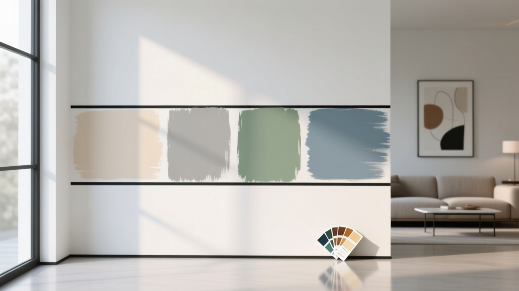
How to Test Paint Colors Before Committing - The Decor Mag
Paint is one of the fastest ways to change how a home feels—airier, calmer, warmer, sharper, more grounded. It’s also one of the easiest design choices to regret. A color that looked perfect on a tiny paint chip can turn muddy on a north-facing wall, read neon under cool LED bulbs, or feel unexpectedly dark once it wraps around an entire room.
Testing paint colors isn’t just a practical step—it’s a color theory shortcut. When you test correctly, you’re not guessing; you’re observing undertones, light behavior, and contrast in real conditions. That’s the difference between a “pretty color” and a color scheme that supports the mood and function of the space.
This guide breaks down designer-approved methods for testing interior paint colors, including where and how to sample, which tools make the process easier, and what mistakes cause most “why does it look like that?” moments.
Why Paint Colors Change on the Wall
Before you test, it helps to know what you’re actually testing. Paint color isn’t fixed—your room completes it.
Light direction and intensity
- North-facing rooms: Cooler, grayer light can emphasize blue/green undertones and make warm colors feel flat or dull.
- South-facing rooms: Warm, bright light can intensify warmth and make colors appear lighter and more saturated.
- East-facing rooms: Bright, warm morning light; cooler later. Great for calm neutrals if you test across the day.
- West-facing rooms: Softer mornings, dramatic warm evenings. Colors can look neutral at noon and suddenly golden at sunset.
Undertones, reflectance, and surrounding finishes
- Undertones: That “hidden” hint of green, pink, violet, or blue is often what you notice when the color is on a larger surface.
- LRV (Light Reflectance Value): Higher LRV reads brighter; lower LRV reads deeper. A low-LRV “soft gray” can feel moody fast.
- Fixed elements: Flooring, countertops, tile, and upholstery cast color back onto walls—especially in lighter paint colors.
Color psychology in real rooms
Color psychology is most useful when it’s tied to function. A warm off-white can make a social space feel welcoming; a dusty blue can lower visual energy in a bedroom. Testing helps you confirm the emotion you’re aiming for:
- Warm neutrals (cream, greige): Cozy, inviting, flattering for skin tones.
- Cool neutrals (blue-gray, crisp white): Clean, modern, focused.
- Greens: Restorative, balanced, nature-linked—excellent for living rooms and kitchens.
- Deep hues (navy, charcoal, forest): Grounding, dramatic, intimate—best when balanced with light trim and layered lighting.
Start With a Smart Shortlist (Not 30 Samples)
Testing works best when you narrow your options first. Aim for 3–5 paint colors that are close in depth but slightly different in undertone. If you sample wildly different colors, the process becomes overwhelming and the winner may just be the least confusing.
How to shortlist like a designer
- Match to fixed finishes: Pull your shortlist from the warm/cool family of your floors and countertops.
- Choose a depth range: Pick one “safe” mid option, one slightly lighter, one slightly deeper.
- Check undertones: Compare chips against a true white sheet of paper to reveal whether they lean pink, yellow, green, or blue.
Reliable color families to start with (brand references)
- Warm off-whites: Benjamin Moore White Dove (OC-17), Sherwin-Williams Alabaster (SW 7008)
- Clean whites: Benjamin Moore Chantilly Lace (OC-65), Sherwin-Williams Pure White (SW 7005)
- Versatile greiges: Benjamin Moore Edgecomb Gray (HC-173), Sherwin-Williams Agreeable Gray (SW 7029)
- Soft blue-grays: Benjamin Moore Boothbay Gray (HC-165), Sherwin-Williams Misty (SW 6232)
- Nature greens: Benjamin Moore Saybrook Sage (HC-114), Sherwin-Williams Evergreen Fog (SW 9130)
- Deep accents: Benjamin Moore Hale Navy (HC-154), Sherwin-Williams Iron Ore (SW 7069)
The Best Ways to Test Paint Colors at Home
Testing paint colors means evaluating them at different times, on different walls, and next to your actual finishes. Here are the methods that give the clearest answers.
Method 1: Paint large sample squares (the classic approach)
Small swatches lie. A big sample shows undertone and value correctly.
- Paint at least 12" x 12"; better is 18" x 24" (poster-size).
- Do two coats to reach true opacity.
- Leave a little space between samples so colors don’t influence each other.
Pro tip: Paint samples on the wall and on a second spot near a major fixed element (like beside the sofa, near the backsplash, or by the vanity) to see reflected color in action.
Method 2: Use paint sample boards (cleaner and more accurate)
Sample boards are often the most foolproof option for interior color design because you can move them around and compare them directly to furnishings.
- Use foam core, primed drywall scraps, or poster board.
- Paint two coats and label each board with brand + color name.
- View the board on multiple walls (tape it up and step back).
If you want convenience, many homeowners use peel-and-stick samples from services like Samplize (often available for Benjamin Moore and Sherwin-Williams). They’re not a perfect substitute for paint texture, but they’re excellent for undertone and value testing.
Method 3: Test sheen at the same time
Sheen changes how color reads. A satin finish can reflect more light and make a color look brighter; matte can make it look richer and more velvety.
- Walls: Matte/eggshell for most rooms; satin for kitchens/baths if you need washability.
- Trim: Satin or semi-gloss for contrast and durability.
- Ceilings: Flat, usually 80–100% of a white wall color for a softer transition.
Where to Place Samples (So You Don’t Get Fooled)
Placement is as important as color selection. You’re looking for the room’s “problem areas” and “hero walls.”
Test at least three zones
- The brightest wall: Usually near the largest window—shows the color at its lightest.
- The darkest wall: Corners and hall-adjacent walls show the color at its moodiest.
- Next to a fixed finish: Flooring, stone, tile, cabinets—this is where undertones become obvious.
View samples at multiple distances
- Stand 6–8 feet back to see overall color impression.
- Step close to evaluate undertone, texture, and sheen.
- Look from adjoining rooms—open sightlines affect whole-home color schemes.
Timing and Lighting: Test Over 24 Hours
A color that works at noon can fall apart at night under warm bulbs. Test your paint colors through a full day of real life.
A simple testing schedule
- Morning: Checks how color behaves with cool/warm early daylight.
- Midday: Reveals truest read in most rooms.
- Evening: Shows how lamplight or overhead fixtures shift undertones.
- Late night: Confirms whether the room stays relaxing or becomes harsh under artificial light.
Bulb temperature matters more than most people expect
- 2700K–3000K (warm white): Cozy; can yellow warm paints and dull cool grays.
- 3500K (neutral): Balanced; great for kitchens, hallways, and open plans.
- 4000K+ (cool): Crisp; can make whites look icy and amplify blue/green undertones.
Real Room Examples: What Testing Reveals
Example 1: Open-plan living room with warm oak floors
Scenario: You want a light neutral that doesn’t look yellow, and a cohesive color scheme that flows into the kitchen.
Test set: Benjamin Moore White Dove (OC-17), Sherwin-Williams Alabaster (SW 7008), Benjamin Moore Edgecomb Gray (HC-173).
- What often happens: White Dove reads softly creamy and consistent; Alabaster can feel warmer/golden in afternoon sun; Edgecomb Gray can lean beige and deepen in shadowed corners.
- Great pairing: White Dove walls + Sherwin-Williams Pure White (SW 7005) trim for gentle contrast, plus blackened bronze hardware and natural linen textiles.
Example 2: North-facing bedroom that feels dim
Scenario: You want calm and bright without going stark.
Test set: Sherwin-Williams Snowbound (SW 7004), Benjamin Moore Classic Gray (OC-23), Sherwin-Williams Misty (SW 6232).
- What often happens: Snowbound can flash slightly pink in cool light; Classic Gray reads like a soft off-white and lifts the room; Misty can become more blue-gray and moodier at night.
- Great pairing: Classic Gray walls + warm white bedding + light oak nightstands to counter cool daylight.
Example 3: Kitchen cabinets stay put, walls need to harmonize
Scenario: White cabinets + gray veined quartz + brushed nickel, but your wall color keeps turning purple.
Test set: Sherwin-Williams Agreeable Gray (SW 7029), Benjamin Moore Balboa Mist (OC-27), Benjamin Moore Stonington Gray (HC-170).
- What often happens: Some grays pull violet with certain stones; Balboa Mist often behaves as a soft greige that’s more forgiving; Stonington Gray can feel crisp but cooler.
- Great pairing: Balboa Mist walls + warm wood stools + soft matte black accents to balance nickel and stone.
Common Color Mistakes to Avoid
- Testing only one wall: Every wall is a different lighting condition. Test bright and dark zones.
- Comparing colors on the chip alone: Chips are too small to show undertones accurately.
- Ignoring sheen: The same color in satin vs matte can look like two different paint colors.
- Choosing under store lighting: Big box store lighting distorts. Use the store to collect options, not finalize decisions.
- Forgetting adjacent rooms: Paint colors reflect into each other—especially in open floor plans.
- Not checking against textiles: Rugs, sofas, and curtains carry undertones. Hold sample boards against them.
- Assuming “gray” is neutral: Many grays have strong blue, green, or purple undertones and can clash with warm floors.
Practical Tips for Confident Paint Color Decisions
A quick checklist before you buy gallons
- View samples in daylight and nighttime lighting.
- Confirm the color next to flooring, countertops, and upholstery.
- Decide on sheen and test it.
- Check the color from doorways and hallways.
- Make sure your chosen color works with trim white (or choose a trim white that works with it).
Go-to color combinations that rarely fail
- Warm neutral + crisp trim: Benjamin Moore White Dove walls + Chantilly Lace trim
- Greige + soft black accents: Sherwin-Williams Agreeable Gray + Iron Ore doors/metalwork
- Sage green + warm whites: Sherwin-Williams Evergreen Fog + Alabaster trim
- Navy accent + creamy white: Benjamin Moore Hale Navy built-ins + White Dove walls
FAQ: Testing Paint Colors Before Committing
How many paint colors should I test in one room?
Three to five is the sweet spot. It’s enough range to see undertones and depth shifts without overwhelming the eye. If nothing works, adjust the undertone direction (warmer/cooler) rather than adding ten more options.
Do peel-and-stick paint samples match real paint?
They’re typically very good for undertone and value, which is what most homeowners need to confirm. They won’t replicate paint texture, roller stipple, or sheen perfectly. If sheen and finish are major concerns, paint a sample board as well.
Why does my white paint look yellow or gray?
Whites are highly reflective and pick up surrounding color. Warm bulbs, honey-toned floors, and beige textiles can push a white warmer (yellow/cream). North light, cool LEDs, and blue-gray décor can make the same white read cooler or grayer.
Should I paint the whole room as a test?
Usually no. Large sample boards or multiple big wall swatches give nearly the same insight without committing. Consider painting one full wall only if you’re choosing between two very similar colors and need a final tie-breaker.
How do I choose a paint color for an open floor plan?
Start with one main neutral that works in the largest shared space, then layer supporting colors by function (calmer in bedrooms, fresher in baths). Testing boards are especially helpful—walk them through the connected rooms to ensure the color scheme stays cohesive.
What’s the biggest sign I picked the wrong undertone?
If the color consistently looks “off” no matter the time of day—too pink, too green, too purple, too icy—your undertone is fighting the room’s fixed finishes or lighting. Shift one step warmer or cooler rather than changing the depth.
Next Steps: Your Paint Testing Plan
Choose a shortlist of 3–5 paint colors, create large sample boards (or use high-quality peel-and-stick samples), and test them on multiple walls for a full day. Evaluate them next to your floors, textiles, and cabinetry, then lock in sheen and trim color before ordering gallons. That simple process turns paint selection from a gamble into a repeatable design method—one that supports both color psychology and timeless interior color design principles.
For more paint color ideas, color schemes, and room-by-room interior color design guides, explore the latest at thedecormag.com.
More Articles
 How to Use Undertones to Match Colors - The Decor Mag
 Best Sage Green Paint Colors for Serenity - The Decor Mag
 How to Use Muted Colors for Sophistication - The Decor Mag
 Best Cucumber Paint Colors - The Decor Mag
 Living Room Colors for Entertaining (2026)
 Best Key Lime Paint Colors - The Decor Mag
 Pastel Color Palette Design Guide - The Decor Mag
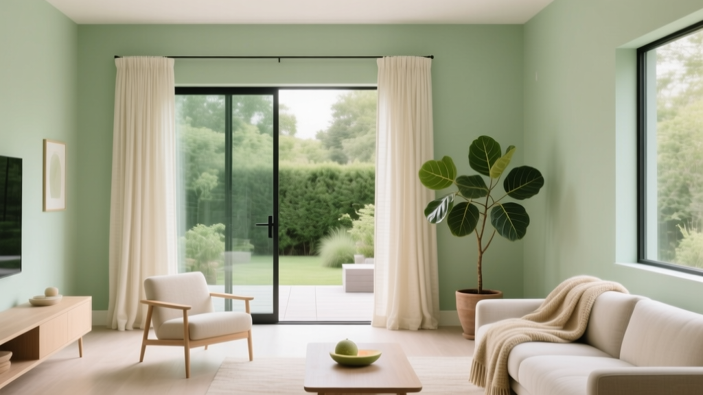 Best Honeydew Paint Colors - The Decor Mag
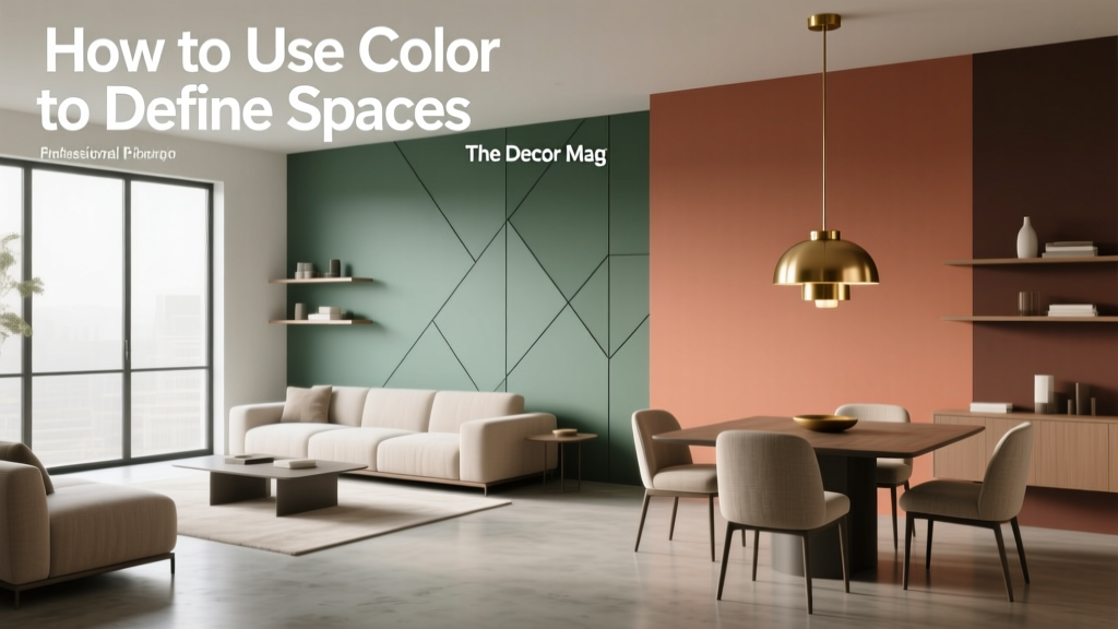 How to Use Color to Define Spaces - The Decor Mag
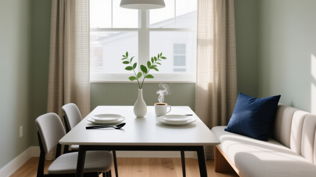 How to Choose Colors for a Breakfast Nook - The Decor Mag