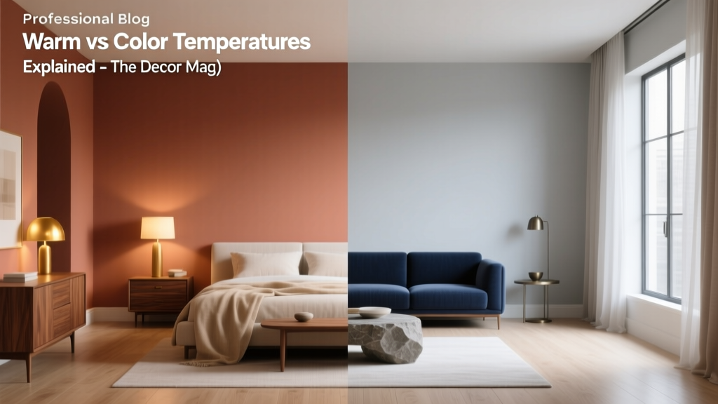
Warm vs Cool Color Temperatures Explained - The Decor Mag
Color is one of the fastest ways to change how a home feels—without moving a single wall. The right paint colors can make a north-facing room feel sunlit, help an open-plan layout feel cohesive, or calm a busy household with a more restful palette. Yet many homeowners get stuck because they’re choosing colors by “pretty” alone, not by temperature.
Warm vs cool color temperature is the behind-the-scenes design principle that explains why one white looks cozy and another looks crisp, why a beige can read peachy at night, or why a blue-gray can suddenly feel icy. Once you understand temperature, you can build color schemes that look intentional in every light—morning, afternoon, and evening—and you’ll make fewer expensive paint do-overs.
This guide breaks down warm and cool colors in a practical, room-by-room way, with paint color recommendations, real application scenarios, and the most common mistakes that cause color to look “off” in a home.
What “Color Temperature” Means in Interior Design
Color temperature describes whether a color visually leans warm (toward red, orange, and yellow) or cool (toward blue, green, and violet). Temperature isn’t about the color name on the label—it’s about undertone. A “gray” can be warm (greige or taupe-leaning) or cool (blue-gray or green-gray).
Warm Colors: The Cozy, Energizing Side
Warm colors bring psychological associations of sunlight, fire, comfort, and social energy. They tend to:
- Feel welcoming and intimate
- Visually advance (making spaces feel closer and often cozier)
- Pair naturally with warm materials like oak, walnut, brass, terracotta, leather, and creamy stones
Cool Colors: The Calm, Airy Side
Cool colors suggest water, sky, shade, and quiet. They tend to:
- Feel calming, crisp, and refreshing
- Visually recede (often making rooms feel more spacious)
- Work beautifully with cool materials like marble, chrome, stainless steel, concrete, and many white quartz counters
Undertones: The Make-or-Break Detail
Two paint swatches can look similar in the store and completely different at home because of undertones and lighting. Common undertone categories include:
- Warm undertones: yellow, golden, peach, red, pink, warm green (olive), brown
- Cool undertones: blue, violet, icy green, blue-gray
- Neutral-leaning undertones: balanced mixes that can shift depending on surroundings
How Lighting Changes Warm vs Cool Paint Colors
Interior color design lives and dies by light. Before you commit to a wall color, evaluate:
- Natural light direction: North, south, east, west exposure
- Time of day: Morning vs afternoon vs evening
- Artificial lighting: LED temperature (Kelvin) and fixture placement
Room Exposure Quick Guide
- North-facing rooms: Cooler, grayer daylight. Warm paint colors often balance the chill.
- South-facing rooms: Strong, warm light. Cool colors can look beautifully balanced; warm colors can intensify.
- East-facing rooms: Bright and warm in the morning, cooler later. Neutrals with stable undertones work best.
- West-facing rooms: Cooler in the morning, very warm late afternoon. Some warm neutrals can turn overly orange at sunset.
Artificial Light and the “Warm vs Cool” Trap
Most homes mix bulbs across rooms, which can make the same paint color shift. As a general rule:
- 2700K–3000K (warm white): Enhances warm tones; can make creams and beiges richer (and sometimes more yellow).
- 3500K (neutral): Balanced; helpful for whole-home consistency.
- 4000K–5000K (cool daylight): Amplifies cool tones; can make grays feel crisper (and sometimes colder).
Warm Paint Colors: Best Picks and Where They Shine
Warm palettes aren’t limited to “tan.” Warm color schemes can be modern (creamy whites + camel leather + matte black), earthy (terracotta + olive), or softly romantic (blush + warm greige).
Warm Whites and Creams (Walls, Trim, Whole-Home)
- Sherwin-Williams Alabaster (SW 7008): A soft, creamy white that reads calm and inviting—excellent for living rooms and open layouts.
- Benjamin Moore White Dove (OC-17): A classic warm white with flexibility for walls and trim; pairs well with both warm and cool accents.
- Farrow & Ball School House White (No. 291): A nuanced off-white that feels historic and cozy, great with natural wood.
Warm Neutrals: Beige, Greige, Taupe
- Sherwin-Williams Accessible Beige (SW 7036): A go-to greige for hallways and family rooms—warm without looking muddy.
- Benjamin Moore Edgecomb Gray (HC-173): A soft greige that can read warm and airy; excellent for open-plan walls.
- Farrow & Ball Elephant’s Breath (No. 229): A warm taupe with a sophisticated, lived-in feel for dining rooms or studies.
Warm Statement Colors: Terracotta, Rust, Warm Greens
- Benjamin Moore Terra Cotta Tile (2090-30): A rich clay tone for a powder room or accent wall.
- Sherwin-Williams Cavern Clay (SW 7701): Earthy and modern—stunning in a dining room with warm brass lighting.
- Sherwin-Williams Evergreen Fog (SW 9130): A softened green with warmth and grayness; ideal for bedrooms or built-ins.
Cool Paint Colors: Best Picks and How to Keep Them Inviting
Cool colors bring clarity and calm. They’re popular in modern interiors, coastal styles, and homes with lots of warm wood where you want visual balance.
Cool Whites (Bright, Clean Backdrops)
- Benjamin Moore Chantilly Lace (OC-65): A crisp, clean white that reads modern; great for trim or a gallery-like wall color.
- Sherwin-Williams Extra White (SW 7006): Bright and cool; ideal for contemporary kitchens, especially with cool countertops.
Cool Grays and Blue-Grays (Modern Neutrals)
- Benjamin Moore Stonington Gray (HC-170): A balanced cool gray that feels polished in living rooms and hallways.
- Sherwin-Williams Passive (SW 7064): A cool-leaning gray that pairs well with white trim and black accents.
- Benjamin Moore Gray Owl (OC-52): A light gray that can flash green-blue depending on light; test carefully.
Cool Blues and Blue-Greens (Bedrooms, Bathrooms, Offices)
- Benjamin Moore Hale Navy (HC-154): A deep, classic navy for cabinetry, built-ins, or a dramatic bedroom.
- Sherwin-Williams Sea Salt (SW 6204): A soft blue-green that feels spa-like in bathrooms and serene in bedrooms.
- Farrow & Ball Hague Blue (No. 30): A moody blue-green that elevates dining rooms and libraries.
Warm vs Cool: How to Choose for Each Room
Living Room: Comfort vs Clarity
Choose warm if you want the room to feel inviting and social, especially with warm wood floors or a fireplace surround.
- Example palette: SW Alabaster walls + SW Evergreen Fog built-ins + camel leather + brass + textured ivory rug
Choose cool if you want a more modern, airy feel or have lots of warm elements to balance.
- Example palette: BM Stonington Gray walls + crisp white trim + black metal + light oak + linen upholstery
Kitchen: Match Temperature to Fixed Finishes
Kitchens have “bossy” elements—counters, cabinets, backsplash, flooring—so temperature should harmonize with what you’re not changing.
- Warm kitchen scenario: Honey oak or walnut cabinetry + warm white walls (BM White Dove) + creamy backsplash + unlacquered brass pulls
- Cool kitchen scenario: White quartz with gray veining + stainless steel + cool white (SW Extra White) or cool gray (SW Passive) on walls
Bedroom: Warm for Cozy, Cool for Sleep
Color psychology often supports cooler hues for rest (blue, blue-green, soft gray), but warm neutrals also work when layered with textiles.
- Soothing cool option: SW Sea Salt walls + white bedding + natural wood nightstands
- Cocooning warm option: SW Accessible Beige walls + warm white trim + linen drapery + soft tan accents
Bathroom: Spa Coolness or Candlelit Warmth
- Cool spa look: BM Chantilly Lace + pale blue-green accents + chrome fixtures + white tile
- Warm boutique look: SW Alabaster + warm stone + brushed brass + terracotta textiles
Home Office: Energy, Focus, and Screen-Friendly Color
- For focus and calm: BM Hale Navy on an accent wall or cabinetry + warm wood desk + soft white walls
- For creative energy: SW Cavern Clay accent + warm white walls + black accents for structure
Easy Temperature Balancing: How to Mix Warm and Cool Like a Designer
Most beautiful homes mix temperatures. The key is to make the mix look intentional.
Use the 70/20/10 Color Rule (With Temperature in Mind)
- 70% dominant: Wall color (warm or cool neutral)
- 20% secondary: Upholstery, rugs, curtains (a supporting temperature)
- 10% accent: Pillows, art, décor (contrast temperature for energy)
Go-to Warm/Cool Color Combinations
- Warm white + navy: BM White Dove + BM Hale Navy (timeless and tailored)
- Greige + dusty blue: SW Accessible Beige + a muted blue textile palette (soft, transitional)
- Cream + olive green: SW Alabaster + warm olive accents (earthy and current)
- Cool gray + camel: BM Stonington Gray + camel leather (modern warmth)
Material and Metal Shortcuts
- Warm it up: brass, aged bronze, warm wood, terracotta, rattan, creamy linen
- Cool it down: chrome, polished nickel, blackened steel, marble, glass, concrete
Real-World Application Scenarios (What to Choose When…)
You Have a North-Facing Living Room That Feels Cold
- Try: SW Alabaster or BM White Dove on walls
- Add: warm lighting (2700K–3000K), caramel or rust textiles, and warm wood tones
- Avoid: icy blue-grays that can make the room look flat and shadowy
Your Open-Plan Main Floor Looks Disjointed
- Try: one consistent neutral (BM Edgecomb Gray or SW Accessible Beige) across main walls
- Then: vary temperature with accents—cooler blues in the living area, warmer terracotta in the dining zone
- Pro tip: keep trim color consistent for a cleaner color story
Your Bedroom Feels Too “Beige” and Dull
- Try: add a cool counterpoint—navy pillows, blue-gray drapery, or SW Sea Salt on one wall
- Upgrade: paint the ceiling a softer warm white to keep it cozy while the accents cool it down
Common Warm/Cool Color Mistakes to Avoid
- Choosing paint without checking undertones: Compare swatches against a true white sheet of paper to reveal hidden pink, green, or yellow.
- Ignoring fixed finishes: Countertops, tile, flooring, and cabinetry have undertones that will fight or harmonize with paint colors.
- Testing too small: A tiny swatch can’t show the full temperature shift. Use large samples and view them morning and night.
- Mixing warm and cool metals randomly: Mixed metals can be gorgeous, but they need repetition (e.g., brass in two places, chrome in two places) to feel intentional.
- Using a cool gray to “modernize” a warm room: Cool gray walls with warm beige carpet often look mismatched. Consider a warm greige instead.
- Forgetting the bulb color: One room with 2700K bulbs and another with 4000K can make your whole-home paint color scheme look inconsistent.
FAQ: Warm vs Cool Color Temperatures
Is beige always a warm color?
Most beiges lean warm, but some “beige” paints have cooler or greener undertones. The undertone and the lighting determine whether it reads warm, neutral, or slightly cool.
Are cool colors always better for small rooms?
Cool colors can make walls feel like they recede, which may help a room feel larger. Warm colors can also work in small rooms when you want coziness—powder rooms and dens often look incredible in warm, saturated hues.
How do I tell if a white paint is warm or cool?
Compare it to a clean, bright white. Warm whites look creamier or slightly golden; cool whites look sharper and may lean blue or gray. Testing next to your trim and countertops is the most reliable method.
Can I mix warm and cool colors in the same room?
Yes—most designer spaces do. Keep one temperature dominant and use the other as accents. Repeating your accent temperature (through pillows, art, and décor) makes the mix feel cohesive.
Why does my gray paint look blue or green?
Many grays carry blue or green undertones that show up under certain exposures (especially north light) and next to reflective surfaces like tile or countertops. Try a warmer greige (like SW Accessible Beige) if you want gray without the cool cast.
What’s the easiest way to choose a whole-home paint palette?
Start with one versatile neutral that matches your fixed finishes, then choose 1–2 supporting colors for bedrooms/baths. Keep trim consistent and use textiles to introduce warmer or cooler accents.
Next Steps: How to Use Color Temperature Confidently
To apply warm vs cool color theory in your home, focus on three moves:
- Identify your fixed undertones (flooring, cabinets, stone, tile) before picking wall paint.
- Choose your dominant temperature per room based on light exposure and the mood you want—cozy and energized (warm) or calm and airy (cool).
- Test large samples in multiple lighting conditions, then balance with materials and accents for a polished color scheme.
If you’re ready to refine your palette further, explore more paint color guides, color schemes, and interior color design tips on thedecormag.com.
More Articles
 How to Use Color to Create Emphasis - The Decor Mag
 Step On A Budget: How to Buy High-Performance Ski Boots Without Breaking the Bank
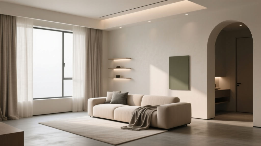 How to Create a Low Contrast Color Palette - The Decor Mag
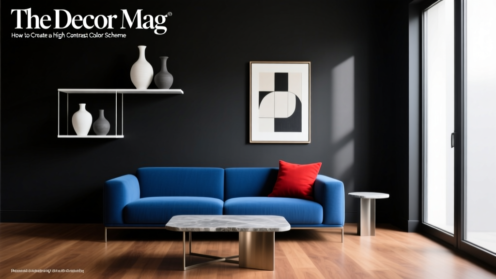 How to Create a High Contrast Color Scheme - The Decor Mag
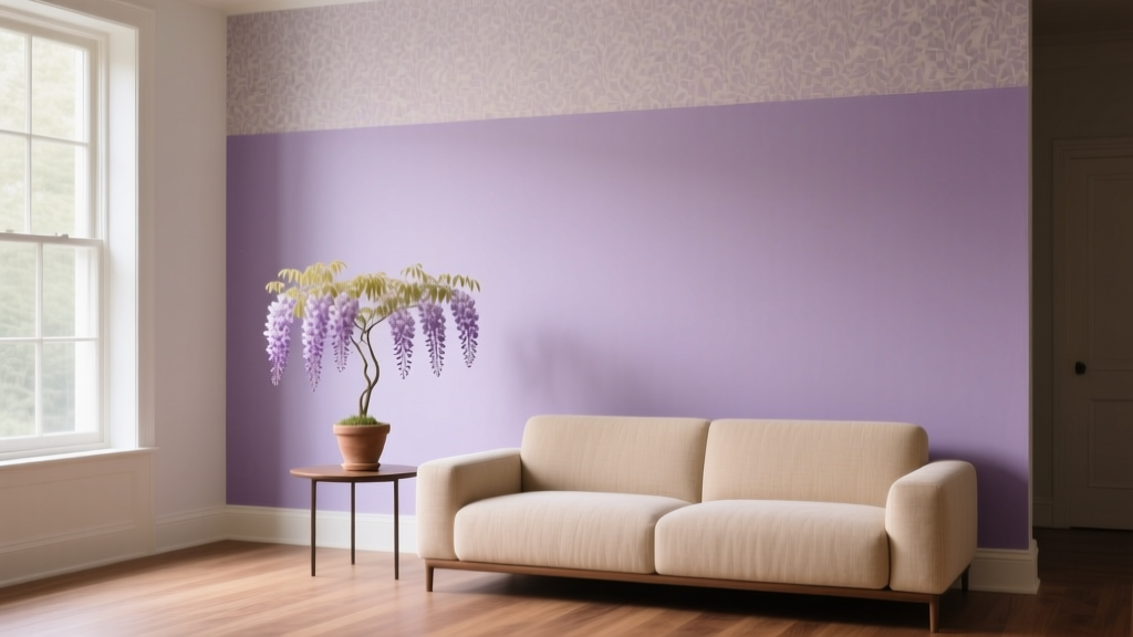 Best Wisteria Paint Colors - The Decor Mag
 How to Use Color to Create Calm - The Decor Mag
 Best White Paint Colors Compared - The Decor Mag
 Best Scarlet Paint Colors - The Decor Mag
 How to Choose Colors for a Balcony - The Decor Mag
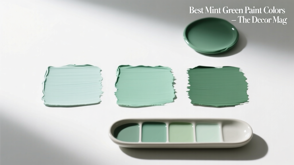 Best Mint Green Paint Colors - The Decor Mag