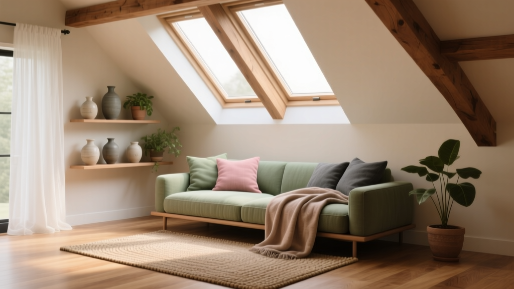
How to Choose Colors for an Attic Room - The Decor Mag
An attic room has a certain magic: sloped ceilings, tucked-away corners, and that sense of retreat you don’t get anywhere else in the house. It can also be one of the trickiest spaces to color. Angled walls change how paint reads, natural light may be limited or dramatically directional, and the room’s proportions can feel either cozy or cramped depending on your choices.
Color matters more in an attic than in a standard box-shaped bedroom because every surface works harder. The ceiling might be a wall, the “walls” may be low knee walls, and the light may shift quickly throughout the day. With the right interior color design approach—grounded in color psychology, light behavior, and a clear color scheme—you can make an attic feel brighter, taller, calmer, or more character-filled without changing a single beam.
This guide walks you through choosing paint colors for an attic room with practical steps, specific paint color names, and real-life application scenarios—so you can turn that overlooked upper level into your favorite room in the house.
Start With the Attic’s Reality: Light, Ceiling Angles, and Function
1) Evaluate natural light (and its direction)
Attics often have dormer windows, skylights, or small gable windows. Each affects color differently:
- North-facing light is cooler and can make grays and whites look bluer. Warm whites and greiges usually feel more welcoming.
- South-facing light is warmer and stronger. You can handle cooler colors (soft blues, blue-grays) without them turning icy.
- East-facing light is warm in the morning, cooler later. Choose balanced neutrals and avoid overly yellow creams that can look “sour” by midday.
- West-facing light is bright and golden later in the day. Colors can intensify—especially warm tones—so consider softer, muted versions.
2) Identify the room’s purpose and desired mood
Color psychology is especially useful in attic rooms because the architecture already sets a mood. Decide what you want the space to feel like:
- Attic bedroom: restful (soft warm whites, muted greens, gentle blue-grays)
- Home office: focused but not sterile (mid-tone blues, grounding greiges, muted olive)
- Playroom: upbeat but not chaotic (softened brights, warm whites, one accent zone)
- Media room: cozy and enveloping (deep navy, charcoal, earthy browns)
- Guest suite: universally appealing (warm neutral palettes with one subtle color accent)
3) Notice the “broken planes” created by slopes
Sloped ceilings create multiple paint planes that catch light differently. A color that looks calm on a vertical wall might feel darker or busier on an angled surface. This is why attic paint color selection benefits from sampling larger swatches on multiple angles before committing.
Attic Color Strategy: Choose Your Approach
Option A: One color everywhere (the “wrap” technique)
Painting walls and sloped ceilings in the same color reduces visual breaks and can make a low-ceiling attic feel more expansive. This works beautifully with:
- Soft whites and warm off-whites
- Light greiges and mushroom tones
- Misty blue-grays and pale sage greens
Best for: small attics, awkward angles, rooms with many planes, or spaces you want to feel calm and cohesive.
Option B: Light ceiling + slightly deeper walls
This classic approach can still work in an attic, especially if you have some full-height walls. Use a lighter color on slopes to visually lift them, then add depth with the walls.
Tip: Keep undertones aligned. A cool white ceiling with a warm beige wall often looks mismatched in a space with complicated angles.
Option C: Moody color-drenching (dramatic and cozy)
Attics are ideal for intimate, cocoon-like design. Painting the walls, slopes, and even trim in a deeper shade can feel intentional and boutique-hotel chic—especially in media rooms, reading nooks, and guest rooms.
Best for: attic rooms with good lighting, or spaces used primarily in the evening.
Specific Paint Color Recommendations (With Brand References)
Best warm whites for attic rooms
Warm whites help attic spaces feel brighter without going stark or icy, especially under cool northern light.
- Benjamin Moore White Dove (OC-17): a creamy, versatile warm white that softens angles and feels lived-in.
- Sherwin-Williams Alabaster (SW 7008): warm and calm, excellent for a wrap technique on walls + slopes.
- Farrow & Ball School House White (No. 291): a gently muted off-white with depth; great in older homes with character.
Pair with: natural oak, warm brass, linen textiles, and soft black accents for contrast.
Best light neutrals (greige, mushroom, and stone)
Light neutrals are a smart choice when you want subtle warmth and easy coordination with furniture, flooring, and built-ins.
- Benjamin Moore Edgecomb Gray (HC-173): a warm greige that reads cozy without feeling beige-heavy.
- Sherwin-Williams Agreeable Gray (SW 7029): a balanced greige that works in many attic light conditions.
- Farrow & Ball Cornforth White (No. 228): a refined mid-light gray that looks sophisticated on slopes.
Application scenario: In an attic guest room with low knee walls, use Edgecomb Gray on all surfaces (including slopes) and crisp white bedding to keep the room airy and welcoming.
Best calming colors for attic bedrooms
For sleep spaces, muted color schemes lower visual noise and encourage relaxation.
- Benjamin Moore Palladian Blue (HC-144): a soft blue-green that feels spa-like, especially with white trim and rattan textures.
- Sherwin-Williams Sea Salt (SW 6204): a gentle green-gray that shifts with the light; beautiful in airy bedrooms.
- Benjamin Moore October Mist (1495): a modern, silvery sage that feels calm and current.
Pro tip: If you’re painting sloped ceilings in the same hue, consider going one step lighter on the same color strip to prevent the angles from reading too heavy.
Best moody attic colors (for a den, office, or media room)
Deep colors can make an attic feel intentionally cozy and design-forward—especially when paired with layered lighting.
- Benjamin Moore Hale Navy (HC-154): a classic deep navy that feels timeless and rich.
- Sherwin-Williams Iron Ore (SW 7069): a soft charcoal-black that adds drama without harshness.
- Farrow & Ball Railings (No. 31): a blue-black that reads elegant and architectural on angles and trim.
Application scenario: In an attic media room, color-drench Iron Ore across walls, slopes, and trim in a matte finish. Add a warm white ceiling light (2700K), wall sconces, and a wool rug to keep it comfortable rather than cave-like.
Color Schemes That Work Especially Well in Attics
1) Soft monochrome (one hue, multiple values)
Choose one color family and use light-to-medium variations to reduce contrast across slopes and knee walls.
- Example scheme: Benjamin Moore White Dove + a lighter sage + deeper olive accents
- Best for: small attic bedrooms, nurseries, and calm workspaces
2) Warm neutral + one grounded accent
Keep the main paint color neutral, then add personality through an accent on built-ins, a gable wall, or trim.
- Example scheme: Sherwin-Williams Alabaster walls + Benjamin Moore Hale Navy built-in cabinetry
- Best for: attic offices, guest rooms, and multipurpose spaces
3) Nature-inspired palette (green + wood + creamy white)
Attics often feel close to treetops—lean into it with organic color schemes.
- Example scheme: Sherwin-Williams Sea Salt + warm white trim + oak furniture + linen textiles
- Best for: attic reading rooms, bedrooms, yoga spaces
4) Modern contrast (light wrap + dark trim, used sparingly)
High contrast can look sharp, but in attics it should be controlled. Use it where it clarifies architecture rather than fragmenting it.
- Example scheme: Benjamin Moore Edgecomb Gray wrap + black metal lighting + a single dark accent wall on a full-height gable surface
Real Room Examples and How to Apply Color
Example 1: Small attic bedroom with one dormer window
Goal: Make it feel larger and brighter.
- Main color: Benjamin Moore White Dove on walls and slopes (wrap technique)
- Trim: same color in a satin finish to reduce contrast and visual breaks
- Accent: soft textiles in muted blue and oatmeal
Why it works: A unified paint color scheme minimizes the “chopped up” look of angles, while warm white counters cool light and keeps the room inviting.
Example 2: Attic office with skylights and built-in storage
Goal: Focused, modern, not sterile.
- Main color: Sherwin-Williams Agreeable Gray on walls and slopes
- Built-ins: Benjamin Moore Hale Navy for contrast and visual anchoring
- Ceiling/skylight wells: keep in the main neutral for continuity
Why it works: The neutral keeps glare down under skylights, and the navy adds depth without overwhelming the room’s geometry.
Example 3: Teen hangout attic with low knee walls
Goal: Fun, cozy, and durable.
- Main color: Farrow & Ball Cornforth White on slopes and upper walls
- Knee walls: Sherwin-Williams Iron Ore in a washable finish to hide scuffs
- Design move: continue the darker color on any short doors for a built-in feel
Why it works: The darker lower zone grounds the space and reduces maintenance, while the lighter upper planes keep the attic from feeling compressed.
Finish and Placement Tips That Make Attic Colors Look Better
- Use matte on slopes to reduce glare and hide surface imperfections common in older attics.
- Choose satin for trim if you want cleanability; use the same color as the walls for a seamless look.
- Test color in multiple spots: one swatch on a vertical wall, one on a slope, and one near the window.
- Consider the skylight effect: overhead daylight can make colors look lighter and more washed out at midday—deeper tones may read perfectly.
- Match your bulbs to your palette: 2700K is warm/cozy (great for warm whites and greiges), 3000K is neutral-warm (good for balanced schemes), 3500K+ can make warm paints feel dull or yellow.
Common Color Mistakes to Avoid in an Attic Room
- Going too bright, too fast: Highly saturated colors on multiple angled planes can feel chaotic. If you love color, try a muted version or keep it to one focal area.
- Choosing a stark white in cool light: Bright whites can look gray-blue and clinical in north-facing attics. Warm whites are usually more flattering.
- Over-contrasting slopes and walls: Painting slopes one color and every vertical plane another can chop up the room. Use fewer transitions for a more spacious feel.
- Ignoring undertones: A pink-beige next to a green-gray will clash even if both look “neutral” alone. Compare samples side-by-side.
- Skipping sample testing at night: Attics are often used in the evening. Your paint colors should look great under lamps as well as daylight.
FAQ: Choosing Paint Colors and Color Schemes for Attic Rooms
Should attic ceilings be painted white?
Not always. White can lift the space, but in many attics the best result comes from painting slopes the same color as the walls to reduce visual breaks. If you do use white, choose a warm white like Benjamin Moore White Dove or Sherwin-Williams Alabaster for a softer look.
What colors make an attic room look bigger?
Light, low-contrast color schemes make attic rooms feel larger. Warm whites, pale greiges, and soft blue-greens work well—especially when used on both walls and sloped ceilings. Minimize harsh trim contrast to keep the eye moving.
Can I use dark paint colors in an attic?
Yes—dark colors can be stunning in an attic den, office, or media room. Color-drenching in a deep navy (Benjamin Moore Hale Navy) or charcoal (Sherwin-Williams Iron Ore) creates a cozy, intentional atmosphere. Plan for layered lighting so the room feels rich, not gloomy.
How do I choose an accent wall in an attic with slopes?
Look for a full-height gable wall (the triangular end wall) or a dormer wall—these flatter accent colors because they read as a single plane. Avoid accenting multiple small angled sections; it tends to look fragmented.
What’s the best paint finish for attic walls and ceilings?
Matte (or flat) is usually best for sloped ceilings and walls because it hides imperfections and reduces glare from skylights. Use satin on trim for durability, or use the same wall color in a slightly higher sheen if you want a subtle, tailored look.
How many paint colors should I use in an attic room?
Two to three is usually plenty: a main color, a trim color (often the same as the main color in attics), and an accent for built-ins or a focal wall. The more angles you have, the fewer color changes you want.
Next Steps: A Simple Plan for Picking Your Attic Paint Colors
- Define the mood (airy, cozy, focused, playful) based on how you’ll use the attic room.
- Identify your light direction and note whether skylights make colors look washed out midday.
- Choose a strategy: wrap technique, light slopes + deeper walls, or moody color-drenching.
- Pick 3–5 candidates from a single color family (or coordinated families) and test them on both vertical and sloped surfaces.
- Finalize your palette with one main color, one supporting neutral, and one accent—then align bulbs and finishes.
The right attic color scheme can turn tricky architecture into your home’s most distinctive feature. For more paint color ideas, room-by-room palettes, and interior color design advice, explore the color guides on thedecormag.com.
More Articles
 How to Choose Colors for a Mudroom - The Decor Mag
 How to Create a Timeless Color Palette - The Decor Mag
 Reading for Options: How Visual Literacy Drives Strategic Decision-Making in Design and Branding
 Best Red Paint Colors for Drama and Warmth - The Decor Mag
 How to Choose Colors for a Library - The Decor Mag
 Best Mint Green Paint Colors - The Decor Mag
 Best Citron Paint Colors - The Decor Mag
 How to Use Color to Create Flow - The Decor Mag
 Best Rust Red Paint Colors - The Decor Mag
 Monochromatic Color Scheme Design Guide - The Decor Mag