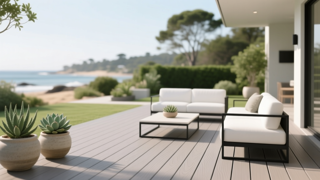
How to Choose Colors for a Deck - The Decor Mag
Your deck is more than an outdoor floor—it’s an extension of your home’s interior color story. The right deck color can make a small yard feel expansive, help your landscaping look more lush, and visually connect your outdoor seating area to your kitchen, living room, or sunroom. The wrong choice can fight your home’s exterior, highlight dirt and wear, or make the space feel hotter and harsher than it needs to.
Color is doing a lot of work outside: it shapes mood (cozy retreat vs. bright entertaining zone), manages contrast against siding and trim, and even affects how you perceive temperature and cleanliness. When you choose deck paint colors or stain colors with a designer’s eye—considering undertones, light, and surrounding materials—you end up with a deck that looks intentional and stays appealing season after season.
This guide breaks down how to choose a deck color scheme that fits your home, your lifestyle, and your climate—plus specific paint and stain color recommendations, real application scenarios, and the most common deck color mistakes to avoid.
Start with the “Fixed” Elements: House, Roof, Hardscape, and Landscape
Before you fall in love with a trendy gray stain or a dramatic black deck, look at what isn’t changing anytime soon. These fixed elements set the boundaries for a successful exterior color palette.
1) Match undertones, not just color families
Two “browns” can clash if one is red-based and the other is green-based. Undertone alignment is the difference between cohesive and “off.”
- Warm undertones (creamy beige siding, red brick, copper gutters, warm stone) pair best with honey, amber, chestnut, and warm grays.
- Cool undertones (blue-gray siding, charcoal roof, cool limestone) look best with driftwood, taupe-grays, espresso, and blue-leaning grays.
- High-contrast modern exteriors (white + black windows) can support deep charcoals and near-black deck colors—if the space doesn’t overheat.
2) Take cues from your roof and railings
Roofs occupy a huge visual area. If your roof is warm (brown/bronze), keep the deck stain warm-leaning. If it’s cool (charcoal/black), you’ll have more flexibility with cool grays and deeper tones.
3) Consider what your deck sits next to
- Concrete patio or pavers: coordinate with their undertones (pink-beige concrete vs. blue-gray pavers).
- Pool decking: prioritize cooler-looking mid-tones that won’t glare; avoid very dark colors that heat up.
- Green landscaping: greens “pop” against warm woods and balanced neutrals; very cool grays can make gardens feel slightly muted unless you add warm accents.
Choose Your Deck Color Strategy: Blend, Contrast, or Highlight
Designers typically use one of three approaches for exterior color schemes. Pick the one that fits your home’s architecture and how you want the deck to feel.
Blend: Subtle, seamless, and timeless
Blending works beautifully on traditional homes and cottages. The deck feels like it belongs, and it won’t steal attention from landscaping.
- Best for: busy backyards, lush gardens, smaller decks
- Go-to colors: warm cedar tones, soft taupes, weathered driftwood
Contrast: Crisp and architectural
Contrast creates definition—especially if your home is light-colored or your deck has strong lines and modern railings.
- Best for: contemporary homes, large decks, strong geometry
- Go-to colors: charcoal, deep espresso, slate gray
Highlight: Make the deck the “destination”
Highlighting uses color to turn the deck into the star of the yard—great for entertaining zones with pergolas, built-in benches, or outdoor kitchens.
- Best for: entertaining-focused patios, covered decks, standout architecture
- Go-to colors: rich teak, deep green-black, coastal blue-gray accents (used thoughtfully)
Color Psychology Outdoors: What Different Deck Colors Feel Like
Color psychology isn’t only for interiors. Outdoors, it influences how you experience the space—calm, energized, grounded, or airy.
- Light neutrals (sand, light taupe, pale gray): feel open and casual; can show dirt/pollen; may glare in strong sun.
- Mid-tone woods (cedar, teak, chestnut): feel welcoming and natural; hide everyday wear; timeless for most homes.
- Dark tones (espresso, charcoal, near-black): feel modern and dramatic; can visually “anchor” a landscape; absorb heat and show dust/pollen contrast.
- Cool grays: feel crisp and contemporary; can read sterile if your home has warm brick or creamy trim.
- Green-leaning darks: feel sophisticated and garden-forward; pair well with plants and black window frames.
Deck Paint vs. Deck Stain: Which Works Best for Your Color Goals?
When deck stain is the better color choice
Stain is ideal when you want a natural look and a finish that ages more gracefully. Semi-transparent and semi-solid stains let wood texture show through, which adds depth to your color scheme.
- Great for: showcasing wood grain, medium-to-large decks, a natural exterior palette
- Look for: UV resistance, mildew resistance, and compatibility with your wood species
When deck paint makes sense
Paint offers the most color control—especially if you want a solid, uniform look or need to cover older boards with heavy discoloration. It can be more maintenance-intensive on horizontal surfaces, so product choice and prep are everything.
- Great for: older decks, dramatic color statements, matching trim or railings
- Watch for: peeling if prep is rushed or moisture is trapped
Practical guideline
If your deck boards are in good condition and you like a wood-forward look, choose a quality exterior stain. If boards are heavily patched or mismatched and you want a clean, consistent color, paint can be worth it—especially on covered porches and low-moisture areas.
How to Test Deck Colors Like a Designer (So You Don’t Regret It)
- Test on multiple boards, not one small spot. Color looks different across grain, knots, and old vs. new wood.
- Check morning, midday, and evening. Outdoor light shifts dramatically; a “perfect” gray at noon can turn blue at dusk.
- Look next to siding and trim. Hold samples vertically near the house and also view the deck from inside through windows.
- Consider wet vs. dry appearance. Stains often deepen as they cure; paint colors can look lighter in bright sun.
- Test sheen. Higher sheen can increase glare and highlight imperfections; most decks look best in low-luster finishes.
Specific Deck Color Recommendations (With Brand References)
These suggestions work as starting points for a deck color palette. Always verify availability and choose an exterior-rated deck product or equivalent color match.
1) Warm, wood-toned classics (timeless and forgiving)
- Cabot Semi-Transparent Stain: Cedar or Honey Teak (warm, inviting mid-tones)
- Benjamin Moore Arborcoat: tones similar to Teak or Cedar (great for traditional exteriors)
- Sherwin-Williams SuperDeck: warm brown families like Cedar and Redwood (excellent for classic curb appeal)
Best pairings: creamy white trim, black metal lanterns, tan or oatmeal outdoor upholstery, natural woven textures.
2) Weathered driftwood and greige (modern-neutral without feeling cold)
- Cabot: Driftwood (a go-to for a relaxed coastal-neutral look)
- BEHR Premium: driftwood/greige families (ideal if your home leans modern farmhouse)
- Benjamin Moore (paint color inspiration): Revere Pewter (HC-172) as a greige reference for coordinating accessories and railings
Best pairings: matte black railings, white siding, muted sage planters, stone fire pit, and textured outdoor rugs.
3) Charcoal and near-black (high-design, high-contrast)
- Sherwin-Williams (paint color inspiration): Iron Ore (SW 7069) for railings/pergolas; also a strong cue for deck stain selection in charcoal families
- Benjamin Moore (paint color inspiration): Wrought Iron (2124-10) (soft black with depth)
- Deck stain direction: choose charcoal/graphite tones labeled Charcoal, Slate, or Graphite in your preferred deck line
Best pairings: white or pale gray cushions, warm wood furniture accents, soft uplighting, and plenty of greenery to keep the look welcoming.
4) Deep, garden-inspired green-black (sophisticated and nature-forward)
- Benjamin Moore: Essex Green (HC-188) (a classic deep green for railings, trim, or pergola accents)
- Sherwin-Williams: Evergreen Fog (SW 9130) (a muted green-gray for accessories and adjoining exterior details)
Best pairings: antique brass accents, terracotta pots, cream textiles, and warm string lights.
5) Light neutrals (airy, coastal, and porch-friendly)
- Benjamin Moore (paint color inspiration): Classic Gray (OC-23) (soft, bright neutral)
- Sherwin-Williams (paint color inspiration): Alabaster (SW 7008) (warm off-white)
Use with care: very light deck colors show pollen, leaf tannins, barbecue grease, and muddy footprints quickly. They’re often best for covered porches or low-debris areas.
Real-World Application Scenarios (What Works and Why)
Scenario 1: White siding + black windows (modern farmhouse)
Goal: crisp contrast without feeling stark.
- Deck color: driftwood greige stain (Cabot Driftwood-style tone)
- Railings: black or deep charcoal (SW Iron Ore-inspired)
- Accessories: oatmeal cushions, natural wood dining table, black planters
Why it works: greige bridges the warmth of outdoor wood furniture and the coolness of black window frames, creating a balanced exterior color scheme.
Scenario 2: Red brick house + creamy trim (traditional)
Goal: honor the warmth of brick and keep the deck timeless.
- Deck color: warm cedar/teak stain (Cabot Cedar or Honey Teak-family)
- Trim/rails: creamy white similar to SW Alabaster
- Front-to-back cohesion: repeat warm metals (bronze lighting, brass accents)
Why it works: warm deck stain undertones complement brick rather than competing with it, keeping the outdoor palette inviting.
Scenario 3: Coastal gray-blue siding + stone walkway (cool-toned exterior)
Goal: cohesive cool palette with a relaxed vibe.
- Deck color: weathered gray or taupe-gray stain (avoid blue-leaning grays that amplify coolness)
- Accent color: muted sage or sea-glass textiles
- Door or shutter option: deeper navy for definition
Why it works: taupe-gray keeps the scheme coastal but adds just enough warmth so the space doesn’t feel icy.
Scenario 4: Shady backyard with lots of trees
Goal: brighten the deck without constant visible debris.
- Deck color: mid-tone warm brown (teak/chestnut) rather than very light beige
- Furniture: lighter cushions and rugs to lift the overall brightness
- Lighting: warm-white sconces or string lights
Why it works: mid-tones hide leaves and pollen better, while light furnishings brighten the experience.
Deck Color Combinations That Rarely Fail
- Warm teak deck + creamy trim + black accents (classic, elevated, widely compatible)
- Driftwood deck + white siding + matte black railings (modern-neutral, great for resale)
- Charcoal deck + warm wood furniture + soft white textiles (contemporary, cozy contrast)
- Cedar deck + sage planters + natural linen cushions (organic, garden-friendly)
Common Deck Color Mistakes to Avoid
- Choosing a gray that turns blue or purple outdoors. Many popular interior grays shift strongly in sunlight. Test in multiple lighting conditions and near your siding.
- Ignoring heat and glare. Very dark decks can become uncomfortably hot; very light decks can reflect harsh glare. Consider your climate and barefoot traffic.
- Overmatching everything. If the deck, siding, and trim are the same value (all mid-tone), the exterior can feel flat. Add contrast through railings, steps, or furniture.
- Forgetting the view from inside. Your deck color becomes part of your interior design because you see it through windows. Make sure it coordinates with nearby interior flooring and wall colors.
- Chasing trends over undertones. A trendy “cool gray” deck can look disconnected next to warm brick, beige vinyl, or golden stone.
- Skipping prep and expecting color to fix flaws. Color can’t compensate for peeling coatings, moisture issues, or uneven weathering. Proper cleaning, sanding, and compatible primers/stains matter more outdoors than anywhere else.
FAQ: Choosing Deck Paint Colors and Stain Colors
What deck color hides dirt and pollen best?
Mid-tone browns (teak, chestnut) and balanced taupe-grays tend to hide everyday dust, pollen, and minor scuffs better than very dark charcoals (which show dust) or very light beiges (which show stains).
Should the deck match the house or the trim?
A deck usually looks best when it coordinates with the home’s overall exterior color palette rather than matching one element exactly. If your trim is bright white, you can echo that in railings while keeping the deck in a complementary wood or neutral tone.
Are gray deck stains going out of style?
Not when they’re chosen thoughtfully. The gray that lasts is usually a driftwood or greige tone with a hint of warmth. Ultra-cool grays are the ones that can feel dated faster—especially next to warm exteriors.
Is a dark deck a bad idea in hot climates?
It can be uncomfortable. Dark colors absorb heat, which affects bare feet and pets. If you love the look, consider using a dark tone on railings/pergola while keeping the deck floor a mid-tone, or choose a slightly lighter charcoal instead of near-black.
How do I choose a deck color if my backyard is very shaded?
Avoid going too dark unless you add strong lighting. A mid-tone warm stain often feels brighter and more welcoming in shade, and you can lift the look further with light cushions, rugs, and planters.
Can I use interior paint colors as references for my deck?
Yes for inspiration and coordination, but use an exterior-rated deck product for performance. Bring paint chips like Benjamin Moore Revere Pewter or Sherwin-Williams Iron Ore to guide your stain/paint selection in a deck-specific line.
Next Steps: A Simple Plan to Choose Your Deck Color
Make your deck color decision with the same confidence you’d bring to an interior paint project:
- Photograph your exterior in daylight and identify warm vs. cool undertones in siding, roof, and stone.
- Pick a strategy: blend, contrast, or highlight.
- Narrow to 3 finalists in the right undertone family (warm woods, greige driftwood, charcoal, etc.).
- Test generously on multiple boards and view from inside and outside.
- Finish the palette with railing color, furniture, planters, and lighting so the deck feels like a complete outdoor room.
Your deck can be as curated as your living room—once the color scheme is anchored in the right undertones, values, and exterior design principles. For more guidance on paint colors, color schemes, and interior color design that translates beautifully outdoors, explore more color guides on thedecormag.com.
More Articles
 How to Use the 60-30-10 Color Rule - The Decor Mag
 How to Choose Colors for a Laundry Room - The Decor Mag
 Best Champagne Paint Colors - The Decor Mag
 Color Wheel Basics for Home Decorating - The Decor Mag
 Best Slate Blue Paint Colors - The Decor Mag
 Best Wine Red Paint Colors - The Decor Mag
 Best Yellow Paint Colors for Cheerful Rooms - The Decor Mag
 Best Neutral Paint Colors for Every Room - The Decor Mag
 Jewel Tone Color Scheme Ideas - The Decor Mag
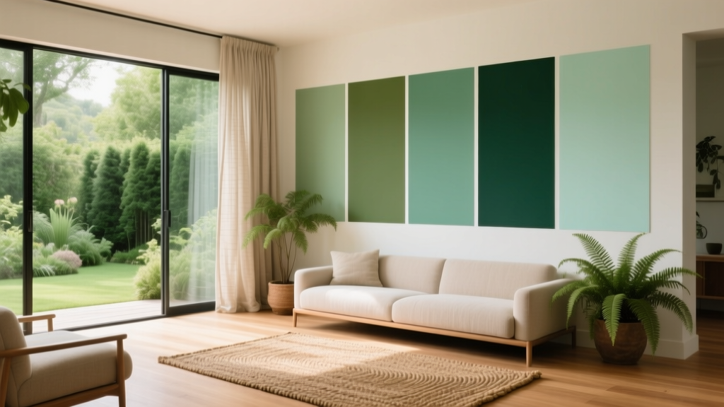 Best Green Paint Colors for Nature Lovers - The Decor Mag