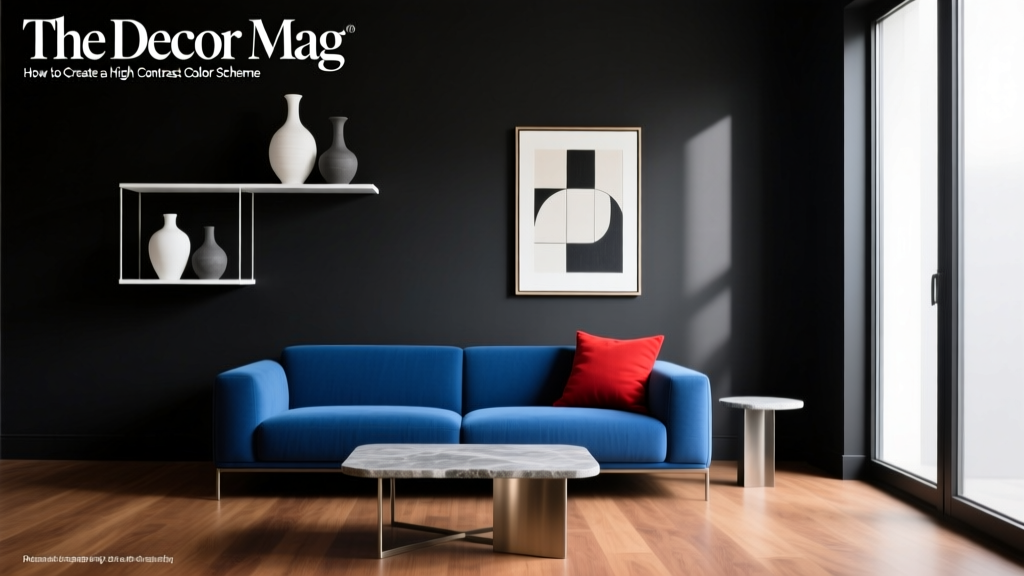
How to Create a High Contrast Color Scheme - The Decor Mag
High contrast color schemes are the secret behind rooms that feel intentional, energetic, and visually “finished.” When contrast is working, your eye knows exactly where to land: architectural details look sharper, furnishings feel more curated, and even a simple layout gains depth. It’s one of the fastest ways to make a home look professionally designed—without a renovation.
Contrast also solves a common homeowner frustration: a room that feels flat. You may have beautiful paint colors and great furniture, but if everything lives in the same mid-range value (neither very light nor very dark), the space can read as bland or undefined. High contrast interior color design adds clarity and hierarchy—two design principles that make a space feel cohesive and confident.
Whether you love classic black-and-white, moody jewel tones, or modern neutrals, the goal is the same: balance light and dark, warm and cool, smooth and textured, so the room feels alive. This guide breaks down the “how” with practical paint color recommendations, real room scenarios, and the common mistakes that trip people up.
What “High Contrast” Really Means in Interior Color Design
In color theory, contrast can show up in a few different ways. The most impactful for interiors is value contrast—the difference between how light or dark colors are. You can also create contrast through temperature (warm vs. cool), saturation (muted vs. vivid), and hue (opposites on the color wheel).
The 4 Types of Contrast to Use at Home
- Value (light vs. dark): White walls with black trim; pale greige walls with a deep charcoal built-in.
- Hue (color vs. color): Navy with crisp white; teal with coral accents.
- Temperature (warm vs. cool): Cool blue-gray walls with warm brass and oak; warm cream walls with inky blue cabinetry.
- Saturation (muted vs. bold): Soft stone walls with a saturated emerald sofa; dusty blush with a bright lacquered red lamp.
Why High Contrast Feels So Good: Color Psychology
- Dark tones (charcoal, navy, forest green) tend to feel grounding, protective, and sophisticated—great for focus and coziness.
- Light tones (white, ivory, pale gray) feel open, clean, and calming—great for airiness and clarity.
- High contrast pairings create energy and sharpness, helping a room feel purposeful rather than “decorated over time.”
Start Here: A Simple Formula for High Contrast Color Schemes
If you want a reliable method, use a three-part palette. This keeps your contrast dramatic but still livable.
The 60-30-10 Rule (High Contrast Edition)
- 60% dominant color: Often your wall color (light or mid-tone).
- 30% secondary color: Typically a darker anchor (cabinets, built-ins, a large rug, or upholstery).
- 10% accent color: A punchy highlight (pillows, art, a painted door, or a bold tile).
Pro tip: If you’re nervous about dark paint, keep the 60% light and make the 30% dark. If you love drama, flip it—dark walls (60%) with light upholstery and trim (30%).
High Contrast Color Combinations That Work Every Time
These combinations are popular for a reason: they deliver strong contrast while staying timeless. Paint brands are included to help you get close quickly; always test samples in your lighting.
1) Crisp Black + Warm White (Classic, Architectural)
- White options: Benjamin Moore White Dove (OC-17), Sherwin-Williams Alabaster (SW 7008)
- Black options: Benjamin Moore Black (2132-10), Sherwin-Williams Tricorn Black (SW 6258)
Where it shines: Trim, stair railings, window sashes, fireplaces, modern farmhouse kitchens.
Application idea: Warm white walls with black interior doors and matching black hardware for a tailored look.
2) Navy + White (Fresh, Tailored, Coastal-to-Classic)
- Navy options: Benjamin Moore Hale Navy (HC-154), Sherwin-Williams Naval (SW 6244)
- White options: Benjamin Moore Chantilly Lace (OC-65), Sherwin-Williams Pure White (SW 7005)
Where it shines: Dining rooms, offices, built-ins, powder rooms, kitchen islands.
Application idea: Navy built-in bookcases against white walls; style shelves with light ceramics and brass to keep contrast crisp.
3) Charcoal + Soft Greige (Modern, Elevated Neutral)
- Charcoal options: Benjamin Moore Wrought Iron (2124-10), Sherwin-Williams Iron Ore (SW 7069)
- Greige options: Benjamin Moore Revere Pewter (HC-172), Sherwin-Williams Agreeable Gray (SW 7029)
Where it shines: Open-plan living rooms, kitchens, hallways, contemporary exteriors.
Application idea: Greige walls with a charcoal feature wall behind the sofa, then repeat charcoal in picture frames and a floor lamp.
4) Forest Green + Cream (Grounded, Historic, Nature-Inspired)
- Green options: Benjamin Moore Essex Green (HC-188), Sherwin-Williams Ripe Olive (SW 6209)
- Cream options: Benjamin Moore Swiss Coffee (OC-45), Sherwin-Williams Creamy (SW 7012)
Where it shines: Libraries, bedrooms, kitchens with wood floors, entryways.
Application idea: Paint lower cabinets forest green and keep uppers creamy white for built-in contrast that still feels warm.
5) Deep Teal + Blush or Clay (Bold, Artistic, Boutique Feel)
- Teal options: Sherwin-Williams Oceanside (SW 6496), Benjamin Moore Aegean Teal (2136-40)
- Blush/clay options: Farrow & Ball Setting Plaster (No. 231), Benjamin Moore First Light (2102-70)
Where it shines: Guest rooms, creative studios, powder rooms, eclectic living spaces.
Application idea: Teal walls with a clay-toned rug and blush accents in artwork; add matte black metal for extra edge.
How to Apply High Contrast in Real Rooms
High contrast doesn’t require painting every wall dark. The most successful rooms use contrast strategically—where the eye benefits from definition.
Living Room: Contrast Through Anchors
Scenario: You have light walls and a neutral sofa, but the room feels washed out.
- Add a dark anchor: Paint the fireplace or built-ins Sherwin-Williams Iron Ore (SW 7069).
- Use a high-contrast rug: Look for ivory-and-black patterns or deep navy with cream motifs.
- Frame the room: Black picture frames or a large black mirror creates crisp focal points.
Tip: Keep at least one large element light (sofa, curtains, or walls) so the room doesn’t feel heavy.
Kitchen: Contrast That Feels Custom
Scenario: You want a designer kitchen without replacing cabinets.
- Two-tone cabinets: Lower cabinets Benjamin Moore Hale Navy (HC-154), uppers Benjamin Moore White Dove (OC-17).
- High contrast hardware: Matte black pulls on light cabinets or polished nickel on dark cabinets.
- Countertop/backsplash pairing: White quartz + dark grout for definition, or dark soapstone-style counters + white tile.
Tip: If your counters are already visually busy (heavy veining), keep cabinet colors simpler to avoid visual competition.
Bedroom: High Contrast Without Losing Calm
Scenario: You want a dramatic bedroom that still supports rest.
- Paint one surface: A deep headboard wall in Benjamin Moore Wrought Iron (2124-10) behind light bedding.
- Use soft contrast: Warm white walls (SW Alabaster) with a near-black velvet bench at the foot of the bed.
- Layer texture: Linen bedding, a chunky knit throw, and a smooth lacquered nightstand create contrast without shouting.
Tip: Darker walls often feel more cocooning than you expect, especially with warm lighting (2700K).
Bathroom/Powder Room: Go Bold in a Small Space
Scenario: You want a memorable powder room.
- Moody walls: Sherwin-Williams Naval (SW 6244) or Benjamin Moore Essex Green (HC-188).
- Bright contrast: Crisp white trim and ceiling (BM Chantilly Lace).
- Reflective accents: A gilded mirror or polished chrome to bounce light.
Tip: If you use a very dark wall color, choose a lighter floor (or a light vanity) to keep the space from feeling closed in.
Exterior-Style Contrast Indoors: Trim, Doors, and Architectural Lines
If you want high contrast without committing to dark walls, use contrast on the “edges” of the room:
- Interior doors: Paint doors Tricorn Black (SW 6258) while keeping walls warm white.
- Trim emphasis: White walls + black window trim for a modern, graphic effect.
- Ceiling contrast: A soft black or deep navy ceiling with light walls makes a room feel taller and more intentional.
Design Principles That Make High Contrast Look Polished
Repeat Your Dark (and Your Light) at Least 3 Times
One random black chair in a sea of beige looks accidental. Repeat the high-contrast color in multiple places:
- A dark paint color on built-ins
- Two dark accents (frames, lamps, hardware)
- A dark line (curtain rod, console legs, or rug pattern)
Balance Contrast With Negative Space
Let some areas stay simple—solid curtains, quieter walls, or clear tabletops—so the contrast reads as intentional rather than chaotic.
Choose the Right Undertones
High contrast amplifies undertones. Pairing a cool black with a warm creamy white can look off if the undertones fight. When sampling paint colors, compare them directly:
- Warm whites pair well with softer blacks and warm charcoals.
- Cool whites pair well with crisp blacks and blue-based navies.
Common High Contrast Color Mistakes (and How to Fix Them)
- Mistake: Using only mid-tones.
Fix: Add a true dark (near-black, deep navy) and a true light (clean white or soft ivory) to widen the value range. - Mistake: Too many competing bold colors.
Fix: Limit the palette. Use one bold color and let neutrals do the supporting work. - Mistake: Forgetting lighting.
Fix: In low-light rooms, choose a slightly lighter “dark” (charcoal vs. black) and add layered lighting: overhead + table lamps + sconces. - Mistake: High contrast everywhere.
Fix: Create a focal point (one wall, cabinetry, or trim) and keep adjacent surfaces calmer. - Mistake: Ignoring sheen.
Fix: Use contrast in finish too: matte walls with satin trim, or a semi-gloss door for a subtle, sophisticated pop.
Practical Tips for Choosing Paint Colors and Finishes
- Sample smart: Paint large swatches (at least 12x12 inches) and view them morning, afternoon, and evening.
- Use the same white consistently: Keeping one white paint color for trim/ceilings improves flow across rooms.
- Pick a trim white first: It acts like the frame for everything else, especially in high contrast schemes.
- Sheen guidelines:
- Walls: matte or eggshell
- Trim/doors: satin or semi-gloss
- Ceilings: flat
- Bridge warm/cool with materials: Wood tones, leather, and brass can harmonize contrasts that feel too sharp.
FAQ: High Contrast Color Schemes
What is the easiest high contrast color scheme for beginners?
Warm white walls with black accents is the simplest to execute. Try Sherwin-Williams Alabaster (SW 7008) on walls or trim with Tricorn Black (SW 6258) on doors, hardware, and a few key decor pieces.
Will high contrast paint colors make my room feel smaller?
Not automatically. Dark colors can recede and feel cozy rather than cramped, especially when you keep the ceiling lighter and include reflective surfaces (mirrors, metallics) and layered lighting.
How do I create contrast if I can’t paint my walls?
Use contrast through textiles and large decor: a black-and-ivory rug, deep curtains on light walls, bold artwork with strong light/dark shapes, and darker furniture silhouettes.
Should trim match walls or be high contrast?
Both can work. Matching trim to walls feels modern and calm; high contrast trim highlights architecture and feels more classic. If your home has detailed molding, high contrast trim often looks more intentional.
What’s a good high contrast palette that isn’t black and white?
Navy and white is a go-to: Benjamin Moore Hale Navy (HC-154) with Benjamin Moore White Dove (OC-17). Another rich option is forest green and cream: BM Essex Green (HC-188) with SW Creamy (SW 7012).
How can I keep a high contrast room from feeling harsh?
Add warmth and softness with natural textures (oak, rattan, wool), warm metals (brass), and slightly creamy whites rather than icy ones. Also, avoid using the darkest color on every surface—choose one or two hero moments.
Next Steps: Build Your High Contrast Color Scheme With Confidence
Pick one room and define your contrast first by value: choose a light, a dark, and a supporting mid-tone. Test paint samples, commit to a clear focal point (built-ins, doors, a feature wall, or cabinetry), and repeat your key colors throughout the space for a cohesive look. With the right balance, high contrast design feels bold, timeless, and personal—exactly what great interiors are meant to do.
Explore more paint color guides, color schemes, and interior color design tips on thedecormag.com.
More Articles
 How to Create a Bold Color Story - The Decor Mag
 Split Complementary Color Palette Ideas - The Decor Mag
 12 Practical DIY Furniture Ideas You Can Build in a Weekend (With Exact Materials & Dimensions)
 How to Create a Restraint Color Palette - The Decor Mag
 Best Navy Paint Colors for Every Style - The Decor Mag
 Best Steel Blue Paint Colors - The Decor Mag
 How to Choose Colors for a Balcony - The Decor Mag
 How to Use Color to Create Rhythm - The Decor Mag
 Best Living Rooms for STEP: Design, Layout, and Accessibility Standards for Seniors and Mobility Support
 Best Cardinal Red Paint Colors - The Decor Mag