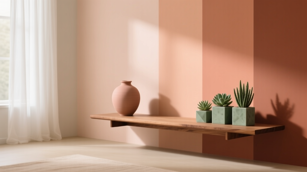
Best Apricot Paint Colors - The Decor Mag
Apricot sits in a sweet spot that few paint colors can match: it’s warm without feeling heavy, bright without becoming neon, and flattering in both daylight and lamplight. For homeowners craving a fresh alternative to beige, blush, or peach, apricot delivers the same comfort—plus more personality. It can read softly sunlit and creamy, or lean lively and modern depending on the undertone and the colors around it.
What makes apricot especially worth exploring is its versatility across styles. In a traditional home, it can mimic the glow of plaster walls and antique textiles. In a contemporary space, it becomes a sophisticated color accent that pairs beautifully with warm woods, off-whites, and black metal. Because apricot is essentially a warmed orange with a softened pink-gold cast, it also plays well with color psychology: it’s associated with optimism, sociability, and creativity—ideal for rooms where you want people to feel welcome.
If you’re considering apricot paint colors for your walls, trim, cabinets, or accents, this guide will help you choose the right shade, pair it with a cohesive color scheme, and avoid common pitfalls that can make warm colors feel dated or overly sweet.
What “Apricot” Really Means in Paint (Undertones Matter)
Apricot is not a single color—it’s a family of warm hues that typically sit between peach, soft orange, and coral. The reason apricot can look wildly different from one home to the next comes down to undertones and light.
Common apricot undertones
- Pink-leaning apricot: softer, romantic, often reads “peachy” on the wall.
- Golden apricot: more sunlit and buttery; pairs well with warm whites and oak.
- Terracotta-leaning apricot: deeper and earthier; great for Mediterranean and desert-inspired palettes.
- Beige-leaning apricot: more neutral, easier to use across open floor plans.
How lighting changes apricot paint colors
- North-facing rooms: cooler light can make apricot appear muted or slightly beige; choose a warmer, richer apricot to keep it lively.
- South-facing rooms: strong warm light can intensify apricot; consider a lighter, softer shade to avoid over-saturation.
- East-facing rooms: bright morning glow can make apricot look airy and fresh; it may soften later in the day.
- West-facing rooms: warm afternoon light can push apricot toward orange; choose a shade with a touch more pink or beige for balance.
Best Apricot Paint Colors (Designer-Approved Picks)
These apricot paint colors are popular for a reason: they’re nuanced, adaptable, and easy to pair with modern interior color schemes. Always test swatches on multiple walls and observe them across a full day.
1) Benjamin Moore Apricot Blush (2092-70)
A light, cheerful apricot with a delicate pink warmth. This is an excellent “first apricot” if you want a subtle color wash rather than a statement.
- Best for: nurseries, guest rooms, dressing rooms, powder rooms
- Pairs well with: Benjamin Moore Simply White (trim), pale oak floors, brushed brass
- Style note: reads fresh and modern with minimal decor and clean-lined furniture
2) Sherwin-Williams Melon Tint (SW 9007)
Soft, creamy, and approachable—this is an apricot that behaves like a warm neutral. It’s ideal if you’re aiming for a gentle glow rather than a “color moment.”
- Best for: open-plan living spaces, hallways, family rooms
- Pairs well with: warm whites, natural linen, light warm grays, rattan
- Design tip: choose matte or eggshell finish for walls to keep the look sophisticated
3) Farrow & Ball Setting Plaster (No. 231)
A cult favorite for a reason: Setting Plaster is a soft, grown-up apricot with a gentle sun-baked feel. It’s not saccharine; it reads like tinted plaster in the best way.
- Best for: bedrooms, living rooms, calm modern interiors
- Pairs well with: creamy whites, caramel leather, warm walnut, muted olive
- Room mood: soothing, flattering, elevated
4) Farrow & Ball Pink Ground (No. 202)
Despite the name, this can read as a refined apricot-pink when used with warm lighting and creamy trim. It’s a beautiful option for classic homes that still want a fresh color story.
- Best for: dining rooms, entryways, upstairs halls
- Pairs well with: deep greens, antique wood, aged brass, patterned textiles
5) Benjamin Moore Buttermilk (2154-70)
A pale, sunny apricot-yellow with a buttery softness. If you love “golden hour” interiors, this one delivers.
- Best for: kitchens, breakfast nooks, mudrooms
- Pairs well with: creamy cabinets, warm terracotta tile, black hardware
- Practical tip: consider a wipeable finish (eggshell) in busy spaces
6) Sherwin-Williams Persimmon (SW 6339) for accents
This is a bolder, more saturated cousin of apricot—perfect when you want a focal point without going full orange.
- Best for: accent walls, interior doors, built-ins, a powder room vanity
- Pairs well with: crisp white, navy, charcoal, warm wood tones
- Best use: keep surrounding walls light and warm to avoid harsh contrast
How to Use Apricot Paint in Real Rooms
Living room: apricot as a “warm neutral” backdrop
Apricot walls can replace beige in a living room, giving the space a friendlier, more curated vibe while still letting art and furniture stand out. Think of apricot as a subtle filter that makes everything look warmer and more inviting.
- Try this look: Melon Tint walls + creamy trim + warm oak + ivory upholstery
- Add depth: layer in rust, camel, and muted olive through pillows and throws
- Anchor the palette: matte black accents (picture frames, floor lamp, hardware)
Bedroom: soft apricot for flattering, restful warmth
Color psychology matters most where you rest. A softened apricot can feel nurturing and cozy without the heaviness of darker warm tones. It’s also notably flattering on skin—great for bedrooms with mirrors and getting-ready zones.
- Try this look: Setting Plaster walls + warm white bedding + walnut nightstands
- Best accent colors: dusty rose, clay, muted sage, soft cocoa brown
- Lighting tip: choose warm bulbs (2700K) to keep the color velvety, not stark
Kitchen: apricot that complements wood and creamy cabinetry
Apricot in kitchens works best when it leans creamy or buttery rather than bright. It complements natural materials—especially oak, travertine, and brass—creating a welcoming “sunrise” mood.
- Great approach: Buttermilk on walls + off-white cabinets + brass pulls
- Tile pairing: warm white zellige, tumbled stone, or terracotta floor tile
- Countertops: creamy quartz, honed marble with warm veining, butcher block
Bathroom/powder room: apricot glow with high contrast finishes
Bathrooms are ideal for apricot because the color counters cool surfaces like porcelain and chrome. In a powder room, a stronger apricot can be dramatic and chic.
- Try this look: Apricot Blush walls + warm white ceiling + aged brass mirror
- Go bolder: Persimmon on vanity or door + white walls + patterned floor tile
- Finish tip: use a bathroom-rated satin or matte bathroom paint for durability
Entryway and hallway: a welcoming color that boosts light
Apricot reflects light warmly, which is a gift in darker transitional spaces. The right apricot makes a hallway feel intentional—like a design choice, not an afterthought.
- Best strategy: choose a beige-leaning apricot and keep trim a warm white
- Make it feel taller: paint walls in apricot and use a slightly brighter warm white ceiling
- Style pairings: woven runner, warm wood console, soft black frame gallery wall
Apricot Color Schemes That Look Designer-Polished
Apricot plays well with both soft tonal palettes and high-contrast modern schemes. Use these combinations as a starting point for interior color design.
Easy, timeless pairings
- Apricot + warm white: clean, bright, and classic (ideal for trim and ceilings)
- Apricot + oatmeal + tan: relaxed, organic, and great for open plans
- Apricot + sage green: balanced warmth and calm; perfect for bedrooms and living rooms
- Apricot + terracotta + clay: cohesive desert-inspired warmth (best with plenty of texture)
Modern contrast pairings
- Apricot + charcoal: sophisticated and grounding; works well in dining rooms
- Apricot + navy: preppy, crisp, and high-impact (great for accent walls or cabinetry)
- Apricot + deep green: elevated and earthy; stunning with brass and walnut
Metal and wood tones that flatter apricot
- Best metals: brushed brass, antique gold, oil-rubbed bronze
- Best woods: white oak, walnut, teak, medium-toned warm stains
- Use chrome carefully: it can feel cold next to apricot unless balanced with warm lighting
How to Choose the Right Apricot Shade (A Practical Process)
- Start with fixed finishes: flooring, tile, countertops, and large upholstered pieces determine whether you need a pinker or yellower apricot.
- Decide your intensity: do you want a whisper of warmth (low saturation) or a statement (higher saturation)?
- Test large swatches: paint 2’x2’ samples on at least two walls, especially one that gets the most daylight and one that gets the least.
- Check morning vs. evening: apricot can bloom at sunset; make sure you like it when lamps are on.
- Coordinate trim: choose a warm white trim for cohesion. Stark bright whites can make apricot look more orange by comparison.
Common Apricot Paint Mistakes to Avoid
- Choosing an apricot that’s too saturated for the room: In strong southern or western light, a vibrant apricot can feel intense. If you’re unsure, go one shade lighter.
- Pairing apricot with cool, icy whites: Cool whites can make apricot appear louder or slightly “off.” Warm whites create a smoother transition.
- Ignoring undertones in nearby materials: Pink-leaning apricot can clash with yellow-beige carpet; golden apricot can fight with cool gray tile.
- Overloading the room with warm tones: Too much apricot + red + orange can feel monotone. Add a grounding neutral (oatmeal, warm gray, soft black) or a cooling counterpoint (sage, deep green).
- Using the wrong sheen: High-gloss on large apricot walls can look plasticky. Matte/eggshell is usually more flattering; use satin where you need washability.
FAQ: Apricot Paint Colors
Is apricot paint the same as peach?
They’re close, but not identical. Peach often leans pink and can feel sweeter, while apricot tends to carry a golden warmth that reads more sunlit and slightly more sophisticated—especially in beige-leaning versions.
What trim color looks best with apricot walls?
Warm whites are the safest choice. Look for creamy or softly neutral whites rather than bright, cool whites. This keeps the overall color scheme cohesive and prevents apricot from shifting too orange.
Will apricot paint look dated?
It can if the shade is very bright or paired with outdated finishes. Apricot looks current when it’s slightly muted, combined with natural textures (linen, oak, stone), and balanced with modern neutrals or deep greens.
What colors go with apricot for a whole-home palette?
Apricot pairs beautifully with warm white, oatmeal, tan, sage green, muted terracotta, charcoal, and navy. For flow, repeat one grounding neutral (warm white or oatmeal) and one deeper anchor color (charcoal, navy, or deep green) throughout.
Is apricot a good color for small rooms?
Yes—especially soft apricots. They reflect light warmly and can make small spaces feel welcoming rather than cramped. In very tiny rooms, choose a lighter apricot and keep trim and ceiling a warm white.
How do I keep apricot from looking too orange?
Pick an apricot with a touch of pink or beige, use warm-white trim, and add balancing colors like sage, ivory, and soft black. Also evaluate evening lighting; very warm bulbs can intensify orange tones.
Next Steps: Make Apricot Work Beautifully in Your Home
Apricot paint colors are a smart choice when you want warmth, optimism, and a lived-in glow—without defaulting to predictable beige. Start by identifying your undertone (pink, golden, terracotta, or beige-leaning), test large samples in your room’s real lighting, and build a supporting color scheme with warm whites, natural textures, and one grounding accent color.
If you’re ready to plan your palette, choose one apricot candidate, one trim white, and two coordinating accents (a green and a deep neutral is a reliable combo). Then test everything together—paint, fabric, and finishes—before committing.
For more paint color guides, color schemes, and room-by-room inspiration, explore the latest on thedecormag.com.
More Articles
 How to Choose Colors for an Entryway - The Decor Mag
 How to Choose Colors for a Wine Cellar - The Decor Mag
 Small vs Step: Decoding the Critical Difference in Color Management for Print and Digital Workflows
 How to Choose Colors for a Breakfast Nook - The Decor Mag
 Tetradic Color Scheme Guide - The Decor Mag
 How to Choose Colors for a Conservatory - The Decor Mag
 How to Choose Colors for a Deck - The Decor Mag
 Best Black Paint Colors for Dramatic Spaces - The Decor Mag
 How to Create a Timeless Color Palette - The Decor Mag
 Color Psychology in Living Rooms: Why Your Space Feels Off