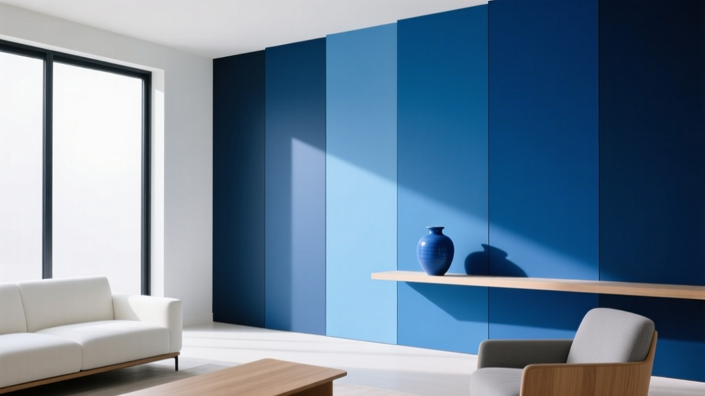
Best Sapphire Blue Paint Colors - The Decor Mag
Sapphire blue has a rare talent: it reads as luxurious and grounded at the same time. It’s bolder than navy, richer than cobalt, and far more dynamic than a flat primary blue. When you use the right sapphire blue paint color, the room gains depth—like adding velvet to an outfit or a gemstone to a simple look.
For homeowners and design enthusiasts, sapphire blue matters because it solves a common design problem: creating impact without chaos. It can anchor an open-concept space, make a bedroom feel serene but not sleepy, and bring sophistication to kitchens and bathrooms where white and gray can start to feel predictable. With the right undertones, lighting strategy, and supporting palette, sapphire becomes an everyday color that still feels special.
This guide breaks down the best sapphire blue paint colors, how to choose one that works in your home, and how to build a color scheme around it—so your blue feels intentional, not accidental.
What Makes a Paint Color “Sapphire Blue”?
Sapphire blue sits in the sweet spot between deep royal blue and blue-leaning navy. The most successful sapphire wall colors have:
- High chroma (saturation) so the blue feels jewel-toned, not dusty.
- Depth (a medium-dark value) to create drama and contrast.
- Controlled undertones—either slightly violet (more regal) or slightly green (more nautical), without turning muddy.
In color psychology, blue is associated with calm, trust, and clarity. Sapphire adds a layer of confidence and creativity—an energizing calm that works especially well in spaces where you want focus, conversation, or restorative quiet.
How to Choose the Right Sapphire Blue for Your Space
1) Start with Lighting (Natural and Artificial)
- North-facing rooms: Light runs cooler; sapphire can look more inky and serious. Consider a slightly brighter sapphire or one with a hint of violet warmth.
- South-facing rooms: Warm light brings out richness; most sapphire blues look vibrant and balanced here.
- East-facing rooms: Morning light is crisp; the color may look brighter earlier and deeper by afternoon.
- West-facing rooms: Afternoon light is warm and dramatic; sapphire can feel jewel-like but may skew slightly purple in golden light.
Practical tip: Sample on at least two walls and observe morning, midday, and evening. Sapphire changes noticeably as light shifts.
2) Decide: Statement Wall, Full Room, or Cabinetry
- Accent wall: Ideal if you want impact with less commitment—behind a bed, fireplace, or built-ins.
- Full room color: Sapphire creates a cocooning effect in bedrooms, dining rooms, libraries, and powder rooms.
- Cabinets or millwork: Great for kitchens, mudrooms, and home offices—especially with brass hardware.
3) Choose Your Finish Wisely
- Matte: Elegant, modern, and forgiving; best for walls with decent texture.
- Eggshell/Satin: Good for living spaces and hallways; easier to wipe clean.
- Semi-gloss: Best for trim, doors, and cabinets; highlights the jewel effect but shows prep flaws.
Best Sapphire Blue Paint Colors (Designer-Approved Picks)
Below are standout sapphire blue paint colors across popular brands. Always confirm with a physical swatch or sample pot—screen colors can mislead, and sapphire is particularly sensitive to lighting.
1) Benjamin Moore Blue Danube (2062-30)
Why it works: A classic jewel-toned sapphire with a vibrant, clean character. It reads bold without veering neon.
- Best for: Dining rooms, accent walls, statement ceilings, creative studios.
- Pairs well with: Crisp whites (Benjamin Moore Chantilly Lace), warm brass, walnut wood.
- Style match: Modern classic, eclectic, transitional.
2) Benjamin Moore Sapphire Blue (2063-20)
Why it works: Deeper and more enveloping than Blue Danube, with a refined, gemstone richness that feels tailored.
- Best for: Libraries, moody bedrooms, built-ins, powder rooms.
- Pairs well with: Creamy off-whites, caramel leather, brushed gold, black accents.
- Designer tip: Use it on cabinetry with a satin or semi-gloss for a lacquered look.
3) Sherwin-Williams Bluebird Feather (SW 9062)
Why it works: A lively sapphire-leaning blue that reads contemporary and artistic—great when you want a “wow” moment.
- Best for: Home offices, kids’ rooms done tastefully, accent walls in open layouts.
- Pairs well with: Warm whites, pale oak, natural linen textures, matte black lighting.
4) Sherwin-Williams Naval (SW 6244)
Why it works: While often categorized as navy, Naval can read sapphire in bright rooms and with high-contrast styling. It’s a dependable, sophisticated deep blue.
- Best for: Kitchen islands, lower cabinets, exterior front doors, dining rooms.
- Pairs well with: White marble, bright white trim, antique brass, warm grays.
- Application note: On cabinetry, prioritize prep and a cabinet-grade enamel for a smooth finish.
5) Farrow & Ball Stiffkey Blue (No. 281)
Why it works: A saturated, dramatic blue with a heritage feel—deep, inky, and elegant. In strong light it can show a sapphire-like richness.
- Best for: Snug rooms, stair halls, dining rooms, dramatic exteriors.
- Pairs well with: Soft whites, aged brass, dark woods, warm terracotta accents.
- Mood: Intimate, cinematic, upscale.
6) Farrow & Ball Hague Blue (No. 30)
Why it works: Hague Blue leans blue-green, but can feel sapphire-like when styled with crisp whites and cool metals. It’s a favorite for cabinetry and built-ins.
- Best for: Kitchen cabinets, mudrooms, built-in bookcases, vanities.
- Pairs well with: Warm white walls, unlacquered brass, natural stone, rattan.
- Design principle: Its subtle green undertone complements plants and natural materials beautifully.
7) Behr Sapphire Blue (S530-7)
Why it works: A bold, straightforward sapphire option with strong saturation—excellent for statement walls and budget-friendly makeovers.
- Best for: Accent walls, playrooms with a refined palette, dramatic hallways.
- Pairs well with: Bright white, light maple wood, gold frames, graphic black-and-white art.
8) Valspar Indigo Streamer (approx. sapphire-leaning deep blue)
Why it works: A deep, sophisticated blue that can read sapphire depending on undertones and lighting—great for cozy, layered rooms.
- Best for: Bedrooms, reading nooks, feature walls with panel molding.
- Pairs well with: Warm neutrals, creamy bedding, antique wood, soft blush accents.
Real Room Ideas: Where Sapphire Blue Shines
Sapphire Blue in Living Rooms
Scenario: A living room with warm oak floors and large windows needs a focal point.
- Paint the fireplace wall in Benjamin Moore Blue Danube.
- Keep surrounding walls warm white for balance.
- Add texture: boucle chairs, woven rug, linen drapery.
- Accent colors: camel leather, brass, and a small hit of rust or terracotta.
Sapphire Blue Bedrooms for a Restful, Boutique Feel
Scenario: A primary bedroom feels flat in beige and needs depth without losing calm.
- Go all-in with Benjamin Moore Sapphire Blue on all walls (matte finish).
- Use warm white bedding and a headboard in walnut or upholstered oatmeal linen.
- Layer lighting: soft bedside lamps (2700K), plus dimmable overhead.
Why it works: Deep blues lower visual “noise,” which supports relaxation, while the jewel tone keeps it from feeling gloomy.
Sapphire Blue Kitchens (Islands, Lowers, or Full Cabinets)
Scenario: You want a timeless kitchen color scheme beyond all-white.
- Use Sherwin-Williams Naval on the island or lower cabinets.
- Pair with warm white uppers and a creamy backsplash tile.
- Hardware: polished nickel for crispness or aged brass for warmth.
Designer tip: Sapphire cabinets look best with countertops that have movement—marble-look quartz, soapstone, or veined granite.
Powder Rooms and Bathrooms: Small Space, Big Impact
Scenario: A powder room needs personality and a memorable moment.
- Choose Farrow & Ball Stiffkey Blue or Hague Blue for drama.
- Add a statement mirror and a sconce with warm bulbs to prevent the blue from feeling too cool.
- Consider wallpaper on the ceiling or one wall for a layered, jewel-box effect.
Entryways and Front Doors
Scenario: You want curb appeal and a welcoming entry.
- Paint the front door in Benjamin Moore Sapphire Blue or Sherwin-Williams Naval in a durable exterior finish.
- Pair with clean white trim and black or brass hardware.
Best Color Schemes with Sapphire Blue
Sapphire blue is flexible, but it looks most intentional when you commit to a supporting palette. Try these designer-friendly combinations:
1) Sapphire + Crisp White + Brass
- Vibe: Fresh, tailored, high-contrast
- Great for: Kitchens, bathrooms, modern classic living rooms
2) Sapphire + Warm Neutrals (Cream, Camel, Greige)
- Vibe: Cozy, elevated, approachable
- Great for: Bedrooms, family rooms, transitional spaces
3) Sapphire + Emerald or Teal Accents
- Vibe: Layered jewel box, maximalist done well
- Great for: Dining rooms, studies, curated eclectic homes
4) Sapphire + Blush + Walnut
- Vibe: Softly dramatic, romantic, modern
- Great for: Bedrooms, nurseries (more grown-up), sitting rooms
5) Sapphire + Terracotta + Natural Fibers
- Vibe: Earth-meets-elegance, Mediterranean warmth
- Great for: Living rooms, kitchens, sunrooms with lots of light
Common Sapphire Blue Paint Mistakes (and How to Avoid Them)
- Choosing by screen color alone: Sapphire undertones shift dramatically. Always sample in your room.
- Ignoring undertones in fixed finishes: Check your tile, countertop, flooring, and upholstery first. A blue with the wrong undertone can clash and look “off.”
- Using cold lighting (5000K+): It can make sapphire feel harsh and clinical. Aim for 2700K–3000K in living spaces and bedrooms.
- Not balancing with neutrals: Sapphire needs breathing room—trim, ceiling color, or adjacent walls in white, cream, or soft taupe.
- Skipping sheen strategy: High gloss everywhere can feel flashy; ultra-matte on high-traffic walls can mark easily. Match sheen to the function of the room.
- Underestimating coverage: Many deep blues need extra coats. Use a quality primer (tinted if recommended) and plan for proper dry time.
FAQ: Sapphire Blue Paint Colors
Is sapphire blue the same as navy?
No. Navy is typically darker and more muted. Sapphire blue is more jewel-toned and saturated, often reading brighter and clearer than navy—especially in good natural light.
Does sapphire blue make a room feel smaller?
Deep colors can visually advance, but sapphire can also add depth and make walls feel farther away when paired with good lighting and contrast. In small rooms like powder rooms, the “jewel box” effect often feels intentional and upscale.
What trim color looks best with sapphire blue walls?
Clean whites and soft warm whites are the most reliable. If you want a slightly softer contrast, choose an off-white that complements your flooring and lighting. For a dramatic look, consider inky trim only if the room has strong light and minimal clutter.
Can I use sapphire blue in an open-concept home?
Yes—use it strategically. Try sapphire on built-ins, a kitchen island, a dining room wall, or a defined entry area. Keep adjacent spaces in coordinating neutrals so the color story flows.
What’s the best sheen for sapphire blue walls?
Matte is beautiful for bedrooms and dining rooms. Eggshell is a practical choice for living rooms and hallways. For doors, trim, and cabinets, satin to semi-gloss gives durability and a crisp finish.
How do I keep sapphire blue from looking too purple or too teal?
Control the environment: sample multiple blues, check them next to your white trim and flooring, and view them under your evening bulbs. If it pulls purple, add warmer neutrals and brass; if it pulls teal, use crisper whites and cooler metals like polished nickel.
Your Next Steps: Make Sapphire Blue Feel Custom
If you want sapphire blue to look designer-level (not just “blue paint”), follow this simple plan:
- Pick 2–3 contenders from the list above based on your room’s light direction.
- Sample large swatches on multiple walls and observe for 48 hours.
- Choose a supporting palette: a white, a warm neutral, and one accent metal (brass, black, or nickel).
- Commit to a finish strategy (matte walls, satin trim, semi-gloss cabinetry where needed).
- Layer texture (linen, wool, natural wood, ceramic) to keep the deep blue feeling inviting.
Sapphire blue paint colors reward thoughtful choices—and once you find the right one, it becomes the kind of backdrop that makes everyday spaces feel curated. For more paint color ideas, color schemes, and room-by-room guidance, explore the latest color guides on thedecormag.com.
More Articles
 Tetradic Color Scheme Guide - The Decor Mag
 Paint Colors That Work With Flooring (2026)
 2026 Color of the Year: Predictions & Palettes
 Color Wheel Basics for Home Decorating - The Decor Mag
 Best Cucumber Paint Colors - The Decor Mag
 How to Use Color to Create Flow - The Decor Mag
 How to Choose Colors That Complement Artwork - The Decor Mag
 How to Choose Colors for South-Facing Rooms - The Decor Mag
 How to Choose Colors for a Veranda - The Decor Mag
 Studio Color Palettes That Expand Small Rooms