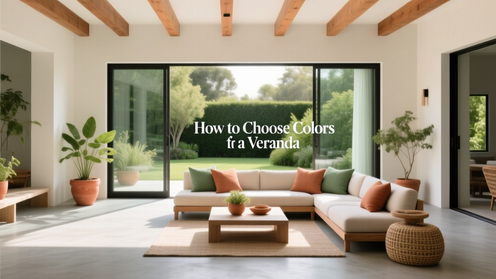
How to Choose Colors for a Veranda - The Decor Mag
A veranda is more than a pass-through space—it’s the first “room” your home presents to the world and the place you’re most likely to linger at golden hour. The right paint colors can make a narrow veranda feel airy, a shaded porch feel warmer, and a sun-drenched veranda feel calm instead of harsh. Color also helps connect your home’s exterior to the interior, creating a seamless design story from curb to couch.
Because verandas sit at the intersection of outdoors and indoors, they’re uniquely sensitive to light shifts, surrounding landscaping, and architectural details. A white that looks crisp inside may read stark in full sun; a cozy greige can turn muddy in deep shade. Choosing a veranda color scheme with a bit of color theory—and a few real-world testing habits—lets you create a welcoming, durable palette that holds up all day, all season.
This guide breaks down how to select paint colors for veranda floors, ceilings, trim, walls, doors, and furniture, with specific color combinations and paint references you can actually take to the store.
Start With What Your Veranda Already Has
Before you pick a “pretty” color, take inventory of the fixed elements that won’t change (or won’t change soon). Your best exterior color scheme supports what’s already there.
- Roof color: charcoal, brown, terracotta, metal, or slate all pull paint undertones differently.
- Brick/stone: warm red brick vs. cool gray stone will steer you toward warm or cool paint colors.
- Hardscaping: concrete, pavers, tile, and steps have their own undertones (pink, green, blue, tan).
- Metal finishes: black railings, bronze hardware, brass lighting—these act like “jewelry” for your palette.
- Landscaping: dense greenery reflects green onto paint; flowering plants bounce color back at your walls and trim.
Quick Undertone Check (2-Minute Method)
- Hold a bright white sheet of paper next to your siding/brick in daylight.
- If the surface looks pinkish, creamy, or yellow, you’re in warm-undertone territory.
- If it looks blue, green, or crisp gray, lean cool/neutral.
- If it looks tan or gray-beige and stays steady through the day, you can use most neutrals.
Understand Light on a Veranda (It Changes Everything)
Verandas experience extreme light variation—morning vs. afternoon, summer vs. winter, sunny vs. overcast. Your paint colors should be chosen for the conditions you have most often.
North-Facing or Deeply Shaded Verandas
Shade can drain warmth and make colors look grayer. Choose paint colors with subtle warmth and slightly higher light reflectance to keep the space inviting.
- Warm whites: Benjamin Moore White Dove (OC-17), Sherwin-Williams Alabaster (SW 7008)
- Light greige: Benjamin Moore Edgecomb Gray (HC-173), Sherwin-Williams Accessible Beige (SW 7036)
- Muted sage to soften shadows: Sherwin-Williams Clary Sage (SW 6178)
South-Facing or Full-Sun Verandas
Direct sun intensifies color and can wash out pale shades. A slightly deeper tone or a “dirty” neutral (with gray/brown in it) can read calmer and more sophisticated.
- Crisp but not icy white: Benjamin Moore Simply White (OC-117)
- Sun-proof greige: Sherwin-Williams Agreeable Gray (SW 7029)
- Coastal blue-gray: Benjamin Moore Boothbay Gray (HC-165)
Verandas Surrounded by Greenery
Green reflections can make neutrals look slightly greener. Counterbalance with a neutral that has a gentle red or warm base.
- Benjamin Moore Classic Gray (OC-23) for trim and walls
- Sherwin-Williams Balanced Beige (SW 7037) for a warmer, grounded feel
Pick a Veranda Color Scheme: 4 Proven Approaches
The easiest way to achieve a designer look is to commit to a clear color scheme. These are veranda-friendly, timeless, and flexible.
1) Timeless Neutral: White + Warm Wood + Black Accents
This is a classic porch and veranda palette because it reads clean, welcoming, and architectural. Color psychology-wise, white communicates freshness and calm; black adds structure and confidence.
- Walls/trim: Benjamin Moore White Dove (OC-17)
- Ceiling: Benjamin Moore Ceiling Paint (a soft flat white) or a slightly warmer white to avoid glare
- Front door: Sherwin-Williams Tricorn Black (SW 6258)
- Furniture: teak, acacia, or cedar with black metal frames
Real application scenario: A Craftsman-style home with tapered columns. Paint columns and trim White Dove, keep railings black, and choose warm wood rocking chairs. Add a woven jute rug and linen cushions for a soft, layered finish.
2) Coastal Calm: Blue-Gray + White + Brass
Blue-gray tones lower visual temperature and feel restful—ideal for relaxing outdoors. Pair with crisp white trim and warm metals to keep it from feeling chilly.
- Walls or siding accent: Benjamin Moore Boothbay Gray (HC-165) or Sherwin-Williams Slate Tile (SW 7624) for a moodier version
- Trim: Sherwin-Williams Pure White (SW 7005)
- Door: Benjamin Moore Hale Navy (HC-154) for a classic nautical focal point
- Details: aged brass light fixtures, natural rope or cane textures
Real application scenario: A small veranda in a humid climate. Choose Boothbay Gray on the beadboard wall, Pure White on trim, and Hale Navy on the door. Add white performance cushions (easy to clean) and a striped indoor-outdoor rug for instant coastal polish.
3) Modern Earthy: Greige + Clay + Matte Black
Earth tones create a grounded, welcoming vibe and hide everyday dust better than stark whites. Clay and terracotta hues also play beautifully with plants and warm brick.
- Main neutral: Sherwin-Williams Agreeable Gray (SW 7029) or Benjamin Moore Revere Pewter (HC-172)
- Accent (door or planters): Sherwin-Williams Cavern Clay (SW 7701)
- Metal accents: matte black railings or lanterns
Real application scenario: A veranda with concrete flooring and modern lines. Paint the ceiling and trim a clean white, keep walls in Agreeable Gray, and paint the door Cavern Clay. Repeat the clay hue in outdoor pillows for a cohesive, editorial look.
4) Cottage Garden: Cream + Sage + Soft Blue Ceiling
This palette feels gentle, nostalgic, and plant-friendly. Cream reads warm and inviting; sage feels restorative; a pale blue ceiling adds a touch of charm while visually lifting the space.
- Trim/walls: Sherwin-Williams Alabaster (SW 7008)
- Accent (shutters/door/furniture): Sherwin-Williams Clary Sage (SW 6178) or Benjamin Moore Saybrook Sage (HC-114)
- Ceiling “haint blue” idea: Benjamin Moore Palladian Blue (HC-144) (a soft blue-green)
Real application scenario: A farmhouse-style veranda with white railings. Use Alabaster on railings and trim, Clary Sage on the door, and Palladian Blue on the ceiling. Add white geraniums in clay pots for a layered, cottage-ready moment.
Where to Use Color: Ceiling, Floor, Trim, Door, and Furniture
A veranda has multiple surfaces, and each one behaves differently in light. A smart exterior color design assigns color by function, not just by preference.
The Ceiling: Brighten, Lift, or Add Character
- Best for most homes: a soft white with low sheen (exterior-rated) to reduce glare.
- To make the veranda feel taller: use the same color as the trim or one step lighter.
- For charm: a pale blue-green like Benjamin Moore Palladian Blue (HC-144).
The Floor: Hide Dirt, Anchor the Palette
Veranda floors take the most abuse, so color choice should balance beauty and practicality.
- Classic gray floor: Sherwin-Williams Peppercorn (SW 7674) for a deep charcoal, or Benjamin Moore Gray (2121-10) for near-black drama.
- Soft “porch” gray: Benjamin Moore Stonington Gray (HC-170) (test carefully in shade; it can read cooler).
- Warm wood tones: consider a stain rather than paint when possible; it adds richness and hides wear patterns.
Trim and Railings: Define the Architecture
Trim color is your outlining tool. High-contrast trim looks crisp and traditional; low-contrast trim looks modern and calm.
- High contrast: white trim + darker walls for a tailored look.
- Low contrast: trim one shade lighter than walls for a contemporary, relaxed vibe.
- Railings: black or charcoal often looks cleanest and hides scuffs (Sherwin-Williams Tricorn Black SW 6258).
The Front Door: Your Accent Color Opportunity
The front door is where you can use richer pigment without overwhelming the space. Strong color here creates a focal point and improves curb appeal.
- Navy: Benjamin Moore Hale Navy (HC-154) — classic, elevated, works with brick and stone.
- Deep green: Sherwin-Williams Rookwood Shutter Green (SW 2809) — heritage and timeless.
- Red (traditional): Benjamin Moore Caliente (AF-290) — energetic, welcoming.
How to Test Paint Colors (So You Don’t Regret Them)
Exterior paint color testing is non-negotiable—especially on a veranda where light shifts dramatically.
- Test at least 3 candidates for each surface (wall, trim, door) to compare undertones.
- Use large samples: paint 2' x 2' swatches on poster board, or use peel-and-stick samples when available.
- Move samples around: near the door, under the roof, and in direct sun.
- Check at 4 times: morning, midday, late afternoon, and nighttime with porch lights on.
- Evaluate next to your fixed elements: brick, roof, pavers, and railings.
Common Veranda Color Mistakes to Avoid
- Choosing paint color from a screen: online images distort undertones and brightness. Always test in person.
- Ignoring undertones in stone and brick: a cool gray next to warm brick often looks “off” and accidental.
- Using an interior paint outdoors: exterior-rated formulas handle UV exposure, moisture, and temperature shifts better.
- Overusing bright white in full sun: it can glare and feel harsh. Consider a warmer white or soft off-white.
- Too many competing colors: a veranda typically looks best with 2–4 coordinated colors (including neutrals).
- Forgetting nighttime lighting: warm bulbs make colors look warmer; cool LEDs can make neutrals look sterile.
Designer-Approved Color Combos You Can Copy
If you want quick veranda color inspiration, these pairings work across a wide range of architectural styles.
- Fresh + Classic: Sherwin-Williams Alabaster (SW 7008) trim + Benjamin Moore Hale Navy (HC-154) door + black railings
- Warm + Welcoming: Benjamin Moore Edgecomb Gray (HC-173) walls + Sherwin-Williams Pure White (SW 7005) trim + Sherwin-Williams Cavern Clay (SW 7701) accent
- Soft + Garden-Friendly: Benjamin Moore White Dove (OC-17) trim + Sherwin-Williams Clary Sage (SW 6178) accents + natural wood furniture
- Modern Monochrome: Benjamin Moore Simply White (OC-117) walls + Sherwin-Williams Peppercorn (SW 7674) floor/railings + warm brass lighting
FAQ: Choosing Veranda Paint Colors
What are the best neutral paint colors for a veranda?
Reliable, widely loved choices include Benjamin Moore White Dove (OC-17), Sherwin-Williams Alabaster (SW 7008), and Benjamin Moore Edgecomb Gray (HC-173). The “best” neutral depends on your light exposure and the undertones in your brick/stone.
Should the veranda trim match the rest of the house trim?
Usually yes—matching trim colors creates a cohesive exterior color scheme. If you want the veranda to feel like a distinct outdoor room, you can shift the veranda ceiling or floor color while keeping trim consistent.
Is a blue ceiling still a good idea for verandas?
Yes, when it suits the style of the home. A soft, muted blue-green like Benjamin Moore Palladian Blue (HC-144) can make a covered veranda feel brighter and more open, especially with white trim.
How many colors should I use on a veranda?
A strong rule of thumb is 2–4 colors total: one main neutral, one trim color, and one accent (often the front door). A fourth color can be the floor or railing if needed.
What sheen is best for veranda surfaces?
Many homeowners use flat or matte for ceilings, satin for walls and trim, and a porch and floor enamel (often in satin or low-luster) for floors. Always follow the paint brand’s exterior recommendations for durability.
How do I choose a front door color that won’t feel trendy?
Look to heritage shades with proven staying power: navy (Benjamin Moore Hale Navy), deep green (Sherwin-Williams Rookwood Shutter Green), or a classic red (Benjamin Moore Caliente). These colors have strong pigment and pair well with both warm and cool neutrals.
Your Next Steps: A Simple Veranda Color Plan
- Photograph your veranda in morning and late afternoon light.
- Identify undertones in brick/stone/roof and decide warm vs. cool neutrals.
- Choose a 3-part scheme: main neutral + trim + door (then decide on floor/railings).
- Test large samples in multiple spots and at night under porch lights.
- Repeat your accent color in small ways—pillows, planters, a rug—for a finished designer look.
A veranda that feels welcoming, balanced, and true to your home’s architecture starts with the right paint colors—and a plan that respects light, undertones, and how people move through the space. For more color schemes, paint color guides, and interior color design tips that translate beautifully outdoors, explore the latest resources on thedecormag.com.
More Articles
 Best Palette Reading: Science, Standards, and Real-World Accuracy for Designers and Brand Managers
 Cheap vs Premium: Why 'Premium' Isn’t Just Marketing—It’s Measurable Performance
 How to Choose Colors for a Nursery - The Decor Mag
 How to Choose Colors for a Dining Room - The Decor Mag
 Best Wine Red Paint Colors - The Decor Mag
 Open Floor Plan Color Transitions (2026)
 Best Hydrangea Blue Paint Colors - The Decor Mag
 How to Create a Serene Color Palette - The Decor Mag
 Best Honeydew Paint Colors - The Decor Mag
 Best Mustard Yellow Paint Colors - The Decor Mag