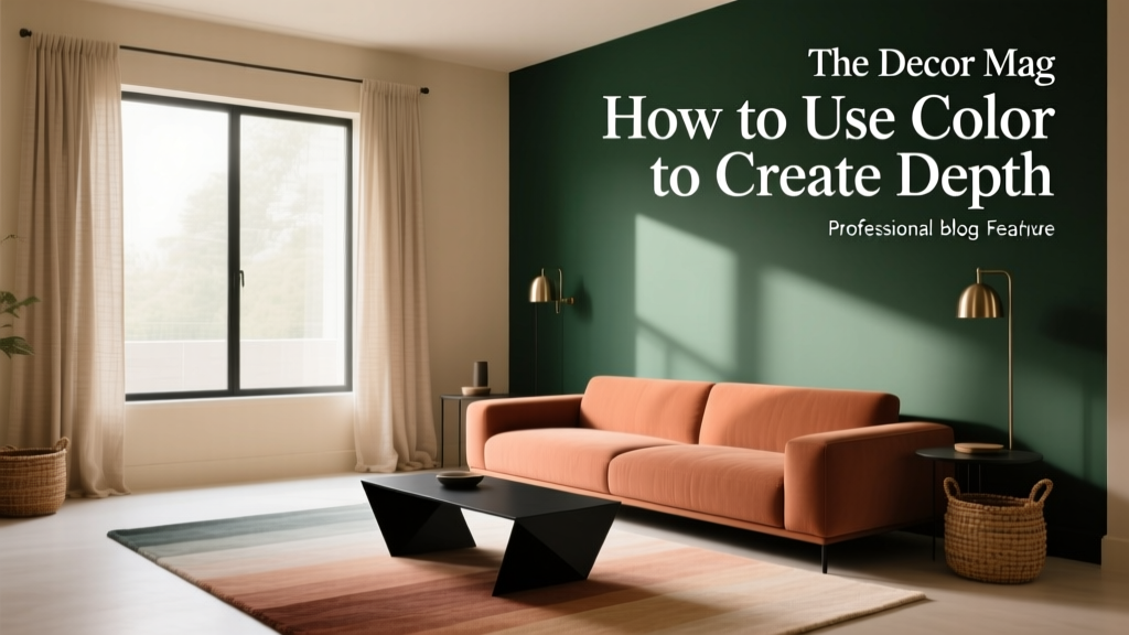
How to Use Color to Create Depth - The Decor Mag
Depth is one of those design qualities you feel before you can explain it. A room with depth looks layered, inviting, and thoughtfully composed—like there’s more to discover beyond the first glance. Without depth, even a beautifully furnished space can read flat, one-note, or smaller than it really is.
Color is the most powerful (and most affordable) way to create that dimensionality. The right paint colors, undertones, and color schemes can visually push walls back, pull features forward, highlight architectural details, and guide the eye through a space. Whether you’re refreshing one room or planning a whole-home palette, understanding how color creates depth will help you make choices with confidence.
This guide breaks down the core principles of interior color design—value, saturation, temperature, contrast, sheen, and placement—so you can use paint colors strategically, not randomly. Expect practical tips, real room scenarios, and specific shade recommendations from trusted brands.
What “Depth” Means in Interior Color Design
In color theory, depth is created by a few key factors that influence how we perceive distance and dimension:
- Value (lightness vs. darkness): Darker colors tend to recede; lighter colors tend to advance—though context can reverse this.
- Saturation (intensity): Muted colors feel atmospheric and layered; highly saturated colors feel closer and more energetic.
- Temperature (warm vs. cool): Cool hues often read farther away; warm hues often feel nearer and cozier.
- Contrast: More contrast increases visual depth; too little can feel flat.
- Finish (matte, eggshell, satin, semi-gloss): Sheen affects reflectivity, which affects perceived dimension.
Depth is also psychological. Humans interpret shadows, light, and subtle shifts in tone as cues for distance. That’s why a nuanced greige with the right undertone can look more “expensive” than a plain beige—it mimics the complexity we see in nature.
Start with the Three Color Moves That Create Instant Depth
1) Use a Value Shift (Light to Dark)
The fastest way to add depth is to create a clear value hierarchy: one color family, multiple depths. This works beautifully for cohesive color schemes.
Try this approach:
- Light on most walls (sets an airy baseline)
- Mid-tone on built-ins or an adjacent room (adds body)
- Dark on an accent wall, ceiling, or trim detail (creates a focal plane)
Paint color suggestions (classic, versatile):
- Benjamin Moore: White Dove OC-17 (soft white), Edgecomb Gray HC-173 (warm greige), Hale Navy HC-154 (deep navy)
- Sherwin-Williams: Alabaster SW 7008 (warm white), Agreeable Gray SW 7029 (greige), Iron Ore SW 7069 (soft charcoal)
2) Layer Undertones (Not Just “Neutral vs. Color”)
Depth often comes from undertone harmony. A room can be neutral and still feel dimensional if the undertones are intentional (warm, cool, green-leaning, violet-leaning, etc.).
- Pair a warm white with a green-gray to create a natural, grounded depth.
- Pair a cool white with a blue-gray for a crisp, airy recession.
- Use a rosy-beige with a moody brown for a soft, enveloping effect.
Undertone-friendly combos:
- Benjamin Moore White Dove OC-17 + October Mist 1495 (green-gray) + Kendall Charcoal HC-166
- Sherwin-Williams Pure White SW 7005 + Sea Salt SW 6204 (green-blue gray) + Tricorn Black SW 6258
3) Control Contrast with Placement
Where you place contrast matters as much as how much contrast you use. To make a space feel deeper, concentrate contrast where you want the eye to travel: a fireplace wall, the back of a bookcase, a hallway terminus, or the far wall of a long room.
Quick placement wins:
- Paint the far wall of a narrow room a deeper tone to anchor the view.
- Paint recessed areas (niches, alcoves) darker to enhance shadow and dimension.
- Paint trim slightly brighter than the wall to outline architecture (or slightly darker for a modern, tailored edge).
How Color Temperature Shapes Depth (Warm vs. Cool)
Color psychology plays a role here: warm colors (reds, oranges, warm beiges) feel sociable, cozy, and closer; cool colors (blues, blue-grays, many greens) feel calm, expansive, and farther away. You can use that perception to shape a room.
When to Use Cool Colors to Push Space Back
- Small bedrooms that need to feel calmer and more spacious
- Low-light rooms where you want a soft, atmospheric feel
- Long rooms where you want to visually extend distance
Try these cool-leaning paint colors:
- Benjamin Moore: Boothbay Gray HC-165, Smoke 2122-40
- Sherwin-Williams: Passive SW 7064, Misty SW 6232
When to Use Warm Colors to Pull a Room In (and Add Cozy Depth)
- Large living rooms that feel echoey or unfinished
- North-facing spaces that feel cool and need warmth
- Dining rooms where you want intimacy and glow
Warm depth-makers:
- Benjamin Moore: Muslin OC-12, Grant Beige HC-83
- Sherwin-Williams: Accessible Beige SW 7036, Kilim Beige SW 6106
Use Saturation Like a Pro: Muted Mid-Tones Create the Best “Layered” Look
Highly saturated color can be stunning, but the most livable depth often comes from mid-tone, slightly muted hues. They behave like a backdrop, letting furniture, art, and textiles do the storytelling—while still adding richness.
Design principle: If you want the room to feel deep but timeless, choose a color with enough gray or earthiness to keep it from feeling loud.
Reliable saturated-but-not-too-saturated options:
- Green: Farrow & Ball Mizzle No. 266; Benjamin Moore Saybrook Sage HC-114
- Blue: Sherwin-Williams Smoky Blue SW 7604; Benjamin Moore Gentleman’s Gray 2062-20
- Terracotta: Sherwin-Williams Redend Point SW 9081; Benjamin Moore Terra Cotta Tile 2090-30
Real Room Examples: How to Apply Depth-Creating Color Schemes
Example 1: A Narrow Hallway That Feels Longer and More Intentional
Goal: Add depth without making it feel cramped.
- Walls: Sherwin-Williams Agreeable Gray SW 7029 (light-mid greige)
- Trim & doors: Sherwin-Williams Pure White SW 7005
- Far wall (end of hall): Sherwin-Williams Iron Ore SW 7069
Why it works: The deeper end wall creates a visual “stop,” giving the hallway a designed destination. Crisp trim outlines the architecture, adding definition.
Example 2: An Open-Concept Living Room That Needs Zones
Goal: Create depth and separation without chopping up the flow.
- Main walls: Benjamin Moore White Dove OC-17
- Kitchen island or built-ins: Benjamin Moore Hale Navy HC-154
- Dining room wall color (same family, warmer mid-tone): Benjamin Moore Edgecomb Gray HC-173
Why it works: The navy adds a grounded focal plane (psychologically stable, calming, classic), while the greige introduces warmth and transition. The space feels layered, not chaotic.
Example 3: A Bedroom That Feels Like a Retreat (Not a Box)
Goal: Add enveloping depth and better sleep vibes.
- Walls: Benjamin Moore Boothbay Gray HC-165 (soft blue-gray)
- Ceiling: One step lighter than the wall (or use the same color at 50% strength if your paint store can adjust)
- Trim: Benjamin Moore White Dove OC-17
Why it works: Cool hues tend to recede and calm the nervous system (color psychology: blues and blue-grays are associated with rest). A slightly tinted ceiling reduces harsh contrast, creating a cocoon effect.
Example 4: A Living Room Fireplace Wall That Becomes a Feature
Goal: Make the fireplace feel substantial and architectural.
- Surrounding walls: Sherwin-Williams Alabaster SW 7008
- Fireplace wall: Sherwin-Williams Urbane Bronze SW 7048
- Accent materials: Brass, walnut, camel leather, or cream textiles
Why it works: A deep warm bronze reads grounded and sophisticated, pulling the fireplace forward. The lighter perimeter keeps the room bright while still creating depth through contrast.
Ceilings, Trim, and Sheen: The Underused Tools for Depth
Paint the Ceiling for Dimension (Beyond Plain White)
- For height: Use a lighter ceiling than the walls (classic lift).
- For cozy depth: Use the same color on walls and ceiling (a “color-drenched” look).
- For subtle sophistication: Tint the ceiling with 10–25% of the wall color.
Great ceiling-friendly whites: Benjamin Moore Chantilly Lace OC-65 (crisp), Sherwin-Williams Alabaster SW 7008 (soft/warm).
Trim Color Choices That Add Depth
- High-contrast trim (white trim + deeper walls): Emphasizes architecture and sharpens edges.
- Low-contrast trim (same color as walls): Expands the wall plane and feels modern.
- Dark trim: Adds drama and a historic feel—best with good natural light and simpler profiles.
Sheen Strategy (Matte vs. Satin)
- Matte/flat walls: Absorb light, reduce glare, enhance a velvety sense of depth.
- Eggshell: A practical middle ground for living spaces.
- Satin/semi-gloss on trim: Reflects light and outlines details, adding definition.
Practical Tips for Choosing Paint Colors That Create Depth
- Sample in multiple lights: Morning, afternoon, and evening. Depth depends on shadow and reflection.
- Check undertones against fixed finishes: Flooring, countertops, tile, and large upholstery pieces.
- Use large samples: Paint 2’x2’ swatches or use peel-and-stick samples to judge value accurately.
- Balance the room’s “visual weight”: If you have dark floors, consider lighter walls and a mid-tone feature for harmony.
- Repeat a color 2–3 times: For depth, echo your accent color in textiles, art, or accessories.
Common Color Mistakes That Make Rooms Look Flat
- Choosing colors by name instead of undertone: Two “grays” can clash if one is blue-leaning and one is green-leaning.
- Using one color everywhere with no value shift: Monochrome can be beautiful, but it needs variation in texture, sheen, or tone.
- Ignoring the light source: North-facing light cools colors; warm bulbs can yellow them. Always test with your actual lighting.
- Overusing pure white: Bright white on walls, trim, and ceiling can erase edges and feel sterile, especially in low light.
- Accent walls with the wrong wall: If the accent wall is random, the room feels unbalanced. Choose a wall with a natural focal point.
- Too many unrelated “statement” colors: Depth comes from relationships. Limit bold hues and connect them through undertones.
FAQ: Using Color to Create Depth
What paint colors make a room look bigger?
Light to mid-tone colors with soft undertones tend to expand space—think Benjamin Moore White Dove OC-17, Sherwin-Williams Alabaster SW 7008, or airy blue-grays like Sherwin-Williams Misty SW 6232. Pair them with low-contrast trim or a slightly tinted ceiling for added openness.
Do dark paint colors always make a room feel smaller?
No. Dark colors can actually create dramatic depth by blurring corners and reducing visual “edges,” especially in bedrooms, dens, and dining rooms. Try Benjamin Moore Hale Navy HC-154 or Sherwin-Williams Iron Ore SW 7069, then layer warm lighting and lighter textiles to balance.
How do I choose an accent wall color that adds depth (not chaos)?
Pick a wall that already acts as a focal point (fireplace, bed wall, the wall you see first). Choose a deeper value from the same undertone family as the main wall color. If your main wall is a warm greige, a warm charcoal or deep bronze will feel cohesive.
Should trim match the wall color or be white?
White trim increases contrast and crispness, highlighting architectural lines. Matching trim to the wall creates a more immersive, modern depth and can make a room feel larger. Use your home’s style and light level to decide; both can be “right.”
What’s the easiest beginner-friendly color scheme for depth?
A three-step neutral palette: warm white + greige + deep charcoal or navy. For example: Sherwin-Williams Pure White SW 7005 (trim), Agreeable Gray SW 7029 (walls), Iron Ore SW 7069 (feature). It’s flexible, widely compatible with finishes, and easy to decorate around.
How do I prevent my paint color from looking muddy?
Mud happens when undertones fight your flooring or lighting. Test samples next to the floor and under your evening bulbs, and avoid overly complex colors if your room has little natural light. Choosing a cleaner neutral (like Benjamin Moore Chantilly Lace OC-65) or a more intentional mid-tone (like Benjamin Moore Edgecomb Gray HC-173) often fixes it.
Next Steps: A Simple Plan to Add Depth This Week
- Step 1: Identify your room’s fixed elements (flooring, tile, countertops) and their undertones.
- Step 2: Choose a main wall color in a flattering value (light to mid-tone for airy; mid to deep for cozy).
- Step 3: Add one depth move: a darker far wall, a color-drenched nook, a deeper built-in, or a tinted ceiling.
- Step 4: Repeat your accent color in at least two other places (pillows, art, rug detail, or curtains) for a layered look.
- Step 5: Lock in sheen: matte/eggshell on walls, satin/semi-gloss on trim for crisp dimension.
Color can shape a home as much as walls and windows do. When you use value shifts, undertone harmony, and smart contrast, depth becomes something you design on purpose—room by room.
Explore more paint color ideas, color schemes, and interior color design guides on thedecormag.com.
More Articles
 Best Papaya Paint Colors - The Decor Mag
 Reading FAQ Answered: Evidence-Based Answers to 27 Common Questions About Vision, Eye Health, and Reading Performance
 How to Use Color to Create Unity - The Decor Mag
 How to Choose Colors for a Wine Cellar - The Decor Mag
 How to Choose Colors for a Media Room - The Decor Mag
 How to Choose Colors for a Playroom - The Decor Mag
 How to Use Color to Create Balance - The Decor Mag
 Best Key Lime Paint Colors - The Decor Mag
 Best Emerald Green Paint Colors - The Decor Mag
 How to Create a Modern Color Palette - The Decor Mag