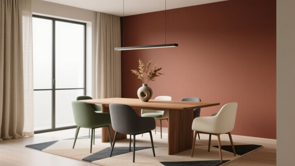
How to Choose Colors for a Dining Room - The Decor Mag
A dining room is where daily routines become rituals—weeknight meals, holiday traditions, long conversations that stretch past dessert. Color has an outsized influence here because it shapes appetite, energy, comfort, and even how long people want to linger at the table. The right dining room paint colors can make a small space feel intimate rather than tight, a formal room feel welcoming rather than stiff, and an open-plan layout feel cohesive instead of chaotic.
Unlike a bedroom that prioritizes rest or a home office that leans toward focus, dining rooms sit at the intersection of mood and performance: you want flattering light on faces, a backdrop that complements food and tableware, and a palette that suits your style—classic, modern, rustic, or eclectic. A smart color scheme also helps define the dining area in a larger great room, giving it presence without needing walls.
This guide breaks down how to choose dining room color schemes using color psychology, lighting, undertones, and practical application tips—plus real room scenarios, paint color recommendations, and the most common mistakes to avoid.
Start With the Feeling You Want (Color Psychology for Dining Rooms)
Color psychology is especially relevant in dining spaces because we experience color while eating, socializing, and entertaining. Begin by choosing the emotional “temperature” of the room, then refine with undertones and finishes.
Warm colors: Inviting, energized, and appetite-friendly
Warm palettes (reds, terracottas, warm neutrals, gold-leaning tans) tend to feel cozy and sociable. They can also subtly boost appetite and conversation.
- Best for: Traditional dining rooms, colder climates, north-facing rooms, and homes that entertain often.
- Try: Benjamin Moore Hale Navy (warm-leaning navy as a sophisticated “warm” alternative), Sherwin-Williams Cavern Clay (grounded terracotta), Farrow & Ball Setting Plaster (soft warm blush-neutral).
Cool colors: Calm, refined, and modern
Cool palettes (blue-greens, blue-grays, some sages) create a composed, airy atmosphere and can feel especially polished in contemporary homes.
- Best for: Sun-drenched south-facing rooms, modern interiors, and dining rooms that double as a workspace.
- Try: Sherwin-Williams Sea Salt (light blue-green), Benjamin Moore Boothbay Gray (blue-gray with presence), Farrow & Ball Green Smoke (moody, elegant green-gray).
Neutrals: Timeless and flexible (but not “safe” by default)
Neutral dining room paint colors can be dramatic, cozy, or crisp depending on undertone and contrast. The key is choosing a neutral that harmonizes with your floors, trim, and adjacent rooms.
- Best for: Open-plan layouts, art-forward homes, frequent decor changes, and anyone building a long-term palette.
- Try: Benjamin Moore Edgecomb Gray (warm greige), Sherwin-Williams Alabaster (creamy off-white), Benjamin Moore Balboa Mist (soft greige that reads calm).
Evaluate the Room Like a Designer (Light, Size, and Sightlines)
1) Understand natural light direction
- North-facing: Light is cooler and can make colors feel grayer. Favor warmer undertones (creamy whites, warm greiges, terracotta, muted warm reds).
- South-facing: Light is warmer and stronger. Many colors work; watch overly warm paints turning yellow. Consider balanced neutrals or cooler tones for calm.
- East-facing: Bright mornings, softer afternoons. A color that looks perfect at 9 a.m. may flatten at dinner. Test in evening light.
- West-facing: Warm, dramatic afternoon/evening light—great for dining. Watch reds/oranges becoming intense. Muted versions often look richer.
2) Consider room size and ceiling height
- Small dining rooms: Mid-tones and deeper colors can be stunning and “jewel box” intimate. Don’t default to white if you want warmth.
- Large dining rooms: You can handle saturation—deep green, navy, charcoal—especially with contrast trim and layered lighting.
- Low ceilings: Use lighter ceiling paint (often a soft white) and consider vertical elements like wainscoting to elongate the walls.
3) Map sightlines to adjacent spaces
Dining room color doesn’t live in isolation. If you can see the kitchen, foyer, or living room, aim for a palette that relates by undertone:
- Warm wood floors pair easily with warm whites, greiges, olives, and clay tones.
- Cool gray floors often prefer cleaner whites, blue-grays, and cooler greens.
- Black/bronze hardware supports moody colors (deep green, charcoal, navy) and crisp whites.
Choose a Color Scheme That Works Every Day
A strong dining room color scheme usually has three layers: a main wall color, a supporting neutral (trim/ceiling), and a contrasting accent (furniture, art, textiles). These classic frameworks make it easier to build a cohesive interior color design.
Scheme 1: Warm neutral walls + deep contrast
- Walls: Sherwin-Williams Accessible Beige or Benjamin Moore Edgecomb Gray
- Trim/Ceiling: Sherwin-Williams Alabaster
- Contrast: Black, oil-rubbed bronze, or dark walnut furniture; consider a deep accent like Benjamin Moore Wrought Iron on built-ins
Best for: Transitional homes, open-plan dining areas, and anyone who wants timeless warmth.
Scheme 2: Moody jewel box (dramatic and flattering)
- Walls: Benjamin Moore Hale Navy or Sherwin-Williams Iron Ore
- Trim: Crisp white like Benjamin Moore Chantilly Lace for a tailored look—or match trim to wall color for modern drama
- Accents: Brass lighting, velvet chair upholstery, oversized art with warm highlights
Best for: Formal dining rooms, evening entertaining, and spaces with great lighting fixtures.
Scheme 3: Soft green and natural textures (fresh but classic)
- Walls: Farrow & Ball Green Smoke or Benjamin Moore Saybrook Sage
- Trim: Creamy white like Sherwin-Williams Alabaster
- Accents: Oak, rattan, linen, stoneware, warm metal finishes
Best for: Farmhouse, cottage, and anyone who wants an organic dining room palette that still feels elevated.
Scheme 4: Modern airy (light walls, bold art, sculptural furniture)
- Walls: Benjamin Moore Balboa Mist or Sherwin-Williams Drift of Mist
- Trim: Benjamin Moore Simply White (soft) or Chantilly Lace (crisp)
- Accents: Matte black, glass, chrome, and a single saturated color (cobalt, rust, emerald) in artwork or upholstery
Best for: Contemporary homes and open dining areas that need brightness without feeling stark.
Paint Color Recommendations (Designer-Approved Favorites)
These dining room paint colors are versatile, widely available, and proven in real homes. Always test swatches in your room’s lighting before committing.
Best warm whites and off-whites
- Sherwin-Williams Alabaster (SW 7008): Soft, creamy, flattering at night.
- Benjamin Moore Simply White (OC-117): Bright but not icy; plays well with warm woods.
- Farrow & Ball School House White (No. 291): A gentle, classic off-white with depth.
Best greige and neutral dining room colors
- Benjamin Moore Edgecomb Gray (HC-173): Warm greige that reads inviting in dining light.
- Sherwin-Williams Agreeable Gray (SW 7029): Balanced, popular, and adaptable (watch undertones with cool floors).
- Benjamin Moore Balboa Mist (OC-27): Calm, slightly cool-leaning greige.
Best blues and blue-grays
- Benjamin Moore Hale Navy (HC-154): Rich and timeless; great for built-ins or full walls.
- Sherwin-Williams Naval (SW 6244): A classic deep navy that feels tailored.
- Benjamin Moore Boothbay Gray (HC-165): Blue-gray with personality, especially under warm bulbs.
Best greens (from soft sage to moody)
- Benjamin Moore Saybrook Sage (HC-114): Warm, traditional, and extremely livable.
- Farrow & Ball Green Smoke (No. 47): Smoky, sophisticated, and stunning in the evening.
- Sherwin-Williams Evergreen Fog (SW 9130): Modern green-gray with a relaxed feel.
Best reds and clays (for warmth without “restaurant red”)
- Sherwin-Williams Cavern Clay (SW 7701): Earthy terracotta that looks designer and grounded.
- Farrow & Ball Setting Plaster (No. 231): A muted blush that reads warm and elegant.
- Benjamin Moore Terra Cotta Tile (2090-30): Saturated warmth best used with strong lighting and neutral upholstery.
Real Room Examples and Application Scenarios
Scenario A: Open-plan dining area next to a white kitchen
Goal: Define the dining zone while keeping a cohesive flow.
- Walls: Benjamin Moore Balboa Mist (soft contrast to white cabinetry)
- Trim: Match kitchen trim color for continuity
- Extra definition: Paint a single feature wall in Benjamin Moore Hale Navy behind a sideboard, or add picture-frame molding in the same wall color
Scenario B: Small dining room that feels flat and forgettable
Goal: Add dimension and intimacy.
- Option 1 (moody): Color-drench walls and trim in Farrow & Ball Green Smoke with a soft sheen for depth.
- Option 2 (warm): Sherwin-Williams Cavern Clay on walls with creamy trim like Alabaster.
- Finishing moves: A large mirror, a statement pendant, and lighter upholstery to keep it from feeling heavy.
Scenario C: Traditional dining room with wainscoting
Goal: Highlight architecture and create a layered color scheme.
- Upper walls: Benjamin Moore Edgecomb Gray
- Wainscoting/trim: Sherwin-Williams Alabaster in semi-gloss
- Ceiling: A soft white one step brighter than trim, or a subtle tint of the wall color for warmth
Scenario D: Modern dining room with minimal decor
Goal: Add visual interest without clutter.
- Walls: Sherwin-Williams Iron Ore or Drift of Mist depending on how bright you want the room
- Contrast: Matte black chairs, warm wood table, and oversized abstract art with one accent color repeated in textiles
Finish, Sheen, and Lighting: The Details That Make Color Work
Pick the right paint sheen
- Walls: Eggshell or satin are common for dining rooms—wipeable and softly reflective.
- Trim and doors: Semi-gloss for durability and crisp contrast.
- Ceiling: Flat or matte to reduce glare.
Use lighting to protect your color choice
Dining rooms are often used at night, so bulb temperature matters as much as paint.
- For warm, flattering ambiance: 2700K bulbs (soft white) with good color rendering (CRI 90+ if possible).
- For cleaner, brighter feel: 3000K bulbs—especially good with modern neutrals and blue-grays.
- Avoid: Mixed bulb temperatures in the same sightline; it can make your paint look inconsistent.
Common Dining Room Color Mistakes to Avoid
- Choosing paint without checking undertones: A “neutral” can flash pink, green, or yellow depending on floors and lighting. Compare your paint sample to a true white paper to spot undertones.
- Forgetting nighttime testing: Many dining rooms are experienced in artificial light. Tape large swatches and view them during dinner hours.
- Going too saturated without balance: Deep colors need relief—lighter upholstery, reflective surfaces, or lighter trim—to keep the room comfortable.
- Ignoring the table and chair colors: Your dining set is a major visual anchor. Ensure your wall color complements the wood tone (warm walnut vs. cool espresso vs. light oak).
- Using stark white everywhere: Bright whites can feel harsh at night and make food look less appealing. Many dining rooms benefit from softer whites or warm greiges.
- Not coordinating with adjacent rooms: In an open layout, clashing undertones are the fastest way to make a home feel disjointed.
Actionable Steps to Choose Your Dining Room Paint Color
- Step 1: Decide the mood: cozy and warm, calm and cool, airy and neutral, or dramatic and moody.
- Step 2: Identify fixed elements: floor tone, dining set finish, countertop/backsplash (if visible), and trim color.
- Step 3: Pick 3–5 contenders and test large swatches (at least 12" x 12") on multiple walls.
- Step 4: Evaluate in changing light: morning, afternoon, and especially evening with your dining fixture on.
- Step 5: Build a simple palette: wall + trim + one accent color repeated 2–3 times (art, rug, curtains, cushions).
FAQ: Choosing Dining Room Colors
What are the best paint colors for a dining room?
Some reliable favorites include Benjamin Moore Edgecomb Gray for warm neutral walls, Sherwin-Williams Alabaster for a soft off-white, Benjamin Moore Hale Navy for a classic moody look, and Farrow & Ball Green Smoke for sophisticated green-gray depth.
Should dining rooms be painted warm or cool?
Warm colors tend to feel more inviting and flattering at night, which suits dining. Cool colors can look refined and calm, especially in bright rooms. Let light direction guide you: north-facing rooms often benefit from warmer undertones; south-facing rooms can handle cooler tones beautifully.
What colors make a dining room look bigger?
Lighter neutrals (soft whites, greiges, light sages) can expand the feel of the room, especially with consistent trim. That said, deep colors can also work in small dining rooms by creating a cohesive “wraparound” effect—particularly when you color-drench walls and trim.
Is a dark dining room color a good idea?
Yes—dark dining room paint colors like Sherwin-Williams Iron Ore or Benjamin Moore Hale Navy can feel luxurious and intimate. Balance them with layered lighting (overhead plus sconces or lamps), reflective elements (mirrors, glass), and lighter textiles.
How do I coordinate dining room paint with a kitchen next to it?
Match undertones rather than exact colors. If the kitchen is a warm white, choose a warm greige, clay, or olive-leaning neutral nearby. If the kitchen is a crisp white with cool stone, consider a blue-gray or cooler green. Keep trim color consistent to unify the spaces.
What paint sheen is best for a dining room?
Eggshell or satin is ideal for most dining room walls: durable, wipeable, and softly reflective. Use semi-gloss on trim for clean contrast and easier maintenance.
Bring Your Color Choice to Life
Choosing dining room colors is part art, part strategy: start with the mood you want, check undertones against your fixed finishes, and test paint samples in both daylight and evening light. Once you land on a wall color, reinforce it with a simple supporting palette—trim, textiles, and one repeating accent—to make the whole room feel intentional.
If you’re ready for the next step, explore more color guides, paint palettes, and room-by-room advice on thedecormag.com.
More Articles
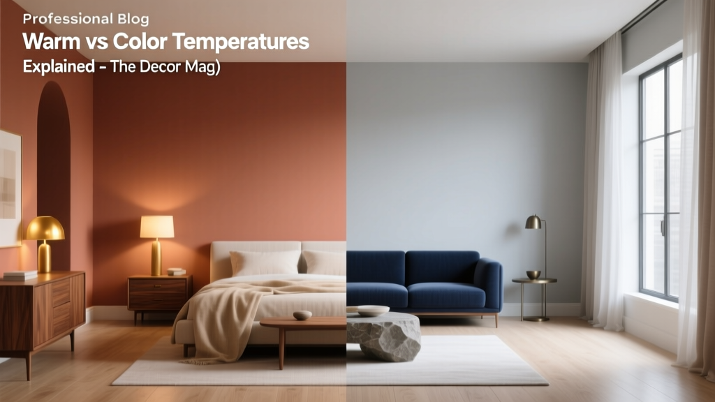 Warm vs Cool Color Temperatures Explained - The Decor Mag
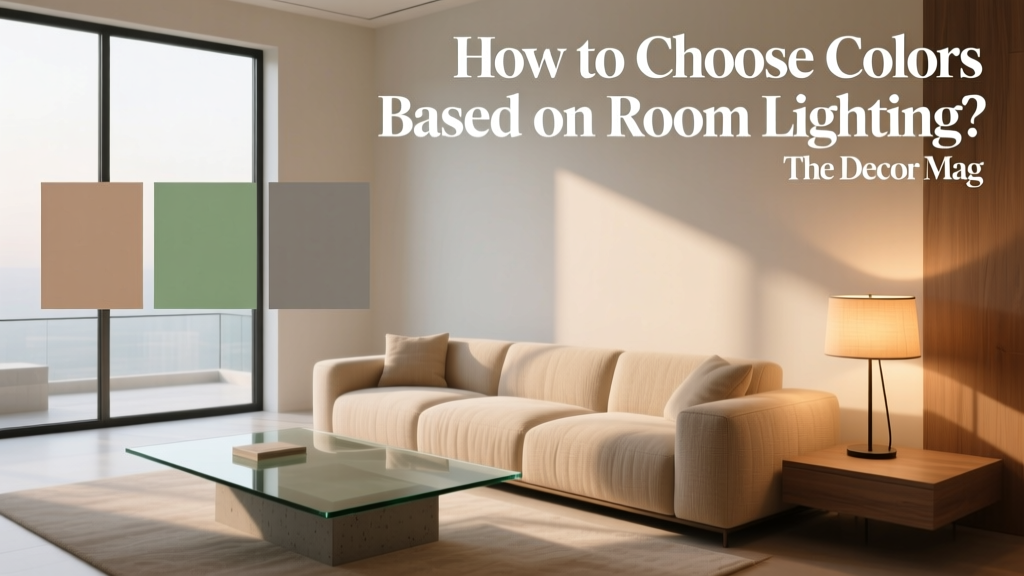 How to Choose Colors Based on Room Lighting - The Decor Mag
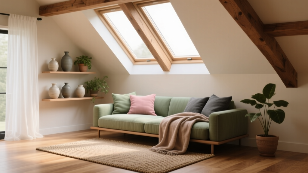 How to Choose Colors for an Attic Room - The Decor Mag
 Best Forest Green Paint Colors - The Decor Mag
 Best Lapis Blue Paint Colors - The Decor Mag
 Best Blue Paint Colors for Every Mood - The Decor Mag
 How to Choose Colors That Complement Artwork - The Decor Mag
 Match Buying Guide: Safety, Performance, and Practical Selection Criteria
 How to Choose Colors for a Craft Room - The Decor Mag
 Earth Tone Color Palette Inspiration - The Decor Mag