Best Dusty Rose Paint Colors - The Decor Mag
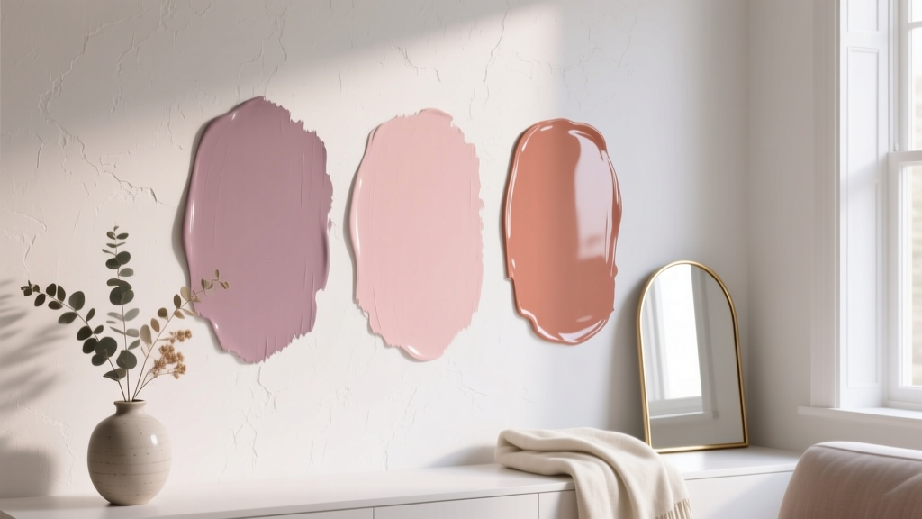
Dusty rose has a rare superpower in interior color design: it reads as both a “color” and a “neutral.” It brings warmth without the intensity of a true pink, and it softens a space without turning sugary or overly romantic. For homeowners who want something more interesting than beige but less assertive than terracotta or fuchsia, dusty rose paint colors land in the sweet spot—grounded, flattering, and surprisingly flexible.
This topic matters because dusty rose behaves differently depending on light, undertones, and surrounding finishes. In one room it can look like a muted blush; in another it can lean mauve, clay, or even a brownish rose. Understanding those shifts helps you choose the right paint color the first time—and create color schemes that feel intentional rather than accidental.
Below, you’ll find curated dusty rose paint color recommendations (with brand references), guidance for pairing them with flooring and materials, real-room application scenarios, and the most common mistakes that make dusty rose look “off.”
What Makes a Paint Color “Dusty Rose”?
Dusty rose sits between pink and beige, usually with muted saturation (that “dusty” effect) and a touch of gray, brown, or taupe. The best dusty rose paint colors feel grown-up because they’re complex—often carrying subtle undertones that tie into modern neutrals.
Typical undertones you’ll see
- Mauve/berry undertones: cooler, slightly purple-leaning rose tones that feel refined and moody.
- Terracotta/clay undertones: warmer, earthier dusty roses that complement natural wood and warm metals.
- Beige/taupe undertones: the most neutral-leaning dusty roses—soft, understated, and easy to live with.
Color psychology: why dusty rose works at home
- Calming and comforting: Soft red-based hues can feel nurturing without overstimulating when muted.
- Flattering in human spaces: Dusty rose casts a gentle glow that tends to look good on skin tones—great for bedrooms, baths, and dressing areas.
- Balances hard surfaces: It counteracts the coolness of stone, concrete, and crisp whites with a quiet warmth.
How to Choose the Right Dusty Rose for Your Room
1) Consider natural light direction
- North-facing rooms: Cooler light can pull mauve or gray from dusty rose. Choose warmer, clay-leaning roses to keep the room from feeling chilly.
- South-facing rooms: Warm light amplifies pink. Pick a more muted, taupe-rose to avoid looking bubblegum.
- East-facing rooms: Morning light can make rose feel fresher; later it may flatten. Mid-tone dusty roses often perform well.
- West-facing rooms: Afternoon light warms and intensifies. Choose a dusty rose with enough gray/brown to stay sophisticated.
2) Match undertones to fixed finishes
- Warm woods (oak, walnut): clay-rose or beige-rose undertones usually harmonize best.
- Cool gray flooring or marble: mauve-leaning dusty roses connect more naturally.
- Brass and aged gold: warm dusty roses look especially elevated.
- Chrome and polished nickel: cooler mauves keep the palette cohesive.
3) Pick your “role”: main wall, accent, or supporting color
Dusty rose can be:
- A whole-room wall color for bedrooms, living rooms, nurseries, and dining rooms.
- An accent color on built-ins, a powder room vanity, or a statement wall.
- A supporting color for ceilings, trim (in a soft color-drench), or adjoining spaces to add warmth.
Best Dusty Rose Paint Colors (Designer-Approved Picks)
These dusty rose paint colors are widely loved for their livability and nuanced undertones. Always sample first—dusty rose is particularly sensitive to lighting and nearby materials.
Warm, Earthy Dusty Roses (clay-leaning)
- Farrow & Ball “Setting Plaster” (No. 231): A soft, earthy pink with a plaster-like warmth. Works beautifully with linen upholstery, light oak floors, and warm whites.
- Farrow & Ball “Pink Ground” (No. 202): A gentle, historically-inspired pink that reads airy rather than sweet. Great for sunlit rooms and traditional millwork.
- Benjamin Moore “First Light” (2102-70): A pale, rosy blush with a soft modern feel—ideal when you want dusty rose energy without strong color depth.
- Sherwin-Williams “Redend Point” (SW 9081): A grounded rosy-beige that behaves like a sophisticated neutral. Excellent for open-concept spaces because it plays well with both warm and cool accents.
Cooler Dusty Roses (mauve-leaning)
- Benjamin Moore “Mauve Desert” (2113-50): A dusty mauve-rose that feels serene and slightly moody. Lovely for bedrooms with crisp white bedding and dark wood nightstands.
- Sherwin-Williams “Chelsea Mauve” (SW 0002): A historic mauve tone that can read dusty rose in many settings. Pairs well with antique brass, walnut, and creamy off-whites.
- Farrow & Ball “Peignoir” (No. 286): A soft gray-rose that can shift toward lilac in cooler light. Beautiful in dressing rooms, bathrooms, and elegant sitting areas.
Dusty Rose Neutrals (taupe-rose and beige-rose)
- Benjamin Moore “Proposal” (AF-260): A muted rose-taupe that feels tailored, not sugary. It’s a strong choice for dining rooms and libraries when you want warmth with maturity.
- Benjamin Moore “Intimate” (AF-55): A cozy, enveloping dusty rose with depth—ideal for a powder room or a den where you want a little drama.
- Sherwin-Williams “Pressed Flower” (SW 6304): A soft, dusty rose that’s approachable and pretty without feeling juvenile. Great for bedrooms and nurseries that need a calming palette.
- Behr “Shipyard” (S190-4) or similar muted rose-taupe tones: Behr offers several rose-taupe shades that work as affordable dusty rose options; look for those described as “muted,” “antique,” or “rose beige.”
Real Room Examples: Where Dusty Rose Shines
Dusty rose bedroom walls: calm, flattering, cocooning
Dusty rose is especially effective in bedrooms because it feels soft at night and warm in the morning. For an elevated look, pair it with tactile neutrals rather than bright white everything.
- Try: Sherwin-Williams “Pressed Flower” on walls + warm white trim + natural linen curtains.
- Finish pairings: light oak furniture, cane details, boucle chairs, brushed brass reading lights.
- Style tip: Add contrast through texture (ribbed bedding, woven throws) and a deeper grounding color like charcoal or espresso.
Dusty rose living room: a “new neutral” that welcomes guests
In a living room, dusty rose reads inviting and curated. It’s a great alternative to greige if you want warmth that still feels modern.
- Try: Farrow & Ball “Setting Plaster” with creamy whites, a tan leather sofa, and black accents.
- Color scheme idea: dusty rose + warm white + camel + matte black + olive greenery.
- Design principle: Balance the softness of rose with a few crisp edges—black frames, structured furniture silhouettes, or graphic rugs.
Dining room dusty rose: romantic without being fussy
Dusty rose in a dining room can feel candlelit and intimate. It pairs beautifully with wood tones and warm metals.
- Try: Benjamin Moore “Proposal” on walls + walnut dining table + aged brass chandelier.
- Pro move: Use a slightly higher sheen (eggshell) for wipeability and a subtle glow in evening light.
Powder room or bathroom: a complexion-friendly glow
Dusty rose in a powder room feels special, and it’s famously flattering in mirror lighting.
- Try: Benjamin Moore “Intimate” for a jewel-box feel with color-drenching (walls + trim in the same shade).
- Pair with: off-white stone, unlacquered brass, and a warm mirror frame.
- Tip: If your bathroom tile is cool gray, shift toward mauve-leaning dusty rose like Farrow & Ball “Peignoir.”
Nursery dusty rose: soothing, timeless, and not “theme-y”
Many homeowners love dusty rose for nurseries because it’s gentle and adaptable—you can change the decor later without repainting.
- Try: Benjamin Moore “First Light” + warm white crib + woven storage + soft sage accents.
- Palette idea: dusty rose + warm white + sage green + natural wood + a touch of soft black in art frames.
Dusty Rose Color Schemes That Always Look Intentional
Pair dusty rose with these go-to neutrals
- Warm whites: creamy off-whites and ivory tones prevent dusty rose from looking icy.
- Soft taupes: creates a seamless, tonal look—great for open floor plans.
- Charcoal and soft black: adds structure and modern contrast without clashing.
Complementary accents for a designer palette
- Sage or olive green: a sophisticated, nature-based pairing that feels relaxed and current.
- Deep teal or smoky blue: adds depth and contrast; perfect for accent chairs or cabinetry.
- Terracotta and rust: warms the palette further for a layered, earthy look.
Metal finishes that elevate dusty rose
- Brass / aged gold: emphasizes warmth and makes dusty rose feel luxe.
- Blackened steel: modern, graphic, and grounding.
- Polished nickel: best with mauve-leaning roses for a cleaner, cooler vibe.
Application Guidance: Sheen, Trim, and Sampling Tips
Recommended sheens by space
- Living rooms & bedrooms: matte or eggshell for softness and easy touch-ups.
- Kitchens & baths: satin or a durable bath formula for moisture resistance and cleanability.
- Trim and doors: satin or semi-gloss in a warm white or a coordinated rose for color-drenching.
Sampling dusty rose the right way
- Test at least two dusty rose options: one warmer and one cooler.
- Paint large swatches (or use peel-and-stick samples) on multiple walls.
- Check color in morning, afternoon, and evening light.
- View next to your flooring, counters, and upholstery—dusty rose is reactive to nearby tones.
Common Dusty Rose Paint Mistakes to Avoid
- Choosing a pink that’s too clean or bright: If the color lacks gray/brown complexity, it can look juvenile. Look for “muted,” “antique,” “dusty,” or “rose beige” descriptors.
- Ignoring undertones in fixed materials: A mauve-leaning dusty rose can fight orange oak; a warm clay-rose can look odd next to cool marble. Match undertones intentionally.
- Pairing with stark, icy whites: High-chroma bright white can make dusty rose look dingy. Choose warm whites or soft off-whites for trim and ceilings.
- Underestimating evening lighting: Warm bulbs intensify rose. If your room relies on ламps at night, test your paint under your actual bulb temperature (2700K–3000K is common).
- Skipping contrast: All-soft-everything can feel washed out. Add contrast through a darker accent (charcoal, espresso, deep green) or black details.
FAQ: Dusty Rose Paint Colors
Is dusty rose a good whole-house color?
It can be, especially a beige-rose or taupe-rose that reads nearly neutral (such as Sherwin-Williams “Redend Point”). For a whole-house scheme, keep adjacent spaces coordinated with warm whites, taupes, and natural wood tones, and reserve deeper dusty rose shades for smaller rooms.
What trim color looks best with dusty rose walls?
Warm white trim is the most reliable. Avoid ultra-cool, blue-white trim unless your dusty rose leans mauve and the rest of your finishes are cool. If you want a modern look, consider color-drenching with the same dusty rose on trim in a slightly higher sheen.
Does dusty rose work with gray flooring?
Yes—choose a dusty rose with mauve or gray undertones (like Farrow & Ball “Peignoir” or a similar muted mauve-rose). Then warm the room with textiles, wood accents, and warmer lighting so it doesn’t feel cold.
How do I keep dusty rose from looking too pink?
Pick a shade with taupe or clay undertones, and build a grounded palette around it: warm whites, camel leather, natural wood, black accents, and greenery. Also check the color under your evening bulbs—warm lighting can push it pinker.
What accent colors go best with dusty rose?
Sage/olive green, charcoal, deep teal, warm taupe, and terracotta are dependable. For a softer look, stay tonal with blush, oatmeal, and warm white; for a bolder look, add black or a deep green.
Is dusty rose a trend, or is it timeless?
Dusty rose has staying power because it behaves like a complex neutral. Like any color, it becomes timeless when paired with classic materials (wood, stone, linen) and a balanced color scheme rather than overly themed decor.
Next Steps: Bring Dusty Rose Home with Confidence
Start by deciding whether you want your dusty rose to read warm and earthy (clay-leaning), cool and moody (mauve-leaning), or neutral and subtle (taupe-rose). Pick two finalists, sample them in your real lighting, and build a simple supporting palette: warm white trim, a grounding contrast color, and one natural texture (wood, linen, jute) to make the scheme feel complete.
If you’re ready for your next color decision—trim whites, whole-house palettes, or the best coordinating greens—explore more color guides on thedecormag.com.
More Articles
 How To Organize Island: A Practical, Space-Smart Guide for Kitchens of All Sizes
 How to Choose Colors for a Music Room - The Decor Mag
 Saturated Colors in Decor: Use Without Overwhelming
 Best Hydrangea Blue Paint Colors - The Decor Mag
 Best Candy Apple Red Paint Colors - The Decor Mag
 Best Citron Paint Colors - The Decor Mag
 Step On A Budget: How to Buy High-Performance Ski Boots Without Breaking the Bank
 Best Purple Paint Colors for Sophistication - The Decor Mag
 How to Choose Exterior House Colors - The Decor Mag
 Best Papaya Paint Colors - The Decor Mag