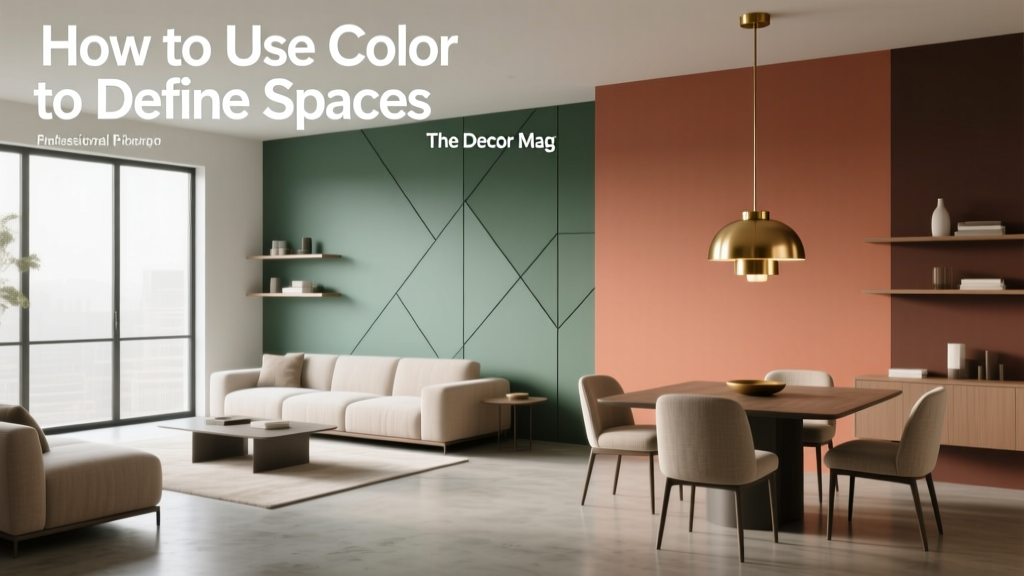
How to Use Color to Define Spaces - The Decor Mag
Open-plan living, multifunctional rooms, and smaller footprints have changed how we “build” spaces at home. When you can’t rely on walls to separate a dining area from a living zone—or a work nook from a bedroom—color becomes one of the most effective tools in interior design. With the right paint colors and color schemes, you can create clear boundaries, guide movement, and give each area its own identity without adding a single partition.
Color also affects how a room feels. Warm hues can make a conversation area feel welcoming and intimate; cool tones can calm a bedroom; higher-contrast palettes can energize a home office. When you combine color psychology with a few design principles—value (lightness/darkness), saturation (intensity), undertone, and contrast—you can shape mood and function while making your home look more cohesive.
This guide breaks down practical, room-by-room ways to use interior color design to define spaces, with paint color recommendations and real-world application scenarios you can try immediately.
Color as a Space-Defining Tool: The Principles That Make It Work
1) Value creates boundaries (light vs. dark)
Value is the fastest way to “draw a line” between zones. A darker value behind a sofa, bed, or dining table visually anchors that area. A lighter value in circulation zones (hallways, paths through an open plan) keeps the overall space feeling open.
- Use darker paint colors to create intimacy (TV wall, reading nook, dining corner).
- Use lighter paint colors to expand and connect (entry-to-living transitions, open walkways).
2) Undertones keep your color scheme cohesive
Two colors can look harmonious on a swatch and clash on the wall if their undertones fight. Match undertones across adjacent zones: warm (yellow/red), cool (blue/green), or neutral-leaning.
- Warm neutral + earthy accent: creamy beige with terracotta, clay, or olive.
- Cool neutral + moody accent: soft gray with deep navy or forest green.
3) Saturation controls energy
Highly saturated colors feel lively and attention-grabbing; muted colors feel calmer and more timeless. In open layouts, a common pro move is to keep large areas muted and reserve saturation for one defining zone.
4) Contrast tells the eye where to “land”
Contrast can be created with color (blue vs. orange), value (light vs. dark), or finish (matte vs. satin). A deliberate contrast point gives a zone purpose—like a dining “moment” or an entry focal wall.
7 Practical Ways to Define Spaces with Paint Color
1) Paint an accent wall that aligns with function
Accent walls work best when they reinforce how the room is used. In an open-plan living/dining area, place the accent behind the dining table to “declare” the dining zone. In a bedroom, anchor the headboard wall.
Paint color ideas (widely available brands):
- Moody blue: Benjamin Moore Hale Navy (HC-154) for a dining zone or office wall.
- Soft green: Sherwin-Williams Sea Salt (SW 6204) for a calm reading corner.
- Deep green: Farrow & Ball Green Smoke for a library feel in a living area.
- Warm terracotta: Benjamin Moore Terra Cotta Tile (2090-30) to warm up a breakfast nook.
Application scenario: Your living room and dining area share the same rectangle. Paint the dining wall in Hale Navy, keep the rest in a warm white, and add a rug under the dining table. The color signals “this is a destination,” even without walls.
2) Use color blocking to create “architectural” zones
Color blocking—painting a large shape (rectangle, arch, or wide stripe)—creates the illusion of built-in structure. It’s especially useful in rentals or spaces with awkward proportions.
- Paint a large rectangle behind a desk to define a home office zone.
- Create a painted arch behind a console to set an entry moment.
- Try a half wall (two-tone) to add a visual “horizon line” that separates functions.
Color pairings that read intentional:
- Benjamin Moore White Dove (OC-17) + Sherwin-Williams Urbane Bronze (SW 7048)
- Sherwin-Williams Alabaster (SW 7008) + Benjamin Moore Saybrook Sage (HC-114)
- Farrow & Ball Skimming Stone + Farrow & Ball Railings
Tip: If you’re painting a block behind furniture, make it slightly larger than the piece—about 6–10 inches wider on each side—so it looks deliberate rather than “missed.”
3) Create flow with a consistent neutral, then shift accents by zone
One of the easiest interior color design strategies for open-plan homes: choose a single neutral for the majority of walls, then define zones with targeted color on trim, built-ins, or one key wall per area. This keeps your color scheme cohesive and avoids choppiness.
Reliable neutrals to consider:
- Benjamin Moore Classic Gray (OC-23): bright, soft, and flexible.
- Sherwin-Williams Alabaster (SW 7008): warm white that doesn’t feel stark.
- Benjamin Moore Edgecomb Gray (HC-173): a warm greige for cozy open spaces.
Application scenario: Paint most walls in Alabaster. Add a muted green built-in (like Saybrook Sage) in the living area and a deep blue buffet wall (like Hale Navy) in the dining area. The house reads unified, but every zone has a clear identity.
4) Use paint sheen to subtly separate areas
You can define space without changing color at all by changing sheen. A matte finish reads soft and architectural; satin reflects more light and feels “cleaner.”
- Matte in living and bedrooms for a calm, velvety look.
- Satin or eggshell in kitchens, hallways, mudrooms for wipeability.
Pro move: Paint one zone’s wall in the same color but a different finish (matte vs. eggshell). It creates a gentle shift that’s especially good for minimalists.
5) Anchor a zone with a darker “envelope”
Painting walls (and sometimes the ceiling) in a deeper hue creates a room-within-a-room effect. This is powerful for defining a lounge area inside a larger open plan, or making a bedroom feel cocoon-like.
Best colors for the enveloping look:
- Benjamin Moore Kendall Charcoal (HC-166): sophisticated and grounding.
- Sherwin-Williams Iron Ore (SW 7069): a soft black that reads modern.
- Farrow & Ball Down Pipe: moody without feeling flat.
Application scenario: In a long living room, paint the “conversation end” (the last 8–10 feet) in Iron Ore and keep the rest light. Add a warm lamp and textured rug. The dark zone feels intentionally intimate and visually “stops” the room from feeling like a hallway.
6) Define the ceiling plane to separate function
Ceilings are a missed opportunity in paint color planning. Painting a ceiling over a specific area—like the dining table—creates a canopy effect and subtly separates that function.
- Try a soft tint (pale blue-gray or warm beige) to avoid heaviness.
- Extend the ceiling color down 6–12 inches onto the wall for an ultra-finished look.
Color idea: A dining ceiling in Benjamin Moore Palladian Blue (HC-144) paired with warm white walls can add definition while keeping the room airy.
7) Use trim and doors as “zone markers”
Painting trim or doors in a distinct color is an elegant way to define spaces—particularly in older homes with lots of transitions, or in hallways where you want rhythm and personality.
Trim/door colors that work across styles:
- Sherwin-Williams Tricorn Black (SW 6258): crisp, graphic, timeless.
- Benjamin Moore Simply White (OC-117): clean trim that flatters many wall colors.
- Farrow & Ball Hague Blue: rich for statement doors and built-ins.
Real Room Examples: Color Schemes That Define Space
Open-plan living + dining: Cozy living, dramatic dining
- Main wall color: Sherwin-Williams Alabaster (SW 7008)
- Dining zone accent: Benjamin Moore Hale Navy (HC-154)
- Living zone accent (optional): Benjamin Moore Saybrook Sage (HC-114) on built-ins
- Palette tip: Tie zones together with repeated metals (brass) and shared textiles (natural linen).
Studio apartment: Sleep zone separation without walls
- Sleep zone “envelope”: Farrow & Ball Green Smoke on the bed wall and adjacent return
- Remaining walls: Benjamin Moore Classic Gray (OC-23)
- Ceiling: keep light to preserve height unless you want extra coziness
- Layout tip: Extend the green 18–24 inches beyond the bed width to create a defined “room” effect.
Kitchen + breakfast nook: Fresh and friendly
- Kitchen walls: Benjamin Moore White Dove (OC-17)
- Nook color block: a warm clay like Benjamin Moore Terra Cotta Tile (2090-30)
- Cabinet contrast: Sherwin-Williams Urbane Bronze (SW 7048) on lower cabinets or island
- Psychology: warm clay tones encourage appetite and conversation; a grounded bronze adds sophistication.
Bedroom + work corner: Calm sleep, focused work
- Bedroom walls: Sherwin-Williams Sea Salt (SW 6204)
- Desk zone rectangle: Sherwin-Williams Iron Ore (SW 7069) in a matte finish
- Balance tip: Keep the desk color confined to the work area so the room still feels restful.
Common Color Mistakes to Avoid
- Choosing colors in isolation. Always test paint colors next to flooring, upholstery, and fixed finishes. Undertones change dramatically in context.
- Using too many “statement” colors in one sightline. In open plans, limit strong colors to one or two anchors. Let neutrals and textures do the connecting.
- Ignoring lighting direction. North-facing rooms skew cooler (colors look grayer); south-facing rooms warm up (colors look creamier). Sample in morning and evening.
- Forgetting the transition spaces. Hallways and entries need a plan. Use them as neutral connectors or intentional moments (like colored doors or a ceiling tint).
- Overusing high-contrast edges. Hard lines everywhere can feel busy. Mix crisp boundaries (accent wall) with softer transitions (related tints, shared undertones).
- Picking the wrong white. A stark white can look icy next to warm wood; a creamy white can look yellow next to cool gray tile. Compare whites side by side before committing.
Practical Tips for Getting Color Right (Without Guesswork)
- Start with what you can’t change: flooring, countertops, major furniture. Pull undertones from those elements.
- Choose a base neutral: one wall color that can flow through multiple areas.
- Assign colors by function: calming hues for rest, energizing hues for activity, grounding hues for gathering.
- Sample properly: use peel-and-stick samples or paint large poster boards; move them around the room.
- Repeat each color at least twice: a dining wall color can reappear in art, pillows, or a nearby rug to create cohesion.
- Use the 60-30-10 guideline: 60% dominant (usually walls), 30% secondary (upholstery/rugs), 10% accent (art, accessories) for balanced color schemes.
FAQ: Using Color to Define Spaces
What are the best paint colors for open-plan spaces?
Look for versatile neutrals for the majority of walls—Benjamin Moore Classic Gray, Sherwin-Williams Alabaster, or Benjamin Moore Edgecomb Gray. Then define zones with deeper accents like Benjamin Moore Hale Navy or Sherwin-Williams Iron Ore on one strategic wall or built-in.
How do I make two connected rooms feel separate but cohesive?
Use one shared element across both rooms (a base wall color or matching trim), then change one variable to create separation—an accent wall color, a ceiling tint, or a shift from warm to cool within the same saturation level. Keeping undertones aligned is what prevents visual clash.
Should accent walls be lighter or darker than the other walls?
Darker accent walls are usually more effective at defining a zone because they visually “pull” the eye and create a focal point. Lighter accent walls can work when the surrounding area is already deep or when you’re using subtle color blocking rather than a bold statement.
How can I define a home office in a living room using color?
Paint a large rectangle or full wall behind the desk in a focused, grounding shade like Sherwin-Williams Urbane Bronze or Benjamin Moore Kendall Charcoal. Keep the rest of the living room lighter. Add task lighting and a distinct rug to reinforce the boundary.
What color schemes make small homes feel bigger while still defining zones?
Use a light, consistent base (warm white or soft greige) and define spaces with low-to-medium contrast accents—muted greens, dusty blues, or soft charcoals. Overly saturated color everywhere can shrink a small home, but targeted accents add structure without visual clutter.
How many colors should I use in one open space?
A reliable approach is 2–4 total: one main wall color, one or two zone-defining accents, and a trim color. If your space has strong finishes (brick, wood beams, patterned tile), treat those as part of the palette and simplify the paint choices.
Next Steps: Build Your Color Plan with Confidence
Choose a base neutral that supports your home’s fixed finishes, then decide which areas need definition: dining, lounging, working, sleeping, or entry. Use value and contrast to create boundaries, keep undertones consistent for flow, and test your paint colors in real lighting before you commit. A few well-placed color moves can make even the most open layout feel organized, intentional, and personal.
For more paint color ideas, color psychology insights, and room-by-room color schemes, explore our latest color guides on thedecormag.com.
More Articles
 Best Steel Blue Paint Colors - The Decor Mag
 How to Choose Colors for Kitchen Cabinets - The Decor Mag
 How to Choose Colors for a Loggia - The Decor Mag
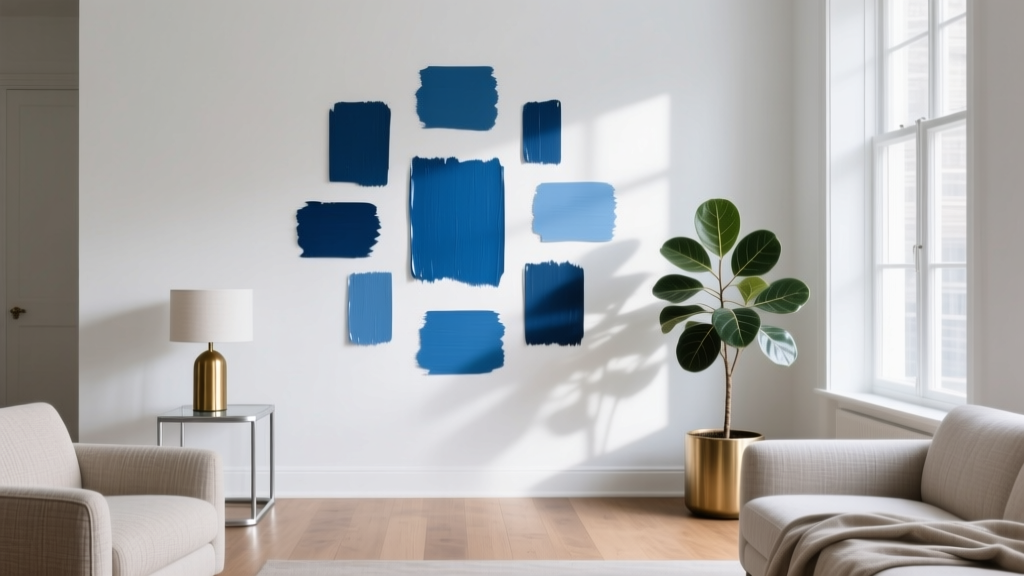 Best Cerulean Blue Paint Colors - The Decor Mag
 Fluted vs Headboard: Understanding the Structural, Aesthetic, and Functional Differences
 How to Use Color to Create Grandeur - The Decor Mag
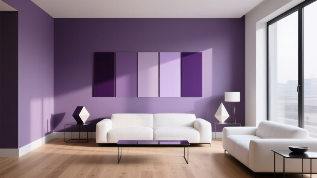 Best Purple Paint Colors for Sophistication - The Decor Mag
 Best Peach Paint Colors for Warmth - The Decor Mag
 Best Gray Paint Colors for 2026 - The Decor Mag
 Best Olive Green Paint Colors (2026) | The Decor Mag