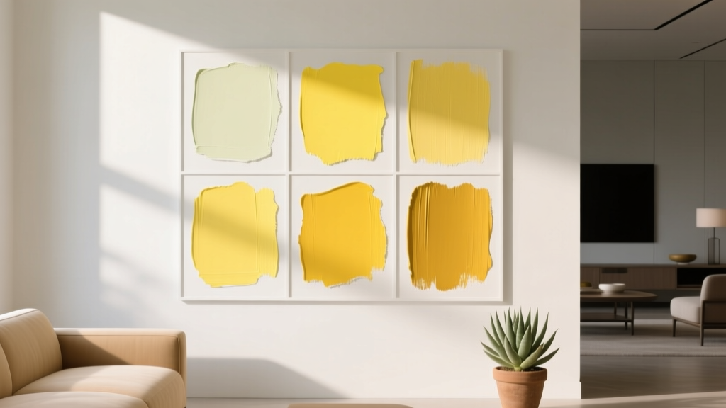
Best Citron Paint Colors - The Decor Mag
Citron is one of those rare paint colors that can feel both energetic and elegant—fresh like citrus peel, but grounded enough to read as a sophisticated yellow-green. When used thoughtfully, citron brightens dark corners, lifts neutral palettes, and gives a room a “designed” look without relying on bold patterns or heavy décor. It’s especially appealing for homeowners who want color that feels optimistic and modern, not sugary or overly primary.
From a color psychology perspective, citron sits between yellow (warmth, cheer, creativity) and green (balance, restoration, nature). That blend makes citron a powerful tool in interior color design: it can make kitchens feel sunlit, home offices feel inventive, and entryways feel welcoming. The key is choosing the right citron paint color—some lean greener, some read more golden—and placing it where the undertones work with your flooring, textiles, and light.
This guide breaks down the best citron paint colors across major paint brands, how to use citron in real rooms, and the color schemes that make it look intentional rather than accidental.
What Is Citron, Exactly? Undertones, Light, and Why It’s Tricky
Citron is typically a high-chroma yellow-green. Depending on the formula, it may show:
- Green-leaning citron: fresher, slightly sharper, can feel more contemporary
- Yellow-leaning citron: sunnier, friendlier, often easier in traditional homes
- Muted citron: softened with gray or brown, more livable for large surfaces
Because citron is sensitive to lighting, always consider:
- North-facing rooms: cooler light can push citron greener and slightly more intense
- South-facing rooms: warm light can pull out the yellow and make it glow
- LED bulbs: “daylight” bulbs emphasize green; warm bulbs emphasize yellow
Design principle to remember: high-chroma colors look stronger on walls than on a swatch. If you love citron but fear overwhelm, pick a slightly muted version or use it as an accent.
Best Citron Paint Colors (By Brand)
Below are designer-favorite citron and citron-adjacent paint colors—ranging from vibrant accent choices to softer, more livable options. Always test with a large sample (at least 12"x12") in multiple parts of the room.
Benjamin Moore Citron & Yellow-Green Favorites
- Benjamin Moore Citron (2018-30): A classic bright citron with a clear yellow-green personality. Best as an accent wall, cabinetry, or a playful powder room.
- Benjamin Moore Wild Lime (2032-30): More electric and punchy than a true citron—great for modern spaces, kids’ rooms, or a pop on built-ins.
- Benjamin Moore Chartreuse (2024-10): A bolder chartreuse that can read “designer-luxury” when paired with deep navy, black, or walnut.
- Benjamin Moore New Lime (2027-10): A zesty yellow-green that works best where you want unmistakable energy—think bar nook or creative studio.
Sherwin-Williams Citron & Lively Yellow-Greens
- Sherwin-Williams Citronella (SW 6915): Bright, sunny, and spirited. Strong color payoff—best for doors, furniture, or small rooms you want to feel upbeat.
- Sherwin-Williams Lime Granita (SW 6715): A crisp, juicy yellow-green that leans modern. Excellent for accent walls with warm white trim.
- Sherwin-Williams Dancing Green (SW 6716): Slightly more green-forward; works beautifully in sunrooms and plant-filled spaces.
- Sherwin-Williams Relish (SW 6443): A deeper, earthier yellow-green that can read more sophisticated and grounded, especially with brass and natural wood.
Farrow & Ball Options for a Designer Citron Mood
- Farrow & Ball Citron (No. 74): A warm, slightly softened citron that feels curated rather than neon. Beautiful in historic homes when paired with chalky whites and dark woods.
- Farrow & Ball Yeabridge Green (No. 287): Not a true citron, but a related yellow-green that’s more subdued for larger rooms and calmer palettes.
Behr Citron-Adjacent Picks for Bright, Affordable Impact
- Behr Retro Avocado (MQ6-12): A midtone yellow-green with vintage warmth—excellent for kitchen cabinetry or a retro-inspired laundry room.
- Behr Pineapple Cream (M320-2): A gentler, more yellow-leaning option that hints at citron without going fully saturated.
How to Use Citron in Real Rooms (Application Scenarios)
1) Citron in Kitchens: Cabinets, Islands, and Breakfast Nooks
Citron shines in kitchens because it plays well with daylight, plants, and reflective surfaces. For a modern, high-end look, consider citron on a single focal element rather than every wall.
Best approaches:
- Kitchen island in citron: Pair with white perimeter cabinets and warm hardware (brass or champagne bronze).
- Breakfast nook banquette: Citron upholstery or painted built-in seating adds personality without overwhelming.
- Lower cabinets only: Keep uppers white to reduce visual weight.
Example color scheme:
- Island: Benjamin Moore Citron (2018-30)
- Perimeter cabinets: warm white (think creamy, not icy)
- Counters: white quartz with subtle warm veining
- Accents: walnut stools, brass pendants, clear glass
2) Citron in Living Rooms: The Accent Wall That Doesn’t Feel Trendy
If you love the idea of a citron living room but want longevity, treat citron like a “jewelry tone”—a controlled pop against elevated neutrals.
- Accent wall behind built-ins: A citron back panel makes books and ceramics stand out.
- Fireplace surround: Works especially well in contemporary spaces with clean lines.
- Color-blocked alcove: Paint the recess in citron and keep the surrounding walls warm white.
Example palette: Sherwin-Williams Lime Granita (SW 6715) + creamy off-white walls + black metal + natural oak.
3) Citron in Bedrooms: Fresh, Not Fluorescent
Bedrooms do best with slightly softened citron or citron used in smaller doses. Too much saturation can feel overly stimulating for rest.
Try citron here:
- On a single wall behind the headboard
- On trim in a playful guest room (with white walls)
- On a dresser or nightstands for a “collected” look
Soothing citron pairing ideas:
- Citron + warm ivory + light oak + linen
- Citron + dusty blue + soft white + brushed brass
- Citron + clay/terracotta accents for earthy balance
4) Citron in Bathrooms and Powder Rooms: High Style in Small Spaces
Small rooms are where citron can go bold and feel intentional—especially in powder rooms with statement mirrors and lighting.
- All-over citron walls with crisp white trim and a graphic floor tile
- Citron vanity with marble-look counters and brass hardware
- Citron ceiling for a surprise effect (especially with white walls)
Real-room look: Farrow & Ball Citron (No. 74) on walls + black-framed mirror + warm sconce lighting + white pedestal sink.
5) Citron in Home Offices and Creative Studios: Color That Sparks Ideas
Yellow-green hues are associated with creativity and mental clarity. Citron can make a home office feel upbeat, especially when balanced with calm neutrals.
- Paint the wall behind your desk in citron for an energizing Zoom background
- Use citron on built-in shelving to highlight storage and décor
- Pair with matte black, walnut, or deep navy for a professional edge
Citron Color Schemes That Always Work
Citron tends to look best when it has a strong supporting cast. These combinations create cohesive interior color design and prevent citron from feeling random.
Citron + Warm White (Clean, Classic, Bright)
- Use warm white walls and citron accents for an airy, timeless feel.
- Best for: kitchens, hallways, open-concept spaces
Citron + Navy (Bold, Tailored, High Contrast)
- Navy anchors citron and gives it a sophisticated, almost preppy confidence.
- Best for: living rooms, offices, dining rooms
Citron + Charcoal or Black (Modern, Gallery-Like)
- Charcoal trims the brightness and makes citron feel intentional and graphic.
- Best for: powder rooms, contemporary spaces, accents like doors
Citron + Natural Wood + Rattan (Organic, Relaxed)
- Wood tones make citron feel more “botanical” and less acidic.
- Best for: sunrooms, kitchens, family rooms
Citron + Blush or Terracotta (Warm, Artistic, Unexpected)
- Warm pink-clays soften citron and add a curated, European feel.
- Best for: bedrooms, eclectic living spaces
Choosing the Right Finish for Citron Paint Colors
- Matte/flat: Softens bright citron and hides wall texture; best for bedrooms and living areas.
- Eggshell: Great all-purpose choice for walls; easier to clean while staying refined.
- Satin: Ideal for kitchens, baths, and trim when you want durability and gentle sheen.
- Semigloss: Use sparingly (doors, trim) for a crisp, high-contrast look—especially striking in citron.
Common Citron Paint Mistakes (and How to Avoid Them)
-
Picking citron without checking undertones in your lighting.
Fix: sample on multiple walls and view morning, afternoon, and nighttime under your actual bulbs. -
Using citron on all walls in a large, open space.
Fix: try one focal wall, an island, or built-ins; let neutrals do the heavy lifting elsewhere. -
Pairing citron with the wrong white.
Fix: avoid icy, blue whites unless you want a sharper, greener look. Choose a warm white to keep citron friendly. -
Ignoring fixed finishes (countertops, tile, flooring).
Fix: if you have cool gray tile, pick a greener citron; if you have warm wood, a yellow-leaning citron usually harmonizes better. -
Forgetting balance and repetition.
Fix: echo citron in at least 2–3 places—art, pillows, a vase, a lampshade—so the scheme feels cohesive.
Practical Tips for Sampling Citron Paint Like a Pro
- Go bigger than a tiny chip: paint a poster board or use peel-and-stick samples; move them around the room.
- Compare two to three citrons at once: one greener, one yellower, one muted—undertones become obvious side by side.
- Check against textiles: hold the sample next to your sofa fabric, rug, and window treatments.
- Account for sheen: citron in satin looks brighter than citron in matte.
FAQ: Citron Paint Colors
Is citron the same as chartreuse?
They’re close. Chartreuse often reads bolder and slightly sharper, while citron can be a touch softer or more lemony depending on the formula. Many brands use the terms interchangeably, so rely on undertone and intensity rather than the name alone.
What colors go best with citron paint?
Warm whites, navy, charcoal, black, natural wood tones, and muted terracotta or blush are consistent winners. For a calmer look, pair citron with soft greige and linen textures; for a modern look, add black accents and clean lines.
Will citron make my room look bigger or smaller?
In moderation, citron can make a room feel brighter and more expansive by reflecting light. In very saturated versions across all walls, it may feel visually “loud” and closer. Using citron on one wall, cabinetry, or built-ins usually gives the best spacious effect.
Is citron a good color for resale?
Citron is more personal than standard neutrals, but it can still be resale-friendly when used as an accent (front door, powder room, island) rather than the main wall color throughout the home.
How do I keep citron from looking neon?
Choose a slightly muted citron, use a matte or eggshell finish on walls, and ground it with deeper tones like navy, charcoal, or walnut. Also avoid cool “daylight” bulbs if you’re seeing an overly green cast.
Where is the easiest place to start with citron?
Start small: a front door, a piece of furniture, a pantry, or a bathroom vanity. You’ll get the uplift of citron without committing to a full room.
Actionable Next Steps for Using Citron at Home
- Pick your citron goal: energizing accent, sunny statement, or softened yellow-green backdrop.
- Choose 2–3 contenders: for example, Benjamin Moore Citron (2018-30), Sherwin-Williams Citronella (SW 6915), and Farrow & Ball Citron (No. 74).
- Test in your lighting: morning and evening, with the bulbs you actually use.
- Build a simple color scheme: citron + warm white + one grounding dark (navy/charcoal) + natural material (wood/rattan).
- Repeat the color: bring citron into art, textiles, or accessories so it feels intentional.
If citron is calling your name, trust it—it’s one of the quickest ways to bring life, personality, and a designer edge to a space. For more paint color ideas, undertone breakdowns, and room-by-room color schemes, explore the latest color guides on thedecormag.com.
More Articles
 Best Brown Paint Colors for Cozy Rooms - The Decor Mag
 Best Black Paint Colors for Dramatic Spaces - The Decor Mag
 Match Buying Guide: Safety, Performance, and Practical Selection Criteria
 How to Create a Contemporary Color Palette - The Decor Mag
 Best Dusty Rose Paint Colors - The Decor Mag
 How to Choose Colors for South-Facing Rooms - The Decor Mag
 Best Cherry Red Paint Colors - The Decor Mag
 Best Steel Blue Paint Colors - The Decor Mag
 Best Cream Paint Colors for Warm Neutrals - The Decor Mag
 How to Choose Colors Based on Room Lighting - The Decor Mag