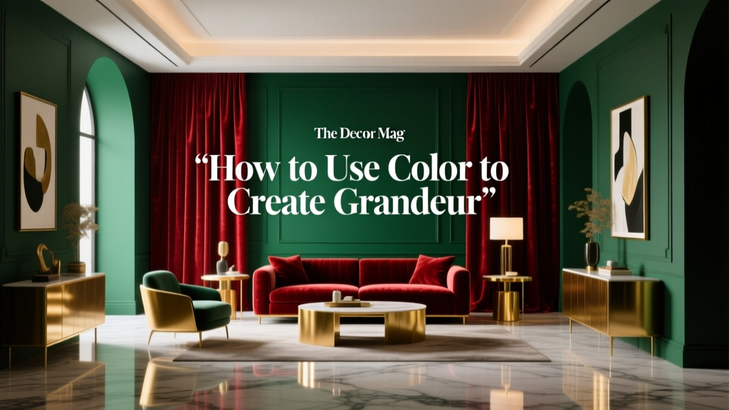
How to Use Color to Create Grandeur - The Decor Mag
Grandeur isn’t only about square footage or soaring ceilings. Some of the most majestic interiors feel that way because of color: the way it expands space, directs the eye, heightens contrast, and makes everyday architecture read as intentional and elevated. Color is one of the fastest ways to make a home feel collected, high-end, and memorable—without changing the footprint.
When people think “grand,” they often picture deep jewel tones, glossy trim, and dramatic chandeliers. Those can help, but grandeur is really a set of design principles: scale, contrast, cohesion, and a clear focal point. Interior color design brings all of those together. The right paint colors can lift a ceiling, elongate walls, make a hallway feel like a gallery, and give a dining room the glow of a historic home.
Below you’ll find practical, room-by-room strategies, paint color recommendations, and real application scenarios. Use these ideas to build a confident color scheme—one that feels dramatic when you want it to, and calm when you don’t.
What “Grandeur” Means in Color Terms
Grandeur is a visual experience. You can create it by shaping what the eye notices first, how far it travels, and what it remembers. In paint and color schemes, that often comes down to four moves.
1) Contrast that feels intentional
High contrast reads as bold and architectural—think light walls with dark trim, or a deep wall color with a crisp ceiling. The key is clarity: clean edges, consistent undertones, and repeatable choices across the home.
2) Saturation that’s placed strategically
Highly saturated colors (jewel tones, inky blues, true charcoals) feel luxurious when balanced by breathing room—lighter adjacent surfaces, reflective metals, or soft textiles.
3) Undertone harmony
Grandeur often fails when undertones fight. A warm creamy white next to a cool blue-gray can look accidental. When undertones align—warm with warm, cool with cool—the space reads more “designed.”
4) A deliberate sheen plan
Paint finish influences how light moves. Grandeur loves luminous surfaces, but not necessarily high gloss everywhere. Use sheen like you’d use jewelry: a few well-placed highlights elevate the whole.
- Ceilings: flat or matte for softness, or a subtle pearl for gentle lift
- Walls: matte or eggshell for depth and sophistication
- Trim/doors: satin or semi-gloss for crispness
Color Psychology: The Emotions Behind Grand Spaces
Color psychology isn’t about rigid rules; it’s about predictable human responses to hue, value (lightness), and saturation. Grandeur tends to combine calm with a sense of occasion.
- Deep blues signal stability and confidence (great for libraries, dining rooms, primary bedrooms).
- Greens feel restorative and “estate-like,” especially when muted or mossy (ideal for living rooms and kitchens).
- Warm whites and creams feel welcoming and timeless (perfect for grand entries and open plans).
- Charcoal and near-black create drama and frame views (excellent for trim, built-ins, or a single enveloping room).
- Soft terracottas and clay tones add richness without heaviness (beautiful in hallways, dens, and dining rooms).
Core Strategies to Create Grandeur with Paint Colors
Use a “light-to-deep” hierarchy
Grand interiors rarely have random color placement. They usually follow a hierarchy: lighter and reflective where you want expansion, deeper where you want intimacy or focus.
- Ceiling: lightest (often a clean white)
- Walls: mid-tone or deep (depending on mood)
- Trim/doors: either crisp bright white for contrast or a deeper tone for a tailored look
Paint color ideas:
- Ceiling white: Benjamin Moore Chantilly Lace (OC-65) for a crisp, modern grand feel; Sherwin-Williams Pure White (SW 7005) for a softer, versatile white.
- Elegant wall neutrals: Benjamin Moore Classic Gray (OC-23) for airy sophistication; Farrow & Ball Ammonite for a refined, contemporary gray-beige balance.
Try color-drenching for instant drama
Color-drenching (painting walls, trim, and sometimes ceiling in the same color) creates a seamless, gallery-like effect that reads expensive and architectural. It’s especially effective in smaller rooms where contrast can feel choppy.
Best rooms for color-drenching:
- Powder rooms
- Libraries and dens
- Dining rooms
- Moody bedrooms
Grand color-drench picks:
- Deep blue-green: Farrow & Ball Hague Blue (dramatic, heritage feel)
- Velvety charcoal: Benjamin Moore Wrought Iron (2124-10) (rich without feeling flat)
- Classic olive: Sherwin-Williams Ripe Olive (SW 6209) (library-worthy warmth)
Use dark trim like architecture
White trim is timeless, but dark trim can create a tailored “grand estate” impression—especially in homes with tall baseboards, crown molding, or paneled doors. The trick is to keep the wall color quieter so trim reads as a frame.
Pairing ideas:
- Walls: Benjamin Moore Pale Oak (OC-20) + Trim/doors: Benjamin Moore Wrought Iron (2124-10)
- Walls: Sherwin-Williams Alabaster (SW 7008) + Trim/doors: Sherwin-Williams Iron Ore (SW 7069)
Make ceilings feel higher with paint placement
If you want a room to feel taller, use color to pull the eye upward. A small shift in where paint stops can change proportions dramatically.
- Paint the crown molding the same color as the ceiling to “erase” the ceiling line and lift height.
- Extend wall color 2–6 inches onto the ceiling (a halo effect) for a custom, designer look.
- Use a slightly lighter ceiling than the walls in the same undertone family to maintain cohesion.
Example combo: Walls in Benjamin Moore Boothbay Gray (HC-165) with a ceiling in Benjamin Moore Chantilly Lace (OC-65) for a crisp, airy lift.
Room-by-Room Color Schemes That Feel Grand
Grand Entryway: Make the first 10 seconds count
Entryways thrive on clarity and contrast. A warm white with a deep accent (door, stair railing, or console wall) gives instant polish.
Scenario: A medium-size foyer with a staircase and limited natural light.
- Walls: Sherwin-Williams Alabaster (SW 7008) for warmth and softness
- Stair rail/trim accent: Sherwin-Williams Tricorn Black (SW 6258) in satin
- Ceiling: Sherwin-Williams Pure White (SW 7005)
Why it works: Warm white feels welcoming; black adds graphic structure, making the space feel intentional and upscale.
Living Room: Estate calm with layered neutrals
A grand living room isn’t always dark; it’s often nuanced. Choose a complex neutral, then add depth through textiles, art, and a deeper adjacent color.
Scenario: Open-plan living room connected to a kitchen.
- Walls: Benjamin Moore Balboa Mist (OC-27) for a refined greige
- Trim: Benjamin Moore Simply White (OC-117) for a creamy, classic contrast
- Optional built-ins: Benjamin Moore Hale Navy (HC-154) for a focal point
Grandeur tip: Repeat the built-in color in small accents (pillows, a lamp base, framed art mats) to create a cohesive color scheme across the room.
Dining Room: Moody color + warm light = instant luxury
Dining rooms are made for drama. Deeper paint colors reduce visual noise and make candlelight and pendants glow.
Scenario: A standard-height dining room with wainscoting.
- Walls (above and below wainscoting): Farrow & Ball Railings (deep blue-black) for a velvety, formal mood
- Ceiling: Keep it the same for a cocooning effect, or use a softer white like Benjamin Moore White Dove (OC-17) for contrast
- Metal finishes: aged brass or antique bronze amplify warmth
Grandeur tip: If you color-drench, use a slightly higher sheen on trim (satin) than walls (matte) to add dimension without introducing a second color.
Kitchen: Grand doesn’t mean bright-white everything
Kitchens can feel grand through contrast and grounded color—especially on cabinetry or islands.
Scenario: White perimeter cabinets with an island and pantry wall.
- Island/pantry cabinetry: Sherwin-Williams Evergreen Fog (SW 9130) for a modern, upscale green-gray
- Walls: Benjamin Moore White Dove (OC-17) to keep the room luminous
- Optional dramatic island alternative: Benjamin Moore Hale Navy (HC-154) with unlacquered brass hardware
Grandeur tip: Match your undertones: if your countertops lean warm (cream, gold, brown veining), choose warmer whites and greens; if they lean cool (gray veining), keep whites crisper.
Bedroom: Grandeur as serenity
For bedrooms, grandeur often means “hotel calm” with depth. Mid-to-deep colors create a restful envelope that feels designed.
Scenario: A bedroom with average light and upholstered headboard.
- Walls: Benjamin Moore Kensington Blue (840) or Boothbay Gray (HC-165) for a calm, upscale blue
- Trim: Benjamin Moore Chantilly Lace (OC-65) for crisp definition
- Accent idea: Paint the ceiling a whisper tint of the wall color (10–25% lighter) for a taller, softer look
High-Impact Color Combinations That Read Luxurious
These pairings work because they balance contrast, undertone harmony, and value shift (light vs. dark). Use them as whole-room schemes or as anchors for your paint palette.
- Cream + Ink: Sherwin-Williams Alabaster (SW 7008) + Sherwin-Williams Iron Ore (SW 7069)
- Greige + Navy: Benjamin Moore Balboa Mist (OC-27) + Benjamin Moore Hale Navy (HC-154)
- Warm white + Olive: Benjamin Moore White Dove (OC-17) + Sherwin-Williams Ripe Olive (SW 6209)
- Soft gray + Black: Farrow & Ball Ammonite + Sherwin-Williams Tricorn Black (SW 6258)
- Stone + Bronze-charcoal: Benjamin Moore Pale Oak (OC-20) + Benjamin Moore Wrought Iron (2124-10)
Common Color Mistakes That Undercut Grandeur
Even expensive furnishings can look less elevated when paint choices are off. These are the most common pitfalls in interior color design—and the fixes.
- Mistake: Choosing paint colors from a tiny chip under store lighting.
Fix: Test large swatches (at least 12x12) on multiple walls and observe morning, afternoon, and evening. - Mistake: Ignoring undertones (warm vs. cool).
Fix: Compare candidates directly against fixed elements: flooring, stone, cabinets, and large upholstery. - Mistake: Using the same white everywhere without considering exposure.
Fix: North-facing rooms often need warmer whites (Alabaster, White Dove). South-facing rooms can handle crisper whites (Chantilly Lace, Pure White). - Mistake: Overusing high-saturation color in open plans.
Fix: Keep major areas in refined neutrals, then concentrate bold color in “moment” spaces (powder room, dining room, study). - Mistake: No sheen strategy.
Fix: Choose finishes intentionally: matte walls for depth, satin/semi-gloss trim for crisp contrast.
Practical Tips for Choosing Paint Colors Like a Designer
- Start with what can’t change easily: stone, tile, wood floors, large rugs.
- Pick a “hero color” for one focal space: a dining room, library wall, or island.
- Build a supporting neutral around it: a warm white or sophisticated greige that repeats throughout the home.
- Use a 70/20/10 balance: 70% main wall color, 20% secondary (adjacent rooms/major furniture), 10% accent (trim, doors, art, textiles).
- Repeat colors through sightlines: Grandeur relies on cohesion—let one deep tone appear at least 2–3 times on a floor.
FAQ: Creating Grandeur with Color
What paint colors make a room look more expensive?
Complex neutrals and deep, muted hues tend to read upscale: Benjamin Moore Pale Oak (OC-20), Balboa Mist (OC-27), Hale Navy (HC-154), Wrought Iron (2124-10), and Sherwin-Williams Iron Ore (SW 7069). Pair them with a consistent white trim and a thoughtful sheen plan.
Should I use bright white walls to create a grand feel?
Bright white can feel grand when the architecture and light support it, but many homes look more elevated with softer whites (Sherwin-Williams Alabaster, Benjamin Moore White Dove). A slightly warmer white often feels more intentional and less stark.
Do dark paint colors make rooms feel smaller?
Not always. Dark colors can blur corners and reduce visual clutter, which can make a room feel more enveloping and cohesive. The “grand” move is pairing dark walls with controlled contrast—good lighting, reflective finishes, and crisp trim (or color-drenched trim for seamless depth).
How do I choose between warm and cool paint colors?
Look at your fixed materials. Warm woods, creamy stone, and brass usually pair best with warm whites, greiges, olives, and clay tones. Cool grays, blue-leaning stone, and chrome pair well with crisper whites, blue-grays, and charcoals. When in doubt, compare two samples side-by-side against your countertop or flooring.
What’s the easiest way to add grandeur without repainting everything?
Paint one high-impact element: a front door, a set of interior doors, built-ins, or a powder room. Try Sherwin-Williams Tricorn Black (SW 6258) for doors, Benjamin Moore Hale Navy (HC-154) for built-ins, or Farrow & Ball Hague Blue for a dramatic small room.
How can I make an open-plan home feel cohesive with color?
Choose one main wall color for the shared areas, then use 1–2 deeper accents repeated across zones (for example: Hale Navy on built-ins and island, or Wrought Iron on railings and interior doors). Keep undertones consistent so transitions feel natural.
Next Steps: Turn Color Into a Grand, Cohesive Home
Pick one space where you want the biggest emotional payoff—often the entry, dining room, or living room. Choose a hero paint color, then build a supporting cast: a complementary neutral, a trim color, and one accent tone you can repeat. Sample generously, view in real light, and commit to a clear contrast and sheen plan.
If you’d like more help building a whole-home color scheme, exploring paint color trends, or choosing the right white paint for your lighting, browse more color guides on thedecormag.com.
More Articles
 Best Plum Paint Colors for Drama - The Decor Mag
 Best Coral Paint Colors for Vibrant Spaces - The Decor Mag
 How to Create a Grounded Color Palette - The Decor Mag
 How to Use Color to Change Room Perception - The Decor Mag
 Reading FAQ Answered: Evidence-Based Answers to 27 Common Questions About Vision, Eye Health, and Reading Performance
 Bedroom for Beginners: A Practical, Step-by-Step Setup Guide
 Reading for Options: How Visual Literacy Drives Strategic Decision-Making in Design and Branding
 Best Honey Paint Colors - The Decor Mag
 Color Psychology in Home Design Guide - The Decor Mag
 How to Use Color to Create Rhythm - The Decor Mag