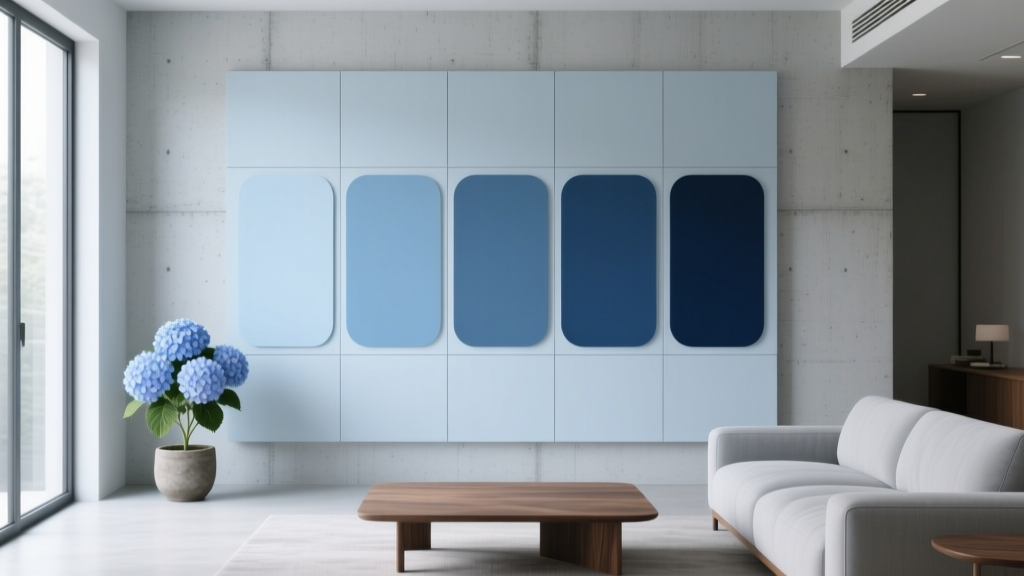
Best Hydrangea Blue Paint Colors - The Decor Mag
Hydrangea blue sits in that sweet spot between airy and grounded—soft enough to feel livable, yet colorful enough to shift the entire mood of a room. Inspired by the cool, petal-rich blues of mophead hydrangeas, this family of paint colors tends to read as a blue with a whisper of violet or gray, sometimes leaning periwinkle in daylight and dustier in evening light.
Homeowners love hydrangea blue because it behaves like a “colored neutral.” It brings calm, freshness, and subtle personality without the intensity of a true royal or primary blue. In color psychology, blues are linked to serenity, clarity, and restoration—ideal for bedrooms, bathrooms, home offices, and any space that needs a soothing reset.
This guide breaks down what hydrangea blue really means in interior color design, how to choose the right undertone for your lighting, and which paint colors consistently deliver that hydrangea-inspired look. You’ll also get real room scenarios, color scheme ideas, and common mistakes to avoid so your blue feels effortless rather than icy or flat.
What Is “Hydrangea Blue” in Interior Design?
Hydrangea blue isn’t one single shade—it’s a range of blue paint colors that feel botanical, soft, and slightly complex. If you’ve ever noticed hydrangeas shifting from blue to lavender depending on soil, you already understand the appeal: this color family is nuanced.
Key traits of hydrangea blue paint colors
- Soft-to-medium depth: Usually mid-tone, not too pale and not too saturated.
- Gentle undertones: Often violet (periwinkle), gray (dusty), or green (watery).
- Light-responsive: Can look brighter in north light, more muted in warm bulbs, and more violet at dusk.
- Versatile styling: Works with crisp whites, warm woods, creamy off-whites, and many metals.
Hydrangea blue vs. powder blue vs. navy
- Powder blue reads lighter and often more pastel; it can feel more “baby blue” if undertones aren’t balanced.
- Navy is deeper and more dramatic; hydrangea blue is more relaxed and daylit.
- Hydrangea blue tends to land in the “garden-inspired” middle, with a soft sophistication.
How to Choose the Right Hydrangea Blue for Your Home
Because hydrangea blues are undertone-driven, the “best” option depends on your fixed elements and lighting. Use these design principles to narrow your selection quickly.
1) Match undertones to your room’s light
- North-facing rooms: Light is cooler and can emphasize gray/violet. Choose a hydrangea blue with a touch of warmth or clarity (less gray) to avoid looking chilly.
- South-facing rooms: Light is warm and abundant; most hydrangea blues look balanced here. Dustier versions can feel especially elegant.
- East-facing rooms: Bright mornings, softer afternoons. If you want “always fresh,” pick a slightly clearer blue.
- West-facing rooms: Warm afternoon/evening light can pull violet. If you’re sensitive to purple, choose a bluer (less lavender) hydrangea shade.
2) Consider adjacent finishes: floors, counters, tile
- Warm wood floors: Hydrangea blue is a natural pairing—try soft blue-grays or periwinkle-leaning blues.
- Cool gray tile or stone: Choose a hydrangea blue with a gray undertone for cohesion.
- White marble with gray veining: Dusty hydrangea blues look tailored and timeless.
- Beige or creamy stone: Pick a hydrangea blue that isn’t too icy; look for a hint of warmth or softness.
3) Pick a sheen that supports the mood
- Walls: Eggshell or satin for most living spaces; matte for ceilings and low-traffic rooms.
- Trim: Satin or semi-gloss in a clean white to frame hydrangea blue walls.
- Cabinetry: Satin or semi-gloss for wipeability; hydrangea blue cabinets can be stunning in kitchens and mudrooms.
Best Hydrangea Blue Paint Colors (Designer-Approved Picks)
These hydrangea-inspired shades are popular for good reason: they’re balanced, flexible, and reliably beautiful across a range of homes. Always test with peel-and-stick samples or large swatches; hydrangea blues can shift dramatically by time of day.
Benjamin Moore Hydrangea Flowers (2072-60)
A fitting name and a true hydrangea moment—light, fresh, and floral without becoming sugary. This shade works well when you want a cheerful blue with a soft violet whisper.
- Best for: Bedrooms, nurseries, airy bathrooms, cottage-style kitchens.
- Pairs well with: Benjamin Moore White Dove (OC-17), pale oak finishes, brushed nickel.
Benjamin Moore Woodlawn Blue (HC-147)
A classic blue-green that often reads like “coastal hydrangea.” It’s gentle, spa-like, and particularly good for open-plan spaces where you want color that still feels neutral.
- Best for: Living rooms, hallways, kitchen islands, laundry rooms.
- Pairs well with: Creamy whites, warm brass, natural linen and jute.
Benjamin Moore Breath of Fresh Air (806)
Light and optimistic, this is a clearer hydrangea blue for homeowners who want brightness over grayness. It’s great in low-light spaces where dusty colors can look flat.
- Best for: Small bathrooms, home offices, ceilings in kids’ rooms.
- Pairs well with: Bright white trim, light maple, crisp black accents.
Sherwin-Williams Sleepy Blue (SW 6225)
Soft, muted, and restful—this one leans into the “calm petals” side of hydrangea blue. It tends to feel gentle rather than bold, making it an easy whole-house accent color.
- Best for: Guest bedrooms, reading nooks, quiet dining rooms.
- Pairs well with: Warm whites, antique brass, layered textured neutrals.
Sherwin-Williams Stardew (SW 9138)
A sophisticated blue-gray with a slightly dreamy quality. If you like hydrangea blue but want it more modern and tailored, Stardew is a strong contender.
- Best for: Primary bedrooms, modern farmhouse living rooms, built-ins.
- Pairs well with: Soft greiges, white oak, charcoal and slate accents.
Sherwin-Williams Aleutian (SW 6241)
A gray-blue with a coastal calm that reads upscale and composed. Aleutian is ideal when you want hydrangea energy without obvious purple.
- Best for: Open-concept spaces, kitchens with white cabinets, bathrooms with marble-look tile.
- Pairs well with: Clean whites, pale gray stone, matte black hardware.
Farrow & Ball Light Blue (No. 22)
Despite the simple name, this is a complex, heritage-style blue with softness and depth. It can feel period-appropriate in older homes while still reading fresh.
- Best for: Traditional dining rooms, stair halls, paneled studies.
- Pairs well with: Off-white trims, warm woods, vintage rugs.
Behr Blueprint (S470-5)
A friendly mid-tone blue that can land in “hydrangea” territory when styled with creamy whites and warm woods. Great for accent walls or cabinetry where you want a confident, clean blue.
- Best for: Accent walls, mudroom built-ins, kids’ rooms, powder rooms.
- Pairs well with: Warm white trim, walnut, polished chrome.
Real Room Examples: Where Hydrangea Blue Looks Best
1) Bedroom walls for a restorative, hotel-calm feel
Hydrangea blue is a natural fit for bedrooms because it supports relaxation without feeling sterile. Use it on all four walls for a cocoon effect, then layer in warm neutrals to keep it inviting.
- Try: Sherwin-Williams Stardew on walls + creamy bedding + walnut nightstands.
- Finishing touches: Soft white trim, linen drapery, warm metal lamps (aged brass or bronze).
2) Bathroom color schemes that feel clean, not cold
Hydrangea blue shines next to white tile and stone surfaces, adding a spa-like vibe. The trick is balancing with warmth so it doesn’t read icy.
- Try: Benjamin Moore Woodlawn Blue with white subway tile and a warm wood vanity.
- Pro tip: Choose bulbs around 2700K–3000K for flattering warmth, especially in blue bathrooms.
3) Kitchen islands and lower cabinets for a soft statement
Hydrangea blue cabinetry gives color without overwhelming the kitchen. It also hides minor scuffs better than stark white while still feeling light.
- Try: Sherwin-Williams Aleutian on an island + white perimeter cabinets + light quartz counters.
- Hardware pairings: Brushed brass for warmth, polished nickel for classic crispness, matte black for modern contrast.
4) Living rooms that want color without heaviness
As a wall color, hydrangea blue can replace gray and beige when you want something more uplifting. It pairs beautifully with warm woods and woven textures.
- Try: Sherwin-Williams Sleepy Blue + ivory sofa + oak coffee table + camel leather accents.
- Art tip: Add one or two pieces with dusty rose, ochre, or deep navy to create depth.
Hydrangea Blue Color Schemes That Always Work
Hydrangea blue is flexible, but the most polished results come from intentional pairing. These combinations show up again and again in well-designed homes.
Go-to pairings (use anywhere)
- Hydrangea blue + warm white: Clean and timeless (great for trim, ceilings, and cabinetry).
- Hydrangea blue + greige: Softer than blue + gray; ideal for open plans.
- Hydrangea blue + natural wood: Adds warmth and keeps the blue from feeling chilly.
- Hydrangea blue + soft blush: Botanical and romantic without being juvenile.
- Hydrangea blue + deep navy: Layered blues create depth and sophistication.
Quick palette formulas (steal these)
- Classic & crisp: Hydrangea blue walls + bright white trim + black accents + light oak.
- Coastal & calm: Blue-green hydrangea shade + creamy white + jute + driftwood tones.
- Modern & moody: Dusty hydrangea blue + charcoal + warm brass + textured ivory.
Common Hydrangea Blue Paint Mistakes (and How to Avoid Them)
- Skipping undertone testing: A hydrangea blue that looks perfect online can turn lavender or gray in your home. Test on multiple walls and check morning vs. night.
- Pairing with the wrong white: A stark, blue-white trim can make hydrangea blue look colder. If your room feels chilly, switch to a softer warm white (think creamy, not yellow).
- Using cool lighting temperatures: 4000K+ bulbs can make blues feel clinical. For most homes, 2700K–3000K keeps hydrangea blue inviting.
- Overdoing cool finishes: Too much chrome, gray tile, and blue paint can feel icy. Add warmth through wood, brass, camel leather, or warm textiles.
- Choosing the wrong saturation for the room size: Very pale hydrangea blues can wash out in bright rooms; deeper/dustier versions can feel heavy in dark hallways. Match depth to light levels.
FAQ: Hydrangea Blue Paint Colors
What undertone should I look for in a hydrangea blue?
Most hydrangea blues fall into three buckets: violet-leaning (periwinkle), gray-leaning (dusty), or green-leaning (watery). Choose violet for a romantic, floral feel; gray for a tailored, modern look; green for a coastal, spa vibe.
Is hydrangea blue a good whole-house color?
It can be, especially the softer blue-grays and blue-greens (such as Sherwin-Williams Aleutian or Benjamin Moore Woodlawn Blue). For a whole-house approach, keep trim consistent and use hydrangea blue in key rooms or as a gentle connecting color in hallways.
What trim color looks best with hydrangea blue walls?
Soft warm whites are the safest pairing for a welcoming look. If your style is crisp and modern, a brighter white can work—just be mindful it may make the blue feel cooler. Sample your white next to the blue before committing.
Will hydrangea blue make a room feel cold?
It can if the shade is very gray, the room gets cool north light, or the finishes lean cool (gray tile, chrome, cool bulbs). Warm it up with creamier whites, wood tones, warm metals, and lighting in the 2700K–3000K range.
Can I use hydrangea blue in a kitchen with wood cabinets?
Yes. Hydrangea blue works beautifully with wood cabinetry, especially oak, maple, and walnut. Use it on walls, an island, or built-ins and tie it together with a warm white backsplash and coordinated hardware.
What colors complement hydrangea blue for accents and décor?
Great accent partners include warm white, cream, natural wood, brass, blush, terracotta, navy, and soft sage. For textiles, look for layered neutrals with one deeper anchor color (navy or charcoal) to keep the palette grounded.
Next Steps: How to Commit to the Right Hydrangea Blue
Start by choosing 3–5 contenders from the list above that match your room’s lighting and finishes. Then:
- Sample strategically: Place large swatches on at least two walls (one that gets strong light and one that doesn’t).
- Check it throughout the day: Morning, afternoon, and evening—hydrangea blues shift beautifully, but you want a shift you enjoy.
- Lock your supporting cast: Decide on trim white, metal finish, and one warm element (wood tone or textile) to balance the blue.
- Choose sheen intentionally: Eggshell for most walls, satin for high-traffic, and a slightly higher sheen for cabinetry.
Hydrangea blue rewards thoughtful selection: get the undertone right, warm up the surroundings, and you’ll have a space that feels fresh, calming, and quietly memorable. Explore more color guides, paint color roundups, and interior color design tips at thedecormag.com.
More Articles
 Best Burnt Orange Paint Colors - The Decor Mag
 How to Create an Energizing Color Palette - The Decor Mag
 How to Create a Soothing Color Palette - The Decor Mag
 Bedroom for Beginners: A Practical, Step-by-Step Setup Guide
 How to Create a Vibrant Color Palette - The Decor Mag
 Best Forest Green Paint Colors - The Decor Mag
 How to Choose Colors for a Library - The Decor Mag
 Best Oxblood Paint Colors - The Decor Mag
 Best Blue Paint Colors for Every Mood - The Decor Mag
 Best Denim Blue Paint Colors - The Decor Mag