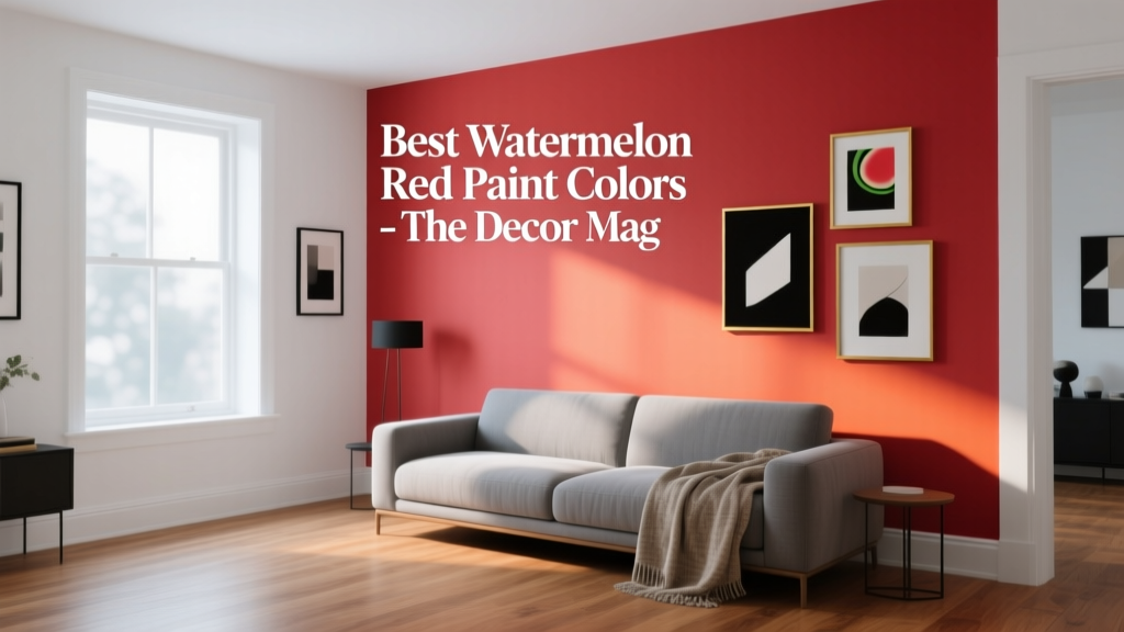
Best Watermelon Red Paint Colors - The Decor Mag
Watermelon red sits in a sweet spot: it’s unmistakably red, but it carries a lively, sunlit pink undertone that feels fresh rather than formal. In a home, that means you can tap into the energy and warmth of red without drifting into a heavy, holiday-only vibe. When homeowners ask for a “happy red” or a “summery statement color,” watermelon red paint colors are often exactly what they’re picturing.
This color family also matters because it solves a common design challenge: adding personality without sacrificing versatility. Watermelon reds play well with natural wood, crisp whites, creamy neutrals, and a wide range of greens and blues. Used thoughtfully, they can make a front door feel welcoming, a dining room feel celebratory, or a powder room feel like a jewel box—without overwhelming the space.
Below you’ll find designer-approved watermelon red paint color recommendations, guidance on choosing the right undertone, real-room application scenarios, and the most common color mistakes that cause “too loud” results. The goal: help you build a confident interior color design plan that looks intentional in every light.
What “Watermelon Red” Really Means (Undertones + Mood)
Watermelon red is typically a bright, medium-to-bold red with noticeable pink or coral undertones. It’s less blue-based than a classic cherry red and less orange-heavy than a true tomato red. The result reads playful, appetizing, and modern—ideal for accent walls, doors, and spaces where you want warmth and conversation.
Color psychology: why it works at home
- Energy + sociability: Reds stimulate conversation and appetite, making them a natural fit for dining rooms, kitchens, and entertaining spaces.
- Confidence: A red element signals intention—great for entryways and front doors where first impressions matter.
- Warmth: Watermelon reds bring a sunny lift to north-facing rooms that can feel cool or flat.
Undertones to watch
- Pink-leaning watermelon: Feels youthful and crisp; pairs beautifully with bright whites and cool greens.
- Coral-leaning watermelon: A touch warmer; works well with creamy off-whites, tan leather, and brass.
- Deeper, slightly muted watermelon: More sophisticated; easier to live with in larger doses (like a whole dining room).
How to Choose the Right Watermelon Red for Your Space
1) Start with your fixed finishes
Your paint color scheme should flatter what can’t easily change: flooring, countertops, tile, and large upholstery. Watermelon reds look different next to:
- Warm woods (oak, walnut): Choose a red with a coral/pink undertone to avoid looking overly orange.
- Cool gray floors or marble: A pink-leaning watermelon red keeps the room from skewing rusty.
- Beige stone or travertine: Slightly muted watermelon reds feel more tailored and less “loud.”
2) Match the color to the room’s “speed”
- High-energy rooms (kitchen, dining, entry): Brighter watermelon red paint colors work beautifully.
- Rest spaces (bedrooms): Use watermelon red as an accent (headboard wall, trim, built-ins) rather than all four walls.
- Small spaces (powder room): Go bold—small rooms can handle saturated colors because the exposure is brief and dramatic.
3) Test correctly (so you don’t get surprised)
- Paint a sample at least 12x12 inches (two coats) or use large peel-and-stick samples.
- Check it in morning, afternoon, and evening light.
- View it next to white trim, your flooring, and any adjacent wall color to confirm harmony.
Best Watermelon Red Paint Colors (Designer-Forward Picks)
These watermelon-inspired reds are popular with interior designers because they balance brightness with livability. As always, the “best” depends on your lighting and finishes—use these as a curated starting point.
Benjamin Moore Watermelon Red Paint Colors
- Benjamin Moore Raspberry Truffle (2080-10): A rich, punchy red with a berry edge. Great for dining rooms, lacquer-like built-ins, or a dramatic powder room. Pairs well with warm brass and creamy whites.
- Benjamin Moore Caliente (AF-290): A confident, modern red that can read slightly warmer depending on light. Excellent for a front door, a statement wall, or kitchen island cabinetry when you want a “wow” color that still feels refined.
- Benjamin Moore Coral Gables (2010-40): A sunny coral-red that leans watermelon in bright light. Ideal for cheerful kitchens, kids’ spaces, and playful accent walls. Looks especially crisp with bright white trim.
Sherwin-Williams Watermelon Red Paint Colors
- Sherwin-Williams Coral Reef (SW 6606): A vibrant coral-red that brings the watermelon vibe without going neon. Great for a lively entryway, a bar nook, or a vintage-inspired bathroom vanity.
- Sherwin-Williams Heartthrob (SW 6866): A bold, saturated red with a bright undertone. Best as an accent wall or statement furniture piece; stunning with black accents and warm woods.
- Sherwin-Williams Poinsettia (SW 6594): Despite the name, this can read as a clean, energetic red in many homes—especially when paired with fresh whites and green accents. Consider it for a door or a focal wall in a modern space.
Farrow & Ball Watermelon-Adjacent Reds
- Farrow & Ball Radicchio: Deep, earthy, and sophisticated—more “grown-up watermelon” than candy red. Beautiful in dining rooms and libraries, especially with moody greens and antique brass.
- Farrow & Ball Red Earth: A warm, softened red with grounded depth. If you love the watermelon family but want less pop and more calm, this is a strong candidate for larger wall areas.
Behr Watermelon Red Paint Colors
- Behr Watermelon Slice: A bright, playful watermelon-inspired red/pink that excels in accent roles—front doors, patio furniture, craft rooms, and modern kids’ spaces.
- Behr Poppy Glow: A lively red that can lean coral in warm light. Works well with white trim and light oak floors for an upbeat, contemporary look.
Pro tip: If you’re painting cabinetry, trim, or doors, consider a slightly higher sheen (satin or semi-gloss) for durability and to give watermelon red a crisp, clean finish.
Color Schemes That Make Watermelon Red Look Intentional
Watermelon red thrives when it has the right supporting cast. Use these designer-friendly pairings to build a cohesive paint color scheme.
Fresh + modern pairings
- Watermelon red + bright white: High contrast, clean, and graphic (think gallery-like walls with a single bold red moment).
- Watermelon red + soft greige: Lets the red shine while keeping the room grounded and livable.
- Watermelon red + pale blush: Tonal and sophisticated, especially in bedrooms or dressing areas.
Nature-inspired pairings (always flattering)
- Watermelon red + sage green: A fresh, botanical balance; sage calms the red’s intensity.
- Watermelon red + deep olive: Moody, upscale contrast that feels curated rather than trendy.
- Watermelon red + teal or dusty blue: Adds depth and a slightly retro charm (great for mid-century homes).
Metal + material matches
- Brass: Warms and elevates watermelon reds; perfect for lighting and cabinet hardware.
- Black accents: Makes bright reds look graphic and modern (frames, railings, faucets).
- Natural wood: Keeps the scheme welcoming; oak and walnut both work when undertones are matched.
Real Room Examples: Where Watermelon Red Shines
1) Front door: instant curb appeal
A watermelon red front door creates a welcoming focal point and looks fantastic against classic exteriors.
- Best exterior pairings: white siding, warm brick, charcoal paint, light stone, natural cedar.
- Suggested finish: exterior satin or semi-gloss for cleanability and a polished look.
- Designer move: match the door color with a subtle interior accent (a bench cushion, artwork, or a runner) so the transition feels intentional.
2) Dining room: bold and flattering
Watermelon red is especially successful in dining rooms because it supports appetite and conversation. If you’re nervous, use it on one wall or on lower paneling with a lighter neutral above.
- Try this layout: watermelon red on walls + warm white ceiling + natural linen drapery + brass chandelier.
- Best lighting: warm bulbs (2700K) to keep the red from looking sharp at night.
3) Kitchen island or lower cabinets: color without overwhelm
For homeowners who love color but prefer calm walls, a watermelon red island is a smart compromise. It reads custom and design-forward.
- Works with: white uppers, butcher block, warm quartz, unlacquered brass, matte black hardware.
- Paint guidance: use a cabinet-grade enamel; pick satin or semi-gloss for durability.
4) Powder room: small space, big personality
Powder rooms are ideal for saturated paint colors because the space is compact and meant to feel special. Watermelon red can look high-end when paired with the right finishes.
- Elevated combo: watermelon red walls + antique brass mirror + crisp white pedestal sink + patterned tile floor with black/cream tones.
- Extra depth: consider color-drenching (walls + trim) in the same shade for a jewel-box effect.
5) Bedroom accents: energizing, not overpowering
In bedrooms, watermelon red works best in controlled doses.
- Use it on: a headboard wall, a painted dresser, bedside tables, or inside a reading nook.
- Balance with: soft whites, warm taupe, or muted sage bedding to keep the room restful.
Common Watermelon Red Paint Mistakes (and How to Avoid Them)
- Choosing the brightest red for a large, sunny room: In strong light, many reds intensify. If you have lots of south-facing light, consider a slightly muted watermelon red or use it as an accent.
- Ignoring undertones in adjacent materials: If your floor has orange undertones and your red also leans orange, the result can feel overly hot. Counterbalance with cooler whites or greener accents.
- Pairing with stark cool gray everywhere: Cool grays can make watermelon red look harsh or “plastic.” If you want gray, lean toward warmer greige or soften with natural textures.
- Forgetting sheen strategy: Flat on walls is forgiving; high gloss shows imperfections. Save higher sheen for trim, doors, and cabinetry unless your walls are perfectly smooth.
- Under-lighting the room: At night, red can look heavy or muddy under cool bulbs. Use warm lighting (2700K–3000K) and layered sources (ceiling + sconces + lamps).
Practical Tips for Painting with Watermelon Red
- Use a tinted primer: Bright reds often need extra coats. A gray or red-tinted primer improves coverage and depth.
- Plan for 2–4 coats: Reds can be translucent; budget time and paint accordingly.
- Sample on multiple walls: Red shifts dramatically from shadow to direct light.
- Anchor with neutrals: Balance watermelon red with warm whites, creams, wood tones, and natural fibers for a designer look.
- Repeat the color subtly: Echo the red with a small artwork detail, a rug motif, or textiles so it feels integrated.
FAQ: Watermelon Red Paint Colors
Is watermelon red too bold for a living room?
Not necessarily. It depends on light and how much you use. For most living rooms, watermelon red works best as an accent wall, built-ins, or a statement piece (like a fireplace surround) balanced with warm neutrals and natural textures.
What trim color looks best with watermelon red walls?
Clean whites and soft warm whites both work. If you want a crisp, modern contrast, choose a brighter white. If your home has warm finishes (oak, beige tile), a creamier white will look more seamless.
Does watermelon red work with brick or terracotta?
Yes—with the right undertone. If your brick is warm and earthy, choose a watermelon red that leans slightly pink rather than orange. Add neutrals and greenery to keep the palette layered and not overly warm.
What are the best coordinating colors for a watermelon red paint scheme?
Reliable pairings include warm white, greige, sage green, olive, teal, dusty blue, and natural wood tones. Brass and matte black finishes help the color scheme feel intentional.
Can I use watermelon red on kitchen cabinets?
Absolutely. It’s striking on an island or lower cabinets. Use a durable cabinet enamel in satin or semi-gloss, and test the color under both daylight and your kitchen’s evening lighting.
Why does my red look different at night?
Artificial light affects undertones. Cool bulbs can make reds look dull or brownish; very warm bulbs can make them feel overly intense. Aim for 2700K–3000K lighting and add layers (pendants, under-cabinet lighting, lamps) for a balanced look.
Next Steps: Make Watermelon Red Feel Like “You”
Pick two or three watermelon red paint colors from the lists above, sample them in your actual space, and view them next to your fixed finishes at different times of day. Decide where the color will live—front door, dining room walls, a kitchen island, or a powder room—and build a supporting color scheme with warm whites, grounding neutrals, and a touch of green or blue for balance.
If you’re ready for more paint color inspiration, explore more color guides and curated palettes on thedecormag.com.
More Articles
 Tetradic Color Scheme Guide - The Decor Mag
 Best Burnt Orange Paint Colors - The Decor Mag
 Best White Paint Colors Compared - The Decor Mag
 Best Cantaloupe Paint Colors - The Decor Mag
 How to Create a Bold Color Story - The Decor Mag
 Best Pistachio Paint Colors - The Decor Mag
 Best Sapphire Blue Paint Colors - The Decor Mag
 Best Cream Paint Colors for Warm Neutrals - The Decor Mag
 How to Choose Colors for a Garage Conversion - The Decor Mag
 How to Use the 60-30-10 Color Rule - The Decor Mag