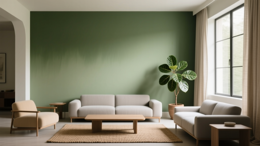
Best Avocado Green Paint Colors - The Decor Mag
Avocado green has a fascinating design reputation: it’s nostalgic without being stuck in the past, earthy without feeling heavy, and bold without shouting. As homeowners look for richer, nature-based palettes that feel comforting and personal, avocado green paint colors are having a major moment—especially in kitchens, living rooms, and cozy, light-starved spaces that need warmth.
What makes this topic worth your time is that “avocado green” isn’t one single shade. It spans a spectrum from olive-leaning greens with golden undertones to deeper, moodier greens that read almost like moss. Choosing the best avocado green paint color comes down to understanding undertones, lighting, and the color scheme you want to build around it. Get those right, and avocado becomes one of the most versatile interior paint colors you can use.
Below, you’ll find specific avocado green paint recommendations (with brand names), real-room application scenarios, and the design principles that help avocado green look intentional—never dated.
What Counts as “Avocado Green” in Interior Design?
Avocado green typically sits between yellow-green and olive on the color wheel. It has a natural, slightly muted quality—less neon “lime,” more organic “leaf.” Most avocado greens share these traits:
- Warm undertones: Often yellow, gold, or brown-based.
- Mid-range depth: Usually medium to medium-dark, though there are lighter “avocado-tinged” options.
- Earthy saturation: Feels grounded and botanical rather than bright and acidic.
Color psychology: Green is associated with balance, restoration, and wellbeing. When green is warmed with yellow (as avocado is), it adds optimism and coziness—perfect for gathering spaces like kitchens and family rooms.
How to Choose the Best Avocado Green Paint Color
1) Read the Undertone: Yellow vs. Brown vs. Gray
Undertone is the difference between a flattering avocado and one that turns murky.
- Yellow-forward avocado greens feel sunny, retro, and friendly (great in kitchens and breakfast nooks).
- Brown/olive avocado greens read sophisticated and earthy (excellent for living rooms, libraries, and exteriors).
- Gray-muted avocado greens feel more modern and subdued (great for open plans and contemporary homes).
2) Match the Shade to Your Light Source
- North-facing rooms: Light is cooler and can make avocado look dull. Choose a slightly brighter, warmer green.
- South-facing rooms: Strong warm light can intensify yellow undertones. Consider a slightly muted olive-leaning avocado.
- East-facing rooms: Warm morning light, cooler afternoons. Balanced avocado shades work best.
- West-facing rooms: Late-day golden light can make avocado glow. Test a swatch at sunset before committing.
3) Use LRV (Light Reflectance Value) as a Practical Filter
While exact LRV varies by brand line, this rule helps:
- LRV 50+: Lighter, airier avocado-adjacent greens for smaller rooms or low ceilings.
- LRV 30–50: The “classic avocado” range—noticeable color, still livable on multiple walls.
- LRV under 30: Deep avocado/olive—dramatic, cozy, best with strong lighting and contrast trim.
Best Avocado Green Paint Colors (Designer-Approved Picks)
These are reliable avocado green paint colors from popular brands. Always test a sample in your specific lighting—avocado shifts a lot from morning to evening.
Sherwin-Williams Avocado Green (SW 2861)
A classic: warm, golden, and true to the name. This is the shade people often picture when they say “avocado green,” with a distinctly retro undertone.
- Best for: Kitchens, vintage-inspired spaces, playful powder rooms
- Pairs well with: Creamy whites, warm wood, brass, terracotta accents
Sherwin-Williams Ripe Olive (SW 6209)
If you want avocado’s richness without leaning too yellow, Ripe Olive is a deeper, more sophisticated take. It’s dramatic but still grounded.
- Best for: Built-ins, libraries, dining rooms, statement doors
- Pairs well with: Warm white trim, camel leather, walnut, black accents
Benjamin Moore Saybrook Sage (HC-114)
A warm, historic-feeling green that can read “avocado-leaning” in the right context—especially next to creamy whites and natural textures.
- Best for: Living rooms, hallways, open-plan transitions
- Pairs well with: Linen upholstery, oak floors, aged brass
Benjamin Moore Vintage Vogue (462)
A moody green with olive depth that still feels botanical. This is a great choice when you want avocado energy but more modern drama.
- Best for: Accent walls, kitchen islands, mudrooms
- Pairs well with: Off-white cabinetry, warm metals, soapstone counters
Farrow & Ball Olive (No. 13)
Farrow & Ball’s Olive is beautifully complex—more “heritage olive” than bright avocado, but it lands in the same family and creates a cozy, enveloping effect.
- Best for: Dining rooms, studies, paneled walls
- Pairs well with: Soft chalky whites, deep reds, antique wood
Farrow & Ball Sap Green (No. 199)
A fresher, slightly more energetic green that can read avocado in sunlit rooms. Great if you want a greener, garden-forward look.
- Best for: Kitchens, garden rooms, breakfast nooks
- Pairs well with: White tile, pale woods, woven textures
Behr Back to Nature (S340-4)
A grounded, approachable green that can work as an all-over wall color in many homes. It’s a friendly stepping stone if you’re avocado-curious.
- Best for: Family rooms, bedrooms, casual spaces
- Pairs well with: Warm neutrals, rattan, muted blues
PPG Olive Sprig (PPG1125-4)
Soft and balanced, this shade leans modern-organic. In warm light it can skew avocado, especially when styled with creamy whites and wood tones.
- Best for: Open concept spaces, nurseries, calm bedrooms
- Pairs well with: Beige, ivory, light oak, clay accents
Real Room Examples: Where Avocado Green Works Best
Avocado Green Kitchens: Cabinets, Islands, or Walls
Avocado green kitchen paint can feel both nostalgic and elevated depending on your finishes. Consider these scenarios:
- Avocado green lower cabinets + warm white uppers: Creates balance and keeps the room bright.
- Avocado green island: A lower-commitment statement in an otherwise neutral kitchen.
- Avocado walls + natural wood cabinets: Cozy, earthy, and especially good with handmade tile.
Try this combo: SW Avocado Green walls, creamy off-white trim, and brushed brass hardware. Add white zellige tile and oak shelving for an updated look.
Living Rooms: A Cozy Backdrop for Warm Neutrals
Avocado green living room walls create a grounded, restful mood—ideal for social spaces that still feel calm.
- Best styling: Oatmeal or camel upholstery, walnut tables, linen curtains
- Art and accents: Abstracts with cream/black, botanical prints, warm metals
Bedrooms: Restorative, Cocooning, Surprisingly Soft
Because green sits in the middle of the visible spectrum, it’s easy on the eyes. An avocado-olive bedroom can feel serene, especially with warm, layered lighting.
- Use on: All four walls for a cocoon effect, or behind the bed as an accent wall.
- Add warmth with: Terracotta textiles, ivory bedding, wood nightstands.
Bathrooms and Powder Rooms: Small Space, Big Personality
Avocado green in a bathroom reads fresh and tailored when paired with the right materials:
- Modern look: Avocado walls + matte black fixtures + crisp white tile
- Vintage look: Avocado + unlacquered brass + cream subway tile + warm wood vanity
Exterior Accents: Doors, Shutters, and Trim
Avocado green exterior paint is striking on doors and shutters, especially against warm white, beige, or brick.
- Works beautifully with: red brick, tan stone, creamy siding, copper lighting
- Tip: Choose a slightly deeper olive-leaning avocado for exteriors to avoid a “too yellow” look in direct sun.
Avocado Green Color Schemes That Always Look Intentional
Avocado green plays well with both complementary and analogous palettes. Here are reliable interior color schemes:
1) Avocado Green + Creamy White + Warm Wood
- Why it works: A timeless nature palette; the white adds clarity, wood adds warmth.
- Best rooms: Kitchens, living rooms, hallways
2) Avocado Green + Terracotta + Natural Linen
- Why it works: Green and red-orange are near complements, creating warm, earthy contrast.
- Best rooms: Dining rooms, bedrooms, sunrooms
3) Avocado Green + Navy + Brass
- Why it works: Navy deepens the palette; brass adds glow and sophistication.
- Best rooms: Offices, living rooms, powder rooms
4) Avocado Green + Blush/Muted Pink + Walnut
- Why it works: Soft warm contrast; the overall feel is welcoming and curated.
- Best rooms: Bedrooms, sitting rooms
5) Avocado Green + Charcoal + Off-White
- Why it works: Modern contrast without the harshness of pure black and white.
- Best rooms: Contemporary homes, open plans
Application Guidance: Sheen, Placement, and Sampling
Pick the Right Sheen
- Flat/Matte: Great for walls; softens avocado and hides imperfections.
- Eggshell/Satin: Good for busy areas (hallways, kitchens); slightly more wipeable.
- Semigloss: Best for trim, doors, cabinets; can make avocado look more “retro” because it reflects more light.
Where to Use Avocado Green for Maximum Impact
- All-over walls: Best with warm white trim and layered lighting.
- Accent wall: Use behind a sofa or bed; keep adjacent walls warm neutral.
- Cabinetry/built-ins: Looks custom and intentional—especially in satin or semigloss.
- Ceiling: Unexpected and cozy in a dining room or powder room with good lighting.
Sampling Tips That Prevent Expensive Mistakes
- Test at least two avocado shades: one warmer/brighter, one deeper/olive.
- Paint a large sample (at least 12" x 12", bigger is better) on multiple walls.
- Check the color under daylight, evening ламps, and overhead lighting.
- View next to your fixed finishes: countertops, flooring, cabinetry, tile.
Common Avocado Green Paint Mistakes to Avoid
- Pairing it with icy whites: Cool, blue-white trim can make avocado look sallow. Choose creamy whites and warm off-whites instead.
- Ignoring warm metals: Chrome can feel too cold against avocado. Brass, bronze, and black tend to harmonize better.
- Not balancing with neutrals: Too much saturated green without light relief can feel heavy. Add cream, beige, or natural wood to break it up.
- Forgetting lighting temperature: 3000K (soft white) lighting usually flatters avocado. Very cool 4000K+ bulbs can make it look muddy.
- Choosing the wrong neighbor color: Some reds or oranges can make avocado look overly yellow. Stick to muted terracotta, clay, and warm blush for smoother contrast.
FAQ: Avocado Green Paint Colors
Is avocado green a warm or cool paint color?
Most avocado green paint colors are warm because they contain yellow or golden undertones. Some olive-leaning versions can read more neutral, especially in cool light.
What trim color looks best with avocado green walls?
Choose creamy whites and warm off-whites (think “soft ivory” rather than bright optic white). Warm trim keeps avocado looking rich and intentional.
Does avocado green work in small rooms?
Yes—especially in small spaces where you want a cozy, enveloping feel (powder rooms, dens). Use good lighting, lighter textiles, and consider a medium LRV avocado rather than the deepest olive.
What’s the difference between avocado green and olive green?
Avocado green typically has more yellow warmth and a slightly brighter, retro character. Olive green usually has more brown/neutral depth and can feel more subdued and classic.
What colors pair best with avocado green for a modern look?
Try avocado green with warm white, charcoal, black accents, light oak, and a restrained metal palette (brass or black). Keep patterns simple and textures natural.
Can I use avocado green on kitchen cabinets?
Absolutely. Avocado green cabinets look elevated when paired with warm counters (butcher block, creamy stone) and balanced with lighter walls or backsplash tile. Use a durable cabinet-grade paint in satin or semigloss.
Next Steps: Make Avocado Green Work in Your Home
Start by choosing 2–3 avocado green paint colors that fit your home’s lighting and fixed finishes, then test large swatches where you’ll actually see them throughout the day. Build a simple, nature-based color scheme—creamy whites, warm wood, and one accent color like terracotta, navy, or charcoal—to keep the look cohesive.
If you’re ready for more guidance on interior paint colors, color schemes, and how to choose undertones with confidence, explore more color guides on thedecormag.com.
More Articles
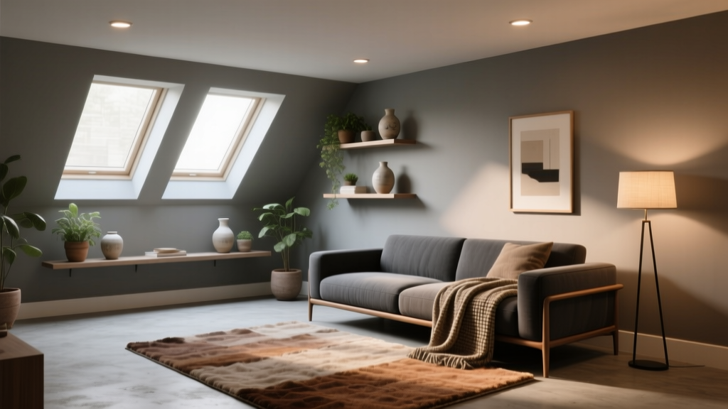 How to Choose Colors for a Basement - The Decor Mag
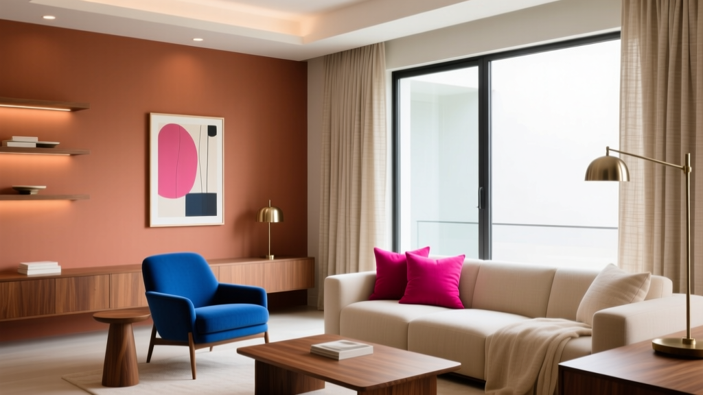 Saturated Colors in Decor: Use Without Overwhelming
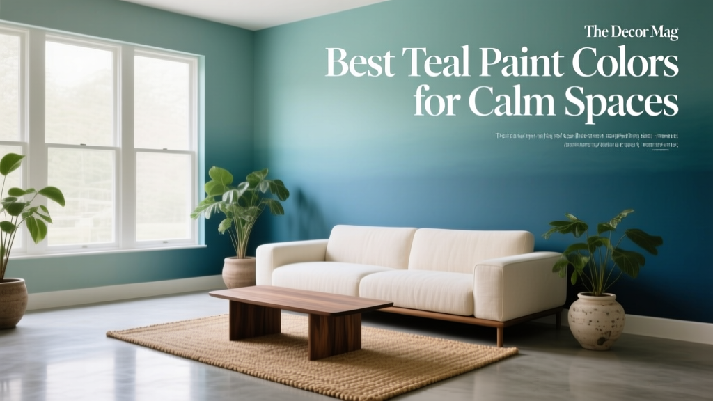 Best Teal Paint Colors for Calm Spaces - The Decor Mag
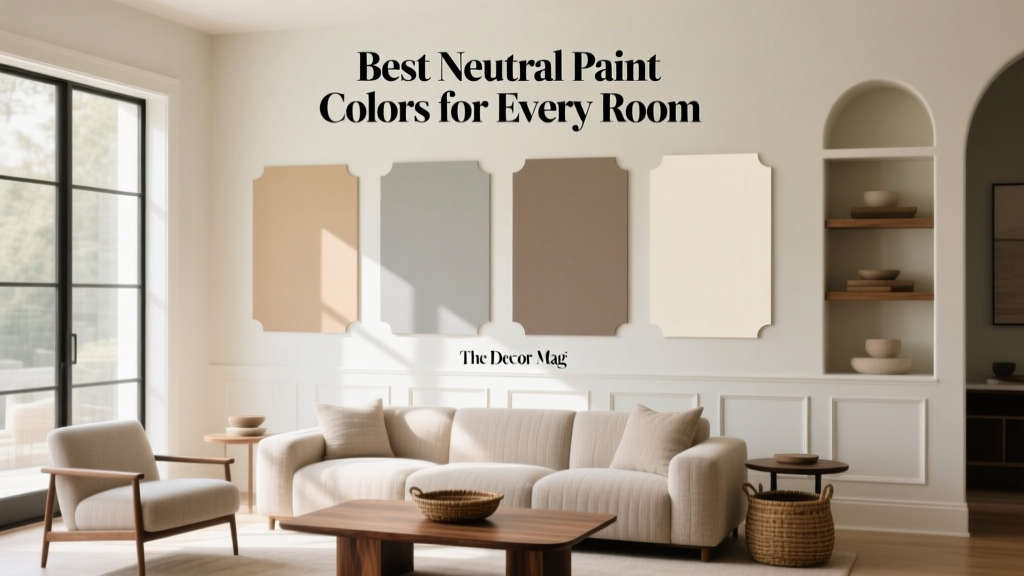 Best Neutral Paint Colors for Every Room - The Decor Mag
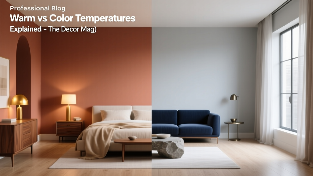 Warm vs Cool Color Temperatures Explained - The Decor Mag
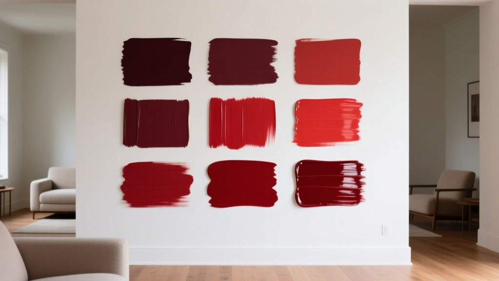 Best Crimson Paint Colors - The Decor Mag
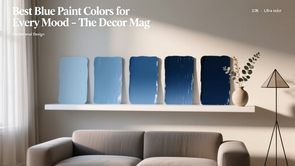 Best Blue Paint Colors for Every Mood - The Decor Mag
 How to Choose Colors for a Mudroom - The Decor Mag
 How to Create a Traditional Color Palette - The Decor Mag
 Placement Safety Tips: Preventing Falls, Injuries, and Equipment Failure in Industrial and Residential Settings