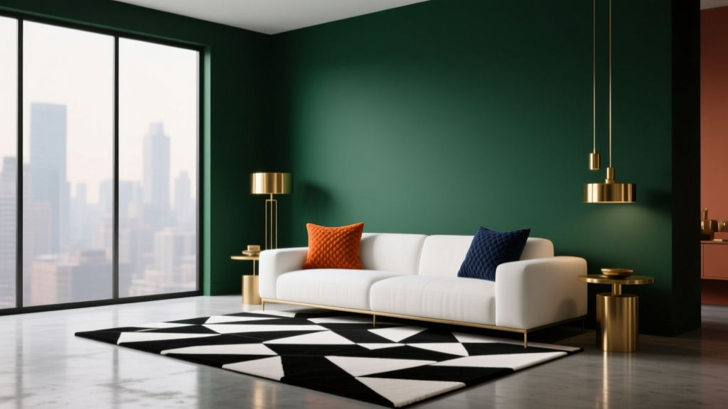
How to Create a Dramatic Color Palette - The Decor Mag
Drama in interior color design isn’t about making a room feel dark or overwhelming—it’s about creating focus, emotion, and a point of view. A dramatic color palette can make a living room feel cinematic, a dining room feel like a destination, or a bedroom feel cocooning and calm. When done well, bold paint colors and high-contrast color schemes don’t just “look pretty”; they shape how you experience the space.
Homeowners often assume dramatic color means “too risky” or “hard to live with.” The truth is the opposite: drama can be incredibly livable when you build the palette with intention—balancing hue, value (lightness/darkness), and saturation (intensity), then repeating those choices through paint, textiles, and finishes. You don’t need a mansion or designer budget; you need a plan.
This guide breaks down practical, designer-approved ways to create a dramatic paint color palette, including specific color recommendations, room-by-room application scenarios, and common mistakes to avoid.
What Makes a Color Palette “Dramatic”?
Dramatic color schemes share one or more of these traits:
- High contrast: Light versus dark (e.g., warm white walls with inky trim).
- Deep values: Rich, low-lightness colors (charcoal, oxblood, forest green).
- Intense saturation: A clear, bold hue (cobalt, emerald, vermilion) used strategically.
- Unexpected pairings: Color combinations that feel curated (plum + camel, teal + rust, black + blush).
- Strong repetition: The palette appears in multiple places—paint, upholstery, art, and accessories—so it feels intentional.
Color psychology plays a role here. Dark blues and charcoals often read as grounded and sophisticated; reds and oxbloods feel intimate and energized; greens can be restorative yet luxe; blacks create structure and confidence. “Drama” is simply emotion plus contrast, controlled by design principles.
Start With the Framework: Hue, Value, and Saturation
1) Choose a Dominant Hue (Your “Main Character”)
Pick one anchor hue that will guide your decisions. Dramatic interiors often start with a deep, complex color rather than a bright primary. Strong candidates:
- Inky blue: Benjamin Moore Hale Navy (HC-154), Sherwin-Williams Naval (SW 6244)
- Charcoal/soft black: Benjamin Moore Wrought Iron (2124-10), Farrow & Ball Off-Black (No. 57)
- Forest green: Sherwin-Williams Ripe Olive (SW 6209), Benjamin Moore Essex Green (HC-188)
- Aubergine/plum: Farrow & Ball Brinjal (No. 222), Benjamin Moore Dark Purple (2083-10)
- Oxblood/burgundy: Farrow & Ball Preference Red (No. 297), Sherwin-Williams Redend Point (SW 9081) for a softer, earthy red-brown
2) Decide Your Value Range (How Light or Dark Will It Go?)
Dramatic palettes usually include at least one very dark value and one light or mid-light counterbalance. Decide early if your walls will be the darkest surface or if you’ll keep walls mid-tone and add drama through trim, ceiling, or built-ins.
Quick rule: If the room is small or has limited natural light, you can still go dark—just plan for a crisp light counterpoint (ceiling, trim, drapery, rug) and layered lighting.
3) Control Saturation (Intensity) to Keep It Sophisticated
Highly saturated colors can feel theatrical; that’s great when intentional, but tiring when everywhere. Many designer-favorite dramatic paint colors are slightly grayed or “dirty” (complex) rather than neon-bright.
- For a refined jewel tone, look for colors with black or gray undertones.
- For modern drama, choose clear contrast but limit saturation to 1–2 hero moments (front door, powder room, statement built-in).
Build a Dramatic Color Scheme: 5 Reliable Formulas
Formula 1: Dark + Warm White + Brass (Classic High Contrast)
This is one of the easiest dramatic palettes to live with. The warm white keeps the room open; the dark color adds depth; brass brings glow.
- Dark: Benjamin Moore Wrought Iron (2124-10)
- Warm white: Benjamin Moore White Dove (OC-17) or Sherwin-Williams Alabaster (SW 7008)
- Accent: Aged brass, cognac leather, walnut wood
Where it works: Living rooms, hallways, offices, kitchens with white counters.
Formula 2: Jewel Tone + Moody Neutral + Soft Black (Gallery-Level Drama)
Pair a saturated jewel tone with a moody neutral, then anchor with near-black details (frames, hardware, trim).
- Jewel: Sherwin-Williams Naval (SW 6244) or Benjamin Moore Emerald Isle (2036-10)
- Moody neutral: Farrow & Ball Drop Cloth (No. 283) or Sherwin-Williams Accessible Beige (SW 7036) as a calmer bridge
- Soft black accent: Farrow & Ball Off-Black (No. 57)
Where it works: Dining rooms, bedrooms, open-plan spaces where you need both drama and balance.
Formula 3: Monochrome Depth (One Hue, Many Values)
Monochrome doesn’t mean flat. Use one hue family in multiple values—light to dark—for a tailored, editorial effect.
- Example (blue): pale blue-gray walls + mid-tone drapery + deep navy built-ins
- Example paint trio:
- Benjamin Moore Boothbay Gray (HC-165) for walls
- Benjamin Moore Van Deusen Blue (HC-156) for cabinetry
- Benjamin Moore Hale Navy (HC-154) for accent/trim
Where it works: Bedrooms, studies, media rooms, and any space where you want calm drama.
Formula 4: Earthy Drama (Rust, Olive, Clay, and Ink)
Earth tones can be dramatic when you push value darker and pair them with blackened accents. This palette is rich, grounded, and welcoming.
- Olive: Sherwin-Williams Ripe Olive (SW 6209)
- Clay/terracotta: Benjamin Moore Terra Cotta Tile (2090-30) or Sherwin-Williams Cavern Clay (SW 7701)
- Inky accent: Sherwin-Williams Iron Ore (SW 7069)
- Balancing neutral: Sherwin-Williams Alabaster (SW 7008)
Where it works: Family rooms, kitchens, entryways—spaces that benefit from warmth and dimension.
Formula 5: Black + Color Pop (Modern, Graphic, Clean)
Use black or charcoal as the structure, then add one vivid accent color in a controlled way.
- Structure: Benjamin Moore Wrought Iron (2124-10) or Sherwin-Williams Tricorn Black (SW 6258)
- Accent pop: emerald, saffron, or cobalt (choose one)
- Support: crisp white and light oak to prevent heaviness
Where it works: Contemporary kitchens, bathrooms, lofts, and homes with lots of clean-lined millwork.
Real Room Examples: How to Apply a Dramatic Palette
1) Living Room: Moody Walls, Bright Ceiling, Layered Neutrals
Scenario: You want a cozy, elevated living room that still feels open for everyday life.
- Walls: Benjamin Moore Hale Navy (HC-154) in eggshell
- Ceiling/trim: Benjamin Moore White Dove (OC-17) in a higher sheen (satin or semi-gloss for trim)
- Soft goods: oatmeal linen curtains, textured ivory rug, camel leather chair
- Metals: brushed brass floor lamp and picture lights to warm the blue
Why it works: Deep blue brings intimacy (color psychology: calm + confidence). Warm whites and brass prevent the room from feeling cold. Texture keeps the palette from feeling flat.
2) Dining Room: Color Drenching for Instant Drama
Scenario: You want a dining room that feels like a boutique restaurant.
- Walls + trim (color-drenched): Farrow & Ball Brinjal (No. 222)
- Ceiling: Same color, 10–20% lighter (or the same color in a flatter finish)
- Furniture: dark wood table, upholstered chairs in a muted neutral
- Lighting: a statement chandelier with warm bulbs (2700K) for flattering light
Why it works: Color drenching reduces visual breaks, so the color feels immersive rather than busy—high drama, low clutter.
3) Bedroom: Dark Accent Wall with Quiet Luxury Neutrals
Scenario: You want a dramatic bedroom without committing to four dark walls.
- Accent wall behind the bed: Sherwin-Williams Iron Ore (SW 7069)
- Other walls: Sherwin-Williams Alabaster (SW 7008) or a warm greige
- Bedding: creamy white, taupe, and one deep accent (espresso or ink)
- Artwork: large-scale art with black framing to repeat the accent wall
Why it works: The dark wall visually “pulls” the headboard forward (a common design principle for coziness). Warm neutrals keep the mood restful.
4) Kitchen: Dramatic Cabinets with Balanced Surfaces
Scenario: You want moody kitchen cabinets that still feel bright and clean.
- Lower cabinets: Benjamin Moore Essex Green (HC-188) or Sherwin-Williams Naval (SW 6244)
- Upper cabinets: warm white like Benjamin Moore White Dove (OC-17)
- Countertops: white quartz or marble-look surfaces for contrast
- Hardware: aged brass or matte black (choose one for clarity)
- Backsplash: simple, slightly glossy tile to bounce light
Why it works: Deep cabinet color creates weight at the bottom; light uppers and reflective surfaces keep the kitchen airy. It’s a dramatic color scheme that still feels practical.
5) Powder Room: The Best Place to Take a Color Risk
Scenario: You want maximum impact in a small space.
- Walls: Farrow & Ball Preference Red (No. 297) or a deep teal
- Ceiling: same color for a jewel-box effect
- Mirror/fixtures: antique brass for warmth and glow
- Extra credit: add a bold wallpaper on the ceiling or a single wall
Why it works: Powder rooms are short-duration spaces—perfect for intense saturation and theatrical contrast.
Practical Tips for Designing a Dramatic Paint Palette
- Sample first, always: Test at least two options per color family. View in morning, afternoon, and night lighting.
- Mind undertones: Pair warm with warm (creamy whites with olive and burgundy) and cool with cool (crisp whites with navy and charcoal) unless you intentionally want tension.
- Use sheen to add dimension:
- Walls: matte/eggshell for softness
- Trim/doors: satin/semi-gloss for contrast and durability
- Ceilings: flat/matte to reduce glare (unless you want reflective drama)
- Repeat your “hero” color 3 times: For example—paint, a textile, and an accessory. Repetition makes bold choices feel cohesive.
- Balance deep colors with light relief: Rugs, drapery, art mats, and lampshades are your best tools.
- Layer lighting: Dramatic palettes need good lighting: ambient (ceiling), task (reading), and accent (picture lights, sconces). Use warm bulbs (2700K–3000K) for cozy drama.
Common Color Mistakes to Avoid
- Choosing a dramatic paint color without a contrast plan: A deep wall color needs a counterpoint (trim, ceiling, textiles) or it can feel heavy.
- Ignoring undertones: A “white” can read pink, yellow, gray, or green. Undertone clashes are a common reason dramatic color schemes feel off.
- Using too many bold colors at once: Limit to one dominant hue, one supporting hue, and one accent. Too many saturated colors compete.
- Forgetting finish and texture: A room can be monochrome and still dramatic if you use velvet, wool, linen, wood grain, and metal to create contrast.
- Skipping lighting upgrades: Dark paint colors can look flat under a single overhead light. Layered lighting turns “dark” into “luxurious.”
- Not considering sightlines: In open plans, your dramatic palette should relate to adjacent spaces. Use a bridging neutral or repeat an accent color to connect rooms.
FAQ: Dramatic Color Palettes at Home
Is a dramatic color palette only for large rooms?
No. Small rooms can look stunning in deep paint colors because the boundaries blur and the space feels intentional. The key is balanced contrast (light trim, lighter furnishings, or a bright ceiling) and good lighting.
What are the best dramatic paint colors for beginners?
Start with deep, flexible hues that pair well with many finishes: Benjamin Moore Hale Navy, Sherwin-Williams Iron Ore, Benjamin Moore Wrought Iron, or Sherwin-Williams Ripe Olive. They deliver drama without looking overly bright.
How do I keep a dark room from feeling gloomy?
Use warm light bulbs (2700K–3000K), add reflective surfaces (mirrors, glossy tile, metallics), choose a lighter rug, and introduce texture (linen, boucle, velvet). Gloom happens when dark paint meets flat lighting and flat materials.
Should trim be white with dramatic wall colors?
Not always. White trim creates crisp contrast, but color-drenched trim (painting trim the same color as the walls) can look even more dramatic and high-end. Choose white trim for a classic look; choose color drenching for an immersive, modern feel.
What’s the easiest dramatic color scheme that won’t date quickly?
Try charcoal or navy with warm white and natural wood. It’s a timeless high-contrast palette that works across modern, transitional, and traditional interiors.
How many colors should a dramatic palette include?
A reliable structure is 3–5: one dominant color, one supporting color, one neutral, and 1–2 accents (often metals or wood tones). Too many paint colors can dilute the drama.
Next Steps: Create Your Own Dramatic Palette
Pick one dominant hue that matches the mood you want—calm and commanding (navy), earthy and grounded (olive), intimate and glamorous (plum or oxblood), or clean and graphic (charcoal/black). Then build contrast with a warm white or soft neutral, repeat your hero color in at least three places, and commit to lighting that flatters the palette.
If you’re choosing paint colors this week, start with these three actions:
- Choose your anchor paint color and one complementary neutral.
- Test large samples on multiple walls and check them at night.
- Plan your contrast: trim color, a light rug, and at least two warm light sources.
For more paint color guides, color scheme ideas, and room-by-room interior color design advice, explore the color library at thedecormag.com.
More Articles
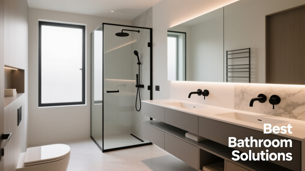 Best Bathroom Floor Solutions: Performance, Safety, and Style Compared
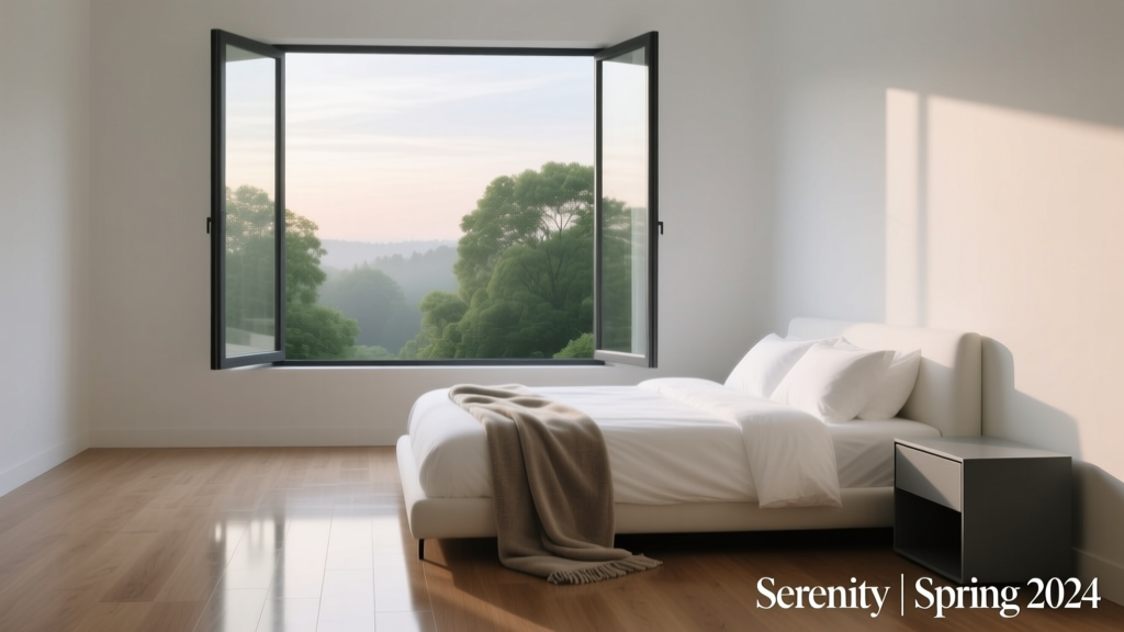 Bedroom vs. Open Concept: Functional, Psychological, and Design Realities
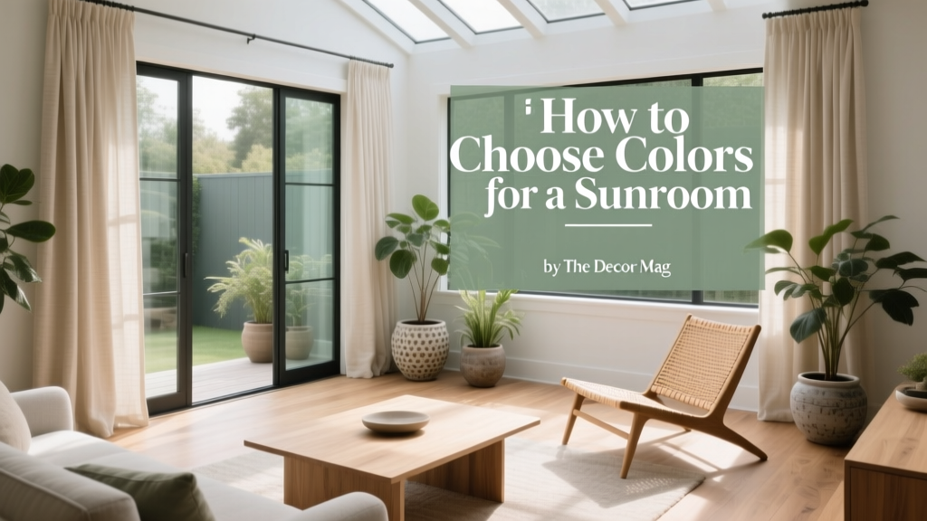 How to Choose Colors for a Sunroom - The Decor Mag
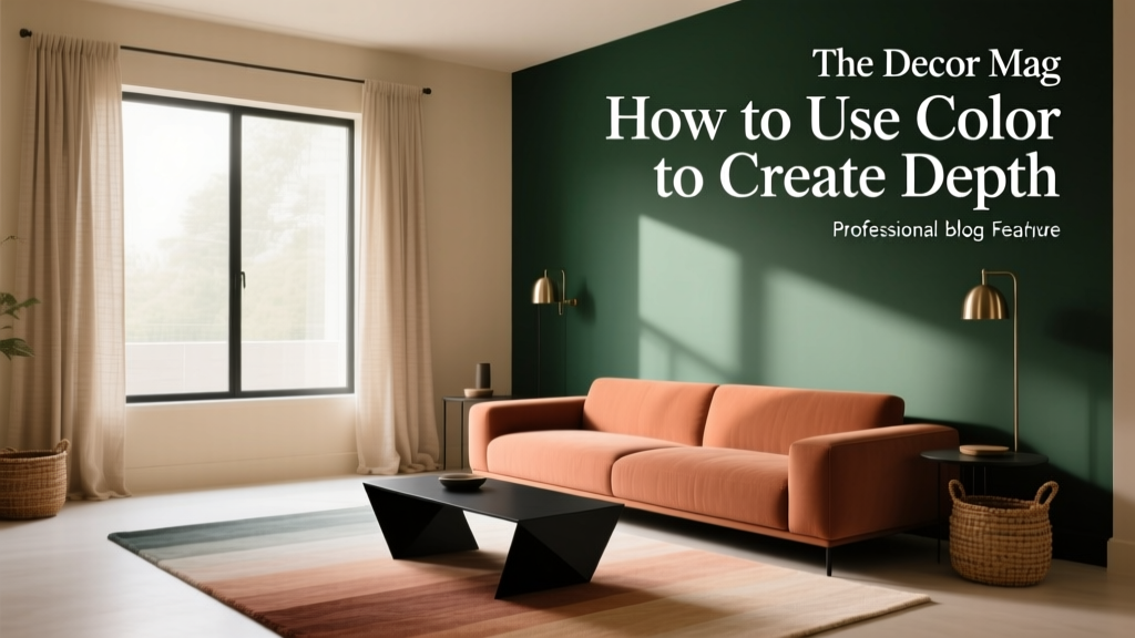 How to Use Color to Create Depth - The Decor Mag
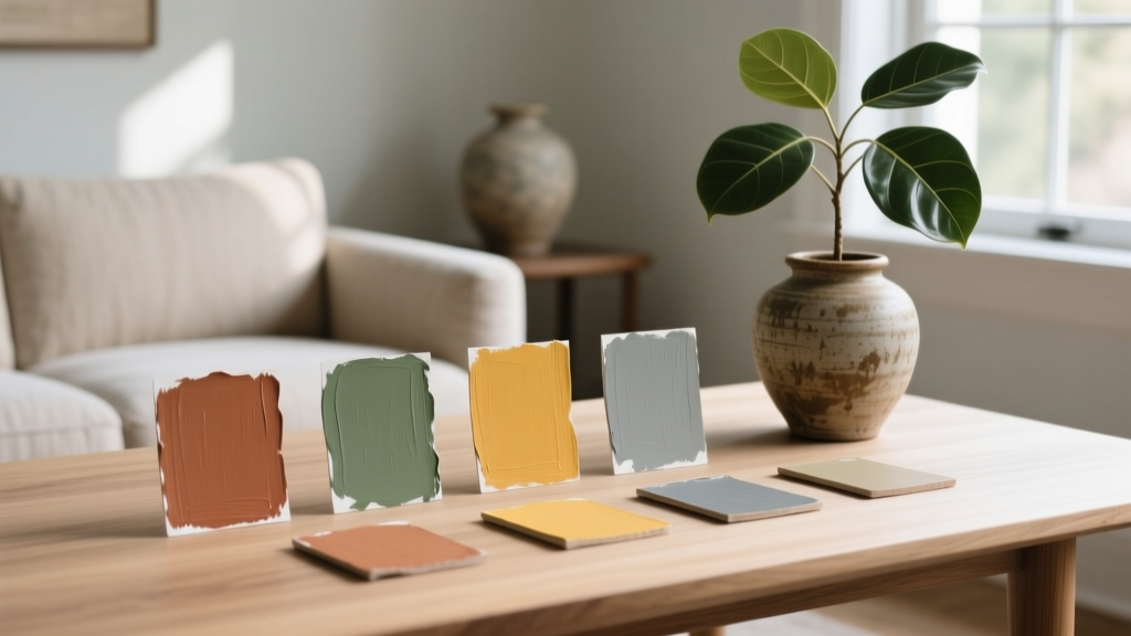 How to Create a Traditional Color Palette - The Decor Mag
 12 Practical DIY Furniture Ideas You Can Build in a Weekend (With Exact Materials & Dimensions)
 How to Create an Uplifting Color Palette - The Decor Mag
 Best Eucalyptus Paint Colors - The Decor Mag
 Best Plum Paint Colors for Drama - The Decor Mag
 How to Choose Colors for North-Facing Rooms - The Decor Mag