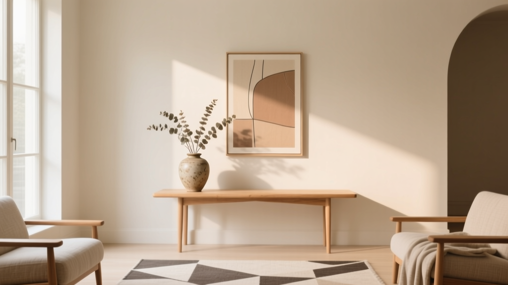
Best Cream Paint Colors for Warm Neutrals - The Decor Mag
Cream paint colors have a special kind of magic: they read as soft and welcoming like a neutral, yet they carry enough warmth to make a room feel lived-in and flattering. In a world of bright whites and cool grays, cream sits in the sweet spot—timeless, easy to decorate around, and forgiving in real homes with changing daylight, mixed materials, and everyday wear.
Warm neutrals are also having a well-deserved comeback. They complement natural wood, antique brass, warm leathers, travertine, and the earthy textiles that are defining today’s interior color design. Cream can be the bridge between “cozy” and “clean,” especially when you want a calm backdrop that still has personality.
This guide breaks down what makes a cream paint color work, the best cream paint colors from trusted brands, how to use them in real rooms, and the common mistakes that cause cream to look yellow, dull, or mismatched.
What Makes a Paint Color “Cream” (and Why Undertones Matter)
Cream is typically an off-white with a noticeable warm base—often yellow, beige, peach, or subtle pink. The key is undertone control. Two creams can look similar on a paint chip but behave very differently once they’re on your walls, especially next to flooring, stone, and trim.
The psychology of cream in a home
- Warmth and comfort: Cream tends to feel nurturing and relaxed, supporting the “soft landing” effect we crave in living spaces.
- Flattering light: Compared to cooler whites, cream can make skin tones look healthier and evening light feel more candlelit.
- Quiet sophistication: Cream reads as curated and classic—particularly in traditional, transitional, and organic modern homes.
How to spot undertones quickly
- Yellow-leaning creams feel sunny and cheerful, but can turn “buttery” in warm lighting.
- Beige/tan creams feel grounded and pair beautifully with warm woods.
- Pink/peach creams add softness and romance, especially in bedrooms.
- Green-tinged creams can look calm and earthy, but may shift depending on surrounding greens outdoors.
How to Choose the Right Cream for Your Lighting and Finishes
Choosing among the best cream paint colors is less about the “prettiest chip” and more about alignment with your home’s fixed elements and light sources. Cream is sensitive—when it’s right, it glows; when it’s off, it can look dingy or unexpectedly yellow.
Use this quick decision checklist
- Identify your fixed warmth: honey oak floors, warm stone, beige carpet, brass hardware, red brick.
- Check natural light direction: north-facing rooms read cooler and may need a slightly warmer cream; south-facing rooms can amplify warmth.
- Assess your bulbs: 2700K–3000K is warm; 3500K is neutral; 4000K+ can make cream look flat or slightly gray-green.
- Decide on trim strategy: cream-on-cream is cozy; crisp white trim adds contrast and a cleaner edge.
Sampling tips that prevent expensive surprises
- Test at least two cream options plus one “control” color (a warm white) on large swatches.
- Place swatches near flooring, cabinets, and countertops.
- View morning, afternoon, and evening—cream shifts dramatically under warm LEDs.
- If you love the color but it feels too deep, consider color-matching at 75% strength (ask your paint store if your brand allows this).
Best Cream Paint Colors for Warm Neutral Color Schemes
Below are designer-favorite cream paint colors that work reliably in warm neutral interiors. Paint availability and tinting can vary slightly by region, so always sample first.
Benjamin Moore Cream Paint Colors
- Benjamin Moore White Dove (OC-17): A warm off-white that often reads “creamy” in real rooms without going heavy yellow. Excellent for walls, trim, or cabinets when you want a soft, welcoming white.
- Benjamin Moore Swiss Coffee (OC-45): A popular creamy neutral with noticeable warmth. Beautiful in open-concept homes with warm floors and soft textiles.
- Benjamin Moore Navajo White (OC-95): Classic, richer cream with a golden warmth. Ideal for traditional homes, hallways, and rooms with less natural light.
- Benjamin Moore Simply White (OC-117): Technically a warm white, but it can lean creamy in south- and west-facing rooms. Great if you want brightness with warmth.
Sherwin-Williams Cream Paint Colors
- Sherwin-Williams Alabaster (SW 7008): A warm, soft off-white that reads creamy and calm. A go-to for warm neutral color schemes, especially when paired with natural wood and linen textures.
- Sherwin-Williams Creamy (SW 7012): True to its name—gentle warmth that feels friendly and cohesive. Works well in family rooms and kitchens where you want cozy brightness.
- Sherwin-Williams Navajo White (SW 6126): More saturated and distinctly warm. Great when you want a “sunlit” vibe, but sample carefully under warm bulbs.
- Sherwin-Williams Natural Linen (SW 9109): A warm neutral that sits between cream and light beige—excellent for whole-home palettes and open floor plans.
Farrow & Ball (for a softer, heritage-leaning cream)
- Farrow & Ball Pointing (No. 2003): A refined warm neutral with a gentle creaminess that feels elegant in older homes and classic interiors.
- Farrow & Ball School House White (No. 291): Muted, cozy, and slightly deeper—great for creating a restful envelope in bedrooms and studies.
Behr (accessible and versatile creams)
- Behr Swiss Coffee: A warm creamy off-white with broad appeal for living areas and kitchens.
- Behr Creamy White: A soft, approachable cream that pairs nicely with warm metals and wood tones.
Room-by-Room: Real Application Scenarios That Make Cream Shine
Living Room: Cream walls + warm wood = effortless warmth
For a living room that feels grounded but airy, cream walls are a reliable foundation. They create a warm backdrop for art, layered textiles, and natural materials without the starkness of bright white.
- Try: Sherwin-Williams Alabaster or Benjamin Moore White Dove
- Pair with: oak or walnut furniture, jute rug, camel leather, and black accents for definition
- Color scheme idea: cream + camel + soft terracotta + olive green
Kitchen: Cream cabinets or walls for a softer, warmer “white kitchen”
If you love a light kitchen but want it to feel less clinical, cream paint colors are ideal. They also coordinate beautifully with warm metals like brass and champagne bronze.
- Cabinets: Benjamin Moore Swiss Coffee or Sherwin-Williams Creamy for a cozy, inviting look
- Walls: Benjamin Moore White Dove keeps the space bright without going icy
- Countertops: cream works well with warm quartz veining, butcher block, and honed stone
- Backsplash: warm white handmade tile, tumbled marble, or creamy zellige
Bedroom: Cream creates a flattering, restorative glow
Bedrooms benefit from warm neutrals because they lower visual “noise.” Cream walls can soften shadows and make the room feel calm at night—especially under warm bedside lighting.
- Try: Farrow & Ball School House White or Benjamin Moore Navajo White (for extra warmth)
- Pair with: oatmeal linens, warm grays, muted blush, antique brass, and dark wood
- Color scheme idea: cream + warm taupe + dusty rose + espresso brown
Bathroom: Cream balances tile and stone, but choose the undertone carefully
Bathrooms often have cooler reflective surfaces (porcelain, chrome, mirrors) that can change how cream reads. If your tile has warm undertones, cream will look cohesive. If your tile is cool, cream can look “too yellow.”
- Try with warm tile: Sherwin-Williams Natural Linen or Benjamin Moore White Dove
- Try with cool tile: a warmer white (less yellow) like Benjamin Moore White Dove rather than a deep cream
- Tip: match your bulbs (3000K is a sweet spot for most warm neutral bathrooms)
Hallways and Open-Concept Spaces: Use cream to unify transitions
Cream is excellent for flow. In open layouts, a consistent cream in the main areas helps wood, rugs, and upholstery look intentional—even when styles vary slightly from room to room.
- Try: Benjamin Moore Swiss Coffee or Sherwin-Williams Alabaster
- Add depth: use a warm greige or tan in adjacent rooms (or on interior doors) for subtle contrast
Winning Color Combinations with Cream (Trim, Accents, and Materials)
Cream paint colors are flexible, but they look best when you repeat warmth across the room. Use these combinations to build a cohesive warm neutral palette.
Cream + crisp white trim (fresh and tailored)
- Walls in a cream (Swiss Coffee, Creamy)
- Trim in a cleaner warm white (Benjamin Moore Chantilly Lace for crisp contrast, or White Dove for softer contrast)
- Best for: transitional homes, modern classic interiors, and spaces needing definition
Cream + cream (cozy and enveloping)
- Walls in White Dove or Alabaster
- Trim one step lighter or darker in the same family
- Best for: low-ceiling rooms, older homes, and a “quiet luxury” feel
Cream + earthy colors (warm neutral perfection)
- Terracotta: art, textiles, or an accent wall in a muted clay tone
- Olive and sage: curtains, upholstery, built-ins, or a kitchen island
- Chocolate and espresso: beams, furniture, frames, or interior doors
Materials that love cream
- Warm woods (oak, walnut, teak)
- Natural fibers (linen, wool, jute, sisal)
- Warm metals (brass, bronze, copper)
- Stones with warmth (travertine, limestone, creamy marbles)
Common Cream Paint Color Mistakes (and How to Avoid Them)
- Mistake: Choosing cream without checking the flooring.
Fix: If your floors pull orange or red, choose a cream that’s less golden (White Dove or Alabaster often behave well). If floors are very light and warm, a deeper cream can add balance. - Mistake: Using warm bulbs that push cream into “yellow.”
Fix: If your cream looks too buttery at night, try 3000K LEDs with high CRI (90+). Lighting is part of your color scheme. - Mistake: Pairing cream walls with cool white tile or bright cool trim.
Fix: Align undertones: warm tile with warm cream; cool tile with a more neutral warm white. Avoid icy whites next to creamy walls unless you want a deliberate contrast. - Mistake: Sampling too small or in only one spot.
Fix: Paint large swatches on multiple walls. Cream can look different near windows versus interior corners. - Mistake: Forgetting sheen and surface texture.
Fix: Eggshell on walls is forgiving; matte can look velvety but may show scuffs. Semi-gloss on trim makes cream look slightly brighter and more reflective.
FAQ: Cream Paint Colors and Warm Neutrals
Is cream paint the same as beige?
No. Cream is typically closer to off-white with a warm undertone, while beige is deeper and more obviously tan/brown. Some colors sit in between (often labeled “light beige” or “warm neutral”). Sampling is the best way to see where a color lands in your room.
What cream paint color works best in north-facing rooms?
North-facing light is cooler, so many homeowners prefer a slightly warmer cream to prevent the room from feeling flat. Sherwin-Williams Alabaster and Benjamin Moore Swiss Coffee are popular starting points, but test first—surrounding trees and exterior colors also affect the result.
How do I keep cream paint from looking yellow?
- Choose a cream with a softer, balanced undertone (often less golden).
- Use 3000K lighting and avoid overly warm bulbs at night.
- Coordinate with counters, tile, and trim so undertones don’t clash.
Should trim be white or cream with cream walls?
Both work. For a clean, higher-contrast look, choose a warm white trim (not icy). For a cozy, seamless look, use a cream-on-cream approach with trim slightly lighter or in a different sheen for definition.
Are cream paint colors a good choice for resale?
Generally yes—cream reads neutral, welcoming, and broadly appealing, especially in homes with warm finishes. The safest approach is a cream that stays soft rather than heavily yellow, paired with cohesive trim and lighting.
Next Steps: How to Commit to the Right Cream with Confidence
Start by narrowing to three cream paint colors that suit your fixed finishes and the mood you want—bright and tailored, or cozy and enveloping. Sample them on multiple walls, view them through the day, and confirm your lighting temperature before you paint the whole space. Once your cream is chosen, build your warm neutral color scheme with repeated elements: wood tone, metal finish, and one or two earthy accent colors.
- Pick 2–3 cream paint samples (one lighter, one mid, one deeper).
- Test near floors, cabinets, and tile.
- Choose trim strategy (crisp contrast or soft monochrome).
- Lock in lighting (aim for 3000K, high CRI).
For more curated paint color palettes, warm neutral color schemes, and room-by-room guidance, explore the latest color guides on thedecormag.com.
More Articles
 Best Poppy Red Paint Colors - The Decor Mag
 Best Kitchen Design for Studio Apartments: Smart, Stylish & Space-Saving Solutions
 Best Olive Green Paint Colors (2026) | The Decor Mag
 Cheap vs Premium Reading: What the Data Says About Eye Strain, Comprehension, and Long-Term Value
 Best Honey Paint Colors - The Decor Mag
 Best Mustard Yellow Paint Colors - The Decor Mag
 How to Match Colors to Furniture and Fabrics - The Decor Mag
 How to Choose Colors for a Home Office - The Decor Mag
 Best Indigo Paint Colors - The Decor Mag
 How to Choose Colors for a Wine Cellar - The Decor Mag