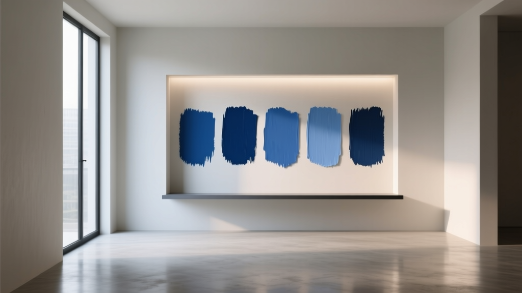
Best Cobalt Blue Paint Colors - The Decor Mag
Cobalt blue has a rare superpower in interior design: it reads as bold and timeless at the same time. It’s saturated without being neon, confident without feeling trendy, and it can swing from crisp and tailored to moody and dramatic depending on the light and the finishes around it. When homeowners search for the best cobalt blue paint colors, they’re usually looking for that “wow” moment—without sacrificing livability.
Color psychology backs up cobalt’s popularity. Blue is associated with calm, clarity, and trust; cobalt adds energy and focus because of its intensity. That’s why cobalt blue can feel surprisingly grounding in a busy family space, yet polished enough for a dining room or entry. Used thoughtfully, cobalt becomes a design anchor—a color that gives the rest of the palette something to organize itself around.
This guide breaks down the best cobalt blue paint options, how to choose the right one for your home, and how to avoid common missteps. You’ll also find real room scenarios, color scheme ideas, and practical tips for sampling and application.
What Makes a Paint Color “Cobalt Blue”?
Cobalt blue sits in the blue family as a vivid, medium-to-deep blue with a clean, slightly cool bias. It’s more saturated than a classic navy, less purple than many royals, and typically brighter than indigo. In paint form, cobalt can shift depending on undertones and lighting, which is why two “cobalt blues” can look very different on the wall.
Key traits to look for
- Saturation: Cobalt is intense—if the swatch looks muted, it’s probably more denim or slate than cobalt.
- Undertone: Many cobalts lean cool (slightly violet), while others lean clean/neutral (truer blue) or even green-leaning in certain lights.
- Value (lightness): Cobalt typically lands mid to deep. If it’s very dark, it may read as navy; if it’s too light, it reads as bright sky blue.
How to Choose the Right Cobalt Blue for Your Space
1) Read your light first
- North-facing rooms: Cooler, dimmer light can make cobalt feel deeper and slightly moodier. Consider a cobalt with a touch of warmth or clarity to keep it lively.
- South-facing rooms: Warm, abundant light can make cobalt look brighter and more energetic. If you want sophisticated, choose a deeper cobalt or pair it with warm neutrals.
- East-facing rooms: Morning light is crisp; cobalt can look sharp early and calmer later.
- West-facing rooms: Afternoon light warms up; some cobalts can shift slightly purple or feel more dramatic at sunset.
2) Decide: statement wall, full room, or cabinetry?
- Accent wall: Best for first-time cobalt users, open floor plans, or rooms with lots of artwork.
- Full room color: Best when you want an enveloping, designed feel—especially in dining rooms, powder rooms, libraries, and bedrooms.
- Cabinetry/trim: A high-impact way to use cobalt while keeping walls neutral. Great for kitchens, mudrooms, and built-ins.
3) Pick the right sheen
- Matte/flat: Velvety and modern; hides wall imperfections better. Great for bedrooms and living rooms.
- Eggshell: A safe all-around choice for walls; easier to clean than flat.
- Satin/semigloss: Ideal for cabinets, trim, doors, and kids’ spaces where durability matters. Saturated colors look richer in higher sheen, but surface prep must be excellent.
Best Cobalt Blue Paint Colors (Designer-Approved Picks)
Below are standout cobalt and cobalt-adjacent blues from major brands. Always test in your room—cobalt is sensitive to lighting, surrounding materials, and time of day.
Benjamin Moore: Iconic Cobalt Choices
- Benjamin Moore Old Navy (2063-10): A deep, high-impact blue that can read cobalt-meets-navy. Gorgeous for built-ins, libraries, and modern dining rooms.
- Benjamin Moore Patriot Blue (2064-20): Bold and clean with a classic Americana vibe. Strong for entry doors, powder rooms, and statement walls.
- Benjamin Moore Blue Danube (2062-30): A vivid royal-leaning blue that can feel very cobalt in bright spaces. Fantastic for accent walls and creative studios.
Sherwin-Williams: Bright, Versatile Blues
- Sherwin-Williams Loyal Blue (SW 6510): Saturated and upbeat. Works well in playrooms, laundry rooms, or as a lively cabinet color with white counters.
- Sherwin-Williams Blue Chip (SW 6959): Electric and modern; best used strategically (door, niche, furniture) or balanced with warm woods and neutrals.
- Sherwin-Williams Salty Dog (SW 9177): A deeper, sophisticated blue that can read as inky cobalt in the right light. Great for exterior doors and moody interiors.
Farrow & Ball: Statement Blues With Depth
- Farrow & Ball Hague Blue (No. 30): A cult favorite that reads deep blue-green and can feel cobalt-rich on cabinetry and paneling. Ideal for kitchens, studies, and built-ins.
- Farrow & Ball Lulworth Blue (No. 89): A fresher, clearer blue that can lean coastal. Lovely in bathrooms and airy bedrooms with white trim.
Behr: Accessible, Bold Options
- Behr Blueprint (S470-5): A confident medium blue that pairs well with warm whites and natural textures. Great for accent walls and home offices.
- Behr Ultra Pure Blue: A vivid primary-leaning blue; best for small doses (front doors, furniture flips, graphic accents) unless you’re intentionally going high-energy.
PPG: Clean, Modern Cobalts
- PPG Chinese Porcelain (PPG1160-6): Deep, refined, and slightly complex—gives a luxe cobalt mood in bedrooms and dining rooms.
- PPG Blue Opal (varies by line): Look for a mid-saturated blue that reads crisp rather than gray; excellent for contemporary spaces with white oak and black accents.
Real Room Examples: How Cobalt Blue Works in Everyday Homes
Cobalt blue in a living room: tailored and welcoming
Scenario: You want a sophisticated living room without going dark and gloomy.
- Try: Benjamin Moore Blue Danube on a single fireplace wall, or Old Navy on built-ins only.
- Pair with: Warm white walls (think creamy off-whites), oatmeal linen upholstery, and light oak.
- Style tip: Repeat the blue in two more places—pillows and a piece of art—so it feels intentional.
Cobalt blue in a bedroom: calm with a boutique-hotel edge
Scenario: You want restful, but not bland.
- Try: PPG Chinese Porcelain on all four walls in matte, or a cobalt headboard wall with the remaining walls warm neutral.
- Pair with: Crisp white bedding, walnut nightstands, and brass or aged bronze lighting.
- Style tip: Add softness with texture—bouclé, velvet, and layered rugs prevent cobalt from feeling hard.
Cobalt blue in a kitchen: cabinetry that feels custom
Scenario: You want a memorable kitchen but worry about resale.
- Try: Hague Blue or Sherwin-Williams Salty Dog on lower cabinets or an island only, with perimeter cabinets in warm white.
- Pair with: White quartz with subtle veining, unlacquered brass pulls, and zellige or classic subway tile.
- Style tip: Keep the cobalt grounded with natural wood stools or a wood hood detail.
Cobalt blue in a bathroom or powder room: small space, big impact
Scenario: You want drama that feels intentional, not overwhelming.
- Try: Sherwin-Williams Loyal Blue or Benjamin Moore Patriot Blue in satin for durability.
- Pair with: Bright white trim, a warm metallic mirror, and patterned tile with blue accents.
- Style tip: Consider a color-drenched look (walls + trim in the same cobalt) for a high-end, enveloping feel.
Cobalt blue on an exterior front door: instant curb appeal
Scenario: You want color that reads crisp from the street.
- Try: Benjamin Moore Patriot Blue or Sherwin-Williams Salty Dog in semigloss.
- Pair with: White trim, black hardware, and a natural fiber doormat. Add planters with silvery greens for contrast.
Best Color Combinations With Cobalt Blue (Schemes That Work)
Clean and classic: cobalt + white + natural wood
- Whites: Warm whites keep cobalt from feeling icy; bright whites make it graphic and modern.
- Woods: White oak, ash, and walnut all complement cobalt—choose based on your desired warmth.
Luxe contrast: cobalt + brass + deep neutrals
- Neutrals: Charcoal, espresso, and warm greige create a layered, designer look.
- Metals: Brass and aged bronze elevate cobalt immediately; chrome feels more contemporary and crisp.
Coastal modern: cobalt + sand + soft aqua accents
- Grounding tones: Beige, camel, and woven textures balance cobalt’s intensity.
- Accent colors: Sea-glass green, pale aqua, and soft gray-blue make the palette feel breezy.
Artful and energetic: cobalt + terracotta + blush
- Why it works: Blue and orange are complementary; terracotta is a softer, livable orange.
- Where to use: Rugs, artwork, and textiles bring in the warm counterpoint without repainting.
Practical Tips for Sampling and Applying Cobalt Blue
- Sample large: Paint at least a 2' x 2' area (or use large peel-and-stick samples) on multiple walls. Cobalt changes dramatically from one corner to another.
- Check day and night: Evaluate in morning, afternoon, and evening with lights on. LEDs can skew cobalt cooler or more violet.
- Mind the finish: Higher sheen increases perceived saturation and highlights wall texture. Prep, sand, and prime accordingly.
- Use the 60-30-10 guideline:
- 60% main neutral (walls or large upholstery)
- 30% secondary (wood tone, rugs, drapery)
- 10% cobalt (or flip it: make cobalt the 30% via built-ins)
- Repeat the color: A cobalt wall looks best when the room includes at least two additional blue touchpoints (art, textiles, ceramics).
Common Cobalt Blue Mistakes to Avoid
- Choosing cobalt without considering fixed finishes: Cobalt can clash with very cool gray floors or very warm yellow stone. Compare samples directly next to tile, countertops, and flooring.
- Underestimating saturation: Many people love cobalt on a swatch and panic on the wall. If you’re unsure, use it on built-ins, a door, or a single focal wall first.
- Ignoring undertones: A violet-leaning cobalt can look “royal” next to certain LEDs; a green-leaning cobalt can look teal near warm woods. Match undertone to your palette.
- Too many competing bold colors: Cobalt plays well with one strong partner (terracotta, chartreuse accents, or magenta art), but multiple saturated hues can feel chaotic.
- Forgetting trim strategy: Bright white trim makes cobalt pop; color-drenched trim makes it moody and modern. Pick a direction intentionally.
FAQ: Cobalt Blue Paint Colors
Is cobalt blue the same as royal blue?
They overlap, but they’re not identical. Royal blue often leans slightly more purple and can feel more “regal,” while cobalt typically reads cleaner and more balanced. Lighting and brand formulas can blur the lines, so always test samples.
What colors go best with cobalt blue walls?
Reliable pairings include warm whites, greige, camel, natural wood, brass, and crisp black accents. For a more colorful scheme, add terracotta, blush, or soft sea-glass greens.
Does cobalt blue make a room look smaller?
Darker, saturated colors can make walls feel closer, but cobalt doesn’t automatically shrink a room. In a space with good lighting and a thoughtful palette, cobalt can add depth and make the room feel more designed. Try matte finishes and balanced neutrals to keep it comfortable.
Is cobalt blue a good choice for a home office?
Yes. Blue supports focus and calm, and cobalt adds energy without feeling frantic. Use it on the wall behind your desk for a strong backdrop, then keep the rest of the room light and uncluttered.
What sheen is best for cobalt blue walls and cabinets?
For walls, matte or eggshell offers richness without highlighting flaws. For cabinets and trim, satin or semigloss is more durable and easier to clean—just be sure the surface is properly prepped.
How do I keep cobalt blue from feeling too intense?
Use it in controlled areas (built-ins, an island, a door), add warm materials (wood, woven textures), and choose softer lighting (2700K–3000K) to reduce a harsh, overly cool look.
Next Steps: Bring Cobalt Blue Home With Confidence
Start by choosing where cobalt blue will live in your design—an accent wall, cabinetry, a powder room, or a front door—then sample two to three shades in your actual lighting. Build a simple color scheme around it (white + wood + metal is a foolproof base), and repeat cobalt in small details so the room feels cohesive.
For more paint color ideas, room-by-room palettes, and expert color scheme guidance, explore our latest color guides on thedecormag.com.
More Articles
 How to Use Color to Create Intimacy - The Decor Mag
 Best Apricot Paint Colors - The Decor Mag
 How to Use Color to Create Rhythm - The Decor Mag
 Triadic Color Scheme Applications - The Decor Mag
 How to Create an Energizing Color Palette - The Decor Mag
 How to Choose Colors Based on Room Lighting - The Decor Mag
 Best Cream Paint Colors for Warm Neutrals - The Decor Mag
 How to Choose Colors for a Craft Room - The Decor Mag
 Best Citron Paint Colors - The Decor Mag
 How to Choose Colors for a Media Room - The Decor Mag