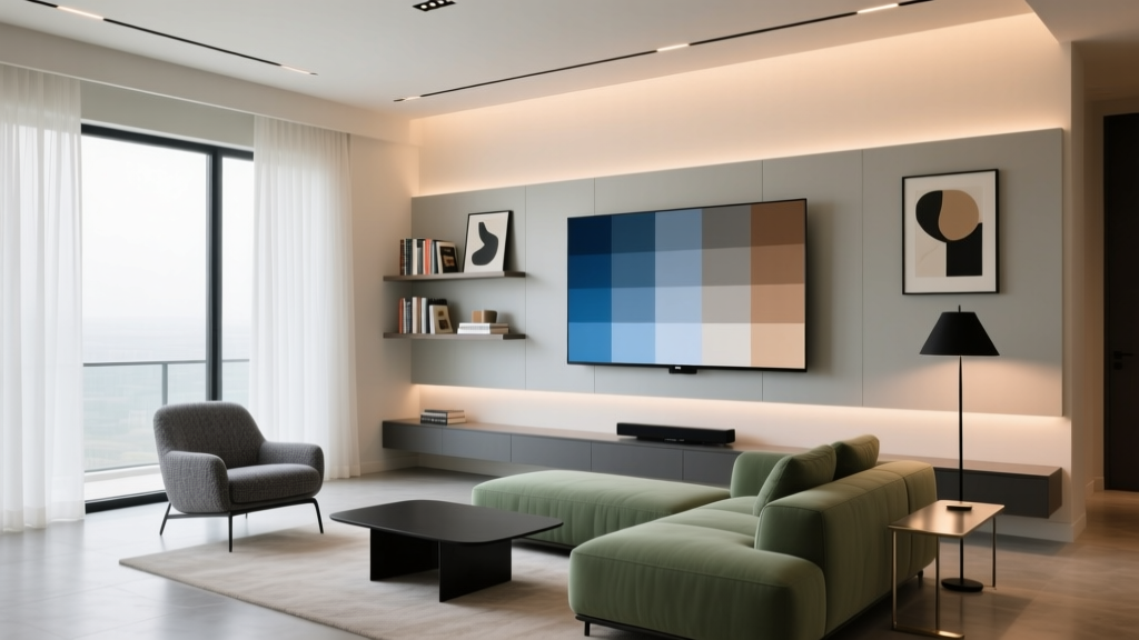
How to Choose Colors for a Media Room - The Decor Mag
A media room is one of the few spaces in a home where color does more than set a mood—it actively shapes how you see, how you focus, and how comfortable you feel for hours at a time. The right paint colors can reduce screen glare, improve perceived contrast, and make the room feel intentionally cinematic rather than “spare bedroom with a TV.”
Color also affects behavior. Dark, enveloping hues encourage relaxation and immersion (ideal for movies and gaming), while brighter, high-contrast palettes can keep the energy up for sports and social viewing. Because a media room blends technology, lighting, acoustics, and comfort, choosing an interior color scheme with purpose pays off every time the screen turns on.
This guide breaks down how to choose paint colors for a media room—using color psychology, design principles, and practical application tips—plus specific color recommendations from trusted brands so you can test and commit with confidence.
Start With the Job of the Room: Movies, Sports, Gaming, or Mixed Use
Before you look at paint swatches, define the primary experience you want. A media room designed for film viewing has different color priorities than a bright space for daytime sports.
Pick a direction based on use
- Movie-first (cinematic): Lower reflectance colors, matte finishes, and deep hues that visually “disappear” around the screen.
- Sports and entertaining: Mid-tones with warmth, better brightness tolerance, and color schemes that feel social and upbeat.
- Gaming: Dark foundations with controlled contrast; accent colors can be bolder (but keep them away from the screen wall).
- Mixed use: Balanced mid-to-deep tones, flexible lighting, and an accent strategy that adds personality without visual noise.
Understand Light and Screen Glare: The Most Overlooked Design Principle
The biggest difference between a media room and a typical living room is the screen. When walls are too light or too shiny, they reflect the screen’s light back into your eyes, reducing perceived contrast and making blacks look washed out. This is why many designers reach for deeper paint colors and flatter finishes in media spaces.
Key lighting factors to evaluate
- Natural light: Do you have windows? If yes, consider blackout shades and avoid high-reflectance wall colors near the screen.
- Screen type: Projectors are more sensitive to reflected light than TVs. Projector rooms typically benefit from darker colors overall.
- Ceiling lighting: Recessed cans can create glare; wall color choices should support softer, dimmable lighting.
A practical rule of thumb
Darker and flatter = better viewing, especially on the wall the screen sits on (often called the “screen wall” or “front wall”). You can still use color creatively—just be strategic about where higher-contrast or lighter shades go.
Choose the Right Color Family: Psychology Meets Performance
Color psychology matters in a media room because the goal is sustained comfort and focus. Highly saturated, high-energy colors can feel exciting at first and exhausting later. Meanwhile, low-saturation, deeper tones can feel soothing and immersive—perfect for long viewing sessions.
Best-performing color families for media rooms
1) Charcoal, near-black, and deep gray (high contrast, modern)
These shades minimize reflection and help the screen feel crisp. They also make equipment, speakers, and cables visually recede.
- Benjamin Moore Kendall Charcoal (HC-166): A rich charcoal that reads sophisticated rather than flat.
- Sherwin-Williams Peppercorn (SW 7674): A favorite deep gray for dramatic rooms with modern seating.
- Farrow & Ball Railings (No. 31): A deep near-black with blue undertones; luxurious in low light.
2) Deep navy and inky blue (cinematic, calming, timeless)
Blue has a calming psychological effect and can feel “theatrical” without being heavy like black. Navy also plays beautifully with brass, walnut, and warm leathers.
- Benjamin Moore Hale Navy (HC-154): Classic navy that holds depth day and night.
- Sherwin-Williams Naval (SW 6244): An inky blue that looks refined in matte finishes.
- Farrow & Ball Hague Blue (No. 30): Green-leaning blue; especially rich with warm wood.
3) Deep green (grounding, cozy, upscale)
Greens feel restorative and pair well with warm metals and natural textures. In a media room, deeper greens offer darkness without going fully neutral.
- Benjamin Moore Salamander (2050-10): A dramatic, velvety green-black that feels luxe.
- Sherwin-Williams Greenblack (SW 6994): A moody green that reads tailored and architectural.
- Farrow & Ball Studio Green (No. 93): Deep and classic, ideal for traditional media rooms.
4) Warm deep neutrals (inviting, flexible, family-friendly)
If you want cozy without a heavy “theater” vibe, look at deeper taupes, warm grays, and smoky browns. These are forgiving with snacks, kids, and mixed decor styles.
- Benjamin Moore Chelsea Gray (HC-168): A warm, substantial gray that doesn’t feel cold.
- Sherwin-Williams Urbane Bronze (SW 7048): A brown-leaning neutral that looks incredible with soft lighting.
- Behr Cracked Pepper (PPU18-01): A popular dark neutral that works in contemporary spaces.
Build a Simple Color Scheme That Looks Designed
Media rooms benefit from restraint. A strong, cohesive color scheme reduces visual “busyness,” helping the screen remain the focal point. Use classic design principles—value (light vs. dark), undertone harmony, and controlled contrast—to build a palette that feels intentional.
Three reliable color scheme formulas
1) Monochromatic (one hue, multiple depths)
Choose one color family (like navy) and use lighter/darker versions across walls, trim, and textiles. This is a go-to interior color design strategy for creating a cocoon effect.
- Example palette: Sherwin-Williams Naval (walls) + SW Moody Blue (accent textiles) + soft gray rug + brass accents.
2) Analogous (neighbors on the color wheel)
Combine adjacent hues like blue-green or green-teal for a layered, sophisticated feel without harsh contrast.
- Example palette: Benjamin Moore Salamander (walls) + teal velvet pillows + aged brass + warm oak.
3) Neutral + one accent (easy, modern, versatile)
Let deep neutral walls do the heavy lifting and add one accent color in controlled doses.
- Example palette: BM Kendall Charcoal (walls) + cognac leather + muted rust throw + cream boucle ottoman.
Where to Put the Darkest Color (and Why It Works)
Placement can matter as much as the paint color itself, especially for glare control.
Best practice for the screen wall
- Make the screen wall the darkest surface in the room to reduce reflections and create a “frame” effect around the screen.
- Use matte or flat paint on the screen wall whenever possible.
Ceiling and trim strategies
- Ceiling: If you use a projector, a darker ceiling can significantly reduce light bounce. Consider painting the ceiling the same color as the walls for a seamless envelope effect.
- Trim: High-contrast white trim can be distracting in a dark media room. Consider a low-contrast approach:
- Paint trim the same color as walls in a different sheen, or
- Choose a softer trim color (warm off-white or greige) instead of bright white.
Paint Finish Matters: Choose the Right Sheen for Viewing and Durability
Sheen affects both reflection and wear. A shinier finish can highlight wall imperfections and bounce screen light around the room.
- Front/screen wall: Flat or matte (best for glare control).
- Side walls: Matte is usually ideal; eggshell if you need more cleanability.
- Trim and doors: Satin or semi-gloss for durability—just keep contrast subtle.
- Ceiling: Flat or matte.
If you have kids or expect a lot of traffic, ask the paint store for a washable matte line (many brands now offer scrubbable matte formulas).
Real Room Examples: Color Choices That Create a True Media-Room Feel
Example 1: Dedicated projector room with maximum immersion
- Goal: Reduce all reflections for the best contrast.
- Walls: Sherwin-Williams Peppercorn (SW 7674) in matte.
- Ceiling: Same color as walls (matte) to limit bounce.
- Trim: Paint-to-match Peppercorn in satin for subtle definition.
- Textiles: Charcoal sectional, black-out curtains, and a low-sheen rug with a tone-on-tone pattern.
Example 2: Family media room that still feels bright enough for daytime
- Goal: Cozy, durable, not cave-like.
- Walls: Benjamin Moore Chelsea Gray (HC-168) in matte or eggshell.
- Accent: BM Hale Navy (HC-154) on built-ins or the screen wall for depth.
- Trim: Soft off-white (avoid bright, cool whites). Consider BM White Dove (OC-17) for a warmer, calmer edge.
- Decor: Warm wood media console, tan leather ottoman, layered lighting.
Example 3: Small media nook in an open-plan living space
- Goal: Define the TV zone without repainting the entire home.
- Approach: Paint only the TV wall (and possibly the adjacent return wall) in a deeper hue.
- Color: Sherwin-Williams Urbane Bronze (SW 7048) for warmth and sophistication.
- Styling tip: Add darker drapery panels and a large rug to visually “zone” the media area.
Smart Color Combinations That Look Great With Common Media Room Materials
Media rooms often include black screens, dark electronics, metal speaker grills, and plush seating. Here are pairings that consistently work in real homes:
- Deep navy + walnut + brass: Classic cinema vibe with warmth (try BM Hale Navy + walnut console + brass sconces).
- Charcoal + black + soft ivory textiles: Modern and crisp (SW Peppercorn + black frames + ivory pillows).
- Deep green + cognac leather + cream boucle: Cozy and elevated (BM Salamander + cognac sectional + cream ottoman).
- Warm neutral + rust + charcoal: Inviting, not overly themed (SW Urbane Bronze + rust throw + charcoal rug).
Common Color Mistakes to Avoid in a Media Room
- Choosing bright white walls to “keep it open”: White increases glare and makes the screen feel harsh. If you want lighter walls, choose a mid-tone with a softer sheen.
- Using high-gloss or satin on large wall areas: Too reflective for a screen-focused room; it can create hot spots and highlight drywall flaws.
- Ignoring undertones: A “gray” can lean blue, green, or purple. Test samples at night with the TV on and lights dimmed.
- Over-accenting behind the TV: Busy wallpaper, high-contrast stripes, or overly bright accent colors can fight the screen for attention.
- Forgetting the ceiling: In projector rooms, a light ceiling can bounce light back onto the screen and reduce contrast.
- Skipping sample testing: Media rooms change dramatically between daylight, lamp light, and screen light. Always sample.
How to Test Paint Colors the Right Way (So You Don’t Repaint Twice)
Paint chips are a starting point, not a decision. Media rooms are especially sensitive to light, so test in context.
- Step 1: Pick 3–5 candidates in the same color family (for example: two charcoals, two navies, one warm neutral).
- Step 2: Paint large sample boards (at least 12"x12", larger is better) or use peel-and-stick samples.
- Step 3: View samples in these conditions:
- Daylight (if there are windows)
- Evening with your actual lamps/sconces on
- With the TV/projector on (this is crucial)
- Step 4: Check the color next to key items: sofa upholstery, flooring, drapery, and the screen wall.
FAQ: Media Room Paint Colors and Color Schemes
What are the best paint colors for a media room?
Deep, low-reflectance colors tend to perform best: charcoal gray (BM Kendall Charcoal, SW Peppercorn), navy (BM Hale Navy, SW Naval), and deep green (BM Salamander, SW Greenblack). These shades reduce glare and create a more immersive feel.
Should a media room be dark or light?
Darker rooms usually deliver better viewing because they reduce reflected light and improve perceived screen contrast. If you prefer a lighter look, choose a mid-tone (not white) and keep the screen wall darker in a matte finish.
What sheen should I use for media room walls?
Matte is the sweet spot for most media rooms because it reduces glare and still offers decent durability in modern paint formulas. Use flat/matte on the screen wall and consider eggshell only if you need extra cleanability.
Is black paint a good idea for a media room?
It can be, especially for dedicated projector rooms, but true black can feel intense and shows dust and marks. Many homeowners prefer near-black charcoals or deep green-black shades that feel softer while still minimizing reflection.
How do I choose a media room color scheme with existing furniture?
Start with the largest items (sofa, rug, flooring). If you have warm wood and leather, navies and deep greens often look cohesive. If your furniture is cool-toned or modern (black/gray), charcoals and inky blues usually coordinate best.
What if my media room has windows?
Use blackout shades or lined drapery, then choose mid-to-deep wall colors to control glare. Avoid high-sheen paint and consider painting the wall around the screen a darker shade than the rest of the room.
Next Steps: Turn Color Choices Into a Finished Media Room
To choose colors for a media room that look great and perform well, focus on three decisions:
- Pick a deep or mid-deep base color that supports screen contrast (charcoal, navy, deep green, or warm bronze-leaning neutrals).
- Control reflection with matte finishes and a darker screen wall (and consider a darker ceiling for projector setups).
- Build a simple, cohesive color scheme with one primary hue, supportive neutrals, and a restrained accent.
Once you’ve narrowed your options, sample your top choices in the room, view them with the screen on, and commit to the color that keeps the space calm, comfortable, and visually focused.
Explore more paint color ideas, color schemes, and interior color design guides at thedecormag.com to keep building a home that feels as good as it looks.
More Articles
 Minimalist Color Palettes That Actually Feel Warm
 Best Seaweed Green Paint Colors - The Decor Mag
 Best Cerulean Blue Paint Colors - The Decor Mag
 How to Create a Grounded Color Palette - The Decor Mag
 Split Complementary Color Palette Ideas - The Decor Mag
 How to Use Color to Create Unity - The Decor Mag
 Best Emerald Green Paint Colors - The Decor Mag
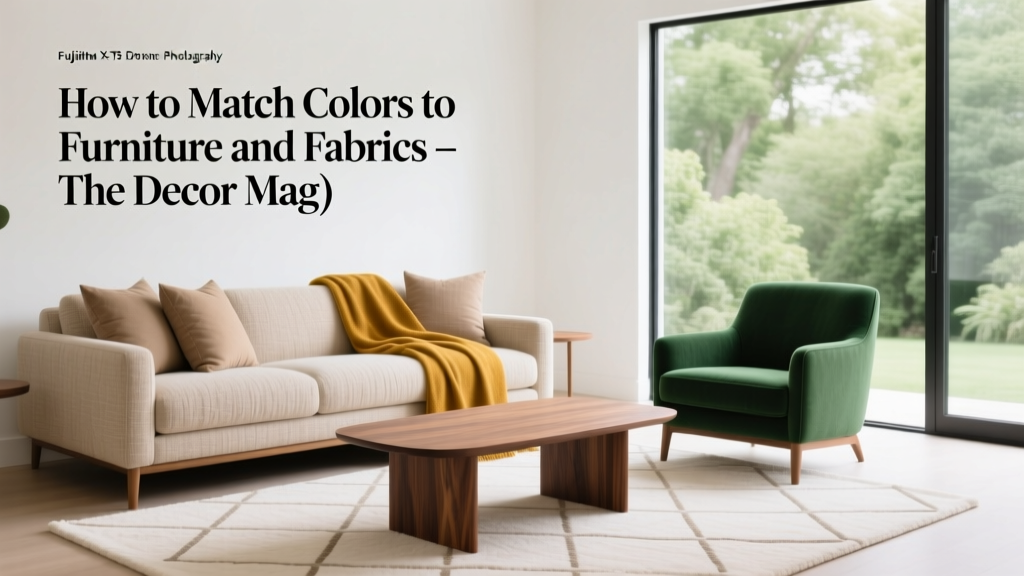 How to Match Colors to Furniture and Fabrics - The Decor Mag
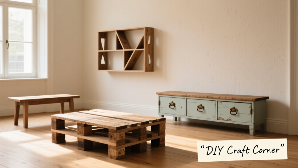 12 Practical DIY Furniture Ideas You Can Build in a Weekend (With Exact Materials & Dimensions)
 Best Red Paint Colors for Drama and Warmth - The Decor Mag