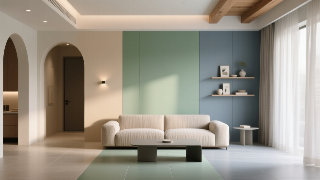
How to Create a Transitional Color Palette - The Decor Mag
Transitional design lives in the sweet spot between classic and contemporary—warm, welcoming, and timeless without feeling dated. The color palette is what makes that balance feel effortless. Get the colors right, and even a mix of traditional millwork, modern lighting, and updated furniture reads as cohesive. Miss the mark, and the space can feel split-personality: too beige and flat on one side, too stark and trendy on the other.
A transitional color scheme matters because it supports how you actually live. It’s flexible enough for evolving styles, forgiving in everyday light, and friendly to both warm and cool finishes. The best transitional palettes also reflect color psychology: calming neutrals reduce visual noise, while measured contrast (like charcoal, navy, or soft black) adds confidence and structure.
Below is a practical, designer-minded approach to interior color design—complete with paint color recommendations, real room scenarios, and common mistakes to avoid—so you can build a transitional paint palette that feels polished from day one and still looks right years from now.
What Makes a Color Palette “Transitional”?
A transitional palette blends traditional warmth with modern clarity. Instead of leaning heavily into one extreme (all cool whites and high contrast, or all warm tans and creams), it uses balanced undertones, layered neutrals, and purposeful accents.
Core Principles of Transitional Color Schemes
- Balanced undertones: Warm and cool elements coexist—think warm white walls with a cooler gray upholstery, or greige walls with crisp white trim.
- Soft contrast: Contrast is present, but not harsh. Charcoal replaces jet black; creamy white replaces bright optical white.
- Layered neutrals: Multiple neutrals (white, greige, taupe, stone, soft gray) create depth without chaos.
- Classic accent colors: Blues, greens, and muted earth tones show up in controlled amounts for longevity.
- Finish cohesion: Sheen and texture (matte walls, satin trim, brushed metal) matter as much as the paint color itself.
Step-by-Step: How to Build a Transitional Color Palette
1) Start With a “Bridge Neutral” (Your Wall Color Workhorse)
The easiest way to achieve transitional harmony is to choose a neutral that bridges warm and cool—often a greige, soft taupe, or creamy off-white with restrained undertones. This becomes your primary wall color and sets the temperature for the whole home.
Designer-favorite bridge neutrals (great for open concept paint colors):
- Sherwin-Williams Agreeable Gray (SW 7029): A classic greige that adapts well to many floors and finishes.
- Benjamin Moore Edgecomb Gray (HC-173): A warm greige with a soft, traditional feel—excellent for north-facing rooms that need warmth.
- Farrow & Ball Skimming Stone (No. 241): Creamy, elegant, and quietly modern in the right light.
- Benjamin Moore Pale Oak (OC-20): Light and airy, with a subtle warmth that suits transitional trim and textiles.
Tip: Test your bridge neutral in at least two rooms and on multiple walls. Transitional palettes depend on consistency, and undertones can shift dramatically between morning and evening light.
2) Choose a Clean (Not Icy) Trim White
Trim color is the tailoring of a transitional home. Too bright and cool, and your space can feel modern-sterile. Too creamy, and it can skew traditional. Aim for a white with gentle warmth or a balanced neutral base.
- Benjamin Moore White Dove (OC-17): A go-to transitional trim white—soft, not yellow, and pairs with both warm and cool palettes.
- Sherwin-Williams Alabaster (SW 7008): Warm and welcoming; works especially well with natural wood and brass.
- Benjamin Moore Chantilly Lace (OC-65): Cleaner and crisper; best when your palette leans cooler or your home lacks natural light warmth.
Application guidance: Use satin or semi-gloss on trim for durability and subtle contrast with matte or eggshell walls.
3) Build Contrast With a Deep Neutral (Not a Trend Color)
Transitional rooms often rely on a “quiet anchor”—a deeper neutral that adds structure to built-ins, interior doors, a kitchen island, or a focal wall. This is where modern edge meets classic grounding.
- Benjamin Moore Kendall Charcoal (HC-166): Rich, timeless, and excellent for cabinetry or fireplaces.
- Sherwin-Williams Iron Ore (SW 7069): A soft black-charcoal that looks sophisticated on doors and millwork.
- Benjamin Moore Hale Navy (HC-154): A heritage navy that feels equally at home with brass, nickel, or matte black hardware.
- Sherwin-Williams Urbane Bronze (SW 7048): A brown-bronze neutral that pairs beautifully with creams, leathers, and warm woods.
Color psychology note: Deep neutrals create a sense of stability and focus. Used strategically, they make open layouts feel organized and intentional.
4) Add One or Two Accent Families (Muted, Nature-Based Works Best)
Transitional color design typically avoids overly saturated, neon, or ultra-trendy accents. Instead, choose muted hues inspired by nature—soft greens, dusty blues, clay, or gentle terracotta. These colors feel restorative (a key element of color psychology) and layer well with classic materials.
Reliable transitional accent paint colors:
- Blue: Benjamin Moore Boothbay Gray (HC-165) for a misty blue; Sherwin-Williams Sea Salt (SW 6204) for a blue-green spa tone.
- Green: Benjamin Moore Saybrook Sage (HC-114) for a warm sage; Sherwin-Williams Evergreen Fog (SW 9130) for a modern muted green-gray.
- Warm earth: Farrow & Ball Setting Plaster (No. 231) for a soft blush-clay; Benjamin Moore Adobe Dust (2171-40) for subtle warmth without going orange.
Rule of thumb: Keep accents to 10–20% of what you see in a room (pillows, art, a feature wall, a powder room vanity) so the palette stays transitional rather than thematic.
Transitional Color Palette Formulas You Can Copy
Palette 1: Airy Greige + Soft White + Charcoal
- Walls: Sherwin-Williams Agreeable Gray (SW 7029)
- Trim: Benjamin Moore White Dove (OC-17)
- Accent/Anchor: Benjamin Moore Kendall Charcoal (HC-166)
- Materials: Light oak, linen upholstery, blackened metal, warm brass
Best for: Open-concept living rooms, hallways, and homes with mixed flooring.
Palette 2: Creamy White + Navy + Warm Wood
- Walls: Sherwin-Williams Alabaster (SW 7008)
- Trim: Alabaster (same color, different sheen) or Benjamin Moore White Dove
- Cabinet/Island/Accent: Benjamin Moore Hale Navy (HC-154)
- Materials: Walnut, cane, marble-look quartz, polished nickel
Best for: Kitchens, dining rooms, and family rooms where you want classic contrast without starkness.
Palette 3: Pale Oak + Sage + Soft Black
- Walls: Benjamin Moore Pale Oak (OC-20)
- Trim: Benjamin Moore White Dove (OC-17)
- Accent: Sherwin-Williams Evergreen Fog (SW 9130)
- Doors/Metal: Sherwin-Williams Iron Ore (SW 7069)
Best for: Bedrooms and bathrooms—calming, layered, and quietly elevated.
Real Room Examples and Application Scenarios
Living Room: Make Neutrals Feel Designed (Not Default)
Scenario: You have a traditional fireplace, contemporary sofa, and mixed metal finishes. You want a cohesive transitional living room color scheme.
- Walls: Benjamin Moore Edgecomb Gray (HC-173)
- Trim: Benjamin Moore White Dove (OC-17)
- Fireplace surround or built-ins: Benjamin Moore Kendall Charcoal (HC-166)
- Textiles: Add a muted blue rug (dusty slate) and warm ivory curtains for softness.
Why it works: Warmth from the greige supports classic architecture, while charcoal adds modern definition. Muted blue introduces calm and trust (blue’s color psychology) without feeling coastal or theme-y.
Kitchen: Use Contrast to Modernize Without Losing Warmth
Scenario: You’re updating paint only—no major renovation—and want a transitional kitchen color scheme that works with existing countertops.
- Perimeter cabinets: Keep light or paint in a soft white like Sherwin-Williams Alabaster (SW 7008)
- Island: Benjamin Moore Hale Navy (HC-154) or Sherwin-Williams Urbane Bronze (SW 7048)
- Walls: A subtle neutral like Benjamin Moore Pale Oak (OC-20)
Tip: If your countertops read cool (gray marble, white quartz with gray veining), favor Hale Navy. If they read warm (beige granite, creamy quartz), Urbane Bronze will tie in more naturally.
Bedroom: A Calm Palette That Still Feels Elevated
Scenario: You want restful color without going full monochrome.
- Walls: Sherwin-Williams Sea Salt (SW 6204) for a spa-like blue-green
- Trim: Benjamin Moore White Dove (OC-17)
- Accent (optional): Iron Ore (SW 7069) on the bedroom door or a dresser for contrast
Why it works: Soft blue-green tones are associated with relaxation and clarity, while crisp trim keeps the look tailored and transitional.
Hallway + Open Concept: Create Flow With a “Whole-Home Neutral”
Scenario: Your home has connected spaces, and you’re struggling with paint colors that look good room-by-room but clash together.
Approach: Use one bridge neutral on most walls, then shift depth (not undertone) by room.
- Main walls: Sherwin-Williams Agreeable Gray (SW 7029) or Benjamin Moore Pale Oak (OC-20)
- Adjacent room depth shift: Add a deeper version in the same family (for example, a slightly darker greige) or introduce a single accent room in muted green.
- Consistent trim: Keep the same white everywhere for continuity.
Common Color Mistakes to Avoid in Transitional Interiors
- Mixing undertones without a plan: Warm beige walls + icy blue-gray trim can look accidental. Pick a direction, then “bridge” with greige or balanced whites.
- Choosing paint from a tiny swatch: Large samples reveal undertones and how light changes the paint color. Use sample pots or peel-and-stick samples.
- Overusing stark white: Bright, optical whites can make transitional spaces feel too modern and emphasize contrast in a harsh way.
- Using trendy accent colors as foundations: A very saturated teal or violet might feel exciting now but can date quickly. Keep bolds to decor, not fixed finishes.
- Forgetting sheen and finish: A perfect wall color can look wrong in high gloss. Matte/eggshell on walls, satin/semi-gloss on trim usually reads most polished.
- Ignoring fixed elements: Flooring, stone, large rugs, and cabinetry undertones should guide your paint color selection—not fight it.
Practical Tips for Testing and Applying Your Palette
- Identify fixed finishes first: Pull undertones from floors, countertops, and large upholstery.
- Test 3–5 colors max: One bridge neutral, one trim white, one deep anchor, and one accent.
- View samples vertically: Paint on poster board or sample panels; walls reflect light differently than flat surfaces.
- Check color in 3 lighting conditions: Morning, afternoon, and evening (with lamps on).
- Use repetition for cohesion: Repeat your accent color at least twice in a room (art + pillow, vase + throw) for intentional design.
FAQ: Transitional Color Palettes
What are the best neutral paint colors for a transitional home?
Top transitional neutrals include Sherwin-Williams Agreeable Gray (SW 7029), Benjamin Moore Pale Oak (OC-20), and Benjamin Moore Edgecomb Gray (HC-173). These are popular because they balance warm and cool undertones and work well in open concept spaces.
Should transitional interiors be warm or cool?
Transitional interiors can be either, but the most successful palettes are balanced. A warm-leaning neutral with a cooler accent (or the reverse) creates that signature “classic-meets-current” look.
How many colors should be in a transitional color scheme?
A strong transitional color palette typically uses 4–6 colors: one main wall neutral, one trim white, one deep anchor, and 1–3 accents. This keeps the home cohesive while still layered.
What’s a good transitional alternative to pure white walls?
Try a soft off-white or light greige: Sherwin-Williams Alabaster (SW 7008), Benjamin Moore White Dove (OC-17), or Benjamin Moore Pale Oak (OC-20). They read bright but feel warmer and more lived-in than stark white.
How do I keep my palette cohesive across an open floor plan?
Use one “whole-home neutral” on most walls, keep the same trim color throughout, and introduce contrast with a consistent deep neutral (like Iron Ore or Kendall Charcoal) in repeated elements—doors, built-ins, or accents.
Next Steps: Build Your Transitional Palette With Confidence
Start by selecting a bridge neutral you can live with daily, then tailor it with a trim white that feels clean but not icy. Add a deep neutral anchor for structure, and bring in muted, nature-based accents for personality. When you test thoughtfully and repeat colors with intention, transitional style becomes less about “playing it safe” and more about creating a home that feels calm, current, and enduring.
For more paint color ideas, color scheme guides, and room-by-room inspiration, explore the latest color articles on thedecormag.com.
More Articles
 How to Choose Colors for Kitchen Cabinets - The Decor Mag
 Best Pink Paint Colors That Aren't Juvenile - The Decor Mag
 How to Use Color to Create Calm - The Decor Mag
 Best Aqua Paint Colors - The Decor Mag
 12 Practical DIY Furniture Ideas You Can Build in a Weekend (With Exact Materials & Dimensions)
 Best Moss Green Paint Colors - The Decor Mag
 Best Brown Paint Colors for Cozy Rooms - The Decor Mag
 Best Honey Paint Colors - The Decor Mag
 Best Sage Green Paint Colors for Serenity - The Decor Mag
 Best Dusty Rose Paint Colors - The Decor Mag