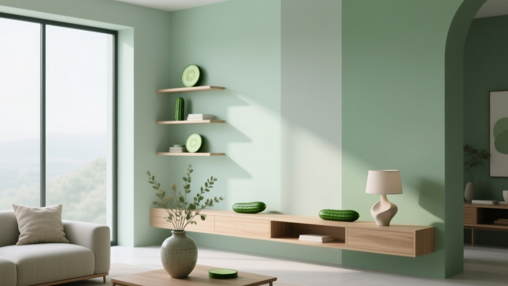
Best Cucumber Paint Colors - The Decor Mag
Cucumber paint colors hit a rare sweet spot in interior color design: fresh without being loud, calming without feeling cold, and versatile enough to work across modern, traditional, and transitional homes. This green family is often described as “spa-like,” but the real magic is how cucumber tones soften a room’s edges—visually lowering stress and making spaces feel more breathable.
For homeowners, cucumber greens solve a common decorating problem: you want color, but you don’t want commitment to something trendy or overpowering. For design enthusiasts, they’re a masterclass in undertones—these shades shift beautifully with light, adjacent materials, and sheen, which makes them ideal for layered, intentional color schemes.
Below, you’ll find the best cucumber paint colors (with trusted brand references), room-by-room examples, color combinations, and practical guidance to help you choose a shade that looks as good on your walls as it does on a paint chip.
What Is a “Cucumber” Paint Color?
Cucumber paint colors live in the light-to-medium green range—often slightly muted—with a crisp, hydrated quality. Think of the inside of a cucumber: clean green with a touch of softness, sometimes leaning yellow-green (warmer) or blue-green (cooler). In paint terms, cucumber shades typically:
- Read as fresh and natural rather than earthy and heavy
- Work well with whites, warm woods, and stone finishes
- Feel serene, making them popular for bedrooms, bathrooms, and kitchens
- Change dramatically under different lighting (daylight vs. LEDs)
Color Psychology: Why Cucumber Greens Feel So Good
Green is associated with balance, restoration, and comfort—qualities that make it a strong choice for spaces where you want to decompress or reset. Cucumber tones, specifically, tend to be lighter and cleaner than olive or forest, so they:
- Reduce visual “noise” in busy rooms
- Support focus in home offices and studies
- Make bathrooms and bedrooms feel more restorative
- Pair easily with biophilic design elements (plants, wood, natural textures)
How to Choose the Right Cucumber Shade (Undertones & Lighting)
Choosing the best green paint color is less about the label and more about undertone and exposure. Cucumber colors can tilt warm (yellow-based) or cool (blue/gray-based). This changes how they play with cabinets, floors, and trim.
Start with Your Room’s Light
- North-facing rooms: Light is cooler and can make cucumber shades look grayer or bluer. Consider a slightly warmer cucumber green to prevent a chilly feel.
- South-facing rooms: Light is warm and abundant; cucumber greens can look more yellow. Choose a balanced or slightly cooler option if you want a cleaner green.
- East-facing rooms: Bright morning light, softer later. Cucumber greens look lively early and more muted in the afternoon.
- West-facing rooms: Warm late-day glow can turn some greens overly yellow. Test in afternoon/evening light.
Use a Simple Undertone Check
Hold your sample next to:
- Pure white paper: Reveals if the paint reads yellow-green or blue-green.
- A warm neutral (cream/beige): If the green suddenly looks icy, it’s probably cool-toned.
- A cool neutral (gray): If it looks neon or overly bright, it may be warm/yellow-based.
Best Cucumber Paint Colors (Designer-Approved Picks)
These cucumber paint colors are reliable, widely available, and known for playing nicely with modern interior finishes. Always sample first—greens are famously reactive to surrounding materials.
1) Benjamin Moore Soft Fern (2144-40)
Vibe: Classic cucumber—fresh, balanced, and softly muted.
Best for: Living rooms, bedrooms, hallways, and open-concept spaces where you want color that doesn’t shout.
Pairs well with:
- Warm whites (Benjamin Moore White Dove OC-17)
- Light oak and natural jute textures
- Brushed brass and black accents
2) Sherwin-Williams Sea Salt (SW 6204)
Vibe: A cucumber-leaning green-gray that can read spa-like and airy.
Best for: Bathrooms, laundry rooms, and bedrooms—especially if you love soft coastal color schemes.
Design tip: In rooms with warm bulbs, Sea Salt may look more green; in cooler daylight, it can pull gray-blue. Use a warm white trim to keep it inviting.
3) Sherwin-Williams Clary Sage (SW 6178)
Vibe: A deeper, more grounded cucumber-sage hybrid.
Best for: Kitchen cabinets, mudrooms, built-ins, and dining rooms where you want a bit more presence.
Pairs well with:
- Creamy whites (SW Alabaster SW 7008)
- Terracotta pottery, warm wood, and woven textures
- Marble or quartz with soft gray veining
4) Farrow & Ball Mizzle (No. 266)
Vibe: Subtle green-gray that reads cucumber in the right light—elegant, quiet, and layered.
Best for: Primary bedrooms, libraries, and refined living spaces with natural fabrics (linen, wool, cotton).
Why designers like it: It behaves like a neutral but still gives you that green “exhale.”
5) Behr Jojoba (N390-3)
Vibe: Soft, approachable green with a gentle earthiness—cucumber adjacent with a cozy undertone.
Best for: Family rooms, kids’ rooms, and casual spaces where you want warmth and durability.
Style match: Works beautifully with boho, modern farmhouse, and relaxed traditional interiors.
6) Benjamin Moore Guilford Green (HC-116)
Vibe: A more traditional, heritage green that can still read cucumber when used with crisp whites and bright light.
Best for: Dining rooms, studies, or exterior accents; also striking on cabinetry.
Elevate it with: Polished nickel, white marble, and tailored trim details.
Real Room Examples: Where Cucumber Paint Colors Shine
Cucumber Green in a Kitchen: Cabinets or Walls
Scenario: White quartz counters, warm wood floors, and a simple tile backsplash.
Try: Sherwin-Williams Clary Sage on lower cabinets with warm white uppers (or warm white walls). Add brass pulls and matte black lighting for contrast.
Why it works: Green reduces the starkness of white surfaces, while warm woods keep the palette grounded.
- Backsplash idea: Off-white zellige tile for texture
- Countertop pairing: White quartz with subtle gray veining
- Hardware: Satin brass for warmth, black for crisp definition
Cucumber Green in a Bathroom: Instant “Spa” Without Feeling Cold
Scenario: A small bathroom with limited natural light.
Try: Sherwin-Williams Sea Salt on walls, paired with warm white trim and a natural wood vanity.
Design principle: In compact rooms, a soft green-gray expands the space visually while still adding color interest.
- Finish tip: Use an eggshell or satin wall finish for wipeability; reserve semi-gloss for trim
- Accent: White shower curtain + eucalyptus-toned towels
Cucumber Green in a Bedroom: Calm That Still Feels Fresh
Scenario: You want a soothing bedroom color scheme that isn’t beige or gray.
Try: Benjamin Moore Soft Fern on all walls with White Dove trim. Layer bedding in white, oatmeal, and muted clay tones.
Why it works: Cucumber greens support relaxation and pair naturally with soft textiles—linen drapes, a boucle chair, a wool rug.
Cucumber Green in a Living Room: A Nature-Based Neutral
Scenario: A living room with lots of plants, warm wood furniture, and mixed metals.
Try: Farrow & Ball Mizzle for a sophisticated, nearly-neutral green. Add contrast with a deeper accent (charcoal, ink, or black).
- Accent colors: Charcoal, camel leather, antique brass
- Art tip: Abstract art with warm whites and black lines keeps the room modern
Cucumber Green on Trim or Built-Ins: A Designer Move
If you love the idea of green but aren’t ready for full walls, use cucumber as an architectural accent.
- Paint built-in bookcases: Benjamin Moore Guilford Green for depth and contrast
- Try a green interior door: Soft Fern in semi-gloss for a subtle statement
- Use on wainscoting: Clary Sage below a warm white upper wall
Winning Color Combinations for Cucumber Paint Colors
Cucumber greens are team players. Use these interior color design pairings to build a coherent palette.
Fresh & Clean (Great for Kitchens and Bathrooms)
- Cucumber green + crisp white + light gray stone
- Add: polished nickel or chrome, glass, white tile
Warm & Grounded (Perfect for Living Rooms)
- Cucumber green + creamy white + warm oak
- Add: camel leather, woven baskets, antique brass
Modern Contrast (For a Contemporary Look)
- Cucumber green + bright white + black accents
- Add: matte black fixtures, graphic rugs, bold line art
Softly Romantic (Bedrooms and Nurseries)
- Cucumber green + blush or muted clay + warm white
- Add: linen bedding, soft curves, brushed brass
Sheen, Sampling, and Placement: Practical Application Tips
- Sample on multiple walls: Greens shift by exposure and time of day. Paint at least 2’x2’ squares or use large peel-and-stick samples.
- Check at night: LED bulbs can push greens cooler or more yellow depending on temperature. Aim for 2700K–3000K for cozy, accurate warmth.
- Match undertones to finishes: If your floors are warm (oak, honey maple), avoid overly blue greens unless you want deliberate contrast.
- Choose sheen strategically:
- Flat/matte: Best for low-traffic bedrooms; hides wall texture
- Eggshell: Best all-around for living rooms and hallways
- Satin: Great for kitchens, baths, kids’ rooms; more wipeable
- Semi-gloss: Trim, doors, cabinetry for durability
- Use a consistent white: Pick one trim white (warm or crisp) and repeat it to keep the green from looking different room to room.
Common Mistakes to Avoid with Cucumber Paint Colors
- Ignoring undertones in tile and countertops: A green with a yellow undertone can clash with pink-beige stone; a cool green can look harsh next to creamy marble.
- Choosing the color under showroom lighting: Always evaluate paint colors in your home’s lighting. What looks “fresh” in-store can look dull or neon at home.
- Pairing with the wrong white: A cool, stark white can make some cucumber greens look muddy; an overly creamy white can make others look too yellow.
- Overusing green in one space: If walls, cabinets, tile, and decor are all green, the room can feel flat. Balance with whites, woods, and a contrasting accent color.
- Skipping contrast: Cucumber shades benefit from definition—think darker hardware, framed art, or trim that outlines the architecture.
FAQ: Best Cucumber Paint Colors
What paint color is closest to a true “cucumber green”?
Benjamin Moore Soft Fern (2144-40) is a strong pick for a classic cucumber feel—fresh, light-to-medium, and not overly gray.
Are cucumber paint colors warm or cool?
They can be either. Many cucumber greens lean slightly warm (yellow undertone), but some popular options (like Sherwin-Williams Sea Salt) lean cooler with gray-blue influence. Your lighting and surrounding finishes decide how they read.
Do cucumber greens work with gray floors?
Yes—choose a cucumber green with a cooler or balanced undertone (often green-gray) so it harmonizes with the floor rather than fighting it. Test samples next to the flooring throughout the day.
What are the best trim colors with cucumber green walls?
Warm whites tend to look best and keep cucumber greens welcoming. Popular choices include Benjamin Moore White Dove and Sherwin-Williams Alabaster. If you want a crisper look, use a cleaner white but confirm it doesn’t make the green look dull.
Is cucumber green a good whole-house paint color?
A soft green-gray cucumber shade can work as a whole-house color, especially in open-concept homes. Keep trim consistent and use adjacent rooms to shift the palette (add warmer neutrals in bedrooms, deeper accents in dining areas) for variety.
How do I keep cucumber paint from looking too bright?
Pick a slightly muted version (more gray or softer chroma), use a matte/eggshell sheen, and balance with natural textures (wood, linen, wool). Bright white can also intensify some greens—try a warmer white instead.
Next Steps: Make Your Cucumber Color Scheme Feel Intentional
Choose two to three cucumber paint color samples that fit your room’s light, then test them against your fixed finishes—floors, countertops, and tile. Build your supporting palette from there: a reliable warm white, one grounding neutral (taupe, sand, or soft gray), and a contrast accent (black, charcoal, or deep navy) to sharpen the look.
For more expert guidance on paint colors, undertones, and room-by-room color schemes, explore more color guides on thedecormag.com.
More Articles
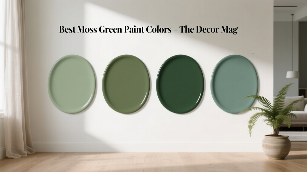 Best Moss Green Paint Colors - The Decor Mag
 How to Choose Colors for North-Facing Rooms - The Decor Mag
 How to Create a Harmonious Color Palette - The Decor Mag
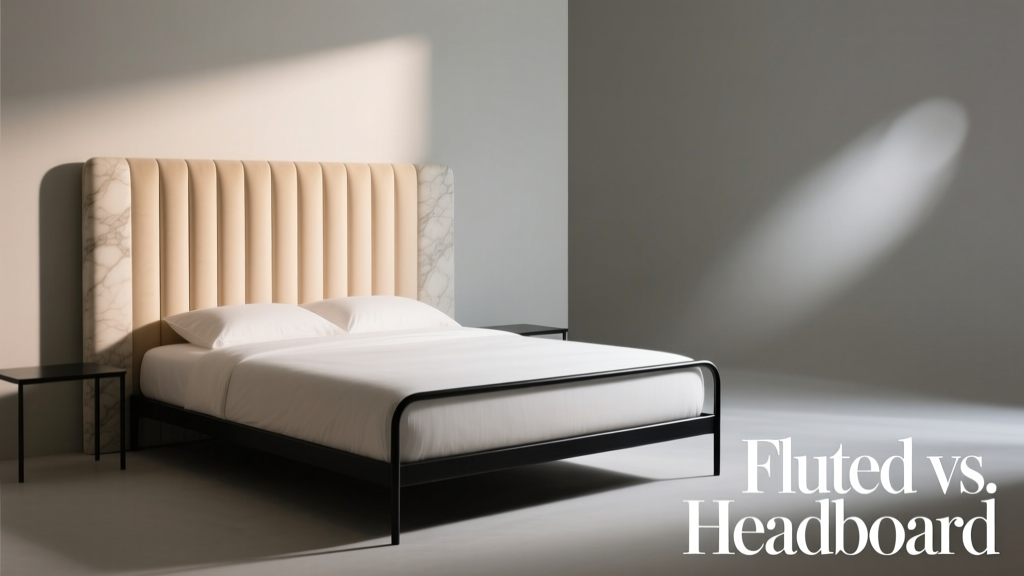 Fluted vs Headboard: Understanding the Structural, Aesthetic, and Functional Differences
 How to Choose Colors for a Balcony - The Decor Mag
 How to Choose Colors for a Media Room - The Decor Mag
 How to Choose Colors for a Courtyard - The Decor Mag
 Best Cantaloupe Paint Colors - The Decor Mag
 Tetradic Color Scheme Guide - The Decor Mag
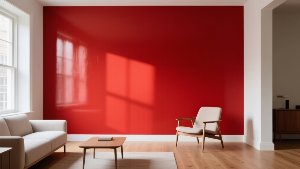 Best Fire Engine Red Paint Colors - The Decor Mag