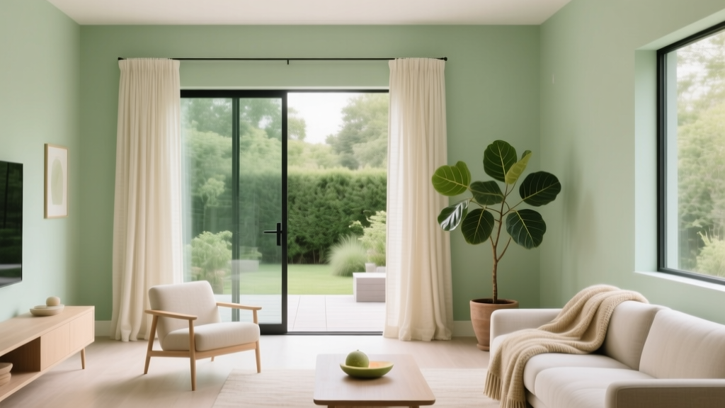
Best Honeydew Paint Colors - The Decor Mag
Honeydew is one of those quietly powerful paint colors that can change how a home feels without shouting for attention. Sitting in the soft green family with a gentle yellow undertone, honeydew shades read as clean, airy, and naturally uplifting—like morning light filtered through leaves. They’re especially relevant right now because homeowners are asking for calm interiors that still feel fresh, and honeydew is a beautifully livable answer.
Unlike many greens that swing too cool (mint) or too earthy (sage/olive), honeydew tends to land in the “happy medium”: warm enough to feel welcoming, light enough to brighten darker rooms, and nuanced enough to avoid looking sterile. When chosen well, it supports a range of interior color design styles—from modern organic and coastal to transitional and cottage—while pairing easily with popular finishes like white oak, matte black hardware, and warm whites.
This guide breaks down the best honeydew paint colors, how to choose the right one for your lighting, and how to build color schemes that look intentional. You’ll also find room-by-room application scenarios, common mistakes to avoid, and practical tips for sampling like a designer.
What “Honeydew” Means in Paint (and Why It’s Tricky)
In color theory terms, honeydew is typically a pale yellow-green with a higher Light Reflectance Value (LRV), often landing in the 70–90 range. That high LRV is why honeydew paint colors can make rooms feel larger and brighter. It’s also why undertones matter so much: a small shift toward gray can read minty-cool; a small shift toward yellow can look buttery; and some honeydew paints can flash neon in harsh light if they’re too clean and saturated.
Honeydew color psychology
- Green is associated with restoration, balance, and nature—great for bedrooms, kitchens, and family spaces.
- Yellow undertones add optimism and warmth, helping honeydew feel welcoming rather than clinical.
- High lightness can reduce visual clutter, making it a smart choice for small rooms and low-ceiling spaces.
How to Choose the Best Honeydew Paint Color for Your Home
1) Start with light direction
- North-facing rooms: Light is cooler and can pull honeydew toward mint. Look for honeydew paints with a slightly warmer (more yellow) base.
- South-facing rooms: Strong warm light can make honeydew look more yellow. Choose a balanced honeydew with a touch of gray to keep it sophisticated.
- East-facing rooms: Honeydew looks bright and optimistic in the morning, calmer later. Balanced tones work well here.
- West-facing rooms: Late-day warmth can amplify yellow. If you don’t want a golden cast, pick a slightly cooler honeydew.
2) Compare with fixed finishes
Honeydew shines when it relates to what you can’t easily change: floors, tile, stone, and cabinetry. Use these quick match cues:
- Warm wood (oak, maple): Choose honeydew with gentle warmth; avoid icy mints.
- Cool gray tile or concrete: Choose honeydew with a touch of gray (a softened pastel green) to harmonize.
- Warm stone (travertine, beige granite): A warmer honeydew looks cohesive and elevated.
3) Use LRV strategically
High-LRV honeydew paint colors brighten a space, but they also reflect surrounding colors. If you have bold rugs, saturated artwork, or red-toned wood, honeydew can subtly pick up those casts. If that worries you, choose a honeydew with slightly more gray (a “misted” honeydew) to reduce color bounce.
Best Honeydew Paint Colors (Designer-Approved Picks)
Below are standout honeydew paint colors across major brands. Each can read differently by lighting, so treat these as curated starting points and always sample.
Sherwin-Williams Honeydew (SW 6428)
A classic honeydew green that feels cheerful but still soft. It’s a strong choice for kitchens, breakfast nooks, and laundry rooms where you want “clean and happy” without bright mint vibes.
- Best for: Kitchens, mudrooms, sunny family rooms
- Pairs well with: Sherwin-Williams Alabaster (SW 7008), warm white quartz, light oak
- Style notes: Fresh traditional, cottage, modern organic
Benjamin Moore Honeydew (OC-101)
Benjamin Moore’s take leans light and airy, with a soft green presence that can feel almost creamy in warm light. This is a beautiful whole-house “whisper color” if you love gentle color instead of stark white walls.
- Best for: Open floor plans, hallways, nurseries
- Pairs well with: Benjamin Moore White Dove (OC-17), pale wood floors, brushed brass accents
- Style notes: Transitional, coastal, Scandinavian-inspired
Benjamin Moore Soft Fern (2144-40)
If you want honeydew’s fresh feeling but with a little more depth and sophistication, Soft Fern is a smart move. It reads as a gentle green that holds up in rooms with less natural light.
- Best for: Bedrooms, home offices, powder rooms
- Pairs well with: Benjamin Moore Simply White (OC-117), natural linen textiles, matte black
- Style notes: Calm, earthy, tailored
Sherwin-Williams Nurture Green (SW 6451)
Nurture Green is a brighter, more playful cousin to honeydew. In the right space—think sunroom or kids’ bath—it’s invigorating and clean. It can skew more “minty” than true honeydew in north light.
- Best for: Bathrooms, sunrooms, accent walls
- Pairs well with: Crisp whites, pale aqua accents, chrome fixtures
- Style notes: Retro, youthful, cheerful
Farrow & Ball Churlish Green (No. 251)
A refined, heritage-leaning light green with a gentle complexity. This is honeydew’s more grown-up cousin—especially stunning with traditional millwork and warm neutrals.
- Best for: Dining rooms, libraries, paneled spaces
- Pairs well with: Warm whites, aged brass, dark oak
- Style notes: Classic, English-inspired, collected
Behr Pale Honeydew (check in-store chip for exact code)
Behr often offers honeydew-leaning pastels that work well for budget-friendly updates. Look for options labeled “honeydew,” “dew,” or “fresh sprout,” and choose the one that looks slightly grayed-down rather than neon under store lighting.
- Best for: Rental refreshes, DIY weekend projects, guest rooms
- Pairs well with: Bright white trim, light woods, woven textures
Room-by-Room Ideas: How to Use Honeydew Paint Colors
Honeydew in the kitchen: fresh, not sterile
Honeydew kitchen walls bring a garden-fresh mood and flatter both warm and cool metals. It’s especially effective when the kitchen has lots of hard surfaces (stone, tile, stainless) and needs softness.
Real-room scenario: A small, north-facing kitchen with white shaker cabinets can feel cold. Paint the walls Sherwin-Williams Honeydew (SW 6428), keep trim in SW Alabaster, and add warmth with a natural jute runner and wood cutting boards on open shelving.
- Best finishes: Satin or eggshell for washable walls
- Color scheme: Honeydew + warm white + light oak + matte black accents
Honeydew in the bedroom: restorative and breathable
Because honeydew lives in a light, gentle range, it supports rest without feeling too cool. For bedrooms, choose a honeydew with a slightly softened (grayer) undertone if you want a more serene look.
Real-room scenario: A west-facing bedroom with beige carpet can look dated under warm afternoon light. Use Benjamin Moore Honeydew (OC-101) on walls, layer crisp white bedding, and add a tonal green throw to create a cohesive, updated palette.
- Color scheme: Honeydew + creamy white + camel leather + muted olive accents
Honeydew in the bathroom: spa-bright and clean
Bathrooms love high-LRV colors. Honeydew reads clean and makes tile and fixtures feel intentional. If your bathroom has cool gray tile, choose a honeydew that’s not overly yellow.
Real-room scenario: A hallway bath with gray porcelain tile and chrome fixtures can feel flat. Paint the walls Sherwin-Williams Nurture Green (SW 6451), keep the ceiling bright white, and add a white shower curtain with a subtle texture.
- Best finishes: Satin for walls; semi-gloss for trim
- Color scheme: Honeydew + white + pale gray + chrome
Honeydew in the living room: subtle color that still reads “designed”
If you’re bored with beige but not ready for bold color, honeydew is an easy step into color schemes that feel curated. It also works beautifully with plants and natural fibers.
Real-room scenario: An open-plan living room with medium-tone wood floors and a greige sofa can feel monotone. Use Benjamin Moore Soft Fern (2144-40) for walls, bring in ivory curtains, and accent with terracotta pillows to add warmth and contrast.
- Color scheme: Honeydew + ivory + terracotta + walnut
Honeydew on cabinets and built-ins: charming and unexpected
Honeydew cabinets can look fresh and custom, especially in laundry rooms, butlers’ pantries, and mudroom lockers. Use a durable cabinet paint and consider a slightly deeper honeydew so it doesn’t read too pastel against bright white walls.
- Great pairings: Honeydew cabinetry + white walls + brass knobs + checkerboard floor (classic) or pale stone (modern)
Color Combinations That Make Honeydew Look Intentional
Best trim and ceiling whites
- Sherwin-Williams Alabaster (SW 7008): Warm, creamy white that keeps honeydew inviting
- Benjamin Moore White Dove (OC-17): Soft white that works in most lighting
- Benjamin Moore Simply White (OC-117): A cleaner white; use when you want a brighter, crisper contrast
Accent colors that elevate honeydew
- Warm neutrals: Oatmeal, sand, camel, mushroom
- Earthy warms: Terracotta, clay, cinnamon, muted coral
- Deep anchors: Charcoal, inky navy, deep olive, espresso brown
- Soft companions: Pale blush, creamy ivory, misty blue-gray
Material pairings (the “designer shortcut”)
- Honeydew + white oak + linen: Modern organic calm
- Honeydew + marble + polished nickel: Clean, classic, bright
- Honeydew + rattan + warm brass: Airy coastal with warmth
- Honeydew + dark walnut + black metal: Sophisticated contrast
Sampling Like a Pro: Practical Honeydew Paint Tips
- Test at least two honeydew options (one warmer, one slightly grayer) to see which stays balanced in your lighting.
- Use large samples (12x12 minimum, larger is better). Honeydew’s undertones reveal themselves across a wider area.
- Check morning, afternoon, and night under your actual bulbs. Warm LEDs can turn honeydew more yellow.
- Place samples next to your fixed finishes (countertops, tile, flooring) and your soft finishes (sofa fabric, rugs).
- Decide your trim strategy early: creamy trim makes honeydew softer; bright trim makes it crisper and more modern.
Common Honeydew Paint Mistakes to Avoid
- Choosing a honeydew that’s too “clean” for the room: Very bright yellow-greens can look highlighter-like in strong sun. If the space is bright, pick a slightly muted honeydew.
- Ignoring bulb temperature: 2700K lighting warms honeydew significantly; 3000K is often a balanced sweet spot; 4000K can make it feel cooler and more minty.
- Pairing with the wrong white: A cool, blue-white trim can make honeydew look dingy. Match your white’s undertone to the honeydew’s warmth.
- Forgetting color bounce: Honeydew reflects nearby colors. A bright red rug or orange-toned wood can push it warmer than expected.
- Overusing it everywhere at the same intensity: In open layouts, vary the approach—honeydew in one main area, then warm white or a related neutral in adjacent spaces for flow.
FAQ: Honeydew Paint Colors
Is honeydew paint warm or cool?
Most honeydew paint colors are warm-leaning because of their yellow undertone, but the “temperature” depends on how much gray or blue is in the formula and your room’s light. North light can make honeydew look cooler; south light can make it look warmer.
What colors go best with honeydew walls?
Honeydew pairs beautifully with warm whites, light woods, earthy terracotta tones, charcoal, navy, and soft blush. For an easy, cohesive color scheme: honeydew walls + warm white trim + natural linen textiles + black or brass accents.
Does honeydew work with gray floors or gray tile?
Yes—choose a honeydew that’s slightly softened (a hint of gray) so it harmonizes instead of clashing. If your gray is very cool, avoid honeydews that are strongly yellow.
Is honeydew a good whole-house paint color?
It can be, especially in homes that want gentle color without committing to bolder greens. Pick a lighter, balanced honeydew (like Benjamin Moore Honeydew OC-101) and keep adjoining rooms in warm whites or related pale neutrals for a seamless flow.
What sheen is best for honeydew paint colors?
Eggshell is a go-to for most living areas because it’s forgiving and easy to clean. Use satin in kitchens and baths for durability. Reserve matte for lower-traffic rooms or when wall texture needs softening.
Will honeydew look too childish?
Not if it’s chosen with the right undertone and paired with elevated materials. Add sophistication with warm whites, natural wood, layered neutrals, and darker anchor accents (charcoal, walnut, aged brass).
Next Steps: Make Honeydew Work in Your Space
Pick two honeydew paint colors that match your lighting (one warmer, one slightly muted), sample them next to your flooring and tile, and decide whether you want a creamy trim for softness or a brighter white for contrast. Then build a simple supporting palette—one warm neutral, one dark anchor, and one natural texture (wood, linen, rattan)—so honeydew feels like part of a complete interior color design plan.
If you’re ready to keep exploring paint colors and color schemes that actually work in real homes, browse more color guides and room palettes on thedecormag.com.
More Articles
 How to Choose Colors for a Gym - The Decor Mag
 Best Prussian Blue Paint Colors - The Decor Mag
 How to Choose Colors for a Craft Room - The Decor Mag
 Best Papaya Paint Colors - The Decor Mag
 How to Choose Colors for South-Facing Rooms - The Decor Mag
 Cheap vs Premium Placement: What $0.12 CPM Really Costs Your Brand
 How To Organize Island: A Practical, Space-Smart Guide for Kitchens of All Sizes
 Best Avocado Green Paint Colors - The Decor Mag
 Triadic Color Scheme Applications - The Decor Mag
 Best Emerald Green Paint Colors - The Decor Mag