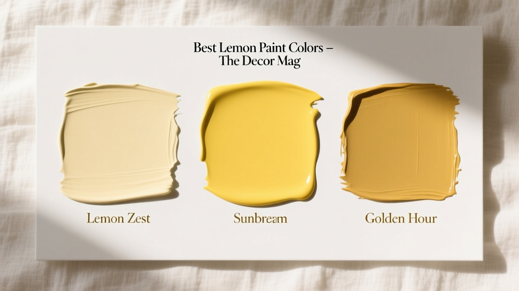
Best Lemon Paint Colors - The Decor Mag
Lemon paint colors bring a rare mix of optimism and polish to interior design. They can read as fresh and modern in a sunlit kitchen, nostalgic and welcoming in a breakfast nook, or quietly sophisticated when used as a softened lemon-cream on trim. For homeowners who want a cheerful home without committing to a bold primary yellow, lemon sits in the sweet spot: bright enough to energize, refined enough to live with daily.
This topic matters because yellow is one of the most light-reactive paint families. The same “perfect” lemon can look crisp and clean at noon, then turn buttery, greenish, or overly neon at dusk depending on undertones and bulbs. Understanding how lemon paint colors behave—and how to pair them with the right whites, woods, metals, and accent hues—lets you use this joyful color with confidence.
What Makes a Paint Color “Lemon” (and Why Undertones Decide Everything)
In interior color design, lemon typically describes a clear, light-to-medium yellow with a hint of green or clean brightness—more “citrus zest” than “golden honey.” It’s different from:
- Butter yellows (warmer, creamy, often slightly orange)
- Golden yellows (deeper, richer, sometimes mustard-leaning)
- Neon or high-chroma yellows (very saturated, can overwhelm a room)
The role of undertones
Most lemon paint colors fall into three undertone categories:
- Green-leaning lemon (crisper, modern, “zesty”; can look sharper under cool light)
- Neutral lemon (balanced; easiest to use across rooms)
- Warm lemon-cream (softer and more classic; pairs well with warm whites and woods)
Color psychology backs lemon’s appeal: yellow is associated with energy, clarity, and sociability—great for kitchens, breakfast areas, hallways, and creative spaces. The design principle to remember is visual temperature balance: lemon is inherently warm in perception, so it looks best when anchored by calming neutrals and natural textures.
How to Choose the Best Lemon Paint Color for Your Home
1) Check your lighting (north, south, east, west)
- North-facing rooms: Light is cooler and can make lemon skew green or look slightly dull. Choose a warmer or creamier lemon, or balance with warm white trim.
- South-facing rooms: Bright, warm light amplifies yellow. Consider a softer lemon or a lighter value to avoid oversaturation.
- East-facing rooms: Morning light is bright; afternoon can flatten. A clear lemon holds up well.
- West-facing rooms: Afternoon/evening light is warm and dramatic; lemon can turn golden. Pick a lemon with a cleaner undertone if you want it to stay “citrus.”
2) Match lemon to fixed finishes
Lemon paint colors interact strongly with countertops, flooring, and tile. Use these quick pairings:
- Warm oak, maple, honey woods: Choose a cleaner lemon or a slightly muted lemon to avoid an overly “yellow-on-yellow” effect.
- Walnut or espresso stains: Most lemons look fantastic—high contrast feels tailored.
- White marble or quartz: Neutral or green-leaning lemons feel crisp and contemporary.
- Beige travertine / warm stone: Opt for a warm lemon-cream rather than sharp lemon.
3) Decide where lemon belongs: walls, ceiling, trim, or accents
Lemon doesn’t have to be an all-over wall color. Often, it shines in targeted applications:
- Whole-room color: Best in kitchens, breakfast nooks, laundry rooms, sunrooms.
- Feature wall: Great behind open shelving, in a home office, or in a kid-friendly play zone.
- Ceiling “fifth wall”: A soft lemon ceiling adds glow without dominating.
- Trim/doors: Lemon on a front door or interior doors adds personality while keeping walls neutral.
Best Lemon Paint Colors (Designer-Approved Picks)
Below are standout lemon paint colors across popular brands. Always sample first—yellow’s undertones shift dramatically between rooms.
Benjamin Moore Lemon Paint Colors
- Benjamin Moore Hawthorne Yellow (HC-4): A classic, friendly yellow that can read lemony in bright light. Works beautifully in traditional kitchens, historic homes, and sunny entryways. Pair with crisp white trim and dark hardware for a timeless look.
- Benjamin Moore Yellow Highlighter (202): A clearer, more energetic yellow. Best as an accent wall, a mudroom moment, or on cabinetry when you want true citrus vibrance. Balance with calm grays or white oak.
- Benjamin Moore Buttercup (2154-30): Not purely lemon, but a lively yellow with punch. Ideal for a front door, powder room vanity, or cheerful laundry room cabinetry.
Sherwin-Williams Lemon Paint Colors
- Sherwin-Williams Friendly Yellow (SW 6680): A bright, approachable yellow that feels upbeat without reading fluorescent. Great in breakfast nooks and playrooms. Looks best with clean whites and light woods.
- Sherwin-Williams Lemon Chiffon (SW 6686): Softer, airier lemon-cream. Excellent for low-light rooms where you want a glow rather than a statement. Try it in hallways, guest rooms, and home offices.
- Sherwin-Williams Viva Gold (SW 6910): A stronger golden-yellow that can lean citrus in daylight. Best as an accent or in small doses—think bar nook, pantry door, or built-ins.
Farrow & Ball (High-Style Lemon Ideas)
- Farrow & Ball Dayroom Yellow (No. 233): A clean, elegant yellow that reads refined rather than loud. Beautiful with warm whites, aged brass, and natural linen textiles.
- Farrow & Ball Yellowcake (No. 279): A richer yellow that can feel lemony when paired with crisp whites. Stunning in dining rooms when you want warmth plus sophistication.
Behr Lemon Paint Colors
- Behr Lemon Twist: A bright, citrus-forward yellow that’s happiest in well-lit spaces. Great for accent walls, small bathrooms, and laundry rooms.
- Behr Lemonade: A softer lemon with an easygoing feel, ideal for casual kitchens and family-friendly spaces. Pair with white subway tile and matte black accents for a fresh look.
Real Room Examples: Where Lemon Paint Colors Shine
Lemon in the kitchen: sunny, clean, and social
Scenario: A kitchen with white cabinets, warm brass pulls, and pale quartz countertops can feel slightly sterile. A lemon wall color adds life without making the room feel smaller.
- Try: Sherwin-Williams Lemon Chiffon (SW 6686) on walls
- Trim: Warm white (creamy, not icy) to keep the lemon inviting
- Accents: Natural wood cutting boards, clear glass, and a few black details to sharpen the palette
Lemon in a breakfast nook: nostalgic charm with modern edges
Scenario: A built-in banquette or small dining zone benefits from a happy color that encourages conversation. Lemon works especially well with gingham, stripes, and botanical prints.
- Try: Benjamin Moore Hawthorne Yellow (HC-4) on walls
- Pair with: Soft white wainscoting, light oak table, and simple linen drapery
- Finish: A satin or eggshell sheen for wipeable durability
Lemon in a hallway: a dark space that needs a lift
Scenario: Windowless hallways often feel flat. A gentle lemon-cream can act like “borrowed sunshine.”
- Try: Sherwin-Williams Friendly Yellow (SW 6680) in a lighter application (consider a softer shade if your hallway is narrow)
- Lighting tip: Use warm LED bulbs (2700K–3000K) to keep lemon from turning greenish
- Style: Add a gallery wall with black frames for contrast and structure
Lemon in a home office or studio: mental clarity and momentum
Scenario: Lemon supports creative energy and focus when used intentionally—especially behind a desk or on built-ins.
- Try: Farrow & Ball Dayroom Yellow (No. 233) on a feature wall
- Pair with: Soft gray, warm white, or pale greige on remaining walls
- Materials: Light wood desk, matte black task lamp, linen textiles
Lemon on cabinets or a door: high impact, low commitment
Scenario: Want lemon without living inside it? Paint a pantry door, lower cabinets, or a utility-room built-in.
- Try: Benjamin Moore Yellow Highlighter (202) or Behr Lemon Twist
- Sheen: Satin or semi-gloss for cabinetry and doors
- Hardware: Brushed brass for warmth, black for crisp contrast, or polished nickel for a fresh classic look
Best Color Combinations for Lemon Paint Colors
Lemon looks most intentional when it’s part of a thoughtful color scheme. Use these pairings as a starting point:
1) Lemon + crisp white (clean and modern)
- Walls: lemon
- Trim/ceiling: bright white
- Accents: black, chrome, or stainless steel
2) Lemon + warm white + natural wood (relaxed and welcoming)
- Walls: soft lemon-cream
- Trim: creamy white
- Accents: oak, rattan, woven textures
3) Lemon + navy (classic, high contrast)
- Walls: lemon in a kitchen or nook
- Lower cabinets or island: navy
- Metals: brass for warmth, nickel for a crisp traditional feel
4) Lemon + sage or olive (nature-forward and grounded)
- Walls: lemon
- Cabinetry or textiles: sage/olive
- Accents: aged brass, terracotta, warm woods
5) Lemon + blush or terracotta (soft retro warmth)
- Walls: gentle lemon
- Accents: blush upholstery, terracotta planters
- Balance: add off-white and walnut to keep it elevated
Common Lemon Paint Color Mistakes (and How to Avoid Them)
- Choosing lemon without sampling in your lighting: Paint a large sample (at least 12" x 12", ideally bigger) and check it morning, afternoon, and evening.
- Ignoring bulb temperature: Cool LEDs (4000K+) can push lemon toward green. Warm LEDs (2700K–3000K) tend to make lemon feel welcoming.
- Overusing a high-chroma lemon in an open floor plan: If your kitchen flows into living areas, consider a softer lemon or limit it to an accent wall, island, or nook.
- Pairing lemon with the wrong white: Stark, blue-white trim can make lemon look harsh. If your lemon is warm, use a warm white; if it’s clean and zesty, a crisp white can work.
- Forgetting about floors and stone: Yellow reflects onto nearby surfaces. A lemon wall can tint white countertops and light flooring—test next to those materials.
- Using flat paint in high-traffic areas: Kitchens, hallways, and kids’ spaces benefit from eggshell or satin for easier cleaning.
Practical Tips for Testing and Applying Lemon Paint Colors
- Start with the undertone: Decide if you want zesty (green-leaning), balanced (neutral), or cozy (cream-leaning).
- Test at scale: Use peel-and-stick samples or paint poster boards and move them around the room.
- Compare to a white: Tape your top lemon sample next to your trim white to spot clashing undertones.
- Choose the right sheen:
- Walls: eggshell (most spaces) or satin (kitchens/hallways)
- Trim/doors: satin or semi-gloss
- Ceilings: flat/matte
- Balance with neutrals: Add visual “rest” through white trim, neutral upholstery, and natural textures.
FAQ: Best Lemon Paint Colors
What’s the difference between lemon yellow and buttery yellow paint?
Lemon yellow is clearer and often slightly green-leaning or neutral, like fresh citrus. Buttery yellow is creamier and warmer, with more softness and sometimes a hint of orange.
Are lemon paint colors a good choice for small rooms?
Yes—especially softer lemon-cream shades. They can make small rooms feel brighter and more welcoming. For very bright lemons, consider an accent wall or a higher-LRV (lighter) lemon to avoid overwhelm.
How do I keep lemon paint from looking neon?
Choose a slightly muted lemon, use warm lighting, and add grounding elements: natural wood, warm whites, and darker accents (navy, charcoal, black). Also avoid ultra-bright white floors and cool 5000K bulbs.
What trim color works best with lemon walls?
It depends on the undertone. Warm lemon-cream looks best with creamy whites; crisp lemons can handle brighter whites. Always test your lemon next to the exact trim white you plan to use.
Do lemon paint colors work with gray?
They can—choose the right gray. A warm greige or soft gray with a subtle warm undertone pairs better than an icy blue-gray, which can make lemon look greenish.
Where should I avoid lemon paint colors?
Bedrooms can feel too energized with a bright lemon unless you keep it very soft or use it as an accent. Also be cautious in rooms with very cool daylight and cool LEDs, where lemon may skew chartreuse.
Next Steps: Bring Lemon Into Your Color Scheme
Pick two to three lemon paint color candidates, test them in your room’s real lighting, and evaluate them next to your fixed finishes (floors, counters, tile). If you’re nervous about committing, start with a lemon-painted door, pantry, or a breakfast nook wall—high impact, low risk. Then build a cohesive color scheme using warm whites, natural woods, and a grounding accent color like navy or olive.
For more paint color recommendations, undertone breakdowns, and room-by-room color scheme ideas, explore our latest color guides on thedecormag.com.
More Articles
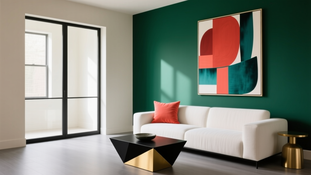 How to Use Color to Create Contrast - The Decor Mag
 Placement Safety Tips: Preventing Falls, Injuries, and Equipment Failure in Industrial and Residential Settings
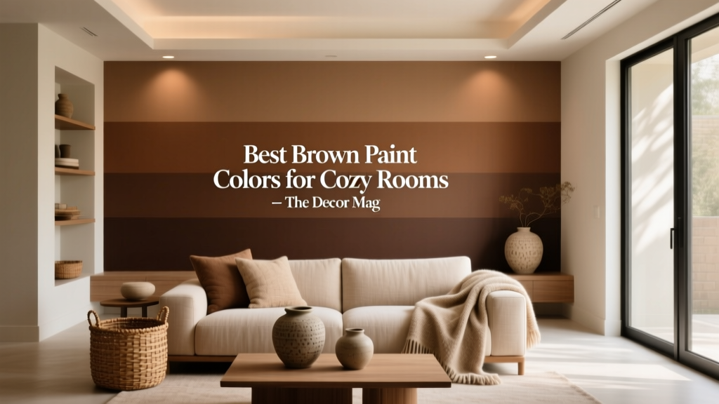 Best Brown Paint Colors for Cozy Rooms - The Decor Mag
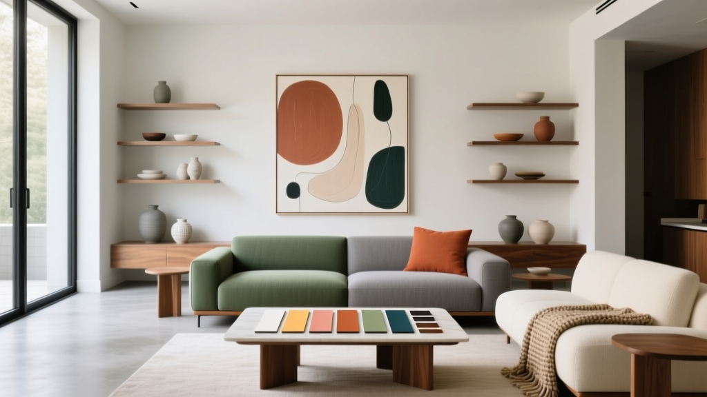 How to Create a Contemporary Color Palette - The Decor Mag
 Cheap vs Premium Placement: What $0.12 CPM Really Costs Your Brand
 Best Apricot Paint Colors - The Decor Mag
 Best Sage Green Paint Colors for Serenity - The Decor Mag
 Color Psychology in Living Rooms: Why Your Space Feels Off
 How to Choose Colors for a Balcony - The Decor Mag
 Best Neutral Paint Colors for Every Room - The Decor Mag