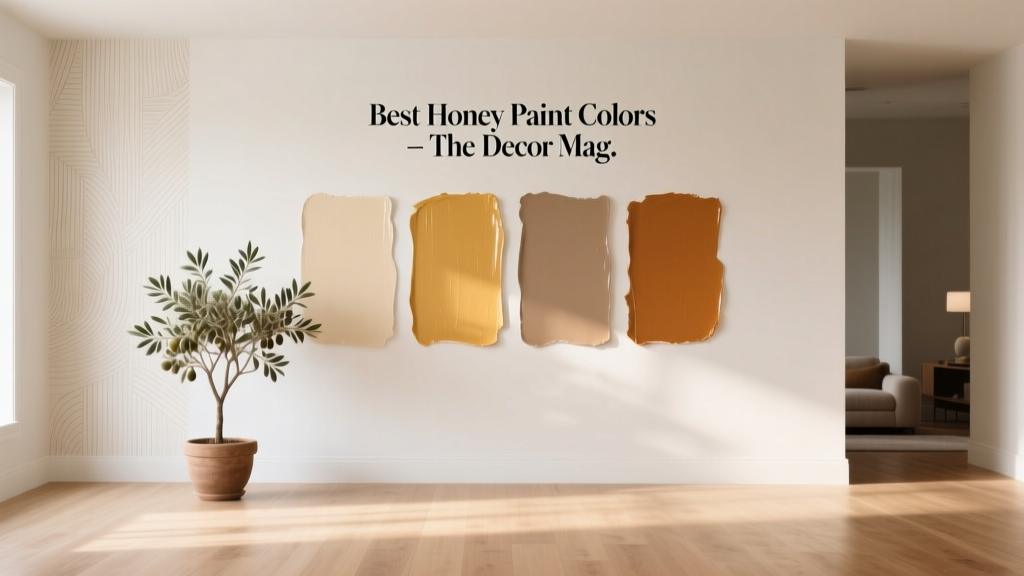
Best Honey Paint Colors - The Decor Mag
Honey paint colors sit in that sweet spot between golden beige, warm amber, and softened yellow—shades that instantly make a room feel welcoming. They’re not as stark as white, not as heavy as deep browns, and not as loud as bright yellow. When homeowners ask for a color that feels “cozy but still fresh,” honey tones are often the answer.
These shades matter because they influence mood and perceived comfort. In color psychology, honey and golden hues are associated with optimism, warmth, and connection—qualities that work beautifully in gathering spaces like kitchens, living rooms, dining rooms, and entryways. Used thoughtfully, honey paint can also support good design principles: it reflects light pleasantly, flatters natural wood, and bridges warm and cool finishes when a home has a mix of materials.
If you’re searching for the best honey paint colors for walls, cabinets, or accents, this guide covers standout options from trusted brands, real-room applications, mistake-proof pairing ideas, and practical tips for choosing the right shade in your lighting.
What Makes a Paint Color “Honey”?
Honey paint colors typically fall into warm neutrals and soft yellow-golds with an amber undertone. They can read as:
- Golden beige (neutral-forward, subtle honey glow)
- Warm tan with a caramel edge (earthy, grounded honey)
- Soft ochre (more color, still refined)
- Amber-leaning yellow (sunlit, cheerful without neon brightness)
Undertones: The Difference Between Cozy and “Too Yellow”
Undertones determine whether a honey color looks rich and sophisticated or veers brassy. Common undertones include:
- Orange/amber undertones: create a candlelit warmth; can amplify in warm lighting.
- Brown/tan undertones: more muted and timeless; great for whole-home color schemes.
- Green (olive) undertones: can make honey feel earthy; pairs well with natural stone and plants.
Where Honey Paint Colors Shine Most
- North-facing rooms (cool light): honey adds warmth and reduces a “blue” cast.
- Open-concept spaces: honey creates continuity and a welcoming flow.
- Rooms with lots of wood: honey harmonizes with oak, maple, and walnut when chosen carefully.
- Homes with black accents: honey + black is a classic high-contrast, modern-traditional combo.
Best Honey Paint Colors (By Brand)
Below are reliable honey paint colors that designers reach for often. Always sample first—honey tones can shift dramatically between daylight and evening bulbs.
Sherwin-Williams Honey Paint Colors
- Sherwin-Williams Honey Blush (SW 6660)
A warm, approachable honey that feels sun-kissed rather than sharp. Ideal for accent walls, powder rooms, and cheerful breakfast nooks. - Sherwin-Williams Honeycomb (SW 6375)
Richer and more golden—great when you want that true “honey jar” warmth. Works beautifully with creamy whites and darker wood tones. - Sherwin-Williams Gold Coast (SW 6376)
An ochre-leaning honey with a sophisticated, slightly earthy vibe. Excellent for living rooms, studies, and dining rooms where you want depth. - Sherwin-Williams Camelback (SW 6122)
A honey-tan neutral that reads timeless. A strong choice for whole-home walls, hallways, and open layouts.
Benjamin Moore Honey Paint Colors
- Benjamin Moore Honeybee (1444)
A classic honey-gold that feels spirited yet grounded. Looks especially good paired with warm white trim and brass hardware. - Benjamin Moore Hawthorne Yellow (HC-4)
A design staple: a historic, muted honey-yellow that reads refined, not juvenile. Fantastic for kitchens, dining rooms, and mudrooms. - Benjamin Moore Dorset Gold (HC-8)
Deeper and more traditional with old-world charm. If you love vintage warmth, this is a beautiful option for libraries and dining rooms. - Benjamin Moore Manchester Tan (HC-81)
Not a “yellow,” but a honey-beige that gives a subtle golden glow. Great for homeowners who want honey warmth without obvious color.
Behr Honey Paint Colors
- Behr Honey Tea
Warm and inviting with a gentle amber cast—easy to live with in family rooms and hallways. - Behr Butterscotch
A sweeter honey tone that plays well with off-whites and mid-tone woods; use in kitchens or as an accent in a home office. - Behr Toasty Gray (warmer greige)
If you want honey warmth without yellow, a warm greige like this can bridge honey accents, wood floors, and black metal.
Farrow & Ball (Honey-Adjacent, Designer-Approved)
- Farrow & Ball India Yellow (No. 66)
A bold, charismatic golden tone that can read honey in softer light. Gorgeous in dining rooms and entries with strong trim contrast. - Farrow & Ball Hay (No. 37)
A gentler, straw-honey shade that works well in bedrooms and sunrooms for a calm warmth.
How to Choose the Right Honey Shade for Your Home
Step-by-Step: A Simple Sampling Process
- Identify your fixed finishes: flooring, countertops, tile, large rugs, and cabinetry.
- Check the wood tone:
- Orange-toned oak often prefers a more muted honey-beige (less saturated).
- Darker walnut can handle richer golds and ochres.
- Test in multiple spots: at least one wall that gets strong daylight and one that stays shaded.
- View it at three times: morning, afternoon, and evening (with lamps on).
- Compare with trim: honey walls often look best with a warm white rather than a cool, blue-white.
Lighting Tips: Why Honey Shifts So Much
- Warm bulbs (2700K) make honey colors look richer and more amber.
- Neutral bulbs (3000K) keep honey balanced and true.
- Cool bulbs (3500K+) can flatten honey into a pale yellow or highlight odd undertones.
Real Room Examples: Where Honey Paint Colors Look Their Best
1) Honey Kitchens: Welcoming, Not Overly Yellow
Scenario: A kitchen with white cabinets, warm wood floors, and matte black hardware.
- Wall color: Benjamin Moore Manchester Tan (HC-81) for a subtle honey glow
- Trim/cabinets: a warm white (think creamy, not stark)
- Accents: black pendants, woven textures, and a natural jute runner
Why it works: honey-beige walls soften the high contrast of white + black and make the room feel inviting without turning “buttery.”
2) Honey Living Rooms: Cozy Light That Flatters Skin Tones
Scenario: A living room that feels chilly in the evening and needs warmth.
- Wall color: Sherwin-Williams Camelback (SW 6122) for a grounded honey neutral
- Color scheme: honey + creamy ivory + warm gray + charcoal
- Materials: oak coffee table, linen upholstery, brass floor lamp
Why it works: honey neutrals create flattering, candlelit warmth—ideal for relaxing and entertaining.
3) Honey Dining Rooms: Elevated and Dramatic
Scenario: A dining room that needs more character without going dark.
- Wall color: Benjamin Moore Dorset Gold (HC-8) or Sherwin-Williams Gold Coast (SW 6376)
- Trim: creamy white for a tailored look
- Contrast: deep brown wood dining table, black-framed art, aged brass chandelier
Why it works: deeper honey/ochre tones create intimacy and make mealtimes feel special, especially in evening light.
4) Honey Bedrooms: Calm, Sunlit Comfort
Scenario: A bedroom that needs warmth but should still feel restful.
- Wall color: Farrow & Ball Hay (No. 37) or a softer honey-beige like Manchester Tan (HC-81)
- Bedding: ivory, oatmeal, or soft white layers
- Accent colors: muted sage, dusty blue, or terracotta in small doses
Why it works: the right honey tone reads like morning sunlight—comforting without overstimulation.
5) Honey Entryways & Hallways: The “Glow Effect”
Scenario: A narrow hallway with limited natural light.
- Wall color: Sherwin-Williams Honey Blush (SW 6660) for a friendly welcome
- Trim and doors: warm white trim; consider a deeper accent color on the door (charcoal, olive, or navy)
Why it works: honey tones bounce light pleasantly and make transitional spaces feel intentional rather than forgotten.
Color Pairings and Schemes That Make Honey Look Designer
Best Trim Colors for Honey Walls
- Warm whites (creamy, soft): keep honey looking elegant and cohesive
- Off-whites with a touch of beige: reduce harsh contrast
- Avoid icy, blue-white trim if your honey is rich—it can make walls look more yellow by comparison
Accent Colors That Complement Honey Paint
- Soft sage or olive green: a nature-inspired pairing that feels grounded
- Navy or inky blue: classic complementary contrast; looks tailored and upscale
- Terracotta and clay: warm-on-warm layering for a Mediterranean feel
- Charcoal and black: modern contrast that sharpens honey’s glow
3 Easy Honey Color Schemes to Copy
- Modern Warm Neutral: honey-beige walls + creamy white trim + black accents + light oak
- Classic Traditional: deeper honey-gold walls + crisp warm white trim + walnut + brass
- Earthy Organic: muted honey + olive green textiles + linen + natural stone + woven textures
Common Honey Paint Color Mistakes (and How to Avoid Them)
- Choosing a honey color that’s too saturated for the room’s light
Fix: In bright south-facing rooms, consider a honey-beige (more neutral) rather than a bold golden yellow. - Pairing honey walls with cool gray flooring
Fix: Bridge with warm greige textiles, natural wood, or a rug that contains both warm and cool tones. - Using stark white trim that makes honey look more yellow
Fix: Select a warm white trim and keep sheen consistent (often satin for trim, eggshell for walls). - Ignoring the effect of nighttime lighting
Fix: Use 2700K–3000K bulbs and test the color with lamps on. Honey can intensify at night; choose a slightly quieter sample if needed. - Overloading the room with other warm tones
Fix: Add balance with cooler accents (navy, charcoal) or clean neutrals (ivory, linen) so honey stays sophisticated.
Practical Application Tips for a Polished Finish
- Use larger swatches: paint a 2x2-foot sample or use peel-and-stick samples to see undertones clearly.
- Consider sheen strategically:
- Eggshell for most walls (easy to clean, soft look)
- Matte for low-traffic rooms (velvety, hides imperfections)
- Satin for trim and doors (durable, subtle glow)
- Let honey be the hero: when walls are honey, keep large upholstery pieces more neutral to avoid visual “noise.”
- Repeat the tone: echo honey through small details—wood frames, brass, tan leather, or woven textures—for a cohesive interior color design.
FAQ: Best Honey Paint Colors
What is the best honey paint color for a whole house?
Look for a honey-beige that reads neutral in most lighting. Benjamin Moore Manchester Tan (HC-81) and Sherwin-Williams Camelback (SW 6122) are strong whole-home options because they provide warmth without feeling overly yellow.
Do honey paint colors make rooms look smaller?
Not inherently. Mid-tone honey shades can feel cozy, while lighter honey-beiges can open a space. To keep a room feeling spacious, pair honey walls with warm white trim, good lighting, and lighter textiles.
What colors go best with honey walls?
Great pairings include warm whites, olive greens, navy blues, charcoal grays, and earthy terracotta accents. For a timeless palette, try honey + ivory + black + natural wood.
How do I keep honey paint from looking too yellow?
Choose a honey tone with more beige or tan in it, avoid stark cool-white trim, and test the color under your nighttime bulbs. Often, shifting one step more neutral (less saturated) solves the “too yellow” issue.
Is honey paint still in style?
Yes—today’s trend leans toward warm, nature-inspired neutrals and comforting color schemes. Honey paint colors align with that movement, especially when paired with organic textures, warm metals, and modern contrast like black or deep blue.
Can honey paint work with gray furniture?
Yes, especially with warmer grays. Add bridging elements (ivory pillows, a rug with tan and gray, light wood accents) so the palette feels intentional rather than mismatched.
Next Steps: Find Your Perfect Honey
Start by narrowing your honey paint color choices to three candidates—one honey-beige, one true honey-gold, and one deeper ochre option—then sample them in the room at different times of day. Build a simple color scheme around warm whites, natural materials, and one grounding contrast (navy, charcoal, or black) for a designer-level result.
For more paint color ideas, color schemes, and interior color design guidance, explore our latest color guides on thedecormag.com.
More Articles
 How to Create a Vibrant Color Palette - The Decor Mag
 Best Bathroom Floor Solutions: Performance, Safety, and Style Compared
 Color Psychology in Home Design Guide - The Decor Mag
 How to Create a Contemporary Color Palette - The Decor Mag
 How to Choose Colors for a Mudroom - The Decor Mag
 Bathroom Trends 2026: Wellness Integration, Material Innovation, and Smart Efficiency
 Best Neutral Paint Colors for Every Room - The Decor Mag
 How to Use Color to Create Contrast - The Decor Mag
 Sage Green Paint: Most Versatile Neutral (2026)
 Best Avocado Green Paint Colors - The Decor Mag