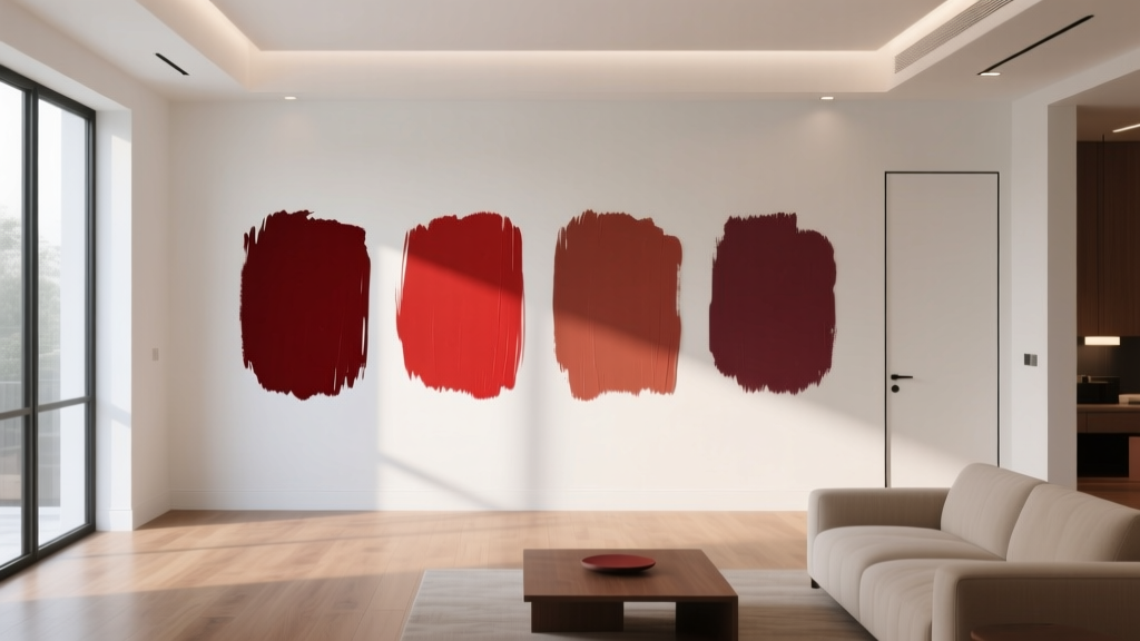
Best Scarlet Paint Colors - The Decor Mag
Scarlet is one of those rare paint colors that can change the entire emotional temperature of a room in a single coat. It’s bold, energizing, and deeply rooted in color psychology: scarlet sits in the red family, which is associated with vitality, appetite, confidence, and warmth. Used well, scarlet paint creates a focal point that feels intentional and elevated rather than loud.
For homeowners and design enthusiasts, scarlet matters because it’s both timeless and trend-aware. You’ll see it in historic dining rooms, lacquered front doors, modern art-filled lofts, and even calm, contemporary spaces where it’s used in smaller doses. The key is selecting the right scarlet paint color (undertone matters), pairing it with the right supporting neutrals, and choosing placements where high-impact color makes sense.
This guide breaks down the best scarlet paint colors, where they shine, what to pair them with, and the common mistakes that make red feel “off.” If you’ve ever loved scarlet in theory but felt nervous in practice, you’ll leave with a plan.
What Makes a Color “Scarlet” (and Why Undertones Matter)
Scarlet is typically a vivid, warm red with an orange lean—think fire engine red, poppy red, or red vermilion. Compared to deeper reds like oxblood or burgundy, scarlet is brighter and more saturated. Compared to blue-based reds (like cranberry), scarlet feels sunnier and more extroverted.
How undertones change scarlet on your walls
- Orange-leaning scarlets feel joyful, energetic, and a touch playful. Great for kitchens, entry doors, and creative spaces.
- Neutral-leaning scarlets read more classic and architectural. Great for dining rooms, libraries, and built-ins.
- Pink-leaning scarlets can feel youthful and artful, especially in north-facing light. Best when balanced with grounded neutrals.
Scarlet paint in different lighting
- North-facing rooms: cooler, flatter light can pull scarlet toward magenta or make it feel sharper. Choose a slightly warmer scarlet or soften with warm whites.
- South-facing rooms: abundant warm light intensifies scarlet. Consider a slightly muted scarlet or use it as an accent.
- East-facing rooms: bright morning light makes scarlet glow; afternoons can feel calmer. Great for breakfast nooks.
- West-facing rooms: warm afternoon light can turn scarlet into a dramatic, sunset-like statement—excellent for dining rooms and living rooms.
Best Scarlet Paint Colors (Designer-Approved Picks)
These scarlet paint colors are widely used for good reason: they have balanced undertones, strong pigmentation, and reliable performance across homes. Always test with a large sample (at least 12x12) and view it morning, afternoon, and evening.
Benjamin Moore scarlet paint colors
- Benjamin Moore Caliente AF-290 – A saturated, confident red that reads modern-classic. Slightly deep, less “toy-like” than brighter scarlets. Ideal for dining rooms, built-ins, and dramatic powder rooms.
- Benjamin Moore Poppy 2063-20 – A vivid, orange-leaning scarlet with high energy. Perfect for front doors, statement walls, and playful kitchens.
- Benjamin Moore Classic Red 2000-10 – True, punchy red with a straightforward scarlet feel. Great for holiday-ready front doors and crisp architectural details.
Sherwin-Williams scarlet paint colors
- Sherwin-Williams Real Red SW 6868 – A strong, primary red with excellent clarity. Best as an accent wall, door, or furniture piece when you want impact without muddiness.
- Sherwin-Williams Heartthrob SW 6866 – A lively, warm red that leans scarlet and feels slightly softened. Great for family rooms, art studios, or a welcoming entry.
- Sherwin-Williams Showstopper SW 7588 – A bold red that reads glamorous and stage-ready. Use for a lacquer-like moment on cabinets or a bar area.
Farrow & Ball scarlet-leaning icons
- Farrow & Ball Incarnadine No. 248 – Deep, classic red with a refined presence. While not a bright scarlet, it’s a sophisticated choice for a scarlet-inspired scheme in traditional spaces.
- Farrow & Ball Red Earth No. 64 – A grounded red with earthy warmth; use when you want scarlet energy with a more livable, clay-adjacent softness.
Behr scarlet options (high-impact, accessible)
- Behr Firework (availability varies by collection) – Bright, celebratory red that works well on doors and accent walls.
- Behr Red Pepper – A warmer, slightly deepened red that can feel more grown-up than a pure primary.
Tip: If you’re matching a specific scarlet (a rug, artwork, or vintage tile), ask the paint store to color-match and then compare it to a fan deck scarlet. Many “matches” skew too pink or too brown unless you fine-tune the formula.
Where Scarlet Works Best: Real Room Ideas and Application Scenarios
1) Scarlet front door: instant curb appeal
A scarlet front door is one of the most satisfying ways to use red paint because it’s contained, architectural, and naturally reads as welcoming. It also pairs beautifully with classic exterior materials like brick, stone, and white siding.
- Try: Benjamin Moore Classic Red 2000-10 or Sherwin-Williams Real Red SW 6868
- Finish: Satin or high-gloss for a crisp, polished look
- Pair with: Brass hardware, warm exterior lights, and a charcoal or deep green doormat
2) Dining room walls: scarlet for warmth and appetite
Color psychology shows reds can stimulate appetite and conversation, making scarlet a natural fit for dining rooms. The key is controlling glare and intensity with the right finish and supporting colors.
- Try: Benjamin Moore Caliente AF-290 for a rich, modern feel
- Pair with: Warm white trim (think creamy, not icy), walnut furniture, and matte black lighting
- Finish: Matte or eggshell to reduce sheen hotspots
3) Kitchen island or lower cabinets: a confident focal point
If full scarlet cabinetry feels like too much, paint only the island or the lower cabinets. Scarlet looks especially sharp against white or off-white uppers and stone counters with warm veining.
- Try: Sherwin-Williams Heartthrob SW 6866 or Benjamin Moore Poppy 2063-20
- Pair with: Creamy quartz, unlacquered brass pulls, and warm white walls
- Finish: Satin or enamel for durability
4) Powder room drama: scarlet + pattern
Small rooms are perfect for bold color because the commitment is low and the impact is high. Scarlet in a powder room can feel boutique-hotel chic when combined with the right mirror and lighting.
- Try: Sherwin-Williams Showstopper SW 7588 or Benjamin Moore Caliente AF-290
- Pair with: Graphic black-and-white tile, a gilt mirror, and warm sconces
- Design trick: Paint trim and door the same scarlet for a “color-drenched” jewel-box effect
5) Accent wall behind a bed: scarlet with restraint
Scarlet can be energizing, so in bedrooms it often works best as an accent. Anchor it with warm neutrals and tactile textiles so the space still feels restful.
- Try: A slightly softened scarlet like Sherwin-Williams Heartthrob SW 6866
- Pair with: Oatmeal linens, camel leather, and soft black accents
- Placement: The wall behind the headboard for a grounded, intentional focal point
Scarlet Color Schemes: What to Pair It With
Scarlet thrives when it has a “supporting cast.” Use design principles like contrast (light/dark), temperature balance (warm/cool), and repetition (echoing red in smaller accessories) to make it feel cohesive.
Go-to scarlet pairings (designer favorites)
- Scarlet + warm white: Clean, classic, and architectural. Great for trim, ceilings, and adjacent rooms.
- Scarlet + charcoal: Modern and grounding. Use charcoal in rugs, window frames, or built-ins.
- Scarlet + navy: A heritage palette that feels tailored. Try navy upholstery with scarlet art or a scarlet door.
- Scarlet + blush/rose: Fashion-forward and playful. Works best when you add a neutral (linen, warm gray) to calm it.
- Scarlet + forest green: Rich and traditional, especially with brass. Excellent for libraries, dining rooms, and exteriors.
Fast palette formulas you can copy
- Classic: Scarlet + creamy white + walnut + brass
- Modern: Scarlet + crisp white + black + concrete/stone
- Moody: Scarlet + charcoal + deep green + aged bronze
- Artful: Scarlet + blush + warm beige + oak
How to Choose the Right Scarlet Paint Finish
- Matte: Best for walls where you want depth and less glare (dining rooms, bedrooms). Note that some mattes scuff more easily in high-traffic areas.
- Eggshell: A safe all-around wall finish—slightly wipeable without a lot of shine.
- Satin: Great for kitchens, baths, doors, and trim when you want durability.
- High-gloss: Best for statement doors, furniture, or a lacquer-like moment. It will highlight surface flaws, so prep matters.
Common Scarlet Paint Mistakes (and How to Avoid Them)
- Choosing scarlet without testing undertones: A red that looks perfect on a swatch can turn hot pink or muddy brown on your wall. Test large samples and compare them next to a true white sheet of paper.
- Ignoring lighting temperature: Warm bulbs can intensify orange undertones; cool LEDs can make red look sharper. Use 2700K–3000K lighting for a flattering glow in most homes.
- Overusing scarlet in open floor plans: Too much red can feel relentless. Limit scarlet to one anchor zone (door, dining room, island) and repeat it in small accents elsewhere.
- Pairing scarlet with the wrong white: Stark, blue-white trim can make scarlet look harsh. Choose warmer whites and soft neutrals to keep the palette cohesive.
- Skipping primer: Reds often need a tinted primer for even coverage. Ask for a recommended primer shade—this reduces coats and improves richness.
- Not balancing saturation: If scarlet is the main event, supporting colors should be calmer: warm whites, natural woods, soft blacks, and textured textiles.
Practical Tips for Painting with Scarlet
- Use a tinted primer: Especially for bright scarlet paint colors; it helps prevent patchiness.
- Plan for extra coats: Many reds need 2–4 coats depending on the brand, sheen, and wall color.
- Prep is non-negotiable: Fill dents, sand smooth, and clean walls—scarlet highlights flaws.
- Sample vertically and in corners: Reds can shift dramatically in shadows and on different planes.
- Repeat scarlet thoughtfully: Echo it in a small piece of art, a pillow stripe, or a vase so the room feels designed, not accidental.
FAQ: Scarlet Paint Colors
What is the difference between scarlet and true red?
Scarlet is typically a warm, orange-leaning red, while “true red” may be more primary or balanced. On walls, scarlet often feels brighter and more energetic than deeper or blue-based reds.
Is scarlet too bold for a living room?
Not if you control the dosage. Try scarlet on a single focal wall, built-ins, or a fireplace surround, then balance it with warm neutrals, textured fabrics, and grounded dark accents like charcoal or black.
Which scarlet paint color is best for a front door?
Look for a clear, confident red that reads crisp outdoors. Sherwin-Williams Real Red SW 6868 and Benjamin Moore Classic Red 2000-10 are strong starting points, especially in satin or high-gloss.
What colors go with scarlet paint?
Scarlet pairs beautifully with warm whites, charcoal, navy, forest green, camel, walnut, and brass. For a modern look, combine scarlet with crisp white and black. For a classic look, use creamy white and warm wood tones.
Why does my scarlet paint look pink or orange?
Undertones and lighting are usually responsible. North-facing light can pull red toward pink/magenta, while warm bulbs and strong sunlight can push it more orange. Test multiple scarlets and evaluate them under your actual day-and-night lighting.
Can I use scarlet in a bedroom?
Yes—best as an accent (headboard wall, a painted dresser, or trim in a dressing area). Keep the rest of the palette calming: warm beige, soft white, muted patterns, and natural textures.
Your Next Steps: Make Scarlet Feel Intentional
Start by choosing where scarlet will deliver the most value: a front door for curb appeal, a dining room for warmth and conversation, or a kitchen island for a high-design focal point. Narrow your options to 2–3 scarlet paint colors, test them in your lighting, and build a supporting palette using warm whites, grounded darks, and natural materials.
When you’re ready, explore more paint color guides, color schemes, and interior color design ideas on thedecormag.com to keep building a home that feels both personal and expertly composed.
More Articles
 Best Honey Paint Colors - The Decor Mag
 How to Choose Colors for a Loggia - The Decor Mag
 Trends vs Island: How Color Forecasting and Brand Identity Diverge in Commercial Design
 Tetradic Color Scheme Guide - The Decor Mag
 How to Create a Vibrant Color Palette - The Decor Mag
 Best Papaya Paint Colors - The Decor Mag
 Best Burgundy Paint Colors - The Decor Mag
 How to Choose Colors for a Scullery - The Decor Mag
 Best Bathroom Floor Solutions: Performance, Safety, and Style Compared
 Best Cobalt Blue Paint Colors - The Decor Mag