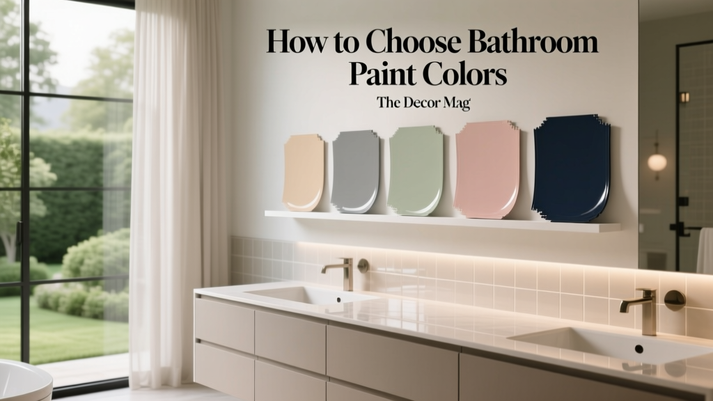
How to Choose Bathroom Paint Colors - The Decor Mag
Your bathroom may be one of the smallest rooms in the house, but it has an outsized impact on how your home feels day to day. It’s where you start the morning, wind down at night, and (for guests) quietly judge the overall style of your space. The right bathroom paint color can make a compact room feel airy, a windowless space feel intentional, and a dated vanity look instantly refreshed—without the cost of a renovation.
Bathrooms also pose unique design challenges: shifting light, lots of hard surfaces, reflective mirrors, and constant humidity. Color behaves differently here than in a living room or bedroom, which is why “pretty on the swatch” can turn into “why is this so blue?” once it’s on the wall. This guide breaks down how to choose bathroom paint colors using color theory, color psychology, and practical application strategies—plus specific paint color recommendations and real-room scenarios to help you commit with confidence.
Start With the Bathroom’s Conditions (Light, Size, and Finishes)
1) Evaluate natural and artificial light
Lighting is the biggest predictor of whether a bathroom color will feel serene, crisp, or downright strange. Most bathrooms mix several light sources: daylight (if there’s a window), overhead lighting, vanity lights, and sometimes shower niche lighting.
- North-facing light: Cooler and grayer. Warm whites, soft greiges, and warm pastels balance the chill.
- South-facing light: Warmer and brighter. Cooler whites, pale blues/greens, and crisp neutrals stay fresh.
- East-facing light: Bright in the morning, cooler later. Colors can shift dramatically; sample in morning and evening.
- West-facing light: Warmer later in the day. Watch warm paints that can look overly yellow at night.
Practical tip: If your bathroom lighting is very warm (2700K), choose paint with a slightly cooler undertone to avoid a yellow cast. If your bulbs are cooler (3000–3500K), avoid icy whites that can feel clinical.
2) Consider scale and sightlines
Small bathrooms can handle bold color beautifully, but the “feel” depends on how enclosed the room is and what you see from the doorway.
- Powder rooms: Great for drama—deep hues, saturated color, or high-contrast color schemes.
- Primary bathrooms: Often benefit from calmer, more restorative palettes (soft neutrals, muted blues/greens, tonal schemes).
- Narrow baths: Light-to-mid tones reduce tunnel effect; consider a slightly darker vanity wall for depth.
3) Match paint undertones to tile and stone
Bathrooms rarely start from a blank slate. Tile, countertops, and metal finishes have undertones that either harmonize with paint or fight it.
- Cool gray tile: Works with crisp whites, blue-grays, sage, and charcoal.
- Warm beige/cream tile: Pairs with warm whites, greige, dusty blush, and olive.
- Marble with heavy veining: Pull a paint color from the veining (warm taupe or blue-gray) instead of trying to “match the background.”
Quick rule: If your tile reads pink/peach (common in older bathrooms), choose a warm off-white or warm greige to neutralize it. Cool whites often exaggerate pink undertones.
Pick a Color Strategy: Calm, Crisp, Cozy, or Dramatic
Color psychology for bathroom design
Bathrooms are transitional and intimate spaces. Color psychology matters here because the room supports routines—energizing mornings and calming evenings.
- Whites and soft neutrals: Clean, bright, timeless. Great for a spa feel when paired with natural textures.
- Blues: Calm, fresh, “water-adjacent.” Lighter blues can feel airy; deeper blues feel luxurious.
- Greens: Restorative, nature-based, balanced. Sage and olive are especially forgiving with mixed materials.
- Warm pinks/clays: Flattering and cozy. These can soften harsh lighting and make skin tones look healthier in mirrors.
- Charcoal/black: Dramatic and architectural. Best with strong lighting and contrasting trim or tile.
Three foolproof bathroom color scheme approaches
- Tonal scheme: One hue in multiple depths (pale blue walls + navy vanity). Feels cohesive and modern.
- Neutral + natural: Warm white walls + wood vanity + brass. Spa-like and universally appealing.
- High-contrast classic: White walls + black accents or vice versa. Crisp, graphic, and timeless.
Bathroom Paint Color Recommendations (With Real Application Scenarios)
Best whites for bathrooms (clean without feeling cold)
White is a top bathroom paint color choice, but undertone is everything. Pick a white that complements your tile and lighting.
- Benjamin Moore White Dove (OC-17): A soft, warm white that works with warm tile, brass, and wood vanities.
Scenario: Classic subway tile shower + warm brass hardware + oak vanity for a welcoming spa look. - Sherwin-Williams Alabaster (SW 7008): Creamy, gentle, and flattering under most vanity lights.
Scenario: Windowless powder room with warm bulbs; pairs beautifully with matte black faucets. - Benjamin Moore Chantilly Lace (OC-65): A crisp, bright white with a cleaner feel; best when you have ample daylight.
Scenario: Sunlit bathroom with marble and chrome for a fresh, tailored finish.
Pairing tip: If you choose white walls, add contrast with a colored vanity (navy, charcoal, forest green) or warm texture (wood shelves, woven baskets) so the room doesn’t feel sterile.
Best light blues for an airy, water-inspired feel
- Benjamin Moore Palladian Blue (HC-144): A soft blue-green that reads spa-like and calming.
Scenario: White tile + brushed nickel + pale gray stone floor; add fluffy white towels and eucalyptus. - Sherwin-Williams Sea Salt (SW 6204): A famously versatile blue-green-gray that shifts with lighting.
Scenario: Small hall bathroom; works well with both warm and cool finishes when you keep textiles neutral. - Farrow & Ball Light Blue (No. 22): A fresh, traditional light blue with a timeless character.
Scenario: Vintage-style bath with pedestal sink and polished chrome.
Application guidance: Light blues can turn icy under cool LEDs. Balance with warm white trim (not stark blue-white) and consider a soft white ceiling instead of bright pure white.
Best greens for a restorative, nature-forward bathroom
- Sherwin-Williams Evergreen Fog (SW 9130): A muted green-gray that feels modern and grounded.
Scenario: Primary bath with creamy stone tile and brushed brass; add walnut accents and linen shower curtain. - Benjamin Moore Saybrook Sage (HC-114): Classic sage with warmth; great for traditional homes.
Scenario: Cottage-style bathroom with beadboard wainscoting in white and a patterned floor tile. - Farrow & Ball Green Smoke (No. 47): A moody, complex green-blue for a boutique-hotel look.
Scenario: Powder room with dramatic mirror, aged brass sconce, and dark framed art.
Pairing tip: Greens look especially refined with warm metals (brass, bronze) and creamy whites. With chrome, choose a greener (less yellow) sage so it feels intentional.
Warm neutrals and greiges that flatter skin tones
Warm neutrals are underrated bathroom paint colors—especially in powder rooms where people use mirrors. They soften shadows and reduce that “washed out” effect.
- Benjamin Moore Edgecomb Gray (HC-173): A warm greige that reads airy and elegant.
Scenario: Builder-grade bathroom refresh: Edgecomb Gray walls, crisp white trim, and upgraded lighting for instant polish. - Sherwin-Williams Accessible Beige (SW 7036): A grounded neutral that works with many tiles and woods.
Scenario: Family bath with mixed finishes; hides scuffs better than bright white. - Benjamin Moore Pale Oak (OC-20): Soft, warm, and calming without looking beige.
Scenario: Modern bathroom with light oak vanity and off-white porcelain tile.
Dark, dramatic colors for powder rooms and statement baths
Dark paint colors can make a bathroom feel chic and enveloping—especially when you lean into the mood with lighting and accessories.
- Benjamin Moore Hale Navy (HC-154): Rich, classic navy that looks tailored and expensive.
Scenario: Powder room with white pedestal sink, brass mirror, and bold wallpaper on the ceiling. - Sherwin-Williams Iron Ore (SW 7069): Soft black/charcoal that reads modern and architectural.
Scenario: Contemporary bath with white quartz and black-framed shower glass; keep trim crisp. - Farrow & Ball Hague Blue (No. 30): Deep blue-green that delivers instant personality.
Scenario: Small guest bath with traditional paneling; paint walls and paneling the same color for a color-drenched look.
Design principle: Dark colors visually “advance,” making walls feel closer. Use them when you want intimacy and drama, and support them with layered lighting (overhead + vanity + accent).
How to Test Bathroom Paint Colors the Smart Way
Sample for undertone and sheen, not just hue
- Paint large sample boards (at least 12" x 12") and move them around the room.
- Check color at three times: morning, evening, and with only vanity lights on.
- Hold samples next to fixed finishes: tile, countertop, vanity, flooring.
Choose the right paint finish for bathrooms
Bathrooms need durable, washable finishes that handle humidity. Flat paint can look beautiful but often isn’t ideal in splash zones.
- Best all-around: Satin or pearl for walls (washable with a gentle sheen).
- For ceilings: Matte or bathroom-specific ceiling paint to reduce glare and resist moisture.
- For trim and cabinetry: Semi-gloss for wipeability and crisp edges.
Brand tip: Look for mildew-resistant lines such as Benjamin Moore Aura Bath & Spa or Zinsser Perma-White (for problem areas), and prioritize good ventilation regardless of product.
Real Room Color Plans (Steal These Combinations)
Plan A: Spa white + soft green accents
- Walls: Benjamin Moore White Dove (OC-17)
- Vanity: Sherwin-Williams Evergreen Fog (SW 9130) or a similar muted green
- Trim: Clean white semi-gloss
- Finishes: Brushed brass + warm wood accessories
Plan B: Airy blue-green with crisp marble
- Walls: Sherwin-Williams Sea Salt (SW 6204)
- Accent: Bright white trim + chrome fixtures
- Textiles: White towels, pale gray bath mat, glass containers
Plan C: Moody powder room with high contrast
- Walls: Benjamin Moore Hale Navy (HC-154)
- Trim: White semi-gloss
- Statement: Brass sconce + round mirror + framed art with warm tones
Common Bathroom Color Mistakes to Avoid
- Choosing paint before tile and countertops: It’s easier to match paint to finishes than the other way around.
- Ignoring undertones: A “gray” can lean purple, green, or blue—especially under LED lighting.
- Going too bright in harsh light: Highly saturated colors can feel louder in small, reflective rooms.
- Using stark white with warm tile: This often makes tile look dingy or pinker than it is.
- Picking flat paint in a high-moisture room: Poor washability leads to streaking and premature wear.
- Forgetting the mirror effect: Mirrors double your wall color; subtle shades can feel stronger once reflected.
FAQ: Bathroom Paint Colors
What are the best paint colors for a small bathroom?
Soft whites, light greiges, and pale blue-greens are reliable because they reflect light and reduce visual clutter. Try Benjamin Moore White Dove (OC-17), Benjamin Moore Pale Oak (OC-20), or Sherwin-Williams Sea Salt (SW 6204). Small powder rooms can also look stunning in dark colors if you add good lighting.
Should bathroom ceilings be painted white?
Not always. White ceilings are classic, but a soft white (rather than bright, stark white) often looks calmer. For a designer look, consider color-drenching—painting the ceiling the same color as the walls—especially in powder rooms or bathrooms with lower ceilings and simple trim.
What paint finish is best for bathrooms?
Satin (or pearl) is a great choice for most bathroom walls because it’s washable and moisture-tolerant. Use semi-gloss for trim and cabinets. In shower-prone areas, prioritize a high-quality, mildew-resistant paint and strong ventilation.
How do I choose between warm and cool bathroom paint colors?
Let your fixed finishes decide. Warm tile and brass usually look best with warm whites, greiges, and muted earthy colors. Cool gray tile and chrome often pair well with crisp whites, blue-grays, and cooler greens. When in doubt, sample two options: one warmer and one cooler, and view them under your bathroom lighting.
Are dark bathroom paint colors a bad idea?
No—dark colors can be gorgeous in bathrooms, especially powder rooms. The key is layered lighting and contrast (white fixtures, light countertops, or bright trim). Consider Benjamin Moore Hale Navy (HC-154) or Sherwin-Williams Iron Ore (SW 7069) for a sophisticated mood.
Next Steps: Choose With Confidence
To choose the right bathroom paint color, start by identifying your lighting and fixed finishes, then decide on the mood you want—clean and crisp, soft and spa-like, warm and flattering, or bold and dramatic. Narrow your shortlist to 2–3 paint colors, test them in the room across the day, and select a bathroom-appropriate finish for long-lasting results.
- Take a photo of your tile/vanity in daylight and compare paint swatches next to it.
- Test samples beside the mirror (that’s where you’ll notice undertones most).
- Pick bulbs you love before finalizing color—lighting and paint work as a system.
For more bathroom color ideas, whole-home color schemes, and expert guidance on undertones and palettes, explore the latest color guides on thedecormag.com.
More Articles
 Best Plum Paint Colors for Drama - The Decor Mag
 How to Choose Colors for a Courtyard - The Decor Mag
 Color Psychology in Home Design Guide - The Decor Mag
 Best Aqua Paint Colors - The Decor Mag
 12 Practical DIY Furniture Ideas You Can Build in a Weekend (With Exact Materials & Dimensions)
 Color Psychology in Living Rooms: Mood & Function (2026)
 How to Use Color to Create Flow - The Decor Mag
 How to Choose Colors for a Garage Conversion - The Decor Mag
 Best Cobalt Blue Paint Colors - The Decor Mag
 Best Cardinal Red Paint Colors - The Decor Mag