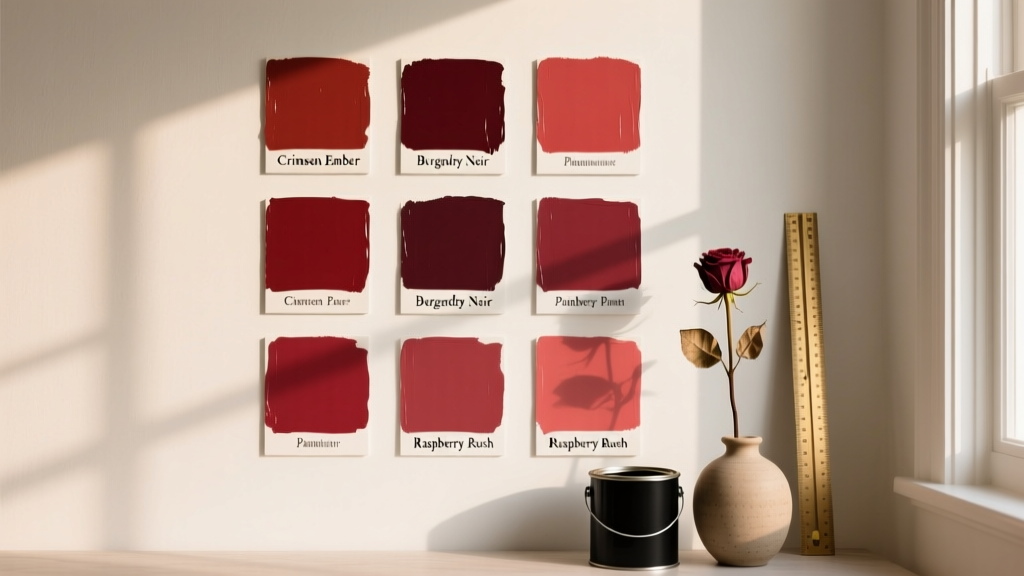
Best Berry Red Paint Colors - The Decor Mag
Berry red sits in a sweet spot between classic red and rich purple—think raspberries, crushed cherries, mulled wine, and ripe pomegranates. It reads as sophisticated rather than shouty, romantic without feeling fussy, and bold without overpowering a space. For homeowners who love color but worry about “too much red,” berry red paint colors are often the most livable entry point.
From a color psychology perspective, berry reds combine the energy and warmth associated with red with the depth and calm of violet undertones. The result is a hue that feels cozy, inviting, and slightly dramatic—perfect for creating a focal wall, elevating a dining room, or giving a powder room a jewel-box moment. When used thoughtfully, berry red can be timeless, not trendy.
This guide breaks down the best berry red paint colors, how to choose the right undertone for your lighting, and practical ways to build color schemes around berry red so your room feels intentional and balanced.
What Counts as “Berry Red” in Interior Paint?
Berry red is typically a medium-to-deep red with noticeable blue or violet undertones. It’s less orange than a tomato red and less brown than a brick red. Depending on the pigment blend, berry red can lean:
- Cool berry: more violet/blue (crisper, moodier, great with grays and crisp whites)
- Warm berry: slightly more red/magenta (cozier, pairs well with creams, brass, and warm woods)
- Deep wine: darker, more dramatic (ideal for dining rooms, libraries, and accent ceilings)
How Berry Red Behaves in Different Lighting
- North-facing rooms: cooler light can intensify purple undertones; choose a slightly warmer berry to prevent a “too-plum” look.
- South-facing rooms: warm light brings out red richness; deeper berry reds look especially luxe here.
- East-facing rooms: bright morning light can make berry read clearer and brighter; it may look duskier later in the day.
- West-facing rooms: afternoon sunlight can make berry glow; test to ensure it doesn’t skew too saturated at golden hour.
Best Berry Red Paint Colors (Designer-Favorite Picks)
Below are standout berry red paint colors from major brands. Always sample first—berry pigments can shift dramatically from swatch to wall and from daylight to lamplight.
Benjamin Moore Berry Red Paint Colors
-
Benjamin Moore Raspberry Truffle (2080-10)
A deep, delicious berry red with a dessert-like warmth. Great for dining rooms, statement walls, or a sophisticated bedroom. -
Benjamin Moore New London Burgundy (HC-61)
A historic-leaning burgundy with berry undertones—rich, grounded, and elegant. Beautiful with traditional millwork, antique rugs, and aged brass. -
Benjamin Moore Classic Burgundy (HC-182)
A deeper wine-berry that reads upscale and dramatic. Ideal for a study, library, or moody powder room with high-contrast trim. -
Benjamin Moore Moroccan Red (1309)
A bold, warm-leaning berry red that energizes a space without going orange. Excellent for an entryway or a creative studio.
Sherwin-Williams Berry Red Paint Colors
-
Sherwin-Williams Borscht (SW 7578)
A saturated beet-berry with a modern edge. Strong on all four walls; use it where you want drama—dining rooms, bars, or a stair hall. -
Sherwin-Williams Garnet (SW 7587)
A refined deep red with berry depth. Feels classic and tailored; pairs beautifully with creamy whites, walnut, and leather. -
Sherwin-Williams Red Bay (SW 6321)
A warm berry-red that’s inviting and slightly softened. Great for bedrooms, breakfast nooks, and family rooms when balanced with light textiles. -
Sherwin-Williams Cordovan (SW 6027)
A wine-berry staple with a timeless feel. Works especially well with warm woods, brass, and layered neutrals.
Farrow & Ball Berry Red Paint Colors
-
Farrow & Ball Preference Red (No. 297)
A deep, heritage-inspired red that reads berry in softer light. Exceptional in dining rooms and formal spaces with paneling. -
Farrow & Ball Brinjal (No. 222)
More aubergine-berry than pure red, but a go-to if you love a purple-forward berry. Stunning in bedrooms and libraries. -
Farrow & Ball Rangwali (No. 296)
A brighter berry-rose option for playful, modern rooms—think powder rooms, studios, or an accent ceiling.
Behr Berry Red Paint Colors
-
Behr Burgundy Wine (PPU7-19)
A deep wine that leans berry and reads plush. Great for a cozy den or an accent wall behind a bed. -
Behr Cranberry Splash (MQ1-11)
A fresher, fruitier berry red—ideal when you want vibrance without going neon. Works well in eclectic and modern interiors.
How to Choose the Right Berry Red: Undertone, Depth, and Finish
1) Match Undertone to Your Fixed Finishes
Berry red looks best when it relates to elements you’re not changing soon:
- Warm woods (oak, cherry, walnut): choose warm berry or wine shades (less purple)
- Cool floors (gray tile, slate, cool-toned LVP): choose cooler berry shades with violet undertones
- Brass/gold hardware: warm berry reds create a luxurious, cohesive glow
- Chrome/nickel hardware: cooler berries feel crisp and contemporary
2) Pick a Depth That Fits the Room’s “Visual Weight”
- Small rooms: deep berry can feel jewel-box chic if you commit (walls + trim) or balance with bright lighting and reflective surfaces.
- Open layouts: use berry red as an accent zone (dining area, fireplace wall) to avoid color overwhelm.
- Low light spaces: consider a slightly brighter berry; overly dark wines can go flat without layered lighting.
3) Choose the Right Sheen
- Matte/flat: velvety, forgiving, best for walls in bedrooms and living rooms
- Eggshell: durable for hallways and family spaces; still soft
- Satin/pearl: good for trim or high-traffic walls; can make berry appear slightly brighter
- High-gloss: dramatic on doors or furniture; highlights surface imperfections
Room-by-Room Ideas: Where Berry Red Paint Shines
Dining Room: Instant Warmth and Conversation
Berry red is a natural fit for dining rooms because it creates intimacy and a flattering glow under evening lighting. Try it on all four walls for a cocooning effect, or as wainscoting/paneling color with a light upper wall.
Real-room approach: Pair Sherwin-Williams Garnet on walls with:
- Warm white trim (creamy, not stark)
- Walnut or dark oak dining table
- Brass chandelier with warm bulbs (2700K)
- Artwork with soft blush, ochre, or charcoal accents
Bedroom: Romantic Without Feeling Themed
Berry red works beautifully behind the bed as a headboard wall, especially with layered neutrals. Choose a slightly softened berry to keep it restful.
Real-room approach: Use Benjamin Moore Raspberry Truffle as an accent wall with:
- Off-white linen bedding
- Dusty rose or mauve throw pillows
- Natural wood nightstands
- Soft black picture frames for contrast
Powder Room: The Jewel-Box Moment
Small bathrooms can handle saturated color incredibly well. Berry red looks especially striking with high-contrast details and reflective finishes.
Real-room approach: Paint walls Sherwin-Williams Borscht and add:
- Brass faucet and mirror frame
- White pedestal sink or quartz vanity top
- Graphic black-and-white tile or a warm marble
- Moody sconce lighting with warm bulbs
Entryway or Stair Hall: A Memorable First Impression
If you want a home to feel curated from the first step inside, berry red in an entryway delivers. It also hides scuffs better than pale neutrals.
Real-room approach: Try Benjamin Moore Moroccan Red on stair walls with:
- Crisp white trim
- Dark runner rug with hints of burgundy, navy, or rust
- Gallery wall in black or walnut frames
Kitchen: Use Berry Red Strategically
All-berry kitchen walls can feel heavy, but berry is fantastic on cabinetry, an island, or a pantry door.
- Island color: Benjamin Moore New London Burgundy with warm white perimeter cabinets
- Pantry/door pop: Farrow & Ball Preference Red in satin for a lacquer-like look
- Breakfast nook: Behr Cranberry Splash for a brighter, cheerful berry
Berry Red Color Schemes That Always Work
Berry red is easiest to live with when you build a supporting cast of neutrals and counterpoints. These combinations create balanced, designer-level interior color design.
Berry Red + Warm White + Brass (Classic and Glowy)
- Walls: berry red
- Trim: creamy off-white
- Metals: brass or aged gold
- Textiles: oatmeal, camel, warm taupe
Berry Red + Charcoal + Crisp White (Modern Contrast)
- Walls: cool berry
- Accents: charcoal upholstery or painted built-ins
- Trim: clean white
- Finishes: matte black + chrome mix
Berry Red + Blush + Terracotta (Soft, Layered Warmth)
- Walls: berry red
- Supporting colors: blush, clay, cinnamon
- Materials: rattan, warm woods, linen
Berry Red + Navy + Camel (Tailored and Timeless)
- Walls: deep wine-berry
- Accents: navy drapery or rug
- Leather: camel or cognac
- Art: gold frames or warm-toned abstracts
Practical Application Tips for a Polished Result
- Sample large: Paint two 2' x 2' squares on different walls or use peel-and-stick samples. Berry undertones can flip dramatically.
- Test day and night: Evaluate in natural light and with lamps on. Berry reds often look deeper at night and cooler in morning light.
- Use the right primer: For saturated reds, ask for a tinted primer. It improves coverage and color accuracy.
- Plan your edge color: Decide if trim is crisp white, warm white, or color-drenched. Berry red looks high-end when trim is intentional.
- Upgrade your bulbs: Aim for 2700K–3000K in most living spaces. Too-cool bulbs can make berry look harsh or overly purple.
Common Berry Red Paint Mistakes to Avoid
- Choosing a red that’s too orange: If you want berry, avoid reds labeled “tomato,” “cayenne,” or “poppy” unless you’ve tested the undertone.
- Pairing berry red with the wrong white: A stark, icy white can make berry look muddy or overly purple. Try a warmer white if your berry has warmth.
- Ignoring sheen: A shiny finish on large walls can amplify imperfections and make the color feel louder. Matte or eggshell is usually more forgiving.
- Under-lighting the room: Deep berry in dim spaces can read brown-black. Layer ambient, task, and accent lighting.
- Forgetting adjacent rooms: Berry red is strong; ensure nearby paint colors and flooring don’t clash. Transitional neutrals help.
FAQ: Berry Red Paint Colors
Is berry red a good choice for small rooms?
Yes. Small rooms often look intentional and luxurious with deep color. Use layered lighting, reflective surfaces (mirrors, glossy tile), and consider color-drenching (walls + trim) for a cohesive jewel-box effect.
What trim color works best with berry red walls?
Most berry reds pair well with warm whites (creamy, soft). Crisp white can work for modern contrast, especially with cooler berry tones. For a dramatic designer look, paint trim the same berry in a different sheen.
How do I keep berry red from feeling too dark?
Balance it with light textiles, warm metallics, and a lighter ceiling. If the room lacks sunlight, choose a berry that’s slightly brighter or less brown-leaning, and use warm bulbs (2700K–3000K).
Does berry red clash with wood floors?
Usually no—berry red looks excellent with wood. Match undertones: warm berry with honey/walnut floors; cooler berry with ashier or cooler-toned woods.
Can berry red work in a modern home?
Absolutely. Pair it with charcoal, crisp white, matte black, and clean-lined furniture. Cooler berry reds (with violet undertones) tend to feel especially modern.
What’s the best way to use berry red if I’m color-shy?
Start with a smaller commitment: a powder room, a painted interior door, a built-in, or a single accent wall behind a bed or sofa. Berry red also looks great on furniture pieces like a sideboard or bar cabinet.
Next Steps: Bring Berry Red Home With Confidence
Pick two to three berry red paint colors that fit your room’s light and finishes, then sample them at scale. Decide whether you want berry red as a full-room envelope, a focal wall, or a statement element like cabinetry or a door. Build your color scheme around supportive neutrals (warm whites, taupes, charcoals) and add depth with brass, walnut, and layered textiles.
For more curated paint color recommendations, color schemes, and room-by-room guidance, explore our latest color guides on thedecormag.com.
More Articles
 Best Aqua Paint Colors - The Decor Mag
 How to Choose Colors for a Scullery - The Decor Mag
 Best Banana Paint Colors - The Decor Mag
 How to Choose Colors for a Terrace - The Decor Mag
 Best Watermelon Red Paint Colors - The Decor Mag
 How to Choose Colors for a Wine Cellar - The Decor Mag
 How to Use Color to Create Unity - The Decor Mag
 2026 Color Trends: Earth Tones Making a Comeback
 Best Neutral Paint Colors for Every Room - The Decor Mag
 Best Coral Paint Colors for Vibrant Spaces - The Decor Mag