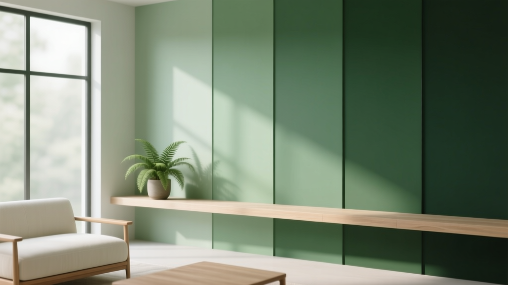
Best Pine Green Paint Colors - The Decor Mag
Pine green is one of those rare paint colors that can feel timeless and trend-forward at the same time. Inspired by evergreen needles and forest canopies, it brings instant depth, calm, and a sense of “architecture” to a room—without relying on heavy patterns or busy decor. Homeowners love pine green paint because it reads as grounded and natural, yet it can look polished enough for formal spaces.
From a color psychology standpoint, green is strongly linked to restoration, balance, and well-being. Pine green sits on the deeper, cooler end of the green family, which makes it especially effective for creating a cocooning mood—think bedrooms, libraries, dens, and dining rooms. At the same time, the right pine green can look crisp and elevated in kitchens, entryways, and even modern bathrooms when paired with the right finishes.
This guide breaks down the best pine green paint colors (with brand-specific picks), how to choose the right shade for your lighting and fixed materials, and how to build foolproof color schemes around it—so you can use pine green with confidence.
What Counts as “Pine Green” in Interior Design?
Pine green typically refers to a deep green with cool undertones (often leaning slightly blue or neutral). It’s darker than many “forest greens,” less yellow than “hunter green,” and usually more muted than jewel-toned emerald. In interiors, pine green paint colors work like a sophisticated neutral: they pair beautifully with wood, stone, metals, and warm whites.
Pine Green vs. Forest Green vs. Hunter Green
- Pine green: deep, cool-leaning, evergreen-inspired; moody and refined.
- Forest green: deep but often slightly warmer or more natural/earthy; can lean olive in some lights.
- Hunter green: traditionally deeper and warmer (more yellow/black), classic and sporty; can feel heavier if overused.
Why Pine Green Works So Well
- Visual stability: dark greens feel “anchored,” which helps rooms feel intentional.
- Nature connection: green supports a biophilic design approach—bringing the outdoors in through color.
- Design flexibility: pairs with warm or cool palettes depending on undertones and finishes.
How to Choose the Right Pine Green Paint Color
1) Start with Lighting (North, South, East, West)
- North-facing rooms: cooler, flatter light can make pine green look more blue or shadowy. Choose a pine green with a slightly softer, more neutral base.
- South-facing rooms: warm, bright light can make greens look clearer and more vibrant. You can handle deeper, moodier greens here.
- East-facing rooms: bright morning light, cooler later. Test swatches at multiple times of day.
- West-facing rooms: warm afternoon/evening glow can pull out warmth in the paint and make it feel cozier (or slightly murkier if the shade is too dark).
2) Read the Undertone Against Your Fixed Finishes
Pine greens can lean:
- Blue-green: crisp, modern, pairs well with marble, chrome, and cool whites.
- Neutral green: versatile, works with both warm woods and cooler materials.
- Warm/earthy green: a touch olive or brown; pairs beautifully with brass and creamy off-whites.
3) Decide How Moody You Want It
Deeper pine greens create drama and intimacy. Mid-depth pine greens feel more relaxed and easier to live with. If you’re unsure, choose a step lighter than your first instinct—especially for low-light rooms.
Best Pine Green Paint Colors (Designer-Approved Picks)
These pine green paint colors are widely loved because they’re balanced, livable, and consistent across different homes. Always sample first: pine green can shift dramatically based on light, sheen, and surrounding colors.
1) Sherwin-Williams Evergreen Fog (SW 9130)
A softened green-gray that reads “pine-inspired” without going fully dark. Ideal if you want a calming, modern organic look.
- Best for: living rooms, open-plan spaces, bedrooms
- Pairs well with: warm white trim (SW Alabaster), light oak, linen textures
- Style vibe: modern rustic, Scandinavian, organic modern
2) Sherwin-Williams Ripe Olive (SW 6209)
A deep, dramatic green that can read pine in many settings, especially when balanced with warm whites and natural materials. It’s bold and sophisticated.
- Best for: dining rooms, libraries, accent walls, cabinetry
- Pairs well with: brass, walnut, creamy whites, terracotta accents
- Style vibe: classic, moody transitional, European-inspired
3) Benjamin Moore Pine Grove (2044-10)
True to its name, Pine Grove is a rich evergreen that leans classic and festive without feeling themed—especially when paired with quiet neutrals.
- Best for: statement walls, powder rooms, built-ins
- Pairs well with: crisp white tile, black accents, medium-tone wood
- Style vibe: timeless, tailored, heritage
4) Benjamin Moore Essex Green (HC-188)
Almost-black green with serious depth. In many rooms it reads as pine-at-night: elegant, enveloping, and high contrast.
- Best for: exterior trim, front doors, dining rooms, dramatic offices
- Pairs well with: warm white walls, antique brass, deep wood tones
- Style vibe: classic colonial, English-inspired, formal modern
5) Farrow & Ball Studio Green (No. 93)
A celebrated deep green that shifts between green and near-black depending on lighting. It’s a top choice for cabinetry and cozy rooms.
- Best for: kitchen cabinets, mudrooms, studies
- Pairs well with: marble, aged brass, creamy off-whites
- Style vibe: elevated, heritage, boutique-hotel mood
6) Farrow & Ball Green Smoke (No. 47)
More muted and smoky than traditional pine, with a soft, lived-in quality. Great if you love pine green but want it gentler and more atmospheric.
- Best for: bedrooms, bathrooms, living areas
- Pairs well with: pale pink accents, warm whites, natural stone
- Style vibe: vintage, cottage-modern, relaxed traditional
7) Behr Pine Grove (N390-7) or Similar Deep Evergreen Options
Behr offers several deep evergreen shades that land in the pine green family. Look for options labeled “pine,” “evergreen,” or “woodland,” then compare undertones in your space.
- Best for: accent walls, budget-friendly refreshes, DIY projects
- Pairs well with: white ceilings, black hardware, light woods
Real Room Examples: How Pine Green Looks in Action
Pine Green Living Room: Cozy Without Feeling Heavy
Use pine green on walls for a layered, intimate feel. Balance with lighter elements so the room doesn’t turn cave-like.
- Try: Sherwin-Williams Evergreen Fog for an all-over wall color
- Style it with: a warm ivory sofa, jute rug, oak coffee table
- Pro tip: add one reflective surface (mirror, glass, or metallic lamp) to bounce light around deep green walls
Pine Green Kitchen Cabinets: Classic, Elevated, and Practical
Pine green cabinets hide everyday smudges better than white, yet feel more organic than black. Choose a durable finish and keep counters and backsplash lighter for contrast.
- Try: Farrow & Ball Studio Green on lower cabinets with warm white uppers
- Hardware: aged brass or matte black depending on your palette
- Countertops: white quartz, honed marble look, or light butcher block
Pine Green Bedroom: Restful and Cocooning
Deep greens support sleep-friendly design because they reduce visual noise and create a grounded atmosphere. A pine green accent wall behind the bed is often enough.
- Try: Benjamin Moore Essex Green for a dramatic headboard wall
- Pair with: soft white bedding, walnut nightstands, warm taupe rug
- Lighting: use warm bulbs (2700K) to prevent the room from feeling cold
Pine Green Dining Room: Instant Drama for Entertaining
Dining rooms are perfect for deeper paint colors because you mostly experience them in evening light. Pine green makes artwork, candles, and wood furniture look richer.
- Try: Sherwin-Williams Ripe Olive for a moody, gathered feel
- Pair with: crisp white ceiling, vintage rug, brass chandelier
Pine Green Exterior or Front Door: Curb Appeal with Tradition
Pine green looks established and architectural outdoors, especially against brick, stone, or creamy siding.
- Try: Benjamin Moore Essex Green on a front door or shutters
- Pair with: warm white trim and matte black lighting
Best Color Schemes to Pair with Pine Green
Pine green is versatile, but the best results come from choosing a clear direction: warm and earthy, crisp and high-contrast, or soft and tonal.
Warm, Earthy Pine Green Palette
- Trim: creamy white (Sherwin-Williams Alabaster, Benjamin Moore White Dove)
- Accents: terracotta, camel leather, rust, warm brass
- Materials: walnut, rattan, travertine, linen
Crisp, Modern Pine Green Palette
- Trim: clean white (Benjamin Moore Chantilly Lace)
- Accents: black, chrome, charcoal, icy gray
- Materials: marble, glass, polished nickel, concrete
Soft, Tonal Green Palette (Relaxed and Layered)
- Companions: sage, olive-gray, muted teal
- Neutrals: oatmeal, greige, warm taupe
- Texture focus: bouclé, wool, raw wood, matte ceramics
Application Guidance: Where to Use Pine Green Paint
Best Spots for Pine Green
- Accent walls: behind a bed, sofa, or dining room hutch
- Cabinetry: lowers, islands, built-ins, mudroom lockers
- Doors and trim: interior doors for a custom, high-end look
- Ceilings: for a wraparound “jewel box” effect in small rooms
Paint Finish Tips
- Walls: matte or eggshell for a soft, velvety look that suits moody greens
- Trim/doors: satin or semi-gloss for durability and contrast
- Cabinets: satin or a cabinet-grade enamel; prioritize cleanability
Common Pine Green Paint Mistakes (and How to Avoid Them)
-
Choosing a shade without testing it in your lighting.
Fix: Paint a large sample board and view it morning, afternoon, and evening. -
Forgetting the impact of adjacent colors.
Fix: Compare pine green next to your flooring, countertop, and upholstery; undertones show up fastest here. -
Going too dark in a low-light room without contrast.
Fix: Add high-contrast trim, lighter textiles, and layered lighting (table + floor + overhead). -
Pairing pine green with the wrong white.
Fix: If the green is cool, avoid overly creamy whites that can look yellow. If the green is warm, avoid icy whites that can look stark. -
Using the same sheen everywhere.
Fix: Mix finishes for dimension—matte walls with satin trim looks intentional and designer-like.
FAQ: Pine Green Paint Colors
Is pine green a good choice for small rooms?
Yes—especially for powder rooms, offices, and dens. Deep pine green can blur edges and feel cozy. Use lighter trim, a brighter mirror, and warm lighting to keep it welcoming.
What trim color looks best with pine green walls?
Most homes do well with a warm white like Benjamin Moore White Dove or Sherwin-Williams Alabaster. If your pine green is very cool or blue-leaning, a cleaner white like Benjamin Moore Chantilly Lace can feel sharper and more modern.
Does pine green work with oak cabinets or oak flooring?
It pairs beautifully with oak because the warmth of oak balances pine green’s cool depth. Choose a pine green with a neutral base (not overly blue) if your oak is very golden.
Can pine green replace a neutral like gray or beige?
In many rooms, yes. Pine green functions like a “color neutral”—it has enough depth to anchor a space but still plays nicely with natural textures and classic finishes.
What accent colors go best with pine green?
Reliable choices include warm whites, camel, cognac leather, brass, black, terracotta, dusty blush, and deep navy. Choose accents based on whether you want a warm earthy scheme or a crisp modern one.
Should I paint the ceiling pine green too?
For a dramatic, enveloping look, painting the ceiling can be stunning—especially in a dining room, bedroom, or small study. If your room lacks natural light, keep the ceiling a lighter white and bring pine green in on walls or millwork.
Next Steps: Make Pine Green Work in Your Home
Start by picking 2–3 pine green paint colors from this list, then test them on large sample boards near your biggest fixed elements (flooring, tile, counters). Decide whether your room wants a soft pine green (more gray/muted) or a deep evergreen (more dramatic). Build your supporting palette with one dependable trim white, one wood tone, and one metal finish—then layer in texture through rugs, drapery, and upholstery.
If you’re ready for more help building cohesive color schemes, explore more paint color guides and interior color design tips on thedecormag.com.
More Articles
 Best Midnight Blue Paint Colors - The Decor Mag
 Trends vs Island: How Color Forecasting and Brand Identity Diverge in Commercial Design
 Best Rust Red Paint Colors - The Decor Mag
 How to Choose Colors for a Veranda - The Decor Mag
 How to Create a Soothing Color Palette - The Decor Mag
 How to Use Color to Create Grandeur - The Decor Mag
 How to Use Desaturated Colors for Elegance - The Decor Mag
 Reading FAQ Answered: Evidence-Based Answers to 27 Common Questions About Vision, Eye Health, and Reading Performance
 Bedroom vs. Open Concept: Functional, Psychological, and Design Realities
 Best Oxblood Paint Colors - The Decor Mag