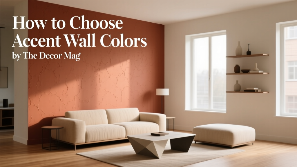
How to Choose Accent Wall Colors - The Decor Mag
An accent wall can change the entire mood of a room without the cost or commitment of painting every surface. Done well, it adds depth, highlights architecture, and creates a focal point that makes your home feel more intentional—like a designer was involved, even if you’re doing it yourself.
Color is also one of the most emotional design tools you have. A warm terracotta accent can make a living room feel welcoming and social. A deep inky blue behind the bed can turn a plain bedroom into a retreat. When you understand a few color theory basics—undertones, contrast, and how light shifts paint—you can choose accent wall colors with confidence instead of guesswork.
This guide walks you through choosing accent wall paint colors that work with your existing finishes, furniture, and lighting, with practical room examples, brand-specific color recommendations, and the most common mistakes to avoid.
What an Accent Wall Really Does (Beyond “Adding a Pop”)
In interior color design, an accent wall is a controlled moment of contrast. It can:
- Create a focal point: drawing the eye to a fireplace, headboard wall, or built-in shelving.
- Adjust perceived proportions: darker colors can visually “pull” a wall closer; lighter colors can make a room feel more open.
- Define a zone: especially in open-plan living where you want to separate dining from lounging without walls.
- Support the room’s purpose: energizing hues for workspaces, calming hues for bedrooms, social warmth for living areas.
Start With Your Room’s Fixed Elements
The fastest way to pick a successful accent wall color is to stop thinking of paint first and start with what you can’t easily change. These elements set your undertone direction and limit your “wrong turn” options.
Identify Undertones in Hard Finishes
Look at flooring, countertops, tile, brick, and large upholstered pieces. Determine whether they lean warm, cool, or neutral.
- Warm undertones: honey oak, brass, creamy marble, beige stone, terracotta tile.
- Cool undertones: gray tile, white marble with blue/charcoal veining, chrome, bluish-grays.
- Neutral/balanced: many modern woods, true whites, mixed metals, greige surfaces.
Practical tip: Hold a plain sheet of white paper next to your floor or countertop. If the surface suddenly looks yellow, pink, or blue by comparison, you’ve found its undertone direction.
Choose a Color Family That Matches Those Undertones
This is where many accent walls fail: the color is “pretty” but fights the home’s existing materials.
- Warm floors + warm accent colors: terracotta, clay, olive, warm navy, caramel browns.
- Cool floors + cool accent colors: slate blue, charcoal, blue-green, crisp black.
- Mixed finishes: choose complex neutrals (deep taupe, smoky green, softened navy) that bridge both sides.
Use Color Theory: Contrast, Temperature, and Saturation
Decide What Kind of Contrast You Want
Accent walls typically succeed with one of these contrast strategies:
- Value contrast (light vs. dark): a deep color against lighter surrounding walls for drama.
- Hue contrast (different color family): a blue accent in a warm-neutral room to add freshness.
- Saturation contrast (muted vs. vivid): a richer accent against soft, quiet neutrals.
Rule of thumb: If your room already has bold patterns or colorful art, choose a more muted accent. If your room is minimal, you can handle a more saturated accent wall paint color.
Warm vs. Cool: Match the Feeling You Want
Color psychology isn’t about rigid rules—it’s about how your brain reads temperature and depth.
- Warm colors (reds, oranges, warm browns) feel social and cozy. They “advance,” making spaces feel more intimate.
- Cool colors (blues, greens, blue-grays) feel calm and airy. They tend to “recede,” which can help a room feel more spacious.
Control Saturation for a More Expensive Look
Highly saturated colors can be stunning, but they’re less forgiving under changing daylight and artificial lighting. Many designers prefer slightly grayed or “dirty” versions of a color for accent walls because they feel layered and timeless.
Pick the Right Wall: Placement Matters
The best accent wall is usually the wall you naturally look at when you enter the room—or the one that already has a built-in focal point.
Great Accent Wall Candidates
- Behind the bed in a bedroom (especially with a headboard).
- Fireplace wall in a living room.
- Dining room wall behind a sideboard or art.
- Wall with built-ins to add depth and shadow play.
- Entry wall that frames a console and mirror.
Walls to Think Twice About
- Random walls with no visual anchor: the color can look accidental.
- Highly chopped walls with multiple doors/windows: the accent reads fragmented.
- Short end walls in narrow rooms: a dark color can over-tighten the space unless you’re intentionally creating a cozy effect.
Specific Accent Wall Color Recommendations (With Brand References)
Below are designer-favorite directions that work across many home styles. Always sample first—paint colors shift dramatically with exposure, sheen, and surrounding materials.
1) Deep Blue Accent Walls: Calm, Classic, and Versatile
Deep blues are a go-to for living rooms, bedrooms, and offices because they read both soothing and sophisticated.
- Benjamin Moore Hale Navy (HC-154): a rich navy that pairs well with crisp whites, brass, and warm woods.
- Sherwin-Williams Naval (SW 6244): slightly inky, excellent for modern spaces and dramatic bedrooms.
- Farrow & Ball Hague Blue: a deep blue-green that feels historic and moody.
Pair with: warm white walls (e.g., Benjamin Moore White Dove), natural oak, linen upholstery, brushed brass, and creamy rugs.
2) Green Accent Walls: Restorative and “Designer” by Nature
Greens connect to nature, which is why they feel balanced in nearly any room. The key is choosing a green with the right undertone.
- Benjamin Moore Guilford Green (HC-116): a soft, classic green that’s calm without being dull.
- Sherwin-Williams Evergreen Fog (SW 9130): a modern green-gray that plays beautifully with warm neutrals.
- Farrow & Ball Green Smoke: smoky and complex—great for libraries, dining rooms, or built-ins.
Pair with: warm white trim, tan leather, black accents, and natural textures (jute, woven shades, oak).
3) Terracotta and Clay Accent Walls: Warmth Without “Red Room” Intensity
Earthy reds and clays can make a room feel grounded and inviting, especially in spaces that feel cold or overly gray.
- Farrow & Ball Red Earth: a refined clay-red that feels mature and architectural.
- Benjamin Moore Terra Cotta Tile (2090-30): bold and warm; best with light surrounding walls.
- Sherwin-Williams Cavern Clay (SW 7701): a popular desert-inspired clay that complements cream, camel, and olive.
Pair with: creamy whites, warm woods, handmade ceramics, and soft black metal accents.
4) Charcoal, Near-Black, and Black Accent Walls: High Contrast, Gallery Effect
Dark neutrals create instant sophistication and make art, textiles, and wood tones stand out. They also hide imperfections better than mid-tone colors.
- Benjamin Moore Wrought Iron (2124-10): a soft black with depth—less harsh than pure black.
- Sherwin-Williams Iron Ore (SW 7069): a deep charcoal that reads modern and warm-leaning.
- Benjamin Moore Kendall Charcoal (HC-166): classic, slightly warm, and very livable.
Pair with: white trim, warm woods, oversized art, and layered lighting to prevent the wall from looking flat.
5) Soft Pastel Accent Walls: Light, Cheerful, and Subtle
Pastels aren’t just for nurseries. When they’re slightly muted, they create a fresh, airy accent that still feels grown-up.
- Benjamin Moore First Light (2102-70): a soft blush-pink that’s flattering and warm.
- Sherwin-Williams Sea Salt (SW 6204): a light green-blue that works well in bathrooms and bedrooms.
- Farrow & Ball Setting Plaster: a sophisticated pink-beige that reads like warm light on the wall.
Pair with: light oak, creamy whites, soft grays, and brushed nickel or aged brass.
Real Room Examples and Application Scenarios
Living Room: Fireplace Accent Wall in a Neutral Space
Scenario: Beige walls, white trim, warm wood floors, black fireplace insert.
Color plan: Paint the fireplace wall Benjamin Moore Hale Navy and keep surrounding walls a warm off-white like Benjamin Moore White Dove.
Why it works: The navy creates depth and a focal point; the black insert and hardware blend seamlessly; warm floors keep it inviting.
Styling tip: Add contrast with a light rug and a few brass accents (picture lights, lamp bases, or a mirror frame).
Bedroom: Headboard Wall for a Boutique-Hotel Feel
Scenario: White walls, upholstered headboard, minimal art, medium-tone wood nightstands.
Color plan: Use Sherwin-Williams Naval behind the bed. Choose crisp white bedding and add one warm element (camel throw or brass sconces).
Why it works: A dark, cool accent wall supports sleep and creates a grounded “destination” wall, especially when paired with warm metals.
Home Office: Productivity Without Harshness
Scenario: Small room, lots of daylight, white built-in shelves.
Color plan: Paint the wall behind the desk Sherwin-Williams Evergreen Fog. Keep the rest a soft warm white.
Why it works: Green supports focus and reduces visual stress. The muted tone stays professional on video calls and doesn’t glare like bright white.
Dining Room: Cozy Drama for Entertaining
Scenario: Traditional room, wainscoting, warm chandelier lighting at night.
Color plan: Consider an accent wall (or even the whole room) in Farrow & Ball Hague Blue or Green Smoke.
Why it works: Dark, complex colors thrive under warm evening lighting, making dinners feel intimate and elevated.
Bathroom: Fresh Accent Behind the Vanity
Scenario: White tile, chrome faucet, gray veining in countertop.
Color plan: Use Sherwin-Williams Sea Salt as the vanity wall accent.
Why it works: The cool, clean undertone aligns with chrome and marble veining, creating a spa-like color scheme.
How to Test Accent Wall Paint Colors Like a Designer
- Sample large: Use peel-and-stick samples or paint poster boards at least 18x24 inches.
- Move the sample around: Check it on the chosen wall and adjacent walls to see bounce light effects.
- View it at multiple times: morning, afternoon, and night under your actual bulbs.
- Compare with a “control” white: Tape a sheet of bright white paper nearby to spot undertones.
- Consider sheen: Matte/eggshell hides flaws and looks velvety; satin is more wipeable but can highlight texture.
Common Accent Wall Color Mistakes to Avoid
- Choosing based on a phone screen: digital images distort undertones and depth. Always sample in your home.
- Ignoring undertones: a “pretty green” can go swampy next to warm flooring or turn neon beside cool LEDs.
- Picking the wrong wall: an accent with no focal point can look like a leftover paint decision.
- Overdoing contrast in a busy room: if you already have patterned rugs, bold art, and colorful pillows, a super-saturated accent wall can feel chaotic.
- Forgetting the transition spaces: accent walls visible from hallways should relate to nearby colors so your home’s palette feels connected.
- Skipping lighting checks: warm bulbs can make colors more yellow/red; cool bulbs can make them look grayer or sharper.
Accent Wall Color Combinations That Rarely Fail
These pairings support a wide range of interior color schemes and styles:
- Navy + warm white + brass: Benjamin Moore Hale Navy + White Dove + aged brass lighting.
- Sage green + cream + natural oak: Sherwin-Williams Evergreen Fog + creamy walls + oak furniture.
- Charcoal + bright white + walnut: Sherwin-Williams Iron Ore + crisp trim + walnut accents.
- Clay + off-white + black accents: Sherwin-Williams Cavern Clay + soft white + matte black hardware.
- Smoky blue-green + linen neutrals: Farrow & Ball Hague Blue + flax/ivory textiles.
FAQ: Choosing Accent Wall Colors
Should an accent wall be darker than the other walls?
Often, yes—darker accent wall colors create clear contrast and a strong focal point. That said, a lighter accent can work if it’s a distinct hue shift (for example, soft blush against warm white) or if the room is already dark and you want a gentle highlight.
Can I do an accent wall in a small room?
Yes. A small room can look bigger with the right accent strategy: try a deeper color on the wall you want to recede (often the far wall) and keep the other walls lighter. Muted darks like Benjamin Moore Wrought Iron can add depth without feeling cramped when lighting is layered.
What’s the best accent wall color for an open floor plan?
Look for a color that connects to at least one element repeated across the space (wood tone, metal finish, countertop color). Muted, complex shades—like Sherwin-Williams Evergreen Fog or Benjamin Moore Kendall Charcoal—tend to blend zones without harsh transitions.
Do accent walls need to match the room’s decor exactly?
No. The goal is coordination, not an exact match. Use your decor as a clue for undertone and intensity. A navy accent can complement tan leather and white walls without matching any one item perfectly.
How do I choose an accent color if my walls are already gray?
First determine if your gray is warm (greige) or cool (blue-gray). Then choose an accent that either harmonizes (cool gray + slate blue) or warms it up (warm gray + clay/terracotta). If your gray feels flat, greens and blue-greens are a reliable fix.
Is wallpaper better than paint for an accent wall?
Wallpaper is excellent when you want pattern and texture as the focal point. Paint is best when you want a cleaner, more flexible option. If you’re color-shy, wallpaper with a neutral ground and one strong color can be an easier “bridge” into bolder design.
Next Steps: A Simple Accent Wall Plan You Can Use This Weekend
- Pick the wall with the clearest focal point (bed, fireplace, desk, or dining sideboard wall).
- Identify your undertone direction from floors, counters, and large furniture.
- Choose 3 candidate paint colors in one family (for example: navy, smoky blue, blue-green).
- Sample large and test for 48 hours in daylight and lamplight.
- Commit with the right finish (matte/eggshell for most accent walls; satin if you need extra durability).
- Style the wall intentionally with art, lighting, and textiles that echo the accent color once or twice elsewhere in the room.
Your accent wall should feel like it belongs to the room’s color scheme—not like it happened to it. When you balance undertones, contrast, and lighting, accent wall paint colors become one of the easiest ways to make a home feel more personal, polished, and alive.
Explore more paint color ideas, color schemes, and interior color design guides at thedecormag.com.
More Articles
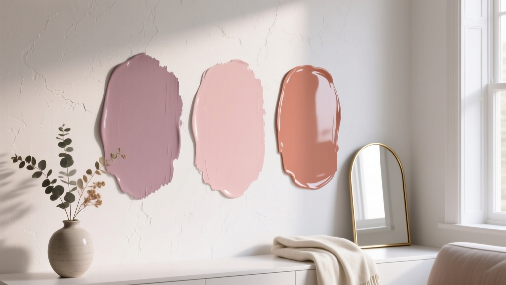 Best Dusty Rose Paint Colors - The Decor Mag
 Small vs Step: Decoding the Critical Difference in Color Management for Print and Digital Workflows
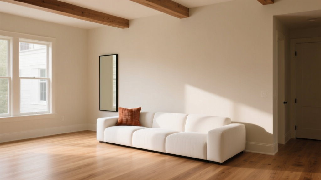 Paint Colors That Work With Flooring (2026)
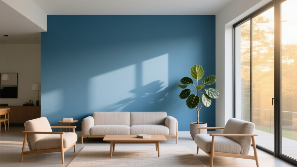 Best Azure Blue Paint Colors - The Decor Mag
 Best Yellow Paint Colors for Cheerful Rooms - The Decor Mag
 Best Beige Paint Colors That Aren't Boring - The Decor Mag
 Best Maroon Paint Colors - The Decor Mag
 Best Bathroom Floor Solutions: Performance, Safety, and Style Compared
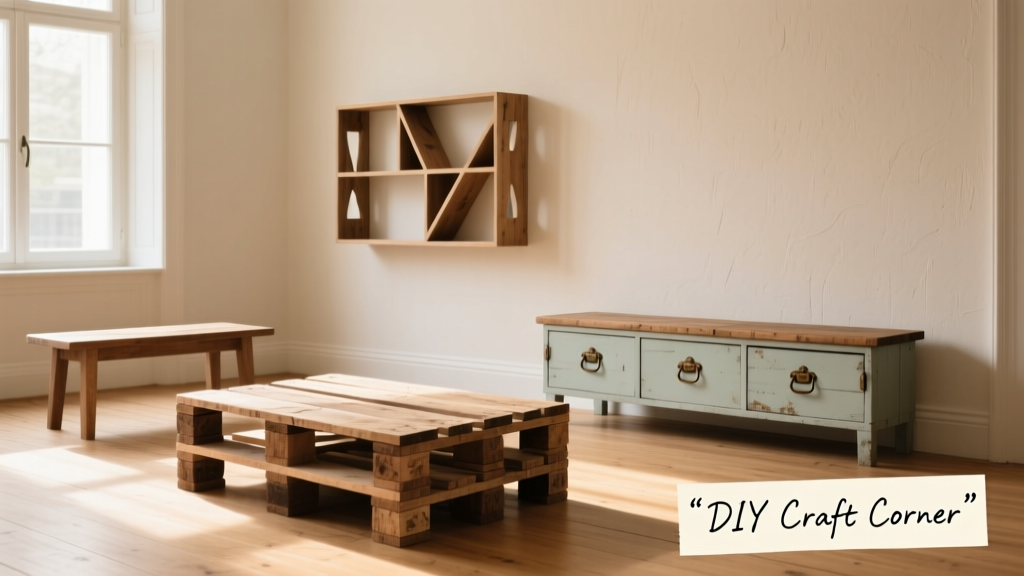 12 Practical DIY Furniture Ideas You Can Build in a Weekend (With Exact Materials & Dimensions)
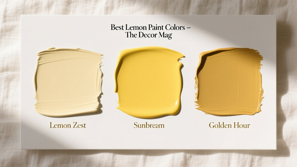 Best Lemon Paint Colors - The Decor Mag