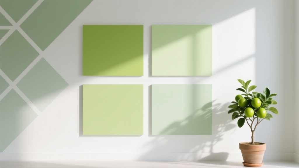
Best Key Lime Paint Colors - The Decor Mag
Key lime is one of those rare paint colors that feels both playful and polished. It sits in the yellow-green family, but with a crisp, citrusy lift that reads as fresh rather than earthy. Used well, key lime paint can brighten dim rooms, energize kitchens, and give modern spaces a clean, optimistic edge—without drifting into neon or looking like a themed “lime” room.
This color topic matters because green has become a cornerstone of today’s interior color design, yet many homeowners struggle to find a green that feels current and livable. Key lime shades solve a common problem: they offer the cheer of yellow and the calming association of green, striking a balance that works across many interior styles—from coastal and mid-century to contemporary and eclectic.
Whether you’re choosing a key lime wall color, updating cabinetry, or adding a zingy accent, the best results come from understanding undertones, lighting, and the supporting palette. Below, you’ll find standout key lime paint colors (with brand references), room-by-room guidance, and practical color schemes that make this bright green feel intentional.
What Counts as a “Key Lime” Paint Color?
Key lime paint colors generally live between chartreuse and yellow-green, but the most usable versions have a touch of softness—either a muted gray base or a slightly creamy yellow cast. In interior design terms, a good key lime reads:
- Fresh and bright, but not fluorescent
- Yellow-leaning green (not teal, not olive)
- High-chroma compared to sage or mint, yet still livable
Color Psychology: Why Key Lime Feels So Good
Green is associated with restoration, growth, and balance. Yellow brings warmth, optimism, and alertness. Together, key lime tends to feel:
- Energizing in kitchens, breakfast nooks, and creative spaces
- Clean and “healthy” in bathrooms and laundry rooms
- Upbeat in entryways where first impressions matter
Before You Pick a Paint: Undertones, Light, and Finish
Undertones to Watch
Key lime colors can swing quickly depending on undertone. Ask yourself what you want the color to do:
- More sunny and tropical: look for a stronger yellow undertone.
- More modern and crisp: choose a slightly cooler lime with less yellow.
- More sophisticated and muted: pick a lime softened with gray.
Lighting Changes Everything
- North-facing light: can make key lime appear cooler and sharper. Pair with warmer whites and light woods.
- South-facing light: intensifies the yellow; many limes look more golden. Great for cheerful kitchens.
- East-facing light: bright and friendly in the morning, calmer later. Consider for breakfast areas.
- West-facing light: can push lime toward bold and saturated in late afternoon. Test first.
Finish Guidance (So It Looks Designer, Not DIY)
- Walls: eggshell or matte for a softer, more refined look.
- Trim: satin or semi-gloss in a warm white for clean contrast.
- Cabinetry/doors: satin or semi-gloss for durability and depth.
- Ceilings: flat white to keep the room airy (unless you’re intentionally color-drenching).
Best Key Lime Paint Colors (Designer-Approved Picks)
Key lime is a spectrum. Here are standout paint color recommendations across major brands, including options that feel bold, softened, or slightly creamy.
Sherwin-Williams Key Lime Paint Colors
- Sherwin-Williams Citrine (SW 6390) – A lively yellow-green with a clean citrus feel. Excellent for a sunny kitchen or playful powder room.
- Sherwin-Williams Lime Granita (SW 6715) – A bright, modern lime that reads energetic on walls and even better as an accent on built-ins.
- Sherwin-Williams Electric Lime (SW 6921) – High-impact and contemporary. Best for small doses: a front door, a niche, or a single statement wall.
Benjamin Moore Key Lime Paint Colors
- Benjamin Moore Key Lime (2039-40) – A quintessential lime-green paint color: crisp, punchy, and true to the name. Great for accents and modern rooms.
- Benjamin Moore Fresh Lime (2029-20) – Brighter and more graphic. Works well in a creative studio, kids’ space, or a retro-inspired kitchen.
- Benjamin Moore Citrus (2018-10) – A warmer citrus-leaning option that can read more yellow-green than straight lime. Lovely with rattan, oak, and warm whites.
Farrow & Ball Lime-Adjacent Greens
Farrow & Ball tends to be more muted, which is helpful if you want a key lime vibe without full saturation.
- Farrow & Ball Yeabridge Green (No. 287) – A soft, cheerful green with a yellow lift. Feels fresh but more tailored than neon.
- Farrow & Ball Cooking Apple Green (No. 32) – A classic, spirited apple-green that can read lime in bright light. Excellent for traditional homes wanting a twist.
Behr Key Lime Options (Budget-Friendly)
- Behr Key Lime (common naming varies by collection) – Behr often carries multiple “Key Lime” variations; look for a yellow-forward lime and test for neon in your lighting.
- Behr Sour Apple (often available by name) – A zesty green that can skew bright. Best as an accent or in sunlit rooms with white trim.
Pro tip: If you’re matching a “key lime” idea across brands, compare swatches side by side and prioritize the undertone (yellow vs. cool green) more than the name.
Where Key Lime Paint Works Best (Room-by-Room Ideas)
Kitchen: Energetic, Clean, and Social
Key lime in kitchens can feel fresh and food-friendly—especially when balanced with grounded materials. Two standout approaches:
- Cabinet moment: Paint lower cabinets in a key lime shade and keep uppers warm white. Add brass pulls and a creamy tile backsplash.
- Breakfast nook glow-up: A key lime wall color in a nook paired with white beadboard, a light oak table, and simple linen shades.
Real-room scenario: In a small galley kitchen with limited daylight, a softer lime (slightly grayed) on walls can brighten without glare. Keep counters light (white quartz or pale butcher block) to maintain the “citrus” freshness.
Bathroom: Spa Meets Citrus
Bathrooms love color—especially when the fixtures are neutral. Key lime can read crisp and clean next to white porcelain and chrome.
- Powder room statement: Lime walls + a graphic black-and-white floor tile + a walnut vanity creates a boutique feel.
- Tile pairing: Try a lime paint with white subway tile and a soft warm-gray grout for subtle contrast.
Entryway: A Confident First Impression
Entryways are transitional spaces where bold color feels intentional. Consider key lime on:
- the front door (inside and out, if appropriate)
- an interior door to a mudroom or pantry
- wainscoting with white walls above for a tailored look
Home Office or Studio: Focus and Creativity
Green supports a balanced mood, while the yellow undertone keeps energy up—ideal for a workspace. Use key lime strategically:
- Accent wall behind the desk to frame your work zone on video calls
- Built-ins or shelving in lime for a curated, modern library feel
- Two-tone color blocking (lime lower wall, warm white upper wall) for an architectural look
Kids’ Rooms and Playrooms: Happy Without Pastel
Key lime reads youthful and optimistic, but can still feel design-forward when paired with grown-up neutrals like warm white, greige, or natural wood.
Key Lime Color Schemes That Always Look Intentional
Key lime is easiest to live with when it has the right supporting cast. Use these color combinations to build a cohesive interior color scheme.
1) Key Lime + Warm White + Natural Wood
- Vibe: fresh, modern-organic
- Use it: kitchens, sunrooms, casual living spaces
- Materials: oak, maple, rattan, jute, linen
2) Key Lime + Navy + Crisp White
- Vibe: tailored, coastal-prep
- Use it: entryways, offices, bathrooms
- Tip: keep navy in textiles or cabinetry and let lime be the accent to avoid heaviness.
3) Key Lime + Blush or Soft Terracotta
- Vibe: playful, design-forward
- Use it: powder rooms, creative studios, eclectic living rooms
- Why it works: red-orange family complements green, creating lively contrast.
4) Key Lime + Charcoal + Brushed Brass
- Vibe: modern and sophisticated
- Use it: kitchens, bars, dramatic powder rooms
- Tip: choose a slightly muted lime so the pairing feels luxe, not loud.
How to Use Key Lime Without Overwhelming the Room
If you love the idea of key lime but feel cautious, scale it to your comfort level.
Low-Commitment Options
- Paint a single door (pantry, laundry, interior French doors)
- Try key lime on a built-in bookshelf back panel
- Use it on furniture: a side table, console, or vintage dresser
- Bring it in through textiles: pillows, an area rug detail, or art
Medium-Commitment Options
- Accent wall in a room with plenty of white and wood
- Half-wall or wainscoting in lime with white above
- Kitchen island in key lime with neutral perimeter cabinets
High-Commitment (High Reward) Options
- Color drenching: walls plus trim in the same lime for a modern “immersive” look (best in small rooms like powder rooms)
- Cabinetry: full lime cabinets balanced by calm counters and backsplash
Common Key Lime Paint Mistakes to Avoid
- Skipping a real paint sample: key lime shifts dramatically by lighting. Use large peel-and-stick samples or paint poster boards and move them around the room.
- Pairing with the wrong white: cool, icy whites can make lime feel harsh. Warm whites and creamy off-whites usually make it more inviting.
- Too many competing brights: lime plus hot pink plus bright turquoise can feel chaotic. Choose one hero color and keep others supportive.
- Ignoring fixed finishes: green next to warm beige tile can look muddy; next to cool gray stone it can look sharper. Match the lime undertone to what you can’t change.
- Overusing lime in large open plans: in a connected living/dining/kitchen area, keep lime to one zone (like an island or nook) and echo it subtly in decor elsewhere.
FAQ: Key Lime Paint Colors
Is key lime paint too bright for a whole room?
It depends on the shade and the room’s light. A slightly muted key lime (with a touch of gray) can work on all walls, especially in smaller rooms like a powder room or laundry room. For larger spaces, many homeowners prefer key lime as an accent wall, cabinetry color, or a color-blocked lower wall.
What trim color goes best with key lime walls?
Warm whites tend to look best because they soften the intensity. Look for creamy off-whites rather than stark, blue-leaning whites. If you want a sharper, modern contrast, a clean bright white can work—just test to ensure the lime doesn’t turn electric in your lighting.
Does key lime work in north-facing rooms?
Yes, but choose carefully. North light can make key lime feel cooler and more piercing. A warmer, slightly yellower lime often looks friendlier in north-facing spaces, especially paired with warm white trim and natural wood.
What colors complement key lime green?
Great complementary pairings include navy, charcoal, warm white, blush, terracotta, and natural wood tones. For a more tonal look, use softer greens like mint or pale sage in adjacent decor.
Can I use key lime paint with brass or gold hardware?
Brass and key lime are a strong match. Brass warms the palette and makes lime feel more sophisticated. This pairing is especially effective on cabinetry, bar areas, and powder room accents.
What’s the difference between key lime and chartreuse?
Chartreuse is often more intense and more purely yellow-green, sometimes reading sharper or more neon. Key lime typically feels slightly softer or creamier—still bright, but more “citrus fresh” than highlighter-bold.
Your Next Steps: Choose, Test, and Style
- Decide your intensity: accent, half-wall, cabinets, or full-room color.
- Pick 2–3 contenders: include one brighter lime, one muted lime, and one warmer yellow-green.
- Test in multiple spots: morning, afternoon, and evening—near windows and in corners.
- Build your supporting palette: warm white + natural wood is the easiest starting point; add navy, charcoal, blush, or brass for personality.
- Commit with confidence: once the undertone works with your fixed finishes, key lime becomes surprisingly versatile.
If you’re ready for more smart color schemes and paint color recommendations—explore our other color guides on thedecormag.com and keep building a home palette that feels personal, fresh, and timeless.
More Articles
 How to Use Undertones to Match Colors - The Decor Mag
 How to Choose Colors for East-Facing Rooms - The Decor Mag
 How To Organize Island: A Practical, Space-Smart Guide for Kitchens of All Sizes
 How to Choose Colors Based on Room Lighting - The Decor Mag
 Best Brown Paint Colors for Cozy Rooms - The Decor Mag
 Color Psychology in Home Design Guide - The Decor Mag
 Best Mango Paint Colors - The Decor Mag
 Cheap vs Premium: Why 'Premium' Isn’t Just Marketing—It’s Measurable Performance
 How to Choose Colors for a Laundry Room - The Decor Mag
 Best Taupe Paint Colors Compared - The Decor Mag