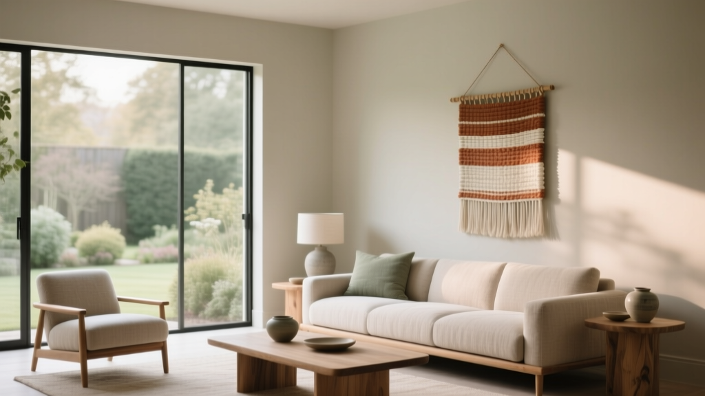
How to Use Muted Colors for Sophistication - The Decor Mag
Muted colors are the quiet power players of interior color design. They don’t shout for attention the way a bright jewel tone might, yet they’re often the shades that make a home feel layered, intentional, and expensive-looking. When homeowners say they want a space that feels “calm,” “timeless,” or “elevated,” they’re usually describing the effect muted paint colors deliver: softened pigments with a touch of gray, brown, or black that pulls everything into harmony.
This topic matters because color is doing more in your home than decorating. It sets emotional tone (color psychology), influences how large or cozy a room feels, and determines whether finishes and furnishings look cohesive or chaotic. Muted color schemes are especially useful today because they work across styles—modern, transitional, traditional, Scandinavian, rustic—and they play well with natural materials like wood, stone, linen, and leather.
If you’ve ever tried to choose a “neutral” paint color and ended up with a wall that looks too yellow, too pink, too icy, or oddly flat, muted hues can be your solution. They offer warmth without looking dated, coolness without feeling sterile, and sophistication without requiring a full redesign.
What Counts as a Muted Color (and Why It Looks Sophisticated)
A muted color is a hue that has been softened—typically by mixing in gray (desaturation), a complementary color, or a bit of black/brown. Think “dusty,” “smoky,” “weathered,” “aged,” or “softened.” These shades feel complex because they contain multiple undertones, which makes them look rich in changing light.
Color psychology: why muted tones feel calm and refined
- Reduced visual noise: Lower saturation is easier on the eyes, helping spaces feel restful.
- Perceived quality: Muted palettes are associated with natural pigments, patina, and heritage interiors—cues we read as “premium.”
- Better backdrop for living: Artwork, textiles, and wood grains stand out without fighting the walls.
Muted vs. neutral: not the same thing
Neutrals are often beige, taupe, greige, white, or gray. Muted colors can be neutrals, but they can also be colored—like dusty blue, muted sage, or softened terracotta. The difference is that muted hues carry color presence without the intensity.
How to Choose Muted Paint Colors That Work in Real Homes
Muted tones can look effortlessly chic—or surprisingly off—depending on lighting, undertones, and surrounding finishes. Use these design principles to avoid expensive mistakes.
1) Start with the fixed elements
Before picking paint colors, look at what won’t change easily:
- Flooring (oak, walnut, tile, carpet)
- Stone and countertops (marble veining, quartz undertones)
- Cabinetry and built-ins
- Large upholstery pieces
Muted colors shine when their undertones relate to these elements. For example, a green-gray will flatter warm oak, while a blue-gray often pairs beautifully with cooler marble.
2) Read undertones like a designer
Muted colors are undertone-driven. A “gray” might lean green, violet, or blue; a “beige” might lean pink or yellow. Quick test: hold a clean sheet of white paper next to your paint sample. Undertones become easier to spot.
3) Match saturation to room mood
Muted palettes can still vary in intensity. Use this rule of thumb:
- Bedrooms, living rooms: softer, more gray-infused hues for calm.
- Dining rooms, libraries: deeper muted colors for intimacy and drama.
- Kitchens, baths: clean muted tones that feel fresh (often with a bit more light reflectance).
4) Sample correctly (so the color doesn’t surprise you)
- Test at least three candidates per room.
- Paint large swatches (12" x 12" minimum) on multiple walls.
- Observe morning, afternoon, and night. Muted colors shift dramatically with warm vs. cool lighting.
- If possible, order peel-and-stick samples from brands that offer them (or use large sample pots).
Designer-Approved Muted Color Recommendations (with Paint Names)
These specific paint colors are well-loved in interior color design for their balanced undertones and sophisticated, livable feel. Always sample first—your exposure and finishes will influence the final read.
Muted warm whites and greiges (elevated neutrals)
- Benjamin Moore White Dove (OC-17): creamy but not too yellow; a classic sophisticated backdrop for muted color schemes.
- Sherwin-Williams Alabaster (SW 7008): soft warm white that flatters wood tones and brass.
- Farrow & Ball Shadow White (No. 282): a warm, gentle off-white that feels historic and layered.
- Benjamin Moore Edgecomb Gray (HC-173): a greige that reads warm and cozy, great for open-plan homes.
Muted greens (grounded, restorative)
- Sherwin-Williams Evergreen Fog (SW 9130): a gray-green that feels modern and serene; excellent for bedrooms and kitchens.
- Benjamin Moore Saybrook Sage (HC-114): a classic muted sage with warmth; pairs beautifully with cream trim and natural linen.
- Farrow & Ball Pigeon (No. 25): a blue-green-gray with a moody, storied quality—stunning in libraries or dining rooms.
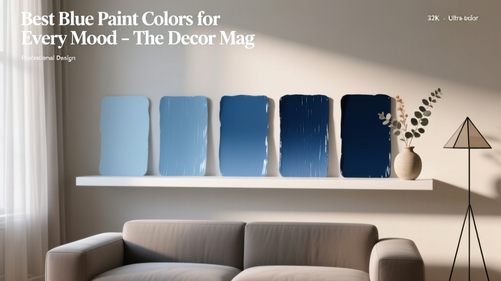
Muted blues (tailored and calming)
- Benjamin Moore Smoke (2122-40): airy blue-gray; a go-to for spa-like bathrooms and light-filled bedrooms.
- Sherwin-Williams Sleepy Blue (SW 9145): a muted blue that reads soft and classic, not juvenile.
- Farrow & Ball Light Blue (No. 22): gentle and sophisticated, especially with warm whites and aged brass.
Muted pinks and clay tones (warmth with sophistication)
- Farrow & Ball Setting Plaster (No. 231): refined blush-plaster that feels architectural and grown-up.
- Benjamin Moore Pale Oak (OC-20): a soft greige with a whisper of pink; gorgeous in living rooms with warm textiles.
- Sherwin-Williams Redend Point (SW 9081): a muted clay/terra-cotta neutral that adds warmth without overwhelming.
Muted charcoals (depth without harshness)
- Benjamin Moore Kendall Charcoal (HC-166): deep, versatile charcoal; dramatic but not pitch-black.
- Sherwin-Williams Iron Ore (SW 7069): a soft black with warmth; great for accent walls, doors, or cabinetry.
Muted Color Schemes That Always Look Polished
The secret to sophisticated color schemes is controlled contrast: a mix of light, midtone, and deep values with consistent undertones.
Go-to muted color combinations
- Dusty blue + warm white + natural oak
Example paints: Benjamin Moore Smoke + White Dove. - Sage green + creamy trim + aged brass
Example paints: Sherwin-Williams Evergreen Fog + Alabaster. - Soft clay + off-white + chocolate leather
Example paints: Sherwin-Williams Redend Point + Benjamin Moore White Dove. - Greige walls + charcoal accents + black hardware
Example paints: Benjamin Moore Edgecomb Gray + Iron Ore. - Muted teal-green + warm neutral rugs + walnut
Example paints: Farrow & Ball Pigeon + Farrow & Ball Shadow White.
Use the 60-30-10 rule (with muted colors)
This classic design principle prevents a muted palette from feeling bland:
- 60%: main wall color (a muted midtone or soft neutral)
- 30%: secondary color (upholstery, drapery, rugs)
- 10%: accent (art, pillows, small decor—this can be brighter even in a muted room)
Real Room Examples and Application Scenarios
Living room: calm sophistication that still feels welcoming
Scenario: A family living room with medium-tone wood floors, a cream sofa, and black metal accents. The goal is to look elevated but livable.
- Walls: Benjamin Moore Pale Oak (OC-20) for a soft, warm greige that flatters skin tones and textiles.
- Trim: Benjamin Moore White Dove (OC-17) for gentle contrast.
- Accents: Iron Ore (SW 7069) on the fireplace surround or built-ins for depth.
Design tip: Layer textures—bouclé, linen, wool—so the muted palette feels rich rather than flat.
Kitchen: muted cabinetry for a high-end, tailored look
Scenario: A kitchen with white quartz counters and warm brass pulls. You want cabinetry color without a trendy vibe.
- Cabinets: Sherwin-Williams Evergreen Fog (SW 9130) for a modern gray-green.
- Walls: Sherwin-Williams Alabaster (SW 7008) to keep it bright.
- Island option: Benjamin Moore Kendall Charcoal (HC-166) for a grounded focal point.
Design tip: Choose a slightly higher-sheen finish for cabinets (satin or semi-gloss) to make the muted color look crisp and cleanable.
Bedroom: a muted blue that supports rest
Scenario: A bedroom with moderate natural light and warm wood nightstands. You want a soothing paint color that doesn’t feel cold.
- Walls: Benjamin Moore Smoke (2122-40) for a gentle blue-gray.
- Ceiling: keep it soft white (White Dove) or use a 50% dilution of the wall color for a cocoon effect.
- Textiles: add warmth with oatmeal linens and a camel throw.
Design tip: Opt for warm-temperature bulbs (around 2700K) to prevent muted blues from turning steely at night.
Dining room or library: moody muted color without heaviness
Scenario: You want a more intimate room for entertaining, reading, or focused work.
- Walls: Farrow & Ball Pigeon (No. 25) or Benjamin Moore Kendall Charcoal (HC-166).
- Trim: match trim to wall color for a seamless, enveloping look.
- Metal finishes: aged brass or antique bronze for warmth.
Design tip: Add a large mirror or art with lighter negative space to keep the room visually balanced.
Bathroom: spa-like muted hues that flatter tile and stone
Scenario: A bathroom with white tile and chrome fixtures that feels too stark.
- Walls: Benjamin Moore Smoke (2122-40) or a light greige like Edgecomb Gray (HC-173).
- Vanity: Iron Ore (SW 7069) for a tailored contrast.
- Soft goods: choose towels in muted sage or oatmeal rather than bright white only.
Design tip: Muted colors love natural materials—add a wood stool, woven basket, or linen curtain to avoid a cold, clinical feel.
Where Muted Colors Go Wrong: Common Mistakes to Avoid
- Choosing a muted color without checking undertones: A green-gray can look muddy next to pink-beige tile; a violet-gray can clash with warm oak.
- Going too flat with no contrast: If everything is the same value (all midtone), the room can feel dull. Add light trim, darker accents, or crisp black details.
- Ignoring lighting temperature: Warm bulbs can make muted greens go yellow; cool LEDs can make warm greiges look lifeless. Match bulbs across the room.
- Using a muted paint color but pairing it with overly saturated decor: A single neon pillow can disrupt the refined mood. Keep accents either muted or intentionally rich (like oxblood, navy, or deep emerald).
- Skipping samples and relying on online images: Screens distort color. Always sample and view in your home’s light.
- Choosing the wrong finish: Matte hides wall flaws and looks velvety but can mark; eggshell is a great all-purpose choice; satin is ideal for kitchens and high-traffic areas.
Practical Tips for Using Muted Colors Like a Pro
- Build a “muted palette” with three steps: one light neutral, one muted midtone, one deep anchoring shade (charcoal, deep olive, or inky blue).
- Repeat undertones across the room: If your wall paint leans green-gray, echo that with a sage throw, olive art tones, or aged brass.
- Use muted color to control sightlines: Paint a hallway or connecting room in a related muted tone to make transitions feel intentional.
- Choose trim color strategically: Warm whites soften muted colors; bright whites sharpen them; matching trim creates a modern, enveloping effect.
- Let texture do some of the decorating: Bouclé, raw linen, plaster finishes, aged wood, and matte ceramics amplify the sophistication of muted walls.
FAQ: Muted Colors and Sophisticated Interior Design
Are muted colors the same as “dusty” colors?
Often, yes. “Dusty” usually means a color has been desaturated with gray, giving it that softened, powdery quality. Muted, dusty, smoky, and weathered are closely related terms in paint color language.
Will muted paint colors make my room feel darker?
Not automatically. Light muted colors (like a pale blue-gray or soft greige) can feel bright while still looking sophisticated. Darkness depends more on value (how light or deep the color is) than on saturation alone.
What’s the best muted color for an open floor plan?
A flexible greige is usually easiest because it connects warm and cool elements. Try Benjamin Moore Edgecomb Gray (HC-173) or a soft warm white like Sherwin-Williams Alabaster (SW 7008) and bring muted color in with rugs, art, and cabinetry.
How do I keep muted colors from looking muddy?
Increase clarity through contrast and materials. Pair muted walls with crisp trim, reflective finishes (glass, metal), and clean textiles. Also confirm undertones with samples—muddy results usually come from undertone clashes.
Can I mix muted warm and muted cool colors in the same home?
Yes—use a “bridge” neutral to connect them. A balanced warm white or greige can transition between a muted blue room and a muted clay-toned room, keeping the overall color scheme cohesive.
What sheen is best for muted wall colors?
Eggshell is the most reliable choice for living areas because it’s washable and still looks soft. Matte is gorgeous for low-traffic rooms. Satin works well for kitchens, baths, and kids’ spaces.
Next Steps: Bring Muted Sophistication Into Your Home
Choose one room and test a small muted palette: a warm white (for trim and ceilings), a muted midtone (for walls or cabinetry), and a deeper anchor (for a door, built-ins, or an accent). Sample large, view in your lighting, then commit with confidence—muted paint colors reward patience and precision.
For more guidance on paint colors, undertones, and room-by-room color schemes, explore more color guides on thedecormag.com.
More Articles
 Triadic Color Scheme Applications - The Decor Mag
 How to Create a Bold Color Story - The Decor Mag
 Friendly and Smart Compared: How Human-Centered Design and AI Intelligence Shape Modern Product Experiences
 Best Turquoise Paint Colors - The Decor Mag
 Cohesive Color Flow Between Rooms | The Decor Mag
 How to Use Color to Create Coolness - The Decor Mag
 Minimalist Color Palettes That Actually Feel Warm
 Split Complementary Color Palette Ideas - The Decor Mag
 Living Room Colors for Entertaining (2026)
 Best Blue Paint Colors for Every Mood - The Decor Mag