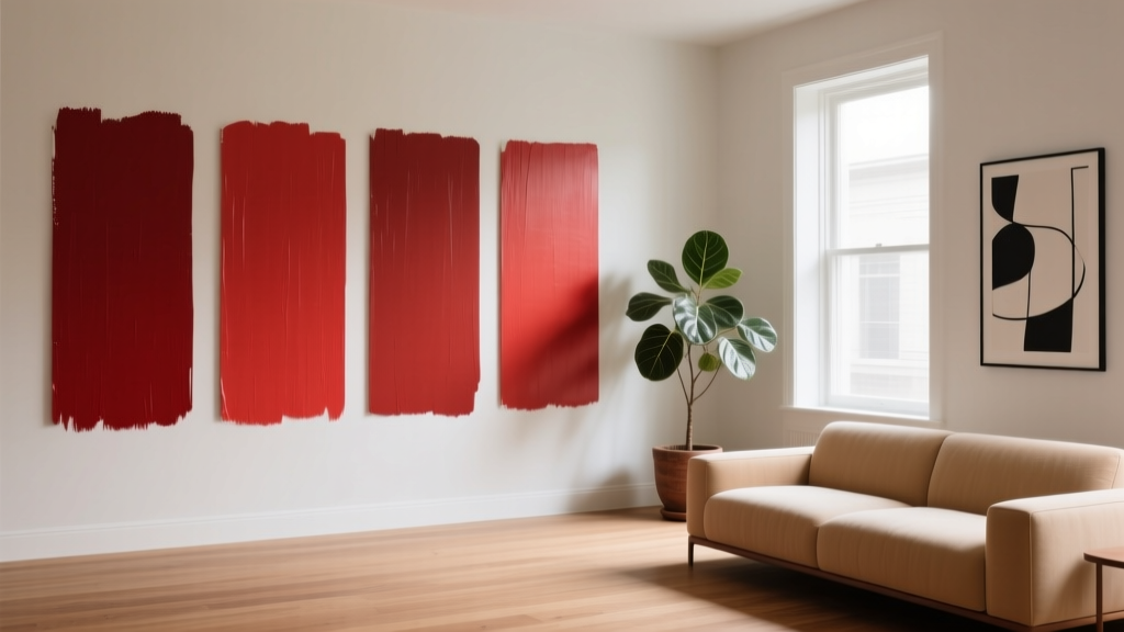
Best Cardinal Red Paint Colors - The Decor Mag
Cardinal red is one of those rare paint colors that can feel both classic and electric. It has the richness of heritage design—think lacquered front doors, library walls, and formal dining rooms—yet it also reads modern when paired with clean lines, matte finishes, and minimal décor. Homeowners love it because it brings instant personality, but they fear it because the wrong red can turn harsh, orange, or flat in everyday lighting.
This topic matters because red is powerful color psychology in action. Reds raise energy, stimulate appetite, and create a sense of warmth and intimacy—perfect for entryways, dining rooms, and statement moments. Cardinal red, specifically, sits in that sweet spot between true red and slightly blue-leaning crimson, giving it depth and sophistication. With the right undertones and pairings, cardinal red can look tailored rather than loud.
Below you’ll find the best cardinal red paint colors, how to choose the right one for your home, and real-world ways to apply it—from front doors to cozy bedrooms—without slipping into “too much” territory.
What Makes a Red “Cardinal”?
Cardinal red is inspired by the vivid red feathers of a cardinal bird: saturated, confident, and slightly cool compared to tomato or brick reds. It generally reads as a true red with subtle blue or magenta undertones, which helps it avoid looking orangey under warm bulbs.
Key traits of cardinal red paint colors
- High chroma (saturation): It feels bold, not muted.
- Balanced undertones: Often slightly blue-based, sometimes a touch of berry.
- Depth over brightness: It looks rich rather than neon.
- Strong light sensitivity: It can swing dramatically from morning to evening.
Cardinal red vs. other popular reds
- Cardinal red vs. cherry red: Cardinal is usually deeper and more refined; cherry can read brighter and more playful.
- Cardinal red vs. brick red: Brick is earthier and more brown-based; cardinal is cleaner and more saturated.
- Cardinal red vs. burgundy: Burgundy is darker and wine-toned; cardinal stays clearly “red,” not purple.
How to Choose the Right Cardinal Red for Your Space
Choosing the best red paint color isn’t just about the swatch—reds are notorious for shifting based on undertones, lighting, sheen, and adjacent materials (floors, countertops, stone, even greenery outside the windows).
1) Evaluate your lighting (the make-or-break factor)
- North-facing rooms: Cooler, grayer light can make reds look deeper and more dramatic. Great for cardinal reds with slight warmth to keep them lively.
- South-facing rooms: Warm, abundant light can intensify red and push it brighter. Choose a deeper cardinal to maintain sophistication.
- East-facing rooms: Bright mornings, softer afternoons. Reds may look crisp early and calmer later.
- West-facing rooms: Warm afternoon/evening light can make reds glow (or skew orange). Favor blue-based cardinal reds here.
2) Consider sheen for the mood you want
- Matte/flat: Velvety, modern, forgiving on walls; ideal for cozy rooms and saturated color-drenching.
- Eggshell/satin: Practical for busy areas; reflects light slightly, making red look brighter.
- Semigloss/high gloss: Stunning for doors, trim, and furniture; adds a lacquered, jewel-box effect.
3) Test like a designer
- Paint a large sample (at least 12" x 12", bigger is better) on multiple walls.
- Check it in morning, afternoon, and evening light.
- Compare against your fixed finishes: floors, tile, counters, upholstery.
- View it next to your “whites” (trim, ceiling) to confirm undertones.
Best Cardinal Red Paint Colors (Designer-Approved Picks)
These paint color recommendations lean cardinal—bold, classic, and versatile—while offering a range of depth and undertone. Availability can vary by region, so use these names as a starting point and always test.
Benjamin Moore: Classic Crimson & Cardinal-Leaning Reds
- Benjamin Moore Caliente AF-290 – A saturated, confident red that reads modern and energetic. Great for dining rooms, powder rooms, and statement doors.
- Benjamin Moore Classic Burgundy HC-182 – Deeper and more formal, ideal if you want a cardinal feel with extra drama. Beautiful in libraries and traditional dining rooms.
- Benjamin Moore Million Dollar Red 2003-10 – A high-impact, glamorous red for accent walls, lacquer-style doors, and contemporary spaces.
Sherwin-Williams: Bold Reds with Strong Design Presence
- Sherwin-Williams Heartthrob SW 6866 – A bright, unapologetic red that works best as an accent, front door, or in a high-gloss finish.
- Sherwin-Williams Rookwood Red SW 2802 – A heritage-leaning, deeper red with a historic sensibility; excellent for Craftsman homes, built-ins, and dining rooms.
- Sherwin-Williams Red Bay SW 6321 – A warmer red that still feels rich; great when you want cardinal energy but with a welcoming, slightly softened effect.
Farrow & Ball: Sophisticated Reds for Moody, Elevated Rooms
- Farrow & Ball Preference Red No. 297 – A rich, refined red that feels grown-up and tailored, especially in matte finishes.
- Farrow & Ball Incarnadine No. 248 – A strong, historic red with depth; excellent for dining rooms, front doors, and statement cabinetry.
Behr: Accessible, Punchy Reds for DIY Projects
- Behr Firecracker – Bright and lively; best on front doors, accent furniture, or smaller doses.
- Behr Red Pepper – Deeper and warmer, a great option for an accent wall or cozy room where you want less “stop sign” and more richness.
Tip: If you’re trying to stay in the cardinal red lane, avoid reds described as “tomato,” “coral,” or “terracotta.” Those typically lean orange and read warmer than cardinal.
Where Cardinal Red Looks Best: Real Room Examples & Scenarios
1) A cardinal red front door (instant curb appeal)
A cardinal red front door is a classic move that reads welcoming and confident. It pairs beautifully with:
- White or cream exteriors (clean and timeless)
- Charcoal/black trim (high contrast, modern)
- Natural brick and stone (traditional, grounded)
Best sheen: Semigloss or high gloss for that crisp, durable finish. Use a coordinating black hardware set for a tailored look.
2) Dining rooms that feel warm, intimate, and elevated
Red is appetite-stimulating and conversation-friendly, which is why it has such a long history in dining room color schemes. Try cardinal red on all four walls for a dramatic, classic dining room—especially with:
- Warm wood furniture (walnut, cherry, oak)
- Crisp white trim for contrast
- Brass or aged gold lighting for glow
Designer move: Add a large-format art piece with cream, black, or muted blue to keep the red from feeling too dominant.
3) A powder room “jewel box” moment
Small spaces are where cardinal red shines. A powder room can handle saturated color because you’re not living in it for hours. Pair cardinal red walls with:
- Black-and-white tile (graphic and timeless)
- Antique brass faucet and mirror (warmth and polish)
- A crisp white pedestal sink (visual breathing room)
Best sheen: Matte walls with a semigloss trim, or go all-in with a more reflective finish if you want glamour.
4) Built-ins, cabinetry, and feature millwork
Cardinal red is stunning on built-ins because it reads intentional—like a custom piece of furniture. Consider it for:
- Kitchen island cabinetry (especially with white perimeter cabinets)
- Living room built-ins behind shelving and décor
- A bar cabinet or butler’s pantry for a statement
Pairing tip: Use warm whites and light stone countertops to balance the saturation. Add natural textures (rattan, linen) to keep it relaxed.
5) Accent walls that feel architectural, not random
If you want cardinal red without committing to a full room, choose an accent wall that makes sense with the architecture:
- The wall behind a headboard
- A fireplace wall
- The back wall of a bookcase or niche
Proportion trick: Keep surrounding walls in a soft warm white or greige so the red reads rich rather than aggressive.
Cardinal Red Color Schemes That Always Work
Cardinal red is easiest to live with when it’s part of a balanced color palette. Use these reliable color combinations to build a cohesive interior color design story.
Classic + crisp (high contrast)
- Cardinal red + bright white trim
- Black accents (hardware, frames, lighting)
- Touches of chrome for a sharper, modern edge
Warm and traditional (heritage feel)
- Cardinal red + creamy ivory
- Walnut or medium-tone wood
- Antique brass and warm lighting (2700K–3000K bulbs)
Moody and sophisticated (designer dramatic)
- Cardinal red + charcoal gray
- Deep green accents (forest, hunter)
- Velvet textiles and layered neutrals
Unexpected and modern (fresh balance)
- Cardinal red + blush or dusty rose accents
- Warm beige or clay neutrals (used sparingly so the red stays cardinal)
- Light oak and matte black details
Common Cardinal Red Paint Mistakes (and How to Avoid Them)
- Choosing red from a tiny chip: Reds intensify on the wall. Test a large sample and view it at night under your actual bulbs.
- Ignoring undertones in nearby finishes: Warm floors and warm bulbs can push some reds orange. If your space runs warm, choose a slightly blue-based cardinal.
- Using the wrong white trim: A very cool, icy white can make red look overly sharp. Try a balanced or slightly warm white for trim and ceilings.
- Overloading the room with more bold color: Cardinal red needs breathing room. Keep large textiles (rugs, sofas, drapery) mostly neutral if the walls are red.
- Choosing a shiny sheen on imperfect walls: Satin can highlight texture. For older walls, matte or eggshell is usually kinder.
- Skipping primer: Reds often require extra coats. A tinted primer or a gray/red-appropriate primer improves coverage and color accuracy.
Practical Application Tips for a Professional Finish
- Plan for extra coats: Many cardinal red paint colors need 2–4 coats depending on the base and product line.
- Use a high-quality roller cover: A 3/8" nap is a solid default for smooth to lightly textured walls.
- Cut in carefully: Crisp edges matter more with bold colors because contrast is stronger.
- Coordinate lighting: Choose warm bulbs (2700K–3000K) for cozy rooms; use 3000K–3500K for a clearer, more modern look.
- Balance with texture: Linen, wool, natural woods, and aged metals soften the intensity and make the red feel layered.
FAQ: Cardinal Red Paint Colors
Is cardinal red a warm or cool color?
Cardinal red is typically more neutral-to-cool compared to tomato reds, often with subtle blue or magenta undertones. That slight coolness is what gives it a richer, more “tailored” look in many interiors.
What rooms are best for cardinal red paint?
Dining rooms, powder rooms, entryways, libraries, and front doors are top choices. For bedrooms and living rooms, cardinal red usually works best as an accent wall, built-ins, or a color-drenched approach balanced with soft lighting and neutral textiles.
What colors go best with cardinal red?
Reliable pairings include warm whites, creamy ivories, charcoal, black, deep greens, and warm woods. For modern color schemes, try cardinal red with muted blush accents and matte black details.
How do I keep a red wall from looking too bright?
Choose a deeper cardinal red (not a cherry or tomato red), use a matte finish, and balance the room with neutrals and natural textures. Lighting matters—very warm bulbs can make some reds feel louder.
Does cardinal red make a room look smaller?
Dark, saturated colors can feel enclosing, but that’s not always a negative. Cardinal red can make a space feel cozy and intimate. To keep it from feeling cramped, add contrast with trim, mirrors, and lighter fabrics, and maintain clear sightlines.
Do red paint colors require special prep?
Often, yes. Reds are prone to coverage issues. Use a quality primer (sometimes tinted), expect multiple coats, and allow proper dry time so the color settles evenly.
Next Steps: Bring Cardinal Red Home with Confidence
Start by choosing where cardinal red will have the most impact with the least risk: a front door, a powder room, or a built-in. Then narrow your shortlist to 2–3 cardinal red paint colors, test them on large samples, and evaluate them under your day-to-night lighting. Once you’ve found the right red, build a supporting cast—warm whites, dark accents, natural textures, and a few intentional metals—to create a cohesive, elevated color scheme.
For more paint color ideas, foolproof color combinations, and room-by-room guidance, explore our latest color guides on thedecormag.com.
More Articles
 Best Seaweed Green Paint Colors - The Decor Mag
 Trends vs Island: How Color Forecasting and Brand Identity Diverge in Commercial Design
 How to Choose Colors for a Wine Cellar - The Decor Mag
 How to Choose Colors for a Potting Shed - The Decor Mag
 Best Lapis Blue Paint Colors - The Decor Mag
 How to Choose Colors for a Rental Property - The Decor Mag
 Reading for Options: How Visual Literacy Drives Strategic Decision-Making in Design and Branding
 Best Candy Apple Red Paint Colors - The Decor Mag
 Best Scarlet Paint Colors - The Decor Mag
 How to Choose Bathroom Paint Colors - The Decor Mag