
How to Create a Serene Color Palette - The Decor Mag
A serene color palette does more than “look pretty.” It changes how a room feels the moment you walk in—lowering visual noise, easing transitions between spaces, and supporting daily rituals like resting, reading, cooking, or focusing. When the colors in your home feel calm, you tend to feel calmer, too.
Serenity isn’t one specific color (it’s not always “all white,” and it’s definitely not only beige). A peaceful interior color scheme is built on balance: softened contrast, thoughtful undertones, and a clear hierarchy of neutrals, midtones, and accents. Color psychology plays a role—cool hues often read as soothing, while warm neutrals can feel cocooning and safe—but the real magic is in how colors relate to one another in your particular light.
This guide breaks down how to choose serene paint colors, coordinate them into cohesive color schemes, and apply them room by room—without the trial-and-error overwhelm. You’ll find specific paint color recommendations (with brand references), real-world application scenarios, and common mistakes to avoid so your calming palette stays clean, layered, and livable.
What Makes a Color Palette Feel Serene?
Serene interiors share a few design principles, regardless of whether your style is modern, coastal, Scandinavian, traditional, or organic contemporary. Calm comes from cohesion and gentle contrast.
Core elements of a soothing interior color scheme
- Low-to-medium contrast: Think soft shifts rather than dramatic jumps (e.g., warm white + pale greige + muted blue).
- Undertone harmony: Colors should share a temperature or “speak the same language” (cool with cool; warm with warm), or be intentionally balanced.
- Muted, grayed tones: Slightly desaturated colors feel quieter than highly saturated hues.
- Repeatable accents: One or two accent colors used in small doses to create a rhythm through the room.
- Natural-material support: Wood, linen, wool, stone, and matte finishes amplify serenity more than glossy surfaces and busy patterns.
Color psychology: why these hues calm the mind
- Soft blues and blue-grays are associated with rest, clarity, and lowered arousal.
- Muted greens echo nature and restoration; they feel stable and grounding.
- Warm whites and gentle greiges create safety and comfort, especially in lower light.
- Dusty lavenders and pink beiges can feel nurturing and quiet when kept toned-down.
Start With Light: The Step Most People Skip
Before choosing paint colors, evaluate your light—because light controls whether a “serene” color reads tranquil or dull.
How to read your home’s light
- North-facing rooms: Cooler, flatter light. Warm up with creamy whites, warm greiges, or green-grays.
- South-facing rooms: Bright, warm light. Can handle cooler whites, blue-grays, and gentle greens without feeling cold.
- East-facing rooms: Bright in the morning, cooler later. Balanced neutrals and softly muted colors work best.
- West-facing rooms: Warm, golden afternoon light. Avoid overly yellow beiges; choose balanced warm neutrals or dusty tones.
Quick test for undertones
- Pick three paint swatches: one warm, one cool, one neutral (greige).
- Tape them to a wall and view morning, midday, and night.
- Hold a piece of true white paper beside each swatch—undertones become obvious fast.
Build Your Serene Palette: A Simple 60-30-10 Framework
A calm color palette is easier when each color has a job. This structure prevents the “everything is neutral, yet it feels messy” problem.
- 60% Base color: Walls (and sometimes ceiling). Usually a soft white, greige, or very light tint.
- 30% Secondary color: Upholstery, larger rugs, cabinetry, or an accent wall. Typically a midtone neutral or muted color.
- 10% Accent color: Pillows, art, pottery, a chair, or a small painted piece. Keep it controlled and repeated.
Recommended base colors (serene wall paint favorites)
- Benjamin Moore White Dove (OC-17): A soft, warm white that feels calm and welcoming in most light.
- Sherwin-Williams Alabaster (SW 7008): Creamy without going yellow; excellent for serene whole-home color schemes.
- Farrow & Ball School House White (No. 291): A quiet, chalky off-white with an understated, lived-in softness.
- Benjamin Moore Classic Gray (OC-23): A very light greige that reads airy and gentle—ideal if stark white feels too sharp.
Secondary colors that stay calm (soft midtones)
- Benjamin Moore Balboa Mist (OC-27): A tranquil greige for living rooms and open plans.
- Sherwin-Williams Accessible Beige (SW 7036): A grounded neutral that pairs well with warm woods.
- Benjamin Moore Boothbay Gray (HC-165): A muted blue-gray that feels coastal and composed.
- Sherwin-Williams Sea Salt (SW 6204): A light green-blue that shifts beautifully with daylight.
Accent colors that won’t disrupt the calm
- Benjamin Moore Hale Navy (HC-154): A deep, classic navy—best as a small, anchoring accent.
- Sherwin-Williams Evergreen Fog (SW 9130): A muted green-gray that adds sophistication without visual noise.
- Farrow & Ball Setting Plaster (No. 231): A dusty, warm blush-beige that reads serene and modern.
- Benjamin Moore Kendall Charcoal (HC-166): A soft charcoal for definition (frames, built-ins, or a powder room vanity).
Serene Color Combinations You Can Copy
These interior color schemes are designed for calm, with enough contrast to feel intentional.
1) Warm, quiet neutral scheme (cozy serenity)
- Walls: Sherwin-Williams Alabaster (SW 7008)
- Trim: Sherwin-Williams Pure White (SW 7005)
- Secondary: Benjamin Moore Balboa Mist (OC-27) on cabinetry or an adjacent room
- Accent: Benjamin Moore Kendall Charcoal (HC-166) in hardware, frames, or a single furniture piece
Best for: North-facing rooms, traditional homes, open-concept living spaces where you want warmth without heaviness.
2) Airy blue-gray scheme (classic calm)
- Walls: Benjamin Moore Classic Gray (OC-23) or White Dove (OC-17)
- Secondary: Benjamin Moore Boothbay Gray (HC-165)
- Accent: Benjamin Moore Hale Navy (HC-154) in small doses
- Materials: Pale oak floors, brushed nickel, crisp white linen
Best for: Bedrooms, bathrooms, and living rooms where you want a fresh, tailored feel.
3) Nature-inspired green scheme (restorative and grounded)
- Walls: Benjamin Moore White Dove (OC-17)
- Secondary: Sherwin-Williams Sea Salt (SW 6204) or Evergreen Fog (SW 9130)
- Accent: Warm clay pottery, aged brass, or a deep olive textile
Best for: Kitchens, sunrooms, and any space where you want the calm of the outdoors brought inside.
Real Room Examples: How to Apply a Serene Palette
Serene living room: calm without feeling bland
Scenario: You want a peaceful living room that still has depth, especially if you have an open floor plan.
- Walls: Benjamin Moore Balboa Mist (OC-27) for soft dimension
- Ceiling/trim: Benjamin Moore White Dove (OC-17) to keep edges gentle
- Sofa: Oatmeal or warm gray performance fabric
- Accent: One deep note (Hale Navy pillow, charcoal lamp base, or blackened bronze hardware)
- Texture strategy: Layer a boucle throw, a wool rug, and linen curtains to create warmth without adding color clutter
Serene bedroom: a color scheme designed for sleep
Scenario: You want a bedroom paint color that supports rest and feels cozy at night.
- Walls: Sherwin-Williams Sea Salt (SW 6204) for a whispery green-blue
- Trim: Sherwin-Williams Alabaster (SW 7008) for softness
- Bedding palette: White + soft sage + a muted taupe blanket
- Nightstand accent: A small lamp or art print with a deeper green-gray to anchor the scheme
Pro tip: Keep the strongest contrast low (rug, bench, or nightstands). High-contrast headboards or bold wall art can feel visually “loud” right where you rest.
Serene kitchen: calm color without sacrificing cleanliness
Scenario: You want a kitchen that feels fresh, not sterile—especially in bright daylight.
- Cabinets: Sherwin-Williams Accessible Beige (SW 7036) or a similar warm greige for a grounded look
- Walls: Sherwin-Williams Alabaster (SW 7008)
- Island option: Sherwin-Williams Evergreen Fog (SW 9130) for a muted, sophisticated focal point
- Counter/backsplash: Quiet veining and matte finishes keep the palette serene
Serene bathroom: spa-like, not icy
Scenario: You want a relaxing bathroom color scheme that still looks crisp with tile and chrome.
- Walls: Benjamin Moore White Dove (OC-17) or Classic Gray (OC-23)
- Vanity: Benjamin Moore Boothbay Gray (HC-165) for a soothing, watery tone
- Accent: Black or oil-rubbed bronze mirror frame to add definition
- Textiles: White towels + a pale gray bath mat to keep contrast soft
Application Tips That Make Serene Colors Look Intentional
- Choose a consistent white: Use the same white (or two closely related whites) for trim throughout the home for a seamless flow.
- Mind the sheen: Matte/eggshell reads softer on walls; satin is practical for trim. High gloss can add glare that disrupts calm.
- Limit bold patterns: If you love pattern, keep it large-scale and low-contrast (tone-on-tone works beautifully).
- Repeat accents 3 times: Example: navy appears in a pillow, an art detail, and a vase—enough to feel cohesive, not random.
- Sample correctly: Paint 2’x2’ swatches (or use peel-and-stick samples) on multiple walls; serene colors can shift dramatically in corners and near windows.
Common Color Mistakes That Disrupt a Serene Palette
- Mixing undertones unintentionally: A cool gray next to a warm beige can look “dirty” or mismatched. Align undertones for a calmer interior color design.
- Choosing stark white in low light: Bright whites can feel harsh and flat in north-facing rooms. Warm whites or soft greiges usually feel more serene.
- Overusing one muted color everywhere: Serenity needs variation. If every surface is the same pale greige, the room can feel lifeless. Add texture and one deeper anchor shade.
- Too many accent colors: A calm paint color scheme can be undone by a rainbow of décor accents. Edit to one or two accent families.
- Ignoring finish and contrast: Busy granite, shiny tile, or high-gloss paint can create visual “static.” Calm palettes love matte, honed, and softly reflective surfaces.
FAQ: Serene Paint Colors and Color Schemes
What are the best serene paint colors for an open floor plan?
Look for flexible neutrals that connect spaces without feeling monotone: Benjamin Moore White Dove (OC-17), Sherwin-Williams Alabaster (SW 7008), and Benjamin Moore Balboa Mist (OC-27) are reliable choices. Add a muted blue-gray or green-gray in one area for gentle zoning.
How do I keep a neutral palette from feeling boring?
Use contrast through value (light vs. medium vs. deep) and through texture. Pair a soft wall color with a midtone rug, natural wood, woven shades, and one darker accent like Hale Navy (HC-154) or Kendall Charcoal (HC-166).
Are cool colors always more calming than warm colors?
Not always. Cool blues and greens can feel tranquil, but warm whites and greiges can be equally serene—especially in dimmer rooms where cool colors may feel chilly. Serenity is more about muted saturation and undertone harmony than temperature alone.
What’s the easiest way to choose trim color for a serene scheme?
Pick one soft white and repeat it. Benjamin Moore White Dove (OC-17) and Sherwin-Williams Pure White (SW 7005) are popular because they’re clean without being stark, and they work with many wall colors.
How do I test paint colors so I don’t waste money?
Use peel-and-stick samples or paint sample boards you can move around. View them next to your flooring, upholstery, and countertops in daylight and in evening lamp light. Serene hues often shift subtly, so testing in multiple spots matters.
Next Steps: Create Your Serene Palette With Confidence
Start by choosing a base paint color that fits your light (warm white, soft greige, or a pale tint). Then add one calm secondary color for depth and one controlled accent for definition. Keep undertones consistent, use softer sheens, and let natural materials do some of the visual work.
If you want a simple plan for this week:
- Photograph your room in morning and evening light.
- Pick 3 base contenders (one warm white, one greige, one light muted color) and sample them.
- Choose one secondary midtone and one deeper accent, then repeat the accent at least three times.
For more paint color guides, serene color schemes, and interior color design ideas, explore the latest color articles on thedecormag.com.
More Articles
 How to Choose Exterior House Colors - The Decor Mag
 How to Choose Colors for South-Facing Rooms - The Decor Mag
 2026 Color of the Year: Predictions & Palettes
 Bedroom for Beginners: A Practical, Step-by-Step Setup Guide
 How To Match Aging With Space: Designing Environments That Support Lifelong Well-Being
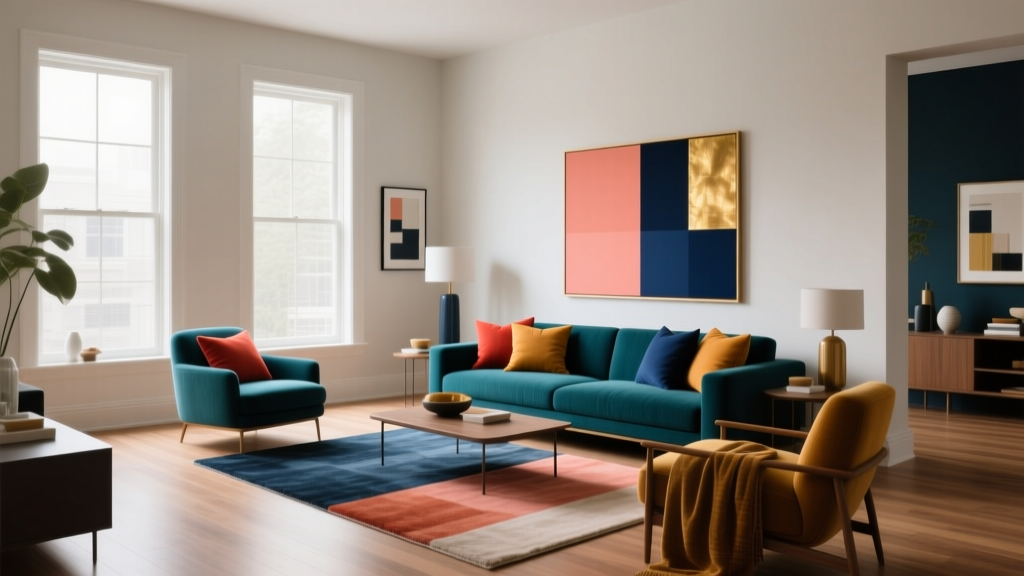 Complementary Color Pairing Ideas - The Decor Mag
 How to Create a Minimalist Color Palette - The Decor Mag
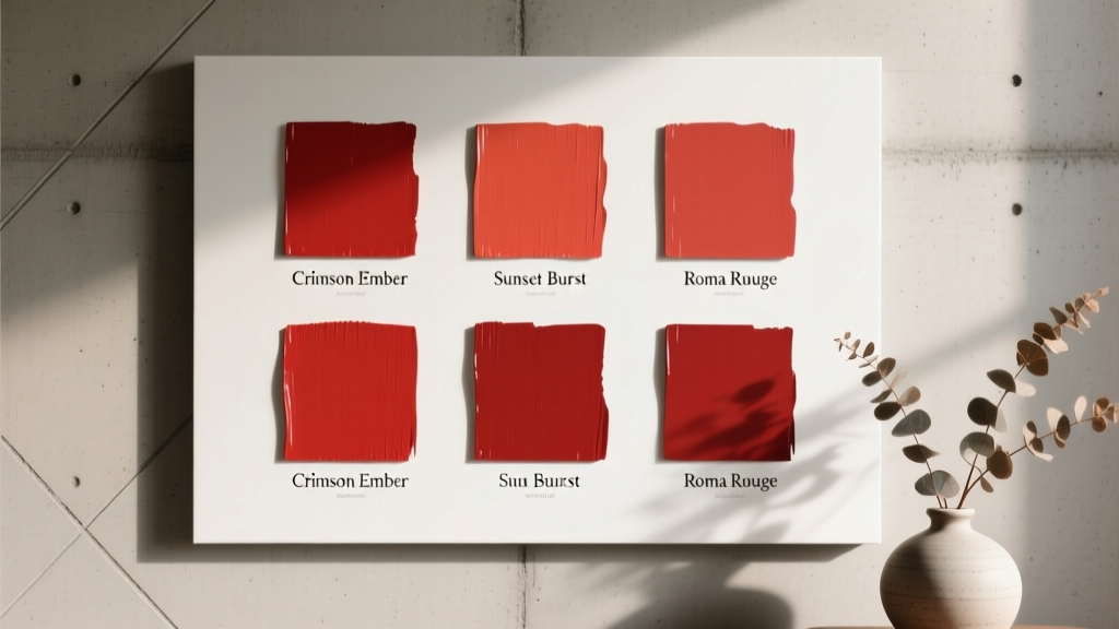 Best Tomato Red Paint Colors - The Decor Mag
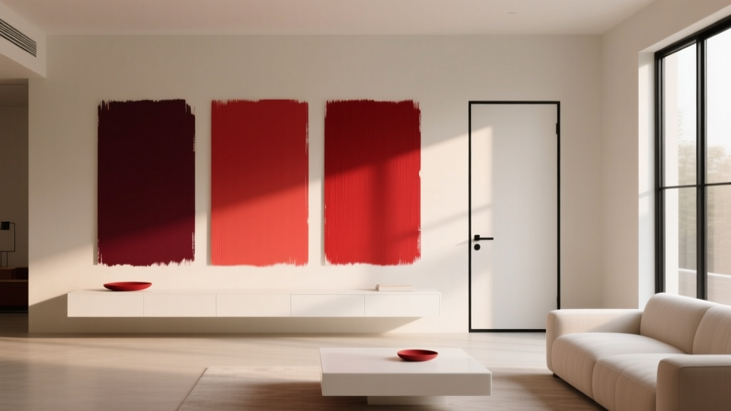 Best Cherry Red Paint Colors - The Decor Mag
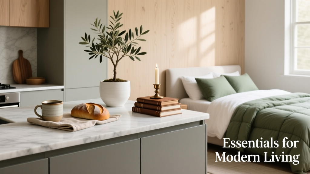 Kitchen & Bedroom Inspiration Essentials: Functional Design, Proven Color Systems, and Space-Smart Layouts