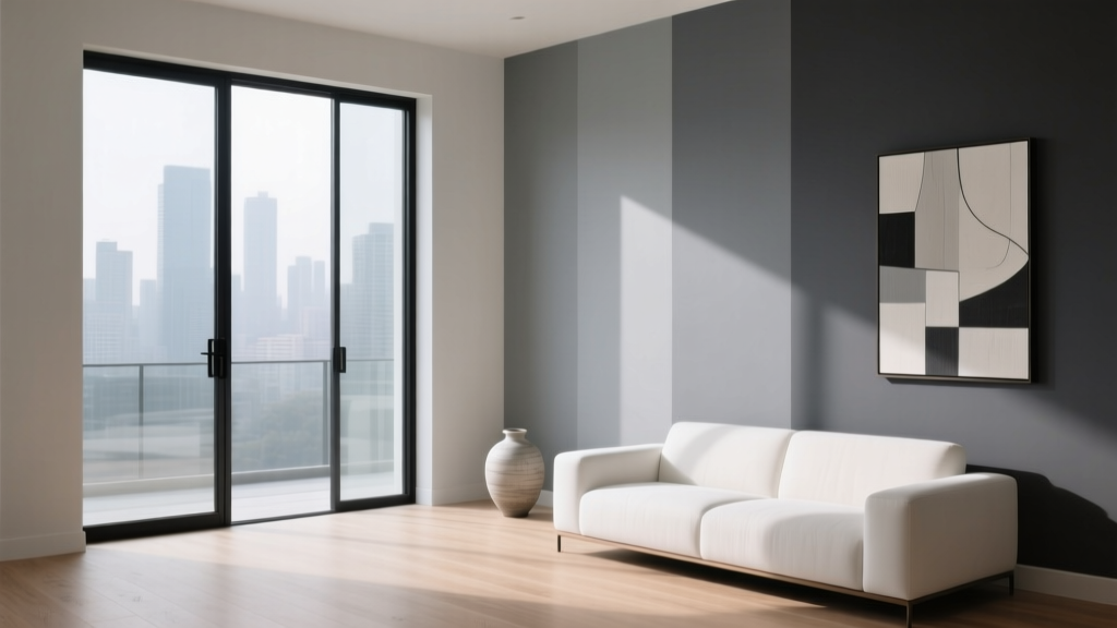
Best Gray Paint Colors for 2026 - The Decor Mag
Gray has earned its place as one of the most reliable paint color families in interior design—yet it’s also one of the easiest to get wrong. A “simple gray” can turn icy blue in north light, muddy in a dim hallway, or unexpectedly violet next to warm wood floors. In 2026, homeowners are still choosing gray paint colors, but the approach is more refined: softer undertones, more livable depth, and better coordination with the warm, natural materials trending in interiors.
What’s shifting this year is the role gray plays in a room. Rather than being the headline color, the best grays for 2026 are working as a backdrop that supports texture and tone—limewash walls, oak cabinetry, brushed brass, creamy whites, and earthy textiles. Think of gray as a “quiet neutral” that helps your furniture, art, and natural light look their best while still feeling intentional and modern.
This guide breaks down how to choose the right gray paint, which specific shades are leading in 2026, and how to apply them room by room—plus common mistakes to avoid so your new paint color looks like a designer chose it (because you did).
Gray Paint in 2026: What’s Trending (and Why It Works)
Gray paint color trends aren’t disappearing; they’re maturing. The most popular gray paint colors for 2026 fall into three broad categories, each tied to both color psychology and practical design needs:
- Warm grays (greige and taupe-leaning): Comforting, grounding, and easy with wood tones. These reflect the ongoing shift toward natural materials and cozy minimalism.
- Soft mid-tone grays: Balanced and versatile. They offer contrast without the starkness of pure white, which helps spaces feel calm and visually organized.
- Deep charcoals: Moodier, elegant, and great for accent walls, cabinetry, or offices. Dark gray supports focus and adds a sense of depth—perfect for creating “rooms within rooms.”
The design principle behind all of these: undertone harmony. A gray that shares undertones with your fixed finishes (flooring, tile, countertops) will look purposeful. A gray that fights those undertones will look off, even if it’s a “popular” shade.
How to Choose the Right Gray: Undertones, Light, and Finish
1) Understand undertones (the real color inside the gray)
Most gray paint colors are not neutral; they’re tinted toward another hue. Common gray undertones include:
- Warm (beige, taupe, brown): Cozy and flattering; best with warm woods, creams, and brass.
- Cool (blue, green): Crisp and modern; best with bright whites, chrome, and cooler stone.
- Violet/purple: Sophisticated but tricky; can look smoky-luxury or unexpectedly lavender depending on light.
2) Match the gray to your light exposure
- North-facing rooms: Light reads cooler. Choose warmer grays (greige) to prevent a cold, steely look.
- South-facing rooms: Light reads warmer. Many grays look more beige; consider a balanced or slightly cooler gray for a cleaner result.
- East-facing rooms: Warm morning light, cooler afternoons. Balanced grays perform best.
- West-facing rooms: Cooler mornings, golden afternoons. Avoid grays that go too yellow; choose subtle undertones.
3) Choose the right paint sheen for your walls
The same gray can look dramatically different in different finishes. For most homes:
- Matte/flat: Soft, modern, forgiving on wall texture; ideal for living rooms and bedrooms.
- Eggshell: Slightly more durable; great for hallways and family spaces.
- Satin: Washable, slightly reflective; use cautiously on large walls because it can highlight imperfections.
Best Gray Paint Colors for 2026 (Designer-Approved Picks)
Below are standout gray paint colors that align with 2026’s warmer, more livable neutral palette. Always sample in your own space—paint color is a partnership between pigment, light, and surroundings.
1) Benjamin Moore Edgecomb Gray (HC-173) — the warm, flexible greige
Edgecomb Gray remains a favorite because it’s softly warm without feeling yellow. It’s a “connector color” that bridges warm woods, creamy trim, and modern furnishings.
- Best for: Open-plan living areas, hallways, kitchens with white or wood cabinets
- Looks great with: Benjamin Moore White Dove (OC-17) trim, natural oak floors, linen textiles
- Room scenario: A family room with a warm white sofa, woven rug, and matte black accents—Edgecomb Gray creates gentle contrast while staying inviting.
2) Sherwin-Williams Agreeable Gray (SW 7029) — the crowd-pleasing neutral gray
If you want a gray paint color that rarely surprises, Agreeable Gray is famous for a reason. It leans warm, reads balanced in many exposures, and plays well with both traditional and modern décor.
- Best for: Whole-home color schemes, living rooms, resale-friendly updates
- Looks great with: Sherwin-Williams Pure White (SW 7005) or Alabaster (SW 7008) trim
- Room scenario: In an open kitchen-living space, Agreeable Gray keeps continuity across rooms while letting your backsplash and hardware stand out.
3) Farrow & Ball Ammonite (No. 274) — a soft, architectural gray
Ammonite has that calm, gallery-like quality many homeowners want in 2026. It’s understated, slightly cool, and beautifully modern without feeling stark.
- Best for: Minimalist interiors, contemporary apartments, softly lit bedrooms
- Looks great with: Crisp whites, pale woods, cool marbles, and blackened steel
- Room scenario: A bedroom with white bedding, a light oak headboard, and layered textures—Ammonite provides a serene backdrop that feels quietly elevated.
4) Benjamin Moore Coventry Gray (HC-169) — a clean mid-tone gray with presence
Coventry Gray is a true mid-tone gray that feels “designed.” It’s an excellent choice when pale grays feel washed out but charcoal feels too heavy.
- Best for: Dining rooms, offices, built-ins, exterior siding in some climates
- Looks great with: White trim, walnut furniture, brushed brass lighting
- Room scenario: A dining room with a walnut table and linen drapery—Coventry Gray adds sophistication and makes artwork pop.
5) Sherwin-Williams Repose Gray (SW 7015) — the soft gray for calm, modern spaces
Repose Gray has a gentle, modern feel and can read slightly cool, especially in north-facing light. It’s a great “quiet gray” when you want crispness without icy vibes.
- Best for: Bedrooms, bathrooms, modern living rooms
- Looks great with: White subway tile, cool stone, light ash wood
- Room scenario: In a bathroom with white tile and matte black fixtures, Repose Gray reads clean and spa-like—especially with fluffy white towels and soft lighting.
6) Farrow & Ball Skimming Stone (No. 241) — the warm stone gray for organic interiors
Skimming Stone leans toward a stone-like greige that fits perfectly with 2026’s warmer neutrals, clay accents, and natural fibers.
- Best for: Living rooms, kitchens, and homes with lots of warm wood
- Looks great with: Creamy whites, terracotta, aged brass, rattan
- Room scenario: A living room with boucle seating, warm oak, and soft ivory curtains—Skimming Stone adds depth while keeping the palette soothing.
7) Benjamin Moore Classic Gray (OC-23) — the near-white gray for brightening
Classic Gray is ideal when you want your walls to feel light and airy but less stark than white. It’s especially helpful in homes that need a gentle neutral to unify rooms.
- Best for: Small rooms, low ceilings, whole-home light neutral schemes
- Looks great with: Warm whites, pale woods, soft pastels, black accents
- Room scenario: In a small entryway, Classic Gray makes the space feel larger and brighter while still giving definition against white trim.
8) Sherwin-Williams Peppercorn (SW 7674) — the charcoal that feels tailored
For 2026, deeper grays are being used more strategically: built-ins, accent walls, and cozy offices. Peppercorn is a rich charcoal that looks sophisticated rather than heavy.
- Best for: Accent walls, cabinetry, powder rooms, libraries
- Looks great with: Warm white trim, cognac leather, brass, deep greens
- Room scenario: A home office with Peppercorn built-in shelves, warm wood desk, and layered lighting—dramatic but highly livable.
Room-by-Room: How to Use Gray Paint Colors Like a Designer
Living Room: build a layered neutral color scheme
Gray works best in living rooms when it supports contrast and texture. Try:
- Wall color: Agreeable Gray or Edgecomb Gray
- Trim: White Dove or Pure White
- Accents: Warm wood, black metal, camel leather, and a grounded rug
Tip: If your sofa is cool gray, avoid cool gray walls—double-cool can feel flat. Warm the walls up or shift the sofa to a warmer neutral with pillows and throws.
Kitchen: choose grays that respect countertops and cabinets
- With warm wood cabinets: Skimming Stone or Edgecomb Gray
- With white cabinets and cool stone: Repose Gray or Ammonite
- For islands or lower cabinets: Coventry Gray or Peppercorn
Tip: If you have granite or quartz with visible speckling, sample your gray right next to the countertop. The pattern often pulls out undertones you won’t see on a blank wall.
Bedroom: use gray for calm, restorative energy
From a color psychology perspective, softer grays can reduce visual noise and support rest—especially when paired with warm lighting and tactile textiles.
- Best paint picks: Repose Gray, Ammonite, Classic Gray
- Best pairings: Cream bedding, oak furniture, muted blues or sage greens
Bathroom: keep it clean, not cold
- Best paint picks: Repose Gray, Classic Gray
- Pair with: Warm white towels, brass or black fixtures, soft lighting (2700K–3000K)
Tip: Bathrooms often have cooler light and reflective surfaces. If your gray looks too blue, shift to a warmer greige or use warmer bulbs.
Exterior: gray siding that feels current in 2026
Exterior gray paint colors are still popular, but the most appealing versions look natural—stone-like rather than flat.
- Try: Coventry Gray for a classic mid-tone, or a deep charcoal like Peppercorn for modern contrast
- Pair with: Clean white trim, natural wood doors, black windows (if your architecture supports it)
Go-To Gray Color Combinations for 2026
Use these pairings to create cohesive interior color design:
- Warm Modern: Edgecomb Gray + White Dove + natural oak + matte black
- Soft Organic: Skimming Stone + creamy white + linen + clay accents
- Cool Contemporary: Ammonite + crisp white + chrome + pale ash wood
- Moody Tailored: Peppercorn + warm white trim + brass + deep green textiles
Common Gray Paint Mistakes (and How to Avoid Them)
- Choosing gray by popularity instead of undertone. A best-selling gray can look wrong if it clashes with your floors or countertops.
- Skipping large samples. Paint a 2’x2’ swatch (or use peel-and-stick samples) and view it morning, afternoon, and night.
- Forgetting about trim and ceilings. The wrong white next to gray can make the gray look purple, green, or dingy. Coordinate your whites intentionally.
- Using cool gray in a dim room. Low light can make cool grays feel gloomy. Choose a warmer gray or go lighter.
- Over-graying the entire home. Too much gray (walls, floors, furniture) can feel flat. Add warmth with wood, creams, and layered textures.
FAQ: Best Gray Paint Colors for 2026
What is the most popular gray paint color for 2026?
Warm, balanced grays are leading—especially versatile choices like Sherwin-Williams Agreeable Gray and warm greiges like Benjamin Moore Edgecomb Gray. Popularity aside, the best pick is the one that matches your home’s light and finishes.
Are gray walls going out of style?
Gray isn’t “out,” but the cold, blue-leaning grays of past years are less favored. In 2026, grays look most current when they’re soft, warm, and layered with natural materials.
What gray paint works best with warm wood floors?
Look for warm grays and greiges such as Edgecomb Gray or Skimming Stone. They harmonize with honey oak, red oak, and walnut better than icy cool grays.
How do I keep gray paint from looking blue?
Choose a gray with warmer undertones, test it in your room’s lighting, and coordinate with a warmer white trim. Also check your bulb temperature—cool LEDs can push gray toward blue.
Should I use the same gray throughout my house?
You can, especially with balanced grays like Agreeable Gray, but it often looks more designer when you vary depth room to room (light gray in halls, mid-tone gray in dining, charcoal on built-ins) while keeping undertones consistent.
What’s the best trim color with gray walls?
For many gray wall colors, soft whites are the easiest match. Popular pairings include Benjamin Moore White Dove and Sherwin-Williams Pure White. The best trim white depends on whether your gray is warm or cool.
Next Steps: Make Your Gray Paint Choice with Confidence
To choose the best gray paint color for your home in 2026, follow a simple process:
- Identify your fixed finishes (floors, counters, tile) and whether they read warm or cool.
- Narrow to 2–3 grays with matching undertones (one lighter, one mid-tone, one deeper).
- Sample large and view in multiple lighting conditions.
- Confirm trim and metal finishes (white paint, brass vs. chrome, warm vs. cool décor).
Gray is at its best when it feels intentional: a calm foundation that supports your home’s personality. For more paint color ideas, room-by-room color schemes, and expert guidance on undertones, explore additional color guides on thedecormag.com.
More Articles
 How to Create a Contemporary Color Palette - The Decor Mag
 How to Choose Colors for a Sunroom - The Decor Mag
 How to Choose Colors for a Gym - The Decor Mag
 How to Use Color to Create Depth - The Decor Mag
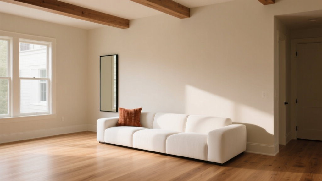 Paint Colors That Work With Flooring (2026)
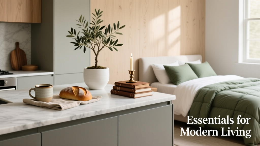 Kitchen & Bedroom Inspiration Essentials: Functional Design, Proven Color Systems, and Space-Smart Layouts
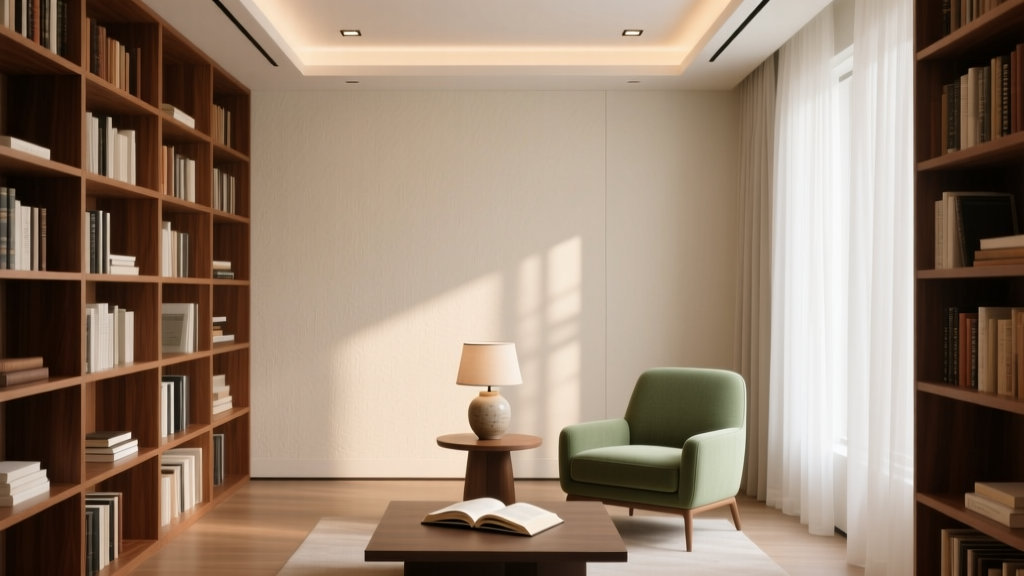 How to Choose Colors for a Library - The Decor Mag
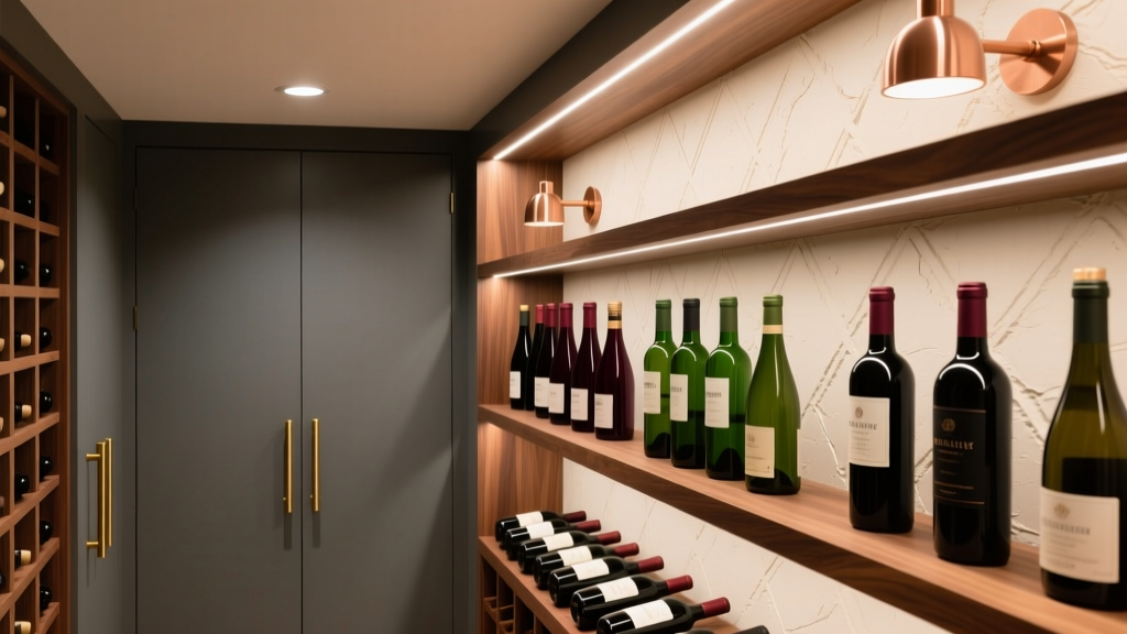 How to Choose Colors for a Wine Cellar - The Decor Mag
 Best Living Rooms for STEP: Design, Layout, and Accessibility Standards for Seniors and Mobility Support
 Best Black Paint Colors for Dramatic Spaces - The Decor Mag