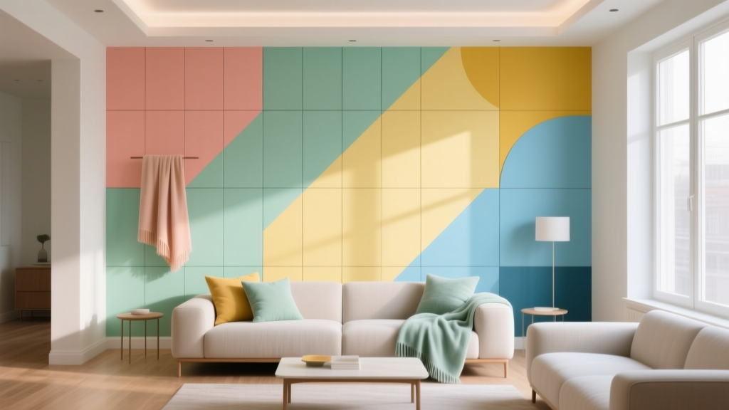
How to Create a Playful Color Palette - The Decor Mag
A playful color palette can change the entire mood of a home. It brings energy to everyday routines, sparks creativity, and makes a space feel personal rather than “perfectly staged.” Whether you lean toward bright, candy-like hues or prefer softer pastels with a surprise pop, playful color is less about breaking rules and more about using design principles in a light, confident way.
For homeowners and design enthusiasts, the challenge usually isn’t finding colors you like—it’s making them work together on walls, trim, furniture, and decor without turning your room into visual noise. A successful playful color scheme balances contrast and cohesion, uses color psychology to shape how the room feels, and considers practical details like light exposure and undertones.
This guide walks you through how to build a playful interior color design step by step, with specific paint color recommendations, real-room application ideas, and the most common mistakes that derail an otherwise fun palette.
What Makes a Color Palette “Playful” (and Not Just Random)?
A playful palette has three key ingredients: contrast, intention, and repetition. It may feature unexpected combinations—like peach with teal, lavender with chartreuse, or navy with bubblegum pink—but it still feels “designed” because the colors relate to each other through undertones, value, and placement.
Playful color design principles to use
- Value contrast: Mix light, mid, and deep tones so the room has structure (example: pale mint + warm coral + inky navy).
- Undertone harmony: Keep colors on the same temperature track (mostly warm or mostly cool), then add one intentional “wild card.”
- Repeat each color at least twice: If you introduce a bright accent, echo it elsewhere (pillow + art, vase + rug detail) for cohesion.
- Let neutrals do quiet work: White, cream, greige, and soft wood tones give the eye a place to rest so brights feel elevated, not chaotic.
Start with a Mood: The Color Psychology of Play
Color psychology isn’t about rigid rules—it’s about predicting the emotional “temperature” of a room. Playful palettes can energize, soothe, or spark imagination depending on the hues and proportions you choose.
- Joyful and social: Corals, warm pinks, sunny yellows, and citrusy accents encourage conversation and warmth.
- Creative and quirky: Unexpected pairings (lavender + lime, teal + terracotta) feel artistic and imaginative.
- Fresh and optimistic: Aqua, mint, sky blue, and crisp whites read clean and upbeat.
- Bold and confident: Deep jewel tones (navy, emerald, aubergine) combined with bright accents feel playful but grounded.
Tip: If you want a playful palette that still feels livable long-term, build it around one “anchoring” color—usually a mid-tone or deep shade—then layer in brights as accents.
How to Build a Playful Color Palette (A Practical Step-by-Step)
1) Choose your anchor color
Your anchor is the shade that will appear most often (wall color, large rug, or main upholstery). It stabilizes the scheme and makes playful accents feel intentional.
Anchor paint color ideas (designer-friendly, versatile):
- Benjamin Moore Hale Navy (deep blue; classic, grounding)
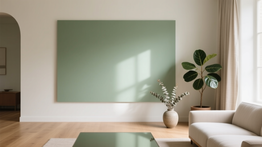
- Sherwin-Williams Evergreen Fog (soft green-gray; calm but modern)
- Farrow & Ball Setting Plaster (warm blush-neutral; playful without being loud)
- Behr Blank Canvas (warm off-white; ideal if you want colorful decor to lead)
2) Add a second color that “agrees” with the anchor
This is your supporting color—often a neighboring hue on the color wheel (analogous color scheme). It keeps the palette coherent.
- Navy anchor + dusty teal
- Warm blush anchor + terracotta
- Soft green-gray anchor + muted blue
3) Choose one surprise accent
The surprise accent is where the playful personality shows up. Think of it as a “spark”—a bright, high-chroma color used in smaller doses.
High-impact accent paint colors (use on a door, niche, vanity, or furniture):
- Sherwin-Williams Electric Lime (punchy green accent)
- Benjamin Moore Calypso Blue (bright aqua-leaning blue)
- Farrow & Ball Yellowcake (warm, cheerful yellow)
- Benjamin Moore Raspberry Blush (bold coral-pink)
4) Lock in your neutrals and metals
Neutrals keep a playful interior color scheme looking polished. Decide early whether you want crisp contrast (bright white) or softer warmth (cream). Then choose metals that complement your undertones.
- Warm palettes: creamy whites, oak tones, brass, aged bronze
- Cool palettes: crisp whites, ash woods, chrome, polished nickel
- Mixed palettes: pick one dominant metal, then add a smaller amount of a second finish for intentional variety
5) Use the 60-30-10 rule (with a playful tweak)
A reliable formula for color schemes in interior design:
- 60% dominant color (walls or large furnishings)
- 30% secondary color (rug, drapery, bedding, big art)
- 10% accent color (pillows, accessories, lampshades)
Playful tweak: Add a “micro-accent” (1–2%)—a tiny hit of something unexpected like neon, metallic, or a contrasting stripe. This is where a room starts to feel collected and fun.
Playful Color Combinations That Work (With Paint Color Names)
Combo 1: Peach + Teal + Warm White (friendly, modern, inviting)
- Wall: Farrow & Ball Setting Plaster
- Secondary: Benjamin Moore Aegean Teal
- Trim/ceiling: Benjamin Moore Simply White
- Accent: a pop of marigold (try Farrow & Ball Yellowcake on a stool or cabinet)
Why it works: Peach brings warmth and approachability; teal adds contrast and sophistication; warm white keeps it airy.
Combo 2: Mint + Coral + Navy (fresh with a bold backbone)
- Wall: a soft mint (consider Benjamin Moore Palladian Blue for a minty-blue feel)
- Anchor: Benjamin Moore Hale Navy (built-ins or a fireplace surround)
- Accent: Benjamin Moore Raspberry Blush (lamp, art, or a powder room vanity)
Why it works: Navy stabilizes the palette, mint reads clean and light, coral adds playful warmth.
Combo 3: Lavender + Olive + Cream (quirky but surprisingly livable)
- Wall: Sherwin-Williams Delightful
- Secondary: Sherwin-Williams Evergreen Fog
- Trim: Behr Blank Canvas
- Micro-accent: a small hit of chartreuse or brass
Why it works: Lavender and olive are both muted enough to coexist; cream softens transitions; a brighter accent gives it a modern edge.
Combo 4: Sunny Yellow + Cobalt + Crisp White (high-energy, graphic, playful)
- Wall (option A): Benjamin Moore White Dove + yellow accents
- Wall (option B): Farrow & Ball Yellowcake for a full-color moment
- Accent: Benjamin Moore Calypso Blue for a bold, saturated punch
Why it works: Yellow energizes; cobalt adds drama; white keeps the look clean and intentional.
Real Room Examples and Application Scenarios
Living room: playful, not childish
Scenario: You want color, but the room needs to work for everyday lounging.
- Paint walls a soft anchor like Sherwin-Williams Evergreen Fog.
- Add a secondary color through textiles: a rug with teal and rust tones.
- Use a bright accent in controlled bursts: coral pillows, a single bold art print, or a painted side table in Benjamin Moore Raspberry Blush.
- Repeat the accent twice: coral pillow + coral book spine stack.
Kitchen: color in the places you can change later
Scenario: You want a playful kitchen without committing to bright upper cabinets.
- Keep perimeter cabinets classic (warm white like Benjamin Moore Simply White).
- Paint the island a confident anchor: Benjamin Moore Hale Navy.
- Add playful accents with bar stools (mustard, teal), a patterned runner, and colorful cookware on open shelves.
- Try a bold color in a small dose: paint the pantry door Benjamin Moore Calypso Blue.
Kids’ room: playful and timeless
Scenario: You want joy now, but not a full redesign in two years.
- Choose a gentle wall color: soft mint or warm blush.
- Use removable impact: decals, bedding, curtains, and art with bright pops.
- Paint one piece of furniture a surprise color instead of all four walls.
- Consider painting the ceiling a pale tint for whimsy without overwhelming the room.
Powder room: the best place to take a risk
Scenario: You want a bold, playful statement in a small space.
- Go saturated on walls: a confident pink like Benjamin Moore Raspberry Blush or a sunny yellow.
- Balance with crisp trim and a simple vanity.
- Add contrast via mirror frame and lighting (brass or black), plus patterned wallpaper if you love maximalism.
Techniques That Make Playful Palettes Look Designed
Color blocking
Paint geometric shapes, half walls, or wide stripes. This is a practical way to use bright paint colors without covering every surface.
- Try a 2/3–1/3 split: lighter on top, deeper on bottom to ground the room.
- Use color blocking to define zones in open-plan spaces (reading nook vs. dining area).
Unexpected surfaces
- Ceilings: a pale tint of your accent color adds charm.
- Interior doors: perfect for a single bold hue (a “wink” of color).
- Built-ins and shelving backs: high impact with minimal paint.
- Trim: playful trim (instead of white) can look tailored if the wall color is quiet.
Common Color Mistakes to Avoid
- Using too many bright colors at the same intensity: Mix in muted tones and neutrals to create hierarchy.
- Ignoring undertones: A warm coral can clash with a cool, blue-based pink. Compare swatches side by side in your room’s lighting.
- Skipping sample tests: Paint large sample boards and view them morning, afternoon, and evening.
- Forgetting about fixed finishes: Countertops, flooring, and tile have undertones that should guide your palette.
- Not repeating colors: A single random bright accessory looks accidental. Echo it at least once more.
- Overloading patterns: Pattern is color’s best friend, but keep a consistent scale strategy (one large-scale pattern + one small-scale + solids).
FAQ: Playful Color Palettes at Home
How many colors should a playful palette include?
A strong playful color scheme usually has 3–5 colors: one dominant anchor, one secondary, one accent, plus one or two neutrals. You can add more if they’re variations (tints/tones) of existing hues.
What’s the easiest way to make bold colors feel sophisticated?
Pair bold accents with a grounded anchor (navy, forest green, warm greige) and repeat the accent intentionally. Matte or eggshell finishes also help saturated colors look more refined than high gloss on large walls.
Should I use warm or cool colors for a playful look?
Either works. Warm palettes (peach, coral, buttery yellow) feel cozy and social; cool palettes (aqua, mint, periwinkle) feel fresh and clean. Choose based on your home’s light: north-facing rooms often prefer warmer paint colors, while south-facing rooms can handle cooler hues.
How do I test paint colors correctly?
Use sample pots or peel-and-stick samples, but go bigger than you think—at least 12x12 inches (larger is better). View next to trim, flooring, and upholstery, and check it under your bulbs at night.
What if I’m scared of bright wall colors?
Start with “low-risk” placements: a powder room, a single door, the back of a bookshelf, or a piece of furniture. You’ll still get the playful effect without committing every wall.
Can playful palettes work in small rooms?
Yes—small rooms are often ideal. Keep the base color lighter, use one bold accent, and add mirrors or metallics to bounce light. A saturated color on all walls can also be stunning in a small space when balanced with crisp trim and simple decor.
Next Steps: Build Your Palette and Try It in One Corner
Pick one anchor paint color, one supporting hue, and a surprise accent. Test them together in your room’s light, then commit to a small application first—an entryway bench, a bookshelf, a bathroom vanity, or a single wall with color blocking. As confidence grows, repeat the palette across textiles, art, and accessories for a cohesive, playful home.
For more paint color ideas, color scheme formulas, and room-by-room guidance, explore the latest color guides on thedecormag.com.
More Articles
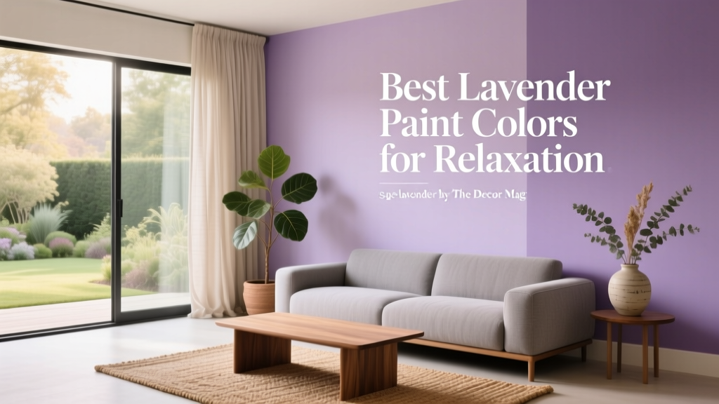 Best Lavender Paint Colors for Relaxation - The Decor Mag
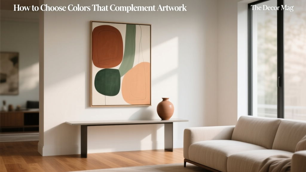 How to Choose Colors That Complement Artwork - The Decor Mag
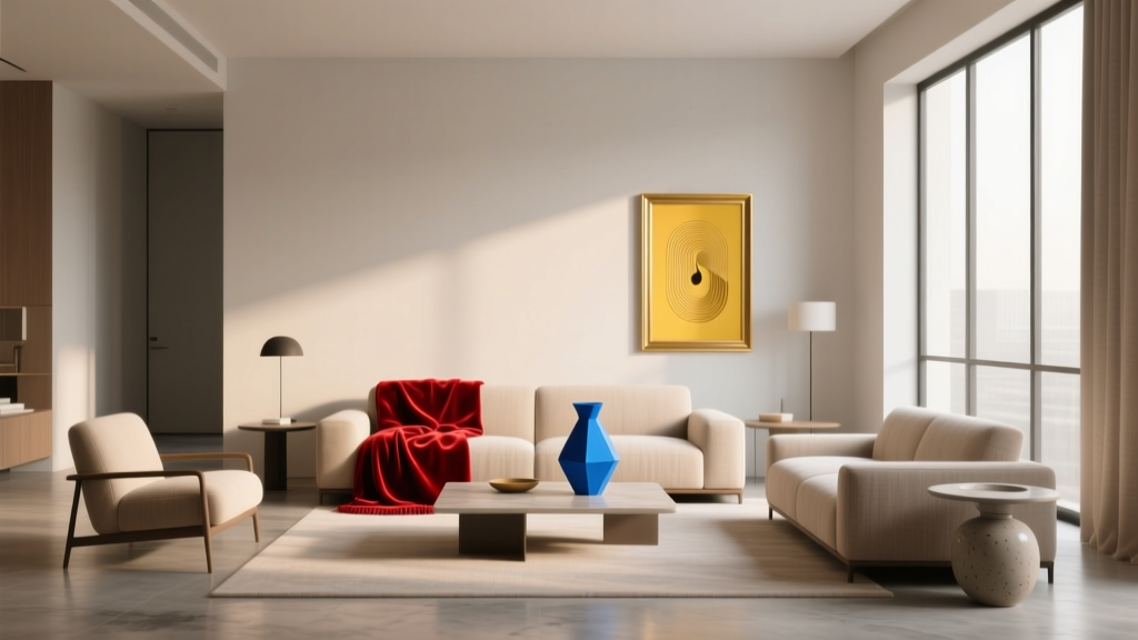 How to Use Color to Create Rhythm - The Decor Mag
 Setup Trends 2026: Modular Workspaces, AI-Integrated Ergonomics, and Sustainable Hardware Standards
 How to Choose Colors for a Butler Pantry - The Decor Mag
 Best Sustainable Solutions: Proven, Scalable, and Impact-Driven Approaches for 2024
 12 Practical DIY Furniture Ideas You Can Build in a Weekend (With Exact Materials & Dimensions)
 Best Honey Paint Colors - The Decor Mag
 How to Create a Sophisticated Color Palette - The Decor Mag
 Best Sage Green Paint Colors for Serenity - The Decor Mag