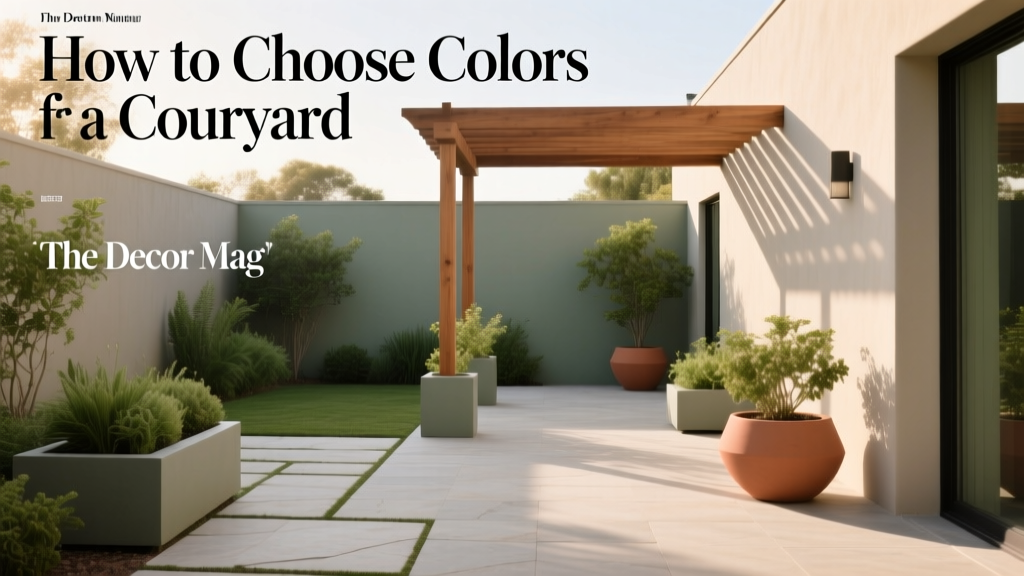
How to Choose Colors for a Courtyard - The Decor Mag
A courtyard is a rare design gift: it’s both indoors and outdoors at once. It has the intimacy of a room—defined walls, a “ceiling” of sky, and a clear sense of enclosure—while still being exposed to shifting daylight, weather, plants, and seasonal color. That makes courtyard color choices uniquely powerful. The right paint colors can cool an overheated space, bounce light into shaded corners, spotlight foliage, and make stone and tile feel intentional rather than incidental.
Courtyards also tend to be seen from multiple angles: from inside the house, from adjacent walkways, and from seating areas where you linger. A wall color that looks calm at noon might feel intense at sunset; a warm neutral that’s perfect for an interior hallway can look muddy in outdoor shade. Understanding a few core color principles—undertones, light reflectance, and how hues interact with greenery and hardscape—helps you choose a courtyard color scheme that stays beautiful all day, all year.
This guide breaks down practical steps, color psychology, and real application scenarios so you can create a courtyard palette that feels cohesive with your home and genuinely enjoyable to live with.
Start With What You Can’t (or Won’t) Change
The best courtyard paint colors don’t start at the paint rack. They start with fixed elements: the surfaces and materials that already set the temperature and mood of the space.
Audit your existing “color anchors”
- Hardscape: pavers, brick, concrete, limestone, slate, gravel, tile
- Architecture: stucco, siding, trim, doors, window frames, pergolas
- Metal finishes: black steel, bronze, aluminum, copper, galvanized
- Wood tones: cedar, teak, oak, painted timber
- Plant palette: evergreen vs. deciduous, silvery foliage, bright blooms
Tip: Pull 2–3 representative samples into one spot (a paver, a tile, a cushion fabric) and view them in your courtyard at different times of day. Your paint color should harmonize with these anchors, not fight them.
Identify undertones (the quiet color in the color)
Undertones are why two “whites” can look completely different outdoors. Warm undertones (yellow, red, peach) feel inviting but can skew too creamy in strong sun. Cool undertones (blue, green, gray) can feel crisp, but may read cold in shaded courtyards.
- Brick/terracotta: often orange-red undertones (pairs well with warm whites, muted greens)
- Concrete: can be cool gray or slightly warm/taupe (pairs well with soft whites, charcoals)
- Limestone/travertine: creamy-beige undertones (pairs well with warm whites, olive greens)
Read the Light: Courtyard Exposure Changes Everything
Because courtyards are enclosed, light behaves differently than on an open exterior wall. Paint colors can look more saturated due to reflected light bouncing between walls.
Match your palette to your exposure
- Full sun courtyards: Colors appear lighter and brighter. Choose slightly deeper or more muted shades to avoid glare.
- Partial shade: Most forgiving. You can use a wider range of neutrals and mid-tones.
- Deep shade / north-facing: Colors appear cooler and darker. Warm whites and gentle warm neutrals help counteract gloom.
Paint-testing rule: Sample at least two large swatches (12" x 12" or larger) on different walls. Check morning, midday, and evening. For truly accurate testing, use peel-and-stick samples or paint poster boards you can move.
Choose a Courtyard Color Scheme That Fits the Mood
Color psychology matters outdoors too. Courtyards often serve as restorative spaces—morning coffee, quiet reading, dinners under string lights—so aim for hues that support your intended use.
Three reliable courtyard “mood directions”
- Calm and airy: warm whites, soft greiges, pale stone tones
- Garden-forward: muted greens, earthy clays, natural browns
- Dramatic and intimate: charcoals, inky blues, deep olives
Easy color scheme formulas (that rarely fail)
- Monochromatic: one hue in multiple strengths (e.g., light sage walls, deeper green door)
- Analogous: neighboring hues (e.g., olive + clay + warm white)
- Complementary accent: mostly neutrals with one contrasting pop (e.g., warm white + terracotta + cobalt planters)
Specific Paint Color Recommendations (With Real Scenarios)
Below are curated courtyard color combinations using widely available paint brands. Use these as starting points, then adjust by one or two shades depending on your light and materials.
1) Sun-washed Mediterranean: warm white + terracotta + aged green
Best for: stucco walls, terracotta pots, saltillo tile, wrought iron, citrus trees.
- Main walls: Benjamin Moore White Dove (OC-17) — a soft warm white that avoids harsh glare.
- Trim/pergola: Sherwin-Williams Alabaster (SW 7008) — creamy but not yellow, great for sun.
- Accent door/gate: Farrow & Ball Green Smoke (No. 47) — muted, historic, garden-friendly.
- Optional grounding element: Sherwin-Williams Iron Ore (SW 7069) for metal railings or planters.
Application scenario: Paint courtyard walls in White Dove for a luminous envelope. Use Green Smoke on a single focal element (a gate, storage door, or built-in bench) to echo foliage. Layer terracotta in pots and tile; add black accents in lighting for structure.
2) Modern minimal: soft greige + charcoal + blackened bronze
Best for: concrete pavers, large-format tile, contemporary architecture, sculptural plants.
- Main walls: Benjamin Moore Edgecomb Gray (HC-173) — a warm greige that reads sophisticated outdoors.
- Secondary wall or built-ins: Sherwin-Williams Gauntlet Gray (SW 7019) — a strong mid-charcoal that hides dirt and adds depth.
- Trim/metalwork: Sherwin-Williams Tricorn Black (SW 6258) — crisp, modern definition.
Application scenario: Use Edgecomb Gray on most walls to soften the hard lines of concrete. Choose one wall behind seating in Gauntlet Gray to create a “room” effect. Add black planters and warm wood furniture to keep it from feeling sterile.
3) Lush garden room: sage walls + creamy white + natural wood
Best for: courtyards with heavy planting, climbing vines, and shade.
- Main walls: Farrow & Ball Mizzle (No. 266) — a gentle gray-green that pairs beautifully with foliage.
- Alternative (more accessible): Sherwin-Williams Clary Sage (SW 6178) — a grounded sage with a timeless feel.
- Trim: Benjamin Moore Swiss Coffee (OC-45) — a warm, creamy white that brightens shaded courtyards.
Application scenario: Paint walls a sage tone to blur the boundary between architecture and garden. Keep trim creamy to lift the space. Let natural wood (benches, fencing, a pergola) bring warmth and tactile contrast.
4) Coastal calm: pale blue-gray + crisp white + sandy neutrals
Best for: bright courtyards, homes near water, spaces with light stone and airy textiles.
- Main walls: Benjamin Moore Pale Smoke (1584) — a soft blue-gray that feels relaxed, not chilly.
- Alternative: Sherwin-Williams Sea Salt (SW 6204) — a blue-green-gray that shifts with the light (test carefully).
- Trim: Benjamin Moore Chantilly Lace (OC-65) — clean, bright definition.
Application scenario: Use a pale blue-gray on courtyard walls to cool a sun-exposed space. Bring in sandy tones through outdoor rugs, cushions, and limestone accessories to keep the palette balanced and inviting.
5) Intimate and dramatic: deep olive + warm white + brass accents
Best for: courtyards used at night, spaces with string lights, fire features, and lots of greenery.
- Main walls (feature or full enclosure): Sherwin-Williams Ripe Olive (SW 6209) — rich, enveloping, excellent with plants.
- Alternative: Benjamin Moore Essex Green (HC-188) — classic, deep, and elegant.
- Trim/ceiling beams: Sherwin-Williams Alabaster (SW 7008) to keep the look warm and livable.
Application scenario: Paint the wall behind your dining table deep olive to create a candlelit “outdoor dining room.” Use warm white on adjacent walls or trim so the space doesn’t feel too heavy. Brass or aged bronze sconces make the palette glow at night.
Where to Use Color in a Courtyard (Beyond the Walls)
Courtyard color design works best when paint is part of a layered plan. If you’re nervous about commitment, start with smaller architectural pieces.
High-impact, low-risk places to add color
- Doors and gates: an ideal spot for deep greens, blues, or bold terracotta
- Planters: repeat an accent color to make the space feel intentional
- Benches and built-ins: color can define a “zone” for lounging or dining
- Pergola or overhead beams: darker tones add intimacy; lighter tones lift the space
- Outdoor cabinetry: treat it like a kitchen island—slightly deeper than walls
Simple layering method for a cohesive palette
- Choose a base neutral (walls or main structure).
- Add one mid-tone (a secondary wall, bench, or pergola).
- Pick one accent (door, planters, textiles).
- Repeat the accent 2–3 times (a pot, a cushion stripe, a lantern) for visual rhythm.
Real Courtyard Examples You Can Picture at Home
Example A: Small townhouse courtyard with shade and brick
Challenge: Brick dominates; the courtyard feels dim.
Solution palette:
- Walls: Benjamin Moore White Dove (OC-17) to brighten and soften the brick’s warmth.
- Trim/railings: Sherwin-Williams Iron Ore (SW 7069) for crisp contrast that hides outdoor wear.
- Accents: muted green planters (similar to Farrow & Ball Green Smoke) to connect with plants.
Result: The courtyard reads brighter, the brick looks richer, and greenery feels more vibrant against the warm white.
Example B: Open-air courtyard with pale stone and intense sun
Challenge: White walls glare; everything feels washed out.
Solution palette:
- Walls: Benjamin Moore Edgecomb Gray (HC-173) for a sun-friendly greige that adds body.
- Feature wall: Sherwin-Williams Gauntlet Gray (SW 7019) to create depth and reduce brightness.
- Accents: black metal (Tricorn Black) + warm wood furniture.
Result: Less glare, more architectural definition, and a comfortable backdrop for outdoor seating.
Common Courtyard Color Mistakes (And How to Avoid Them)
- Choosing paint without testing in outdoor light: Courtyard light is reflective and changes quickly. Test large samples on multiple walls.
- Ignoring undertones in pavers and stone: A “neutral gray” wall can look purple next to warm beige stone. Match undertones first.
- Going too bright in full sun: Saturated colors can feel louder outdoors. Consider muted versions (dusty blue instead of true blue).
- Using stark white in deep shade: It can read cold and flat. Choose warm whites like Alabaster or Swiss Coffee.
- Overloading with competing accents: Limit to one main accent hue and repeat it. Too many colors can make a courtyard feel busy and smaller.
- Forgetting nighttime: Warm lighting (2700K–3000K) changes how paint looks. Check colors under your evening lighting.
Practical Tips for Paint, Finish, and Durability
- Use exterior-rated paint: Even in covered courtyards, humidity and temperature swings matter.
- Choose the right sheen:
- Flat/matte: hides imperfections, softer look; can mark more easily.
- Eggshell/satin: ideal balance for most courtyard walls; easier to clean.
- Semigloss: best for trim and doors for durability and definition.
- Coordinate with landscaping: Silvery plants (lavender, olive, artemisia) love warm whites and clays; deep greens look striking against pale neutrals and charcoals.
- Think in seasons: If your planting changes dramatically, keep walls more neutral and express bolder color through movable planters and textiles.
FAQ: Courtyard Paint Colors and Color Schemes
What are the best neutral paint colors for courtyard walls?
Reliable courtyard neutrals include Benjamin Moore White Dove (OC-17), Sherwin-Williams Alabaster (SW 7008), and Benjamin Moore Edgecomb Gray (HC-173). They’re forgiving in changing light and pair well with stone, brick, and greenery.
Should courtyard colors match the interior paint colors?
They should relate, not necessarily match. A good approach is to keep a shared undertone (warm or cool) so the view from inside feels cohesive. If your interior is warm white, choose a warm white or warm greige outside rather than a cool gray.
Are dark colors a bad idea for a small courtyard?
Not at all. Dark paint colors like Sherwin-Williams Iron Ore or Ripe Olive can make a courtyard feel like a sophisticated outdoor room, especially with warm lighting. Balance with lighter trim, pale paving, or plenty of greenery.
How do I choose an accent color for doors, gates, or planters?
Pull from what’s already present: a muted green that echoes foliage, a terracotta that ties to tile, or a charcoal that matches metalwork. One accent hue repeated a few times reads intentional and elevated.
Why does my courtyard paint look different than it did on the swatch?
Outdoor conditions amplify color shifts: bright sun lightens colors, shade deepens them, and surrounding surfaces reflect their tones. Test larger samples and observe at multiple times of day before committing.
Next Steps: A Courtyard Color Plan You Can Do This Week
- Photograph your courtyard in morning, midday, and evening light.
- Identify fixed materials and their undertones
More Articles
 Placement Safety Tips: Preventing Falls, Injuries, and Equipment Failure in Industrial and Residential Settings
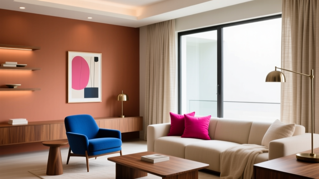 Saturated Colors in Decor: Use Without Overwhelming
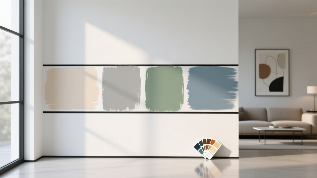 How to Test Paint Colors Before Committing - The Decor Mag
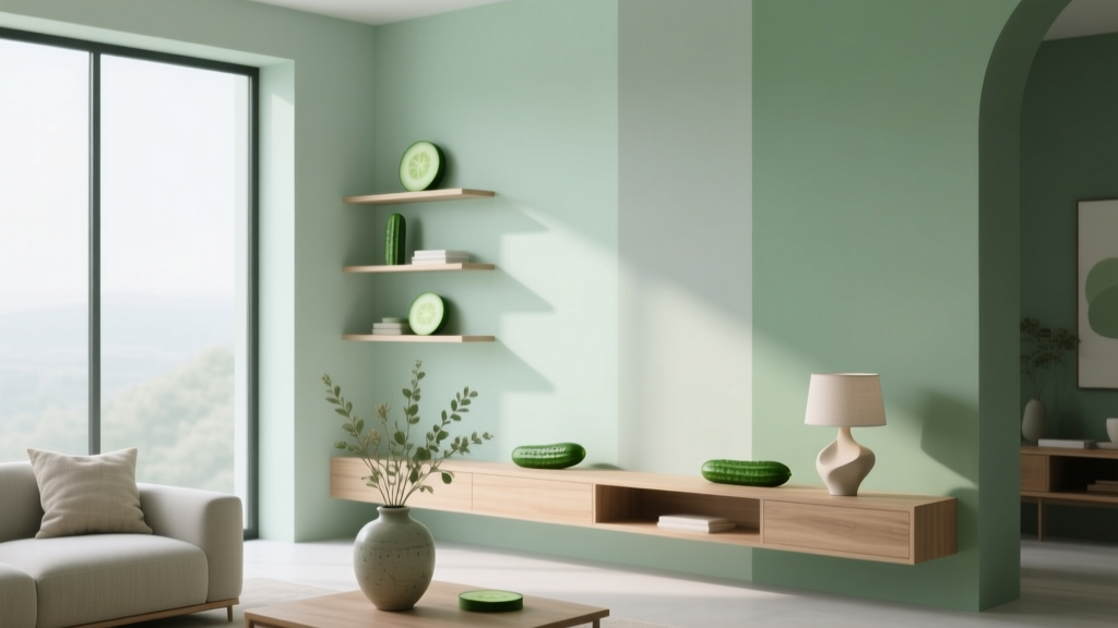 Best Cucumber Paint Colors - The Decor Mag
 Best Burnt Orange Paint Colors - The Decor Mag
 How to Create a Modern Color Palette - The Decor Mag
 Pastel Color Palette Design Guide - The Decor Mag
 How to Use Color to Create Emphasis - The Decor Mag
 How to Choose Colors for a Laundry Room - The Decor Mag
 Best White Paint Colors Compared - The Decor Mag