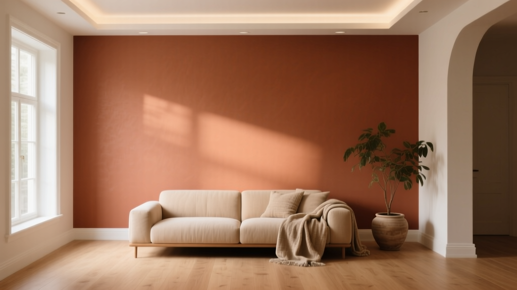
Best Terracotta Paint Colors for Warmth - The Decor Mag
Terracotta is one of those rare paint colors that feels both grounded and elevated. Inspired by sunbaked clay, desert landscapes, and Mediterranean architecture, it brings instant warmth to interiors without the harshness that can come with brighter oranges or the heaviness that sometimes shows up in deep reds. For homeowners who want cozy, welcoming rooms that still feel sophisticated, terracotta paint colors are a smart, design-forward choice.
This topic matters because warmth isn’t just a style preference—it’s a comfort cue. Color psychology links earthy reds and oranges to feelings of connection, energy, and security. When applied thoughtfully, terracotta can make large rooms feel more intimate, brighten dim spaces with a soft glow, and create a flattering backdrop for wood tones, woven textures, and natural stone.
Terracotta also plays well with today’s most-loved interior design looks—modern organic, Spanish revival, warm minimalism, and transitional spaces that mix old and new. The key is choosing the right terracotta undertone and pairing it with balanced neutrals and finishes so the room feels intentional, not “orange.”
Why Terracotta Works: Color Psychology and Design Principles
The emotional effect of terracotta
Terracotta sits between red and orange on the color wheel, which is why it feels both energizing and comforting. Compared with true orange, it’s dustier and more natural, which reads as calm and livable over time. Terracotta’s warmth can:
- Encourage conversation and togetherness in social rooms like living rooms and dining rooms
- Add a “healthy glow” effect in bedrooms and hallways, especially in warm light
- Balance cooler materials (marble, chrome, gray tile) by adding a sense of life
Design rule: undertones are everything
Not all terracotta paint colors are created equal. Some lean pink and clay-like, others lean red-brown, and some feel almost cinnamon. Identifying undertones helps you avoid clashing with existing floors, countertops, and upholstery.
- Pink-clay terracotta: softer, more modern, flattering in bedrooms
- Red-oxide terracotta: bold, traditional, great for dining rooms
- Brown-leaning terracotta: earthy, grounding, ideal for cozy dens
- Muted “desert” terracotta: sunwashed, relaxed, works in open plans
Best Terracotta Paint Colors (With Brand Recommendations)
Below are standout terracotta paint colors that designers repeatedly reach for, plus guidance on where they shine. Because lighting changes everything, treat these as starting points and always sample first.
1) Farrow & Ball Red Earth
Why it works: A classic red-oxide terracotta with a timeless, enveloping warmth. It feels heritage-inspired without looking dated.
- Best for: Dining rooms, libraries, entryways
- Pairs well with: warm whites, antique brass, dark walnut, olive green
- Style cue: Traditional meets modern European
2) Farrow & Ball Charlotte’s Locks
Why it works: A bolder, saffron-leaning terracotta-orange that reads sunny and expressive. Great when you want warmth that feels energized.
- Best for: Powder rooms, front doors, creative studios
- Pairs well with: crisp whites, inky blues, black accents
3) Sherwin-Williams Cavern Clay (SW 7701)
Why it works: A designer favorite for good reason—Cavern Clay is earthy, approachable, and adaptable across styles. It’s a true terracotta that doesn’t skew neon.
- Best for: Living rooms, accent walls, open-plan spaces
- Pairs well with: creamy whites, natural oak, charcoal, woven textiles
- Room vibe: Warm, modern, grounded
4) Sherwin-Williams Redend Point (SW 9081)
Why it works: A softer, pink-beige terracotta that functions like a warm neutral. It’s a great “starter terracotta” if you want warmth without drama.
- Best for: Bedrooms, hallways, nurseries, whole-home palettes
- Pairs well with: linen whites, soft taupes, muted sage, light woods
5) Benjamin Moore Terra Cotta Tile (CC-82)
Why it works: A saturated, classic terracotta with a slightly traditional character—beautiful with tile, brick, and rustic textures.
- Best for: Kitchens with warm cabinetry, mudrooms, fireplace surrounds
- Pairs well with: warm white trim, copper cookware, deep greens
6) Benjamin Moore Potters Clay (1221)
Why it works: A muted clay-brown terracotta that feels calm and earthy. Excellent when you want warmth that reads subtle in daytime.
- Best for: Dens, offices, reading nooks
- Pairs well with: camel leather, cream boucle, black metal, tan rugs
7) Behr Canyon Dusk (S210-4)
Why it works: A sunbaked, approachable terracotta that’s easy to live with and accessible for DIY homeowners.
- Best for: Guest rooms, boho living rooms, accent alcoves
- Pairs well with: warm whites, terracotta textiles, natural jute
8) Clare Headspace (terracotta-leaning option depending on light)
Why it works: Some modern paint lines offer complex warm hues that can read terracotta-adjacent in warm lighting. If you like a softer, contemporary clay vibe, this category is worth sampling alongside true terracotta options.
- Best for: Minimalist homes, modern organic palettes
- Pairs well with: off-white walls, pale oak floors, warm stone
How to Choose the Right Terracotta for Your Space
Step 1: Read the room’s fixed elements
Terracotta interacts strongly with what you can’t change. Before choosing a paint color, look at:
- Flooring: warm oak and terracotta are best friends; cool gray floors may push terracotta too orange
- Countertops/stone: creamy veining loves warm clay tones; stark white quartz can make terracotta look more saturated
- Upholstery: camel, cream, and olive harmonize; icy grays and bright blues can feel harsh unless carefully balanced
Step 2: Evaluate lighting (natural and artificial)
- North-facing rooms: can make terracotta appear deeper and slightly browner—choose a lighter or pinker clay
- South-facing rooms: intensify warmth—choose a more muted terracotta to avoid a “glow overload” effect
- Warm bulbs (2700K): enhance terracotta’s cozy side
- Cool bulbs (4000K+): can make terracotta feel sharper—swap bulbs before blaming the paint
Step 3: Decide your intensity level
Terracotta can be a whisper or a statement. Use this quick guide:
- Low commitment: terracotta on a single wall, built-in, or powder room vanity
- Medium commitment: terracotta in a dining room or bedroom with balanced trim
- High commitment: terracotta in open-plan living areas or multiple connected rooms
Real Room Examples: Where Terracotta Paint Looks Its Best
Living room: Warm modern organic comfort
Scenario: A living room with light oak floors, a cream sofa, and black-framed windows.
- Try: Sherwin-Williams Cavern Clay on the main walls
- Trim idea: a creamy white (avoid stark white) to keep the room soft
- Styling: add olive pillows, a vintage-inspired rug with rust tones, and brass lighting
Dining room: Rich, candlelit warmth
Scenario: A dining room used mostly at night, with a wood table and warm metal accents.
- Try: Farrow & Ball Red Earth for depth and drama
- Design tip: choose a satin or matte finish depending on wall condition; matte feels more velvety and sophisticated
- Pairing: deep green drapery or artwork with black frames
Bedroom: A cozy clay cocoon (without feeling dark)
Scenario: A bedroom with white bedding, linen curtains, and warm wood nightstands.
- Try: Sherwin-Williams Redend Point for a clay-neutral feel
- Headboard wall option: a slightly deeper terracotta behind the bed for dimension
- Color scheme: terracotta + oatmeal + muted sage
Kitchen: Terracotta as an accent that elevates cabinetry
Scenario: A kitchen with off-white cabinets, warm hardware, and open shelving.
- Try: Benjamin Moore Terra Cotta Tile on a pantry door, island, or breakfast nook wall
- Backsplash pairing: creamy zellige tile, warm grout, wood shelves
- Tip: keep counters and backsplash calm so terracotta feels intentional, not busy
Bathroom or powder room: A bold, flattering glow
Scenario: A small powder room that needs personality.
- Try: Farrow & Ball Charlotte’s Locks for a vibrant clay-orange moment
- Pair with: antique brass, a warm white ceiling, and a patterned tile floor
- Mirror trick: terracotta + warm metal makes skin tones look more radiant under soft lighting
Terracotta Color Schemes: What to Pair with Warmth
The most successful terracotta rooms use contrast and relief—cool, light, or muted companions that let the clay tone shine.
Go-to terracotta pairings
- Terracotta + warm white: classic, airy, timeless (great for trim and ceilings)
- Terracotta + sage green: earthy and calming; perfect for bedrooms and living rooms
- Terracotta + olive: richer, moodier, great for dining rooms and libraries
- Terracotta + navy: high contrast, tailored, ideal for modern homes
- Terracotta + charcoal/black: adds structure; use in small doses (hardware, frames, lighting)
- Terracotta + blush or dusty rose: tonal warmth that feels soft and layered
Materials that make terracotta feel elevated
- Natural woods (oak, walnut, teak)
- Woven textures (jute, rattan, sisal)
- Warm metals (brass, aged bronze, copper)
- Handmade tile and ceramics
- Linen, boucle, and wool in cream and camel tones
Common Terracotta Paint Mistakes to Avoid
- Choosing a terracotta that’s too orange for your fixed finishes: If you have cool gray floors or cool white countertops, sample muted, brown-leaning terracotta instead of a bright clay.
- Pairing terracotta with stark white trim: High-contrast white can make terracotta look louder. Opt for creamy whites or soft off-whites for a more cohesive color scheme.
- Ignoring sheen: Higher sheen reflects more light and can make warm colors appear more intense. Matte or eggshell is often the sweet spot for living spaces.
- Overloading the room with warm tones: Terracotta plus warm beige plus warm yellow lighting plus red wood can feel heavy. Add relief with greens, soft blacks, or lighter textiles.
- Skipping a large sample: Terracotta changes dramatically from morning to evening. Use a large swatch (or paint a poster board) and check it in multiple lighting conditions.
Practical Application Tips for Terracotta Walls
- Start with a sample strategy: Test 2–3 terracotta paint colors at once, including one lighter and one deeper than you think you want.
- Plan your trim color early: A warm off-white trim and ceiling keep the look intentional and help terracotta read sophisticated.
- Use terracotta where you want “visual warmth”: North-facing rooms, long hallways, and rooms that feel stark or echoey benefit most.
- Balance with neutrals: Keep large furniture in cream, camel, or warm gray-beige so the wall color can be the feature.
- Repeat the color subtly: Tie the room together with a rust-toned pillow, pottery, or artwork so the terracotta paint color feels integrated.
FAQ: Terracotta Paint Colors for Warm Interiors
Is terracotta a good whole-house paint color?
It can be, but it’s easiest as a “connector” color in hallways, dining rooms, or a study rather than every room. For whole-home warmth, consider a softer clay-neutral like Sherwin-Williams Redend Point and use deeper terracotta in select rooms.
What trim color looks best with terracotta walls?
Warm whites and creamy off-whites are the most flattering. They soften contrast and help terracotta feel timeless. If you prefer a modern look, a soft warm greige trim can also work.
Does terracotta work with gray flooring?
Yes, but choose carefully. Look for terracotta paint colors with brown or muted undertones (less orange). Add bridging elements like warm wood furniture, jute rugs, and creamy textiles to reduce the cool-warm clash.
What’s the difference between terracotta and rust paint colors?
Terracotta is typically lighter and clay-based, often with a sunbaked, earthy orange-red vibe. Rust tends to be deeper and browner, sometimes with a more industrial, oxidized feel.
Which rooms benefit most from terracotta paint?
Dining rooms, living rooms, entryways, and powder rooms are top picks. Bedrooms also work beautifully when you choose a softer, muted terracotta with pink or beige undertones.
How do I keep terracotta from feeling dated?
Pair it with clean-lined furniture, warm whites, and modern materials like honed stone, matte black accents, and minimal window treatments. Avoid overly themed “Tuscan” decor and aim for a curated, natural mix.
Next Steps: Bring Terracotta Warmth Home
Choose two or three terracotta paint colors that match your lighting and fixed finishes, then sample them at a large scale. Build a simple color scheme—terracotta, a warm white, and one grounding accent (sage, olive, navy, or charcoal). From there, add texture: wood, linen, and warm metals will make the color feel layered and lived-in.
If you’re ready for more guidance on paint colors, undertones, and room-by-room color schemes, explore more color guides on thedecormag.com.
More Articles
 Fluted vs Headboard: Understanding the Structural, Aesthetic, and Functional Differences
 How to Use Color to Create Flow - The Decor Mag
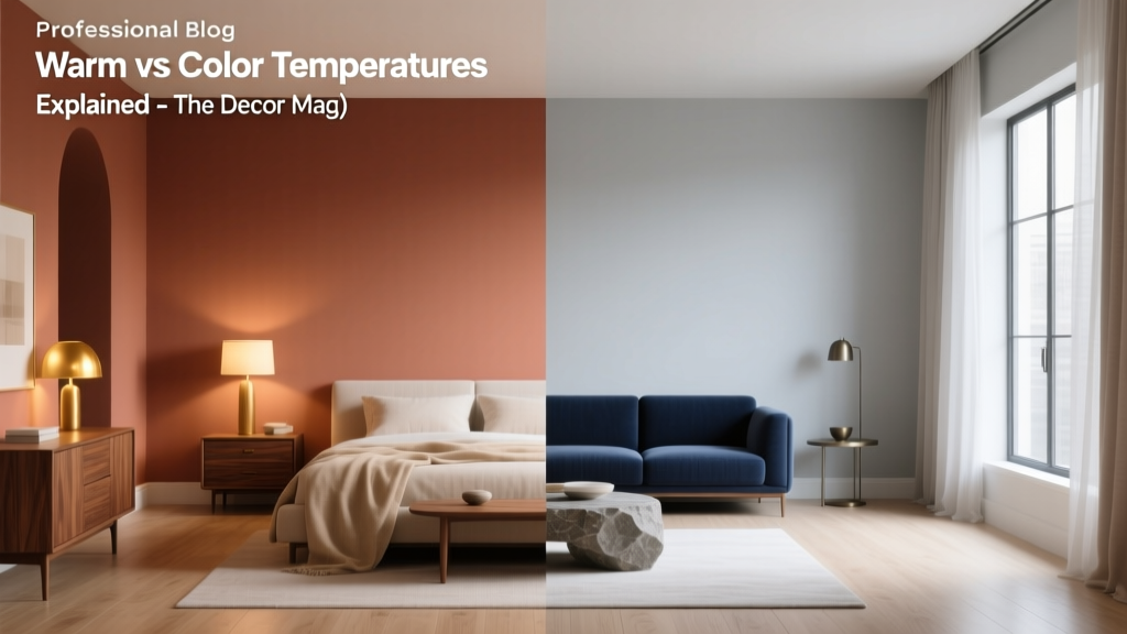 Warm vs Cool Color Temperatures Explained - The Decor Mag
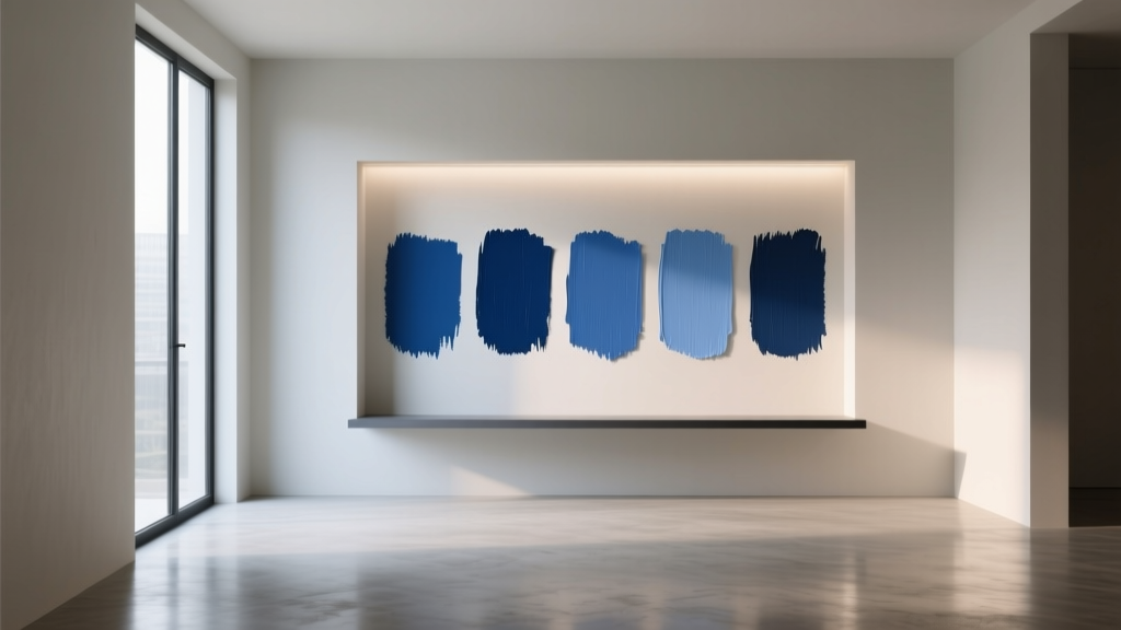 Best Cobalt Blue Paint Colors - The Decor Mag
 Best Green Paint Colors for Nature Lovers - The Decor Mag
 Best Taupe Paint Colors Compared - The Decor Mag
 How to Choose Colors for a Potting Shed - The Decor Mag
 Best Banana Paint Colors - The Decor Mag
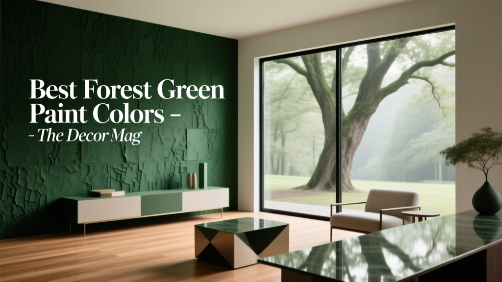 Best Forest Green Paint Colors - The Decor Mag
 Friendly and Smart Compared: How Human-Centered Design and AI Intelligence Shape Modern Product Experiences