Living Room Colors for Entertaining (2026)
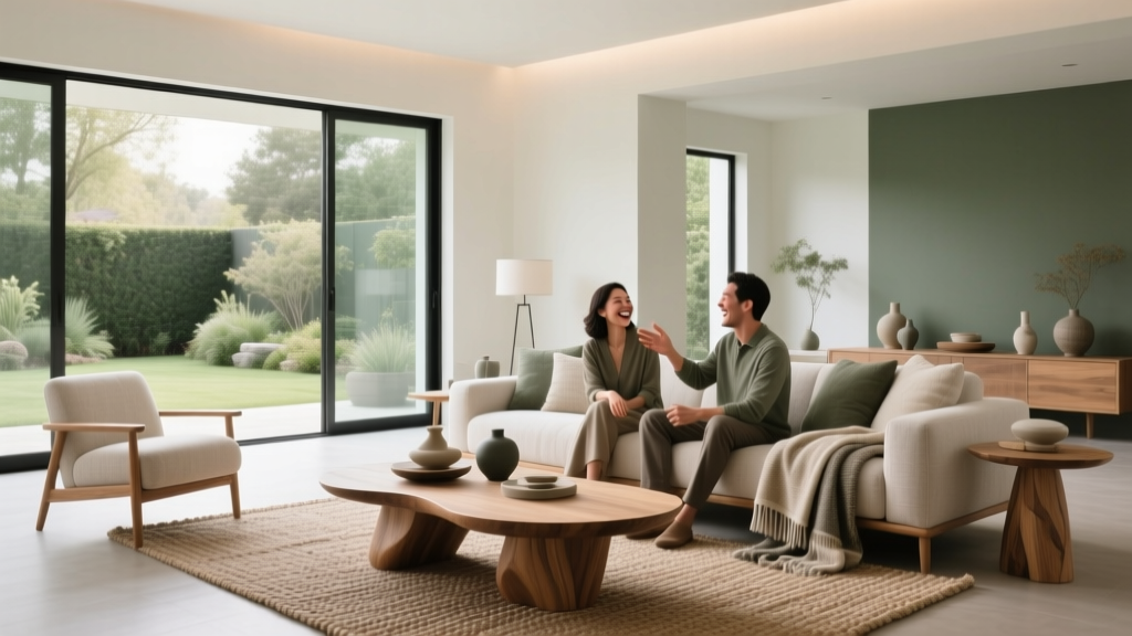
Entertaining happens in real time—laughter bounces off the walls, candlelight warms the corners, and a good playlist makes the room feel like it’s breathing. Color quietly shapes all of it. The right living room paint colors can make guests feel welcomed, energized, relaxed, or subtly guided toward the best seat in the house. The wrong color can flatten your lighting, make faces look tired, or create a space that feels chilly when you want it to feel convivial.
Choosing a living room color scheme for entertaining isn’t about chasing trends. It’s about understanding how color psychology, undertones, and contrast work together with your room’s light, furnishings, and the way you host—cocktails and conversation, family movie nights, holiday gatherings, game-day crowds, or intimate dinners that spill into the living room. When you choose with intention, your walls do more than “match”—they create atmosphere.
This guide walks through how to pick paint colors and color combinations that support entertaining, with practical examples, specific paint color recommendations, and common mistakes to avoid.
Start with How You Entertain (and What You Want People to Feel)
Color is a mood-setting tool. Before sampling paint swatches, define the experience you want your living room to deliver. Different gatherings benefit from different emotional cues.
Match color psychology to your hosting style
- Warm, lively, talkative gatherings: Warm neutrals, terracotta, caramel, and softly saturated reds encourage energy and connection.
- Calm, intimate entertaining: Muted blue-greens, gentle olives, smoky taupes, and warm off-whites help people settle in.
- High-contrast, “wow” hosting: Deep navy, charcoal, inky green, and dramatic trim create a memorable, lounge-like effect.
- Family-friendly, flexible use: Mid-tone greiges, warm beiges, and soft sages hide scuffs and adapt to changing decor.
Ask yourself these quick questions
- Do you host mostly at night, day, or both?
- Is your entertaining vibe bright and airy or moody and cozy?
- Do guests gather around a TV, a fireplace, a bar cart, or an open-plan kitchen?
- Do you want your living room to feel larger and more open, or more enveloped and intimate?
Evaluate Your Light First: The Make-or-Break Step
Lighting determines whether a paint color looks creamy or dull, crisp or icy, elegant or muddy. For entertaining, flattering light matters—especially at night when skin tones, food, and candlelight are in the spotlight.
How light direction affects paint colors
- North-facing: Cooler, grayer light. Choose warm undertones (cream, warm greige, soft clay) to avoid a flat feel.
- South-facing: Warm, bright light. You can use cooler colors (soft blue, blue-gray, crisp white) without them feeling cold.
- East-facing: Bright in the morning, cooler later. Balanced neutrals and “chameleon” greiges work well.
- West-facing: Warm, intense afternoon/evening light. Avoid overly warm yellows; choose grounded warm neutrals or deeper tones.
Nighttime entertaining: choose colors that love lamplight
Warm bulbs (2700K–3000K) make many whites turn creamy and many grays turn slightly purple or green depending on undertones. If you host after sunset, prioritize:
- Warm off-whites rather than stark whites
- Greiges with beige/brown undertones rather than blue undertones
- Deeper hues that become velvety under lamps (navy, charcoal, forest green)
Build a Living Room Color Scheme That Supports Conversation
Entertaining-friendly color schemes create comfort, legibility, and visual flow. In design terms, you want a balanced value range (light to dark), controlled contrast, and a cohesive undertone story.
Use the 60-30-10 rule (with an entertaining twist)
- 60%: Wall color (sets overall mood)
- 30%: Upholstery, rugs, drapery (comfort and sound absorption)
- 10%: Accents (art, pillows, florals—where you can go bold)
For hosting, aim for a mid-contrast room: enough contrast to feel lively, not so much that it becomes visually tiring.
Choose undertones that won’t clash with food, wood, and skin tones
Entertaining brings a lot of variables into one space: warm wood, brass, wine, colorful salads, candlelight, and people. The safest route is a wall color with a stable undertone—warm neutral, olive-leaning green, or a softened blue—paired with flattering warm whites for trim.
Specific Paint Color Recommendations (Walls, Trim, and Accents)
These paint colors are widely loved in interior color design for being versatile, flattering in mixed lighting, and easy to decorate around. Always sample first—paint is famously different on a wall than on a chip.
Welcoming warm neutrals (crowd-pleasers for any party)
- Benjamin Moore Edgecomb Gray (HC-173): A warm greige that reads inviting and polished; great with white oak, black accents, and linen upholstery.
- Sherwin-Williams Accessible Beige (SW 7036): A balanced beige that feels modern, not yellow; strong for open-plan entertaining spaces.
- Farrow & Ball Skimming Stone (No. 241): Soft, sophisticated, and especially beautiful in lamplight.
Trim pairing: Benjamin Moore White Dove (OC-17) or Sherwin-Williams Alabaster (SW 7008) for a warm, guest-friendly glow.
Soft greens that make a room feel grounded (and hide wear)
- Sherwin-Williams Evergreen Fog (SW 9130): A modern sage-green/gray that reads calm and upscale; works with brass, walnut, and creamy textiles.
- Benjamin Moore Saybrook Sage (HC-114): Warmer and more traditional; strong for homes with classic trim and warm woods.
- Farrow & Ball Pigeon (No. 25): A nuanced blue-green that feels tailored and timeless.
Best for: Living rooms that need warmth without going “beige,” and homes with pets or kids where mid-tone colors keep walls looking fresh.
Blues and blue-grays for elegant, social “lounge” energy
- Benjamin Moore Boothbay Gray (HC-165): A soft blue-gray that feels airy by day and refined at night.
- Sherwin-Williams Smoky Blue (SW 7604): Muted and velvety; excellent for accent walls or full rooms with warm lighting.
- Benjamin Moore Hale Navy (HC-154): A classic deep navy that creates drama without feeling harsh.
Trim pairing: Crisp but not icy whites like Benjamin Moore Simply White (OC-117) or a softer warm white like White Dove if your room runs cool.
Moody darks for memorable evenings (without making the room feel small)
- Benjamin Moore Kendall Charcoal (HC-166): A deep, warm charcoal that feels sophisticated and forgiving.
- Sherwin-Williams Iron Ore (SW 7069): A soft black/charcoal that looks stunning with layered lighting and art.
- Farrow & Ball Hague Blue (No. 30): Deep blue-green with richness that reads luxurious in candlelight.
Pro tip: If you’re nervous about dark walls, use them on the fireplace wall or in a built-in niche first, then expand if you love the mood.
Real Room Examples and Application Scenarios
Scenario 1: Open-plan living room that hosts often
Goal: Cohesion between living room and kitchen/dining while keeping the living space warm and inviting.
- Walls: Sherwin-Williams Accessible Beige (SW 7036)
- Trim: Sherwin-Williams Alabaster (SW 7008)
- Accent: Sherwin-Williams Iron Ore (SW 7069) on built-ins or the fireplace surround
- Textiles: Oatmeal linen sofa, woven rug, black metal lighting, walnut coffee table
Why it works: The warm neutral supports conversation, the dark accent adds depth, and the overall palette stays flexible for seasonal decor.
Scenario 2: Small living room, big gatherings
Goal: Make a compact space feel welcoming, not cramped, with flattering light for faces.
- Walls: Benjamin Moore Edgecomb Gray (HC-173)
- Ceiling: Same color as walls in a lighter finish (or 50% strength) to soften edges
- Trim: Benjamin Moore White Dove (OC-17)
- Accent colors: Terracotta pillows, olive greenery, warm brass lamps
Why it works: A warm greige expands the room visually while staying cozy at night—ideal for frequent entertaining.
Scenario 3: Evening cocktail vibe with a “wow” factor
Goal: Create a lounge-like living room that shines after dark.
- Walls: Benjamin Moore Hale Navy (HC-154)
- Trim: Benjamin Moore Simply White (OC-117) for crisp contrast
- Metals: Aged brass or antique gold
- Accents: Burgundy, cognac leather, and off-white boucle
Lighting guidance: Layer at least three sources—overhead on dimmer, table lamps, and a floor lamp—to keep navy walls from feeling flat.
Scenario 4: Family-friendly entertaining (movie nights + guests)
Goal: Comfortable, relaxed, forgiving walls that still look designed.
- Walls: Sherwin-Williams Evergreen Fog (SW 9130)
- Trim: Sherwin-Williams Alabaster (SW 7008)
- Rug: Patterned neutral (helps disguise spills)
- Accent colors: Clay, cream, and black for a modern organic look
Where to Use Color: Walls, Ceiling, Trim, and Beyond
Accent walls that feel intentional (not random)
For entertaining, the best accent wall is typically the one guests naturally face:
- Fireplace wall
- Wall behind the main sofa
- Built-in bookcase wall
Keep the rest of the room in a supporting neutral so the space still feels cohesive when it’s full of people.
Ceiling color for atmosphere
- Airy and bright: Use a soft white ceiling (White Dove or Alabaster).
- Cozy and dramatic: Paint the ceiling the same color as the walls in a flatter finish for an enveloping effect—great for evening entertaining.
Trim and doors: the underrated entertaining upgrade
Painting interior doors or trim a slightly deeper tone (or a crisp contrasting white) makes the room feel finished—like a venue, not an afterthought. A popular pairing is warm walls with a clean, creamy trim for a high-end look.
Common Living Room Color Mistakes to Avoid
- Choosing paint from a swatch under store lighting: Sample on at least two walls and observe morning, afternoon, and night.
- Ignoring undertones: A “neutral” gray can lean blue, green, or purple—especially under warm bulbs.
- Going too icy with cool whites: Stark whites can feel unwelcoming at night and make skin tones look less flattering.
- Overdoing contrast: Very bright white trim with very dark walls can feel formal and harsh if you don’t soften it with textiles and warm lighting.
- Skipping sheen strategy: For most living rooms, eggshell or matte on walls looks refined; semi-gloss on trim is durable. High gloss everywhere can feel echoey and highlight wall imperfections.
- Forgetting the rug and sofa are “color anchors”: If your sofa is cool gray but your walls are warm beige, you may end up fighting undertones. Build your paint color scheme around the largest fixed items.
Practical Tips for Sampling and Committing
- Pick 3–5 contenders max. Too many samples makes decision fatigue more likely.
- Test large. Paint 2' x 2' swatches (or use peel-and-stick samples) on multiple walls.
- Check next to upholstery and flooring. Undertones reveal themselves beside wood, stone, and fabric.
- View with your entertaining lighting. Turn on lamps, dimmers, and candles the way you host.
- Decide your “hero.” Is the star the wall color, the art, or the sofa? Keep one element dominant and the others supportive.
FAQ: Choosing Living Room Colors for Entertaining
What are the best living room paint colors for entertaining that work with most decor?
Warm neutrals and soft complex colors are the easiest: Benjamin Moore Edgecomb Gray (HC-173), Sherwin-Williams Accessible Beige (SW 7036), and Sherwin-Williams Evergreen Fog (SW 9130). They read welcoming under mixed lighting and coordinate with many furniture styles.
Should I choose warm or cool colors for a living room where we host at night?
Warm or warm-leaning neutrals typically look best at night because they complement lamplight and candlelight. If you love cool colors, choose muted versions (blue-grays or blue-greens) and balance them with warm trim and warm bulbs.
What color makes a living room feel cozy but still upscale for guests?
Mid-to-deep tones with soft undertones do this beautifully—Benjamin Moore Kendall Charcoal (HC-166), Benjamin Moore Hale Navy (HC-154), or Farrow & Ball Pigeon (No. 25). Pair with creamy trim (White Dove or Alabaster) and layered lighting.
How do I choose a color scheme for an open-plan living room and kitchen?
Choose one main neutral that works in both spaces, then add depth through accents. For example: Accessible Beige walls, Alabaster trim, and Iron Ore accents on built-ins or a fireplace. Keep metals and wood tones consistent so the palette feels intentional.
Is an accent wall still a good idea for entertaining spaces?
Yes—when it supports the room’s focal point. A deep accent on the fireplace wall or built-ins adds depth and makes the space feel styled for guests. Avoid a random accent wall that doesn’t connect to furniture layout or sightlines.
What’s the easiest way to avoid choosing the “wrong” neutral?
Identify whether your fixed finishes are warm or cool (flooring, stone, large sofa). Then sample neutrals that share those undertones. Test them in your actual lighting at the times you entertain most.
Next Steps: Make Your Entertaining Palette Feel Effortless
Choose a feeling first, then let lighting and undertones guide the exact paint color. Start with 3–5 samples, view them in both daylight and evening lamplight, and build a simple color scheme with one main wall color, a supportive trim color, and one accent for depth. Your living room will look better in photos, feel more welcoming in person, and make hosting feel more natural.
Explore more paint color ideas, color schemes, and room-by-room guides on thedecormag.com to keep refining your home’s palette with confidence.
More Articles
 Cheap vs Premium: Why 'Premium' Isn’t Just Marketing—It’s Measurable Performance
 How to Choose Colors for West-Facing Rooms - The Decor Mag
 How to Choose Colors for a Reading Room - The Decor Mag
 Best Honeydew Paint Colors - The Decor Mag
 Best Pear Green Paint Colors - The Decor Mag
 How to Choose Colors for a Library - The Decor Mag
 How to Use Desaturated Colors for Elegance - The Decor Mag
 Best Eucalyptus Paint Colors - The Decor Mag
 Best Slate Blue Paint Colors - The Decor Mag
 How to Choose Colors for a Home Office - The Decor Mag