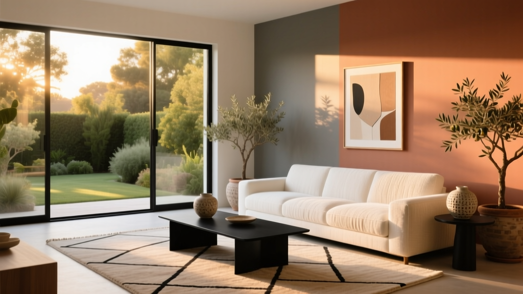
How to Choose Colors for West-Facing Rooms - The Decor Mag
West-facing rooms are the shape-shifters of the home. They can look calm and slightly cool in the morning, then glow with rich, golden sunlight in the late afternoon and evening. That dramatic swing is exactly why paint colors that looked “perfect” in the store—or even in a north-facing bedroom—can suddenly feel too yellow, too orange, too dark, or strangely flat once the sun hits.
Choosing interior paint colors for west-facing rooms isn’t about finding one “correct” shade. It’s about understanding how changing natural light affects undertones, contrast, and mood—then selecting a color scheme that looks beautiful at both 9 a.m. and 6 p.m. With the right approach, you can make a west-facing living room feel inviting all day, keep a dining room cozy (not overly amber), and prevent a home office from turning into a sunset cave.
This guide breaks down the light patterns, the best paint colors for west-facing rooms, and the design principles that help you create balance—plus real room scenarios, common mistakes to avoid, and a quick FAQ for practical decision-making.
Why West-Facing Light Changes Everything
The light pattern: cool-to-warm, then intense
West-facing rooms typically receive:
- Morning: indirect light that can feel cooler and dimmer, especially in winter or if there are obstructions outside.
- Midday: moderate, neutral-ish light (varies by season and window size).
- Late afternoon to sunset: strong, warm light with orange/golden tones that can saturate paint colors.
What that means for paint undertones
West light intensifies warm undertones. That’s great if you want cozy and glowing. It’s trickier if you’re painting a neutral that already leans warm—because it can tip into “too yellow” or “peachy” by evening.
Design principle to remember: Light reveals undertone. A beige that seems balanced at noon can read pink at 7 p.m. A crisp white can turn buttery. A mid-tone color can feel heavier as the sun sets.
Start with the Room’s Job (Mood + Function)
Before picking swatches, decide what you want the room to feel like during its most-used hours. Color psychology plays a real role here:
- Living rooms: often benefit from welcoming, grounded colors that stay comfortable in warm evening light.
- Dining rooms: can lean into richer hues—west light makes dinners feel intimate and flattering.
- Home offices: need focus and visual calm; overly warm walls can feel overstimulating late day.
- Bedrooms: typically want soothing colors; west-facing bedrooms can become too energized at sunset.
Quick guideline: if the room is used most in the evening, embrace warm, cozy palettes—but choose undertones carefully to avoid a “washed in orange” effect.
How to Choose Paint Colors for West-Facing Rooms
1) Identify your fixed finishes (and their undertones)
Paint should harmonize with what you can’t easily change:
- Flooring (red oak vs. white oak vs. gray LVP)
- Stone/tile (warm veining, creamy grout, cool marble)
- Cabinetry and countertops (especially in open-plan spaces)
- Major upholstery (a warm taupe sofa will behave differently than a cool charcoal one)
2) Decide whether to balance the warmth or amplify it
You have two smart strategies for west light:
- Balance strategy: Choose neutrals with a slight cool or green/gray bias to counteract golden afternoon sun.
- Amplify strategy: Choose warm earth tones and richer shades that glow beautifully in sunset light—ideal for cozy living and dining rooms.
3) Sample correctly (this is where most color schemes fail)
To test paint colors in west-facing rooms, sample at multiple times of day. Use large peel-and-stick samples or paint poster boards you can move around. Check:
- Morning (cool/flat phase)
- Midday (most neutral phase)
- Late afternoon (warm/glow phase)
- Night (under lamps—often warmer than you expect)
Tip: West-facing rooms are notorious for making colors look “perfect” at golden hour and disappointing earlier. Make your decision based on the time you use the room most.
Best Paint Color Families for West-Facing Rooms (with Specific Picks)
Soft whites: bright but not buttery
If you want a clean look, choose whites with gentle balance—often a touch of gray or a soft neutral base—to prevent evening light from turning the walls creamy-yellow.
- Benjamin Moore White Dove (OC-17): a versatile warm-white that stays refined; less likely to go neon-yellow than creamier whites.
- Sherwin-Williams Alabaster (SW 7008): warm, calm, and inviting; works well if your room already has cool finishes to balance it.
- Farrow & Ball Wimborne White (No. 239): soft and classic; reads elegant in afternoon light without looking stark.
Best use: West-facing living rooms with lots of art, texture, and contrast; open-plan spaces where you want continuity.
Greige and taupe neutrals: the west-light “problem solvers”
Greige (gray-beige) and taupe are often the safest paint colors for west-facing rooms because they hold their shape across changing light. Look for options with subtle green or gray undertones to resist orange-hour warmth.
- Sherwin-Williams Agreeable Gray (SW 7029): a popular greige that tends to stay balanced; can warm up beautifully at sunset.
- Benjamin Moore Edgecomb Gray (HC-173): a warm greige that reads cozy without looking yellow; great with white trim.
- Benjamin Moore Balboa Mist (OC-27): soft, airy greige; a strong choice if you want light walls that won’t turn too golden.
Best use: Hallways connected to west-facing rooms, family rooms, and multipurpose spaces where you want flexibility.
Green-based neutrals: the secret to calming the glow
Green undertones can neutralize the orange cast of late-day sun. These shades feel grounded and restorative—great color psychology for rooms meant to unwind in.
- Benjamin Moore Pale Oak (OC-20): a light neutral with a gentle, sophisticated undertone that handles warm light gracefully.
- Sherwin-Williams Sea Salt (SW 6204): a soft green-gray that can read more neutral in strong light; calming for bedrooms and baths.
- Farrow & Ball Mizzle (No. 266): a nuanced green-gray that looks layered and architectural in changing sun.
Best use: Bedrooms, reading rooms, and west-facing offices that feel too hot or saturated by evening.
Warm earth tones: lean into the west-facing magic
If you love the golden-hour effect, choose earthy colors that look intentional in warm light. Terracotta, clay, caramel, and mushroom tones create a cozy, welcoming vibe (and often flatter skin tones in dining spaces).
- Benjamin Moore Terra Cotta Tile (CC-90): rich, earthy, and dramatic—stunning at sunset.
- Sherwin-Williams Cavern Clay (SW 7701): a designer favorite for west-facing rooms; reads modern and warm.
- Benjamin Moore Grant Beige (HC-83): a classic beige that feels grounded; works well with traditional trim and wood tones.
Best use: Dining rooms, cozy living rooms, and statement walls where you want warmth to be the point.
Deeper hues: moody, elegant, and surprisingly practical
West-facing light can make dark paint colors glow rather than feel gloomy. Deep colors also hide the unevenness that changing light can create on pale walls.
- Benjamin Moore Hale Navy (HC-154): timeless navy; looks rich in afternoon light and sophisticated at night.
- Sherwin-Williams Iron Ore (SW 7069): a soft charcoal that feels modern; pairs beautifully with warm metals.
- Farrow & Ball Hague Blue (No. 30): moody blue-green; stunning depth in sunset light.
Best use: Libraries, media rooms, dining rooms, and accent walls behind shelving or fireplaces.
Real Room Examples: What Works (and Why)
Example 1: West-facing living room with warm wood floors
Challenge: Red oak floors + golden evening sun can turn beige walls too orange.
Solution: Choose a greige or green-neutral that tempers warmth.
- Walls: Benjamin Moore Balboa Mist (OC-27)
- Trim: Benjamin Moore White Dove (OC-17)
- Accents: charcoal textiles, black frames, brass lighting
Why it works: The greige keeps the room airy in the morning and prevents “orange amplification” at sunset. Black and brass add contrast and polish.
Example 2: West-facing dining room meant for evening entertaining
Challenge: You want cozy, not murky or overly amber.
Solution: Use an earthy mid-tone that glows, and control lighting temperature at night.
- Walls: Sherwin-Williams Cavern Clay (SW 7701)
- Ceiling: warm white like Sherwin-Williams Alabaster (SW 7008)
- Lighting: dimmable bulbs at 2700K–3000K for flattering warmth
Why it works: The color looks intentional in golden light. The ceiling stays lighter to keep the room from feeling heavy.
Example 3: West-facing bedroom that feels too bright and hot at sunset
Challenge: The room becomes visually “loud” in late day, making it harder to relax.
Solution: A soft green-gray supports calm and reduces perceived heat.
- Walls: Sherwin-Williams Sea Salt (SW 6204)
- Bedding: crisp white + flax linen
- Drapery: lined curtains to soften the intense evening glare
Why it works: Green-based neutrals are psychologically restorative and visually balancing against warm sun.
Example 4: West-facing home office that needs focus
Challenge: Warm sunset light can cause eye fatigue and make whites feel yellow.
Solution: A calm greige or a muted blue-green that stays steady.
- Walls: Benjamin Moore Pale Oak (OC-20) or Farrow & Ball Mizzle (No. 266)
- Desk zone accent (optional): deep navy like Benjamin Moore Hale Navy (HC-154)
- Accessories: matte black task lamp, walnut, and soft-gray textiles
Color Combinations That Look Especially Good in West-Facing Rooms
These color schemes are designed to handle warm evening light without turning overly yellow or muddy:
- Greige + crisp white + black accents: Agreeable Gray + White Dove + matte black hardware
- Green-gray + warm wood + ivory textiles: Mizzle + oak + natural linen
- Terracotta + creamy white + aged brass: Cavern Clay + Alabaster + brass lighting
- Navy + warm white + cognac leather: Hale Navy + White Dove + caramel leather
- Charcoal + soft white + stone textures: Iron Ore + Alabaster + travertine or limestone
Application Guidance: Sheen, Trim, and Placement
Choose sheen based on light intensity
West light can highlight wall texture. A flatter finish often looks more refined:
- Walls: matte or eggshell (matte hides flaws; eggshell is easier to wipe)
- Trim/doors: satin or semi-gloss for durability and contrast
- Ceilings: flat to reduce glare
Use trim to control how warm the room feels
- If your walls are warm, pick a clean, soft white trim (White Dove) to keep it crisp.
- If your walls are cooler, a slightly warmer trim (Alabaster) can prevent the room from feeling sterile in the morning.
Accent walls: when they help (and when they don’t)
Accent walls work best when they reinforce architecture—fireplace wall, built-ins, or a natural focal point. In west-facing rooms, deep accents can look especially rich at sunset. If the room already has dramatic shadows, a random accent wall can exaggerate the light imbalance.
Common Color Mistakes to Avoid in West-Facing Rooms
- Picking a warm neutral without checking it at sunset: many beiges and creamy whites go noticeably yellow/orange late day.
- Assuming “bright white” will stay bright: west light can make it look buttery, especially under warm bulbs at night.
- Ignoring nighttime lighting: your lamp bulbs may be warming the walls more than the sun does. Test with the bulbs you actually use.
- Using too much gray in a room that’s dim in the morning: some cool grays look flat or dreary until afternoon.
- Skipping large samples: a tiny chip won’t reveal undertones, especially in changing natural light.
- Forgetting reflective surfaces: mirrors, glossy tile, and adjacent bright rooms can bounce warm light deeper into the space.
FAQ: West-Facing Room Paint Colors
What are the best neutral paint colors for west-facing rooms?
Greige and balanced neutrals tend to perform best. Try Sherwin-Williams Agreeable Gray (SW 7029), Benjamin Moore Balboa Mist (OC-27), or Benjamin Moore Edgecomb Gray (HC-173). They stay flexible as the light shifts from cool to warm.
How do I stop my west-facing room from looking too yellow or orange?
Choose paint colors with subtle green or gray undertones (like Farrow & Ball Mizzle or Sherwin-Williams Sea Salt), avoid overly creamy whites, and test samples at sunset. Also consider switching to slightly cooler bulbs (around 3000K) if nighttime lighting is adding extra warmth.
Are cool grays a bad idea in west-facing light?
Not always, but they can feel flat in the morning if the room is dim. If you love a cooler look, pick a gray with some depth (not icy) and add warm textures—wood, linen, leather—to keep the room inviting.
Should I choose a lighter or darker color for a west-facing room?
Either can work. Lighter colors keep the room open earlier in the day, while darker colors can look dramatic and luxurious during golden hour. The best choice depends on how much window light you get and whether you want airy or moody.
What white trim color works best with west-facing room colors?
Benjamin Moore White Dove (OC-17) is a reliable choice because it reads soft and clean without looking overly creamy. Sherwin-Williams Alabaster (SW 7008) is also a strong option when you want a warmer, more relaxed trim.
How many paint samples should I test in a west-facing room?
Aim for 3–5 options in the same family (for example, three greiges and two off-whites). West-facing light is highly variable, and side-by-side comparisons help you spot undertone shifts quickly.
Next Steps: A Simple Plan to Get Your West-Facing Color Right
- Decide the mood: calm and balanced, or warm and cozy.
- Audit undertones: floors, stone, upholstery, and metal finishes.
- Pick 3–5 paint colors: include one slightly cooler, one balanced neutral, and one that’s a touch deeper.
- Test in phases: morning, afternoon, sunset, and nighttime lighting.
- Commit with coordination: choose trim white, sheen levels, and 2–3 accent colors for a cohesive interior color design.
West-facing rooms reward thoughtful color choices. When you plan for that warm, late-day glow—rather than being surprised by it—you can create paint color schemes that feel intentional, flattering, and livable all day long.
Explore more paint color ideas, color psychology tips, and room-by-room color guides at thedecormag.com.
More Articles
 How to Choose Colors for a Balcony - The Decor Mag
 Best Berry Red Paint Colors - The Decor Mag
 How to Create a Contemporary Color Palette - The Decor Mag
 How to Choose Colors for a Craft Room - The Decor Mag
 Best Chartreuse Paint Colors - The Decor Mag
 Best Hydrangea Blue Paint Colors - The Decor Mag
 How to Choose Exterior House Colors - The Decor Mag
 Best Grapefruit Paint Colors - The Decor Mag
 How to Create a Minimalist Color Palette - The Decor Mag
 Best Denim Blue Paint Colors - The Decor Mag