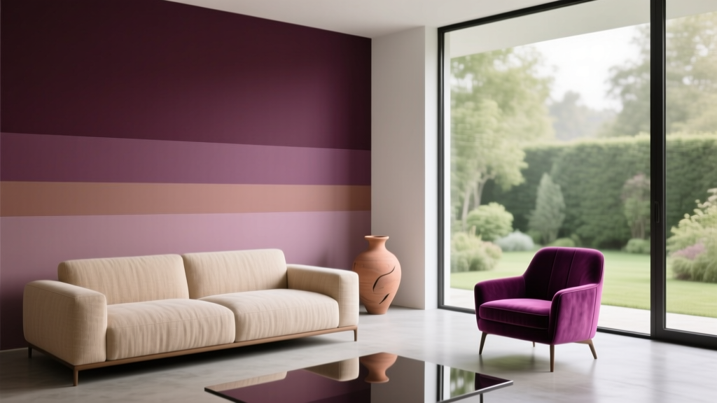
Best Plum Paint Colors for Drama - The Decor Mag
Plum is the kind of color that changes a room’s posture. It can make a hallway feel gallery-worthy, give a dining room instant intimacy, or turn a basic powder bath into a jewel box. Homeowners often crave “drama,” but not the kind that looks trendy for six months and then feels heavy or dated. Plum paint colors deliver that sweet spot: bold, elegant, and surprisingly flexible when you understand undertones, lighting, and proportion.
What makes plum especially powerful in interior color design is its balance of warmth and depth. Sitting between purple and burgundy, plum carries a sense of luxury and creativity (purple’s classic color psychology) while remaining grounded (thanks to red and brown notes). Used thoughtfully, it can read moody and modern, traditional and rich, or softly romantic—depending on the exact shade and what you pair with it.
This guide breaks down the best plum paint colors for drama, how to choose the right one for your space, and how to build paint color schemes around it—without falling into common mistakes that can make purple tones look muddy, too sweet, or overly dark.
Why Plum Works: Color Psychology and Design Principles
Plum isn’t just “purple.” It’s purple with sophistication—often created by adding red, brown, or black, which gives it gravitas. That depth is why plum works so well for dramatic interior color design.
Color psychology: the feeling plum creates
- Luxury and artistry: Purple has long been tied to creativity and richness; plum leans more refined than playful.
- Comfort and intimacy: Deep plum absorbs light and reduces visual noise—great for dining rooms, bedrooms, and libraries.
- Confidence: Plum reads intentional. It’s a statement without the harshness that some blacks or bright reds can bring.
Design principle: contrast is your best friend
Plum looks best when it has contrast around it. That contrast can be:
- Value contrast: crisp white trim, pale stone floors, or light upholstery.
- Temperature contrast: cool plum with warm brass; warm plum with cool marble.
- Texture contrast: matte plum walls with glossy tile, lacquered furniture, or velvet drapery.
How to Choose a Plum Paint Color (Undertones, Light, Finish)
Before you commit to a specific paint color name, decide what you want plum to do in your room: feel warm and cocooning, cool and editorial, or balanced and classic.
Understand undertones: warm plum vs. cool plum
- Warm plums have red, wine, or brown undertones. They flatter warm woods, tan leather, and creamy whites.
- Cool plums lean toward violet with a hint of blue or charcoal. They pair well with crisp whites, chrome, and cool gray stones.
Consider natural and artificial lighting
- North-facing rooms: Cooler, dimmer light can make plum feel heavier. Choose a slightly warmer plum or lighten the sheen/trim.
- South-facing rooms: Strong warm light can pull red from plum. If you want a truer purple, choose a cooler plum.
- Evening lighting: Warm bulbs (2700K) amplify red undertones; neutral bulbs (3000K) keep plums more balanced.
Finish matters for drama
- Matte: velvety, sophisticated, hides wall flaws; best for bedrooms and living rooms.
- Eggshell: slightly more durable; a safe choice for hallways and family spaces.
- Satin: more sheen, more light bounce; ideal for trim or if you want plum to feel less “absorbing.”
- High-gloss (strategic): use on doors, built-ins, or a lacquer-look ceiling for high drama.
Best Plum Paint Colors for Drama (Designer-Approved Picks)
These plum paint colors are widely loved because they read rich rather than cartoonish, and they behave well in real homes. Always sample on multiple walls and view morning-to-night.
1) Farrow & Ball Brinjal
A saturated aubergine-plum that feels plush and historic without looking old-fashioned. Brinjal brings instant mood to libraries, dining rooms, and living rooms with traditional millwork.
- Best for: dining rooms, studies, formal living rooms
- Pairs well with: muted pinks, tobacco leather, antique brass, creamy whites
- Try this scheme: Brinjal walls + warm white trim + walnut furniture + brass picture lights
2) Farrow & Ball Pelt
Pelt is a deeper, more shadowy purple with a refined intensity. If you want drama that feels modern and enveloping, this is a strong contender—especially for a feature wall or built-ins.
- Best for: accent walls, built-ins, media rooms
- Pairs well with: soft black, warm gray, natural oak, ivory textiles
3) Benjamin Moore Black Raspberry (2072-20)
Black Raspberry lands in the plum-meets-berry category—dark, romantic, and glamorous. It reads especially sophisticated when surrounded by clean lines and simple styling.
- Best for: bedrooms, powder rooms, statement ceilings
- Pairs well with: crisp white, blush, smoked glass, brushed brass
- Pro tip: Use it on a ceiling with matching walls for a cocoon effect; keep trim lighter to frame it.
4) Benjamin Moore New London Burgundy (HC-61)
If you want plum drama without leaning too purple, New London Burgundy is a warmer, wine-plum that plays beautifully with historic homes and classic furnishings.
- Best for: dining rooms, entryways, paneled rooms
- Pairs well with: creamy whites, warm greens, aged bronze, Persian rugs
5) Sherwin-Williams Exclusive Plum (SW 6263)
Exclusive Plum is a straightforward, rich plum that reads confident and design-forward. It can lean slightly warmer depending on lighting, making it a great “drama” color that still feels welcoming.
- Best for: accent walls, home offices, cabinetry
- Pairs well with: warm white trim, natural linen, medium-tone woods, matte black hardware
6) Sherwin-Williams Plum Brown (SW 6272)
Plum Brown is a moody, grounded option with a brown backbone. It’s ideal if you love the idea of plum but worry about a space feeling too purple.
- Best for: living rooms, dens, built-ins, exteriors (in the right context)
- Pairs well with: camel leather, warm taupe, olive green, vintage brass
7) Behr Dark Plum PPU16-20
Behr’s Dark Plum offers deep saturation at a more accessible price point. It’s great when you want a high-impact paint color for drama—especially in smaller rooms where you can lean into the boldness.
- Best for: powder rooms, laundry rooms, accent niches
- Pairs well with: white tile, gold accents, pale wood, greenery
Real Room Ideas: Where Plum Paint Looks Best
Dining room drama: plum walls + warm metals
A dining room is one of the easiest places to use a dark plum paint color because evening lighting does half the styling. Picture Brinjal or New London Burgundy on the walls with:
- Brass or antique gold chandelier
- White or ivory ceiling to lift the room
- Artwork with black frames for crisp contrast
- Rust, blush, or camel upholstery for warmth
Powder room jewel box: go darker than you think
Small spaces can handle heavy color because there’s less visual real estate to overwhelm you. A deep shade like Black Raspberry or Dark Plum feels intentional and elevated when paired with:
- High-contrast white pedestal sink or vanity top
- Brass mirror and sconces
- Bold wallpaper on the ceiling or one wall
- Moody artwork and darker towels for a layered look
Bedroom cocoon: plum on the headboard wall (or all four)
For a restful but dramatic bedroom, choose a plum with a soft, velvety finish. Exclusive Plum works well on a headboard wall with warm neutrals elsewhere. For full cocoon mode, bring plum to all walls and balance it with:
- Cream bedding and textured throws
- Light wood nightstands
- Soft, warm lighting (table lamps over bright overheads)
Living room sophistication: plum built-ins instead of full walls
If you’re wary of dark walls, paint the architecture. Plum Brown or Pelt on built-in bookcases gives you drama without shrinking the entire room. Style with:
- Books with lighter spines and neutral ceramics
- Brass library lights
- Warm white walls to keep the space airy
Front door statement: plum as curb appeal color
Plum can be stunning outdoors when the surrounding materials support it. Consider Plum Brown or a similar grounded plum for a front door with:
- Light stone or white-painted brick
- Black or oil-rubbed bronze hardware
- Warm outdoor lighting to keep it rich at night
Winning Color Combinations: Plum Color Schemes That Feel Designer
Plum is easiest to live with when your supporting cast is disciplined. Choose one of these paint color schemes as a starting point.
Plum + warm white + brass
- Look: timeless, elegant, slightly traditional
- Where: dining rooms, hallways, bedrooms
Plum + blush + walnut
- Look: romantic, layered, fashion-forward
- Where: bedrooms, dressing rooms, reading nooks
Plum + olive green + aged bronze
- Look: moody, earthy, sophisticated
- Where: libraries, living rooms, offices
Plum + charcoal + crisp white
- Look: modern, graphic, editorial
- Where: contemporary homes, bathrooms, kitchens (as an accent)
Plum + navy + creamy neutrals
- Look: deep and layered, upscale “boutique hotel” energy
- Where: bedrooms, formal living spaces
Application Guidance: How to Use Plum Without Overwhelming the Room
Plum paint colors deliver drama quickly. The key is controlling how much you use and where.
Best ways to introduce plum
- Accent wall: behind the bed, in a dining room, or framing a fireplace.
- Trim or doors: a plum-painted interior door feels custom and architectural.
- Built-ins: bookcases and cabinets in plum create depth and showcase styling.
- Ceiling: a plum ceiling adds intimacy—especially in rooms with crown molding.
- Color drenching: walls, trim, and even ceiling in one plum shade for maximum drama (best in smaller rooms or rooms with great lighting).
Practical tips for sampling and success
- Sample large: paint at least 2' x 2' swatches on multiple walls.
- Check at night: plum shifts dramatically under warm bulbs.
- Match undertones: if your flooring is orange-toned oak, choose a warmer plum; if it’s cool gray tile, choose a cooler plum.
- Keep textiles lighter: creamy rugs and curtains help prevent a room from feeling cave-like.
Common Plum Paint Mistakes (and How to Avoid Them)
- Mistake: Choosing plum without considering undertones.
Fix: Compare the plum sample against a true gray and a warm white. If it suddenly looks brown or neon, it’s fighting your room’s undertones. - Mistake: Using cool white lighting with warm plums (or vice versa).
Fix: Aim for consistent bulb temperature (2700K–3000K). Test at the times you actually use the room. - Mistake: Pairing plum with too many other saturated colors.
Fix: Let plum be the star. Keep the rest of the palette in quiet neutrals or one supporting jewel tone (like olive or navy). - Mistake: Forgetting contrast on trim and ceilings.
Fix: Use warm white trim for classic contrast, or commit to color drenching intentionally with clean styling. - Mistake: Skipping sheen strategy.
Fix: For dark plum walls, matte/eggshell often looks richest. Add sheen with metal finishes, mirrors, and glossy accessories.
FAQ: Plum Paint Colors for Dramatic Interiors
Is plum a good color for a living room?
Yes—especially if you want a cozy, elevated feel. Use plum on an accent wall or built-ins if you’re nervous, and balance with warm white walls, light upholstery, and good lighting to keep the space from feeling too dark.
What trim color goes best with plum walls?
Warm whites and creamy off-whites are the most forgiving with plum paint colors, especially warmer plums. Crisp bright white can look sharp with cooler plums, but it can also feel stark if your plum pulls red.
How do I keep plum paint from looking too purple or too bright?
Choose a plum with brown or black undertones (such as Sherwin-Williams Plum Brown) and test it in your lighting. Brightness often comes from high-chroma purples—sampling next to a neutral will reveal if it’s too vivid.
Do plum paint colors make rooms look smaller?
Darker colors can visually recede or envelop depending on context. In many rooms, plum creates depth rather than “shrinking” the space—especially when you add contrast through trim, art, rugs, and lighter furniture.
What colors pair with plum for a modern look?
For modern color schemes, pair plum with charcoal, crisp white, matte black, and cool metals (chrome or polished nickel). Keep lines simple and let texture—like velvet, boucle, or stone—add richness.
Can I use plum in an open-concept home?
Yes, but use it strategically: choose one anchor zone (like the dining area wall or built-in cabinetry) and repeat a smaller plum element elsewhere (pillows, art, or a rug detail) to create continuity without overwhelming the flow.
Your Next Steps: Bring Plum Drama Home
Start by choosing the mood you want—warm and romantic, cool and editorial, or grounded and earthy—then test two to three plum paint colors in large samples. Build a simple supporting palette (warm white + wood + one metal finish is a reliable formula), and decide whether plum belongs on walls, built-ins, a ceiling, or a single statement door.
For more paint color ideas, undertone guides, and room-by-room color schemes, explore the latest color guides on thedecormag.com.
More Articles
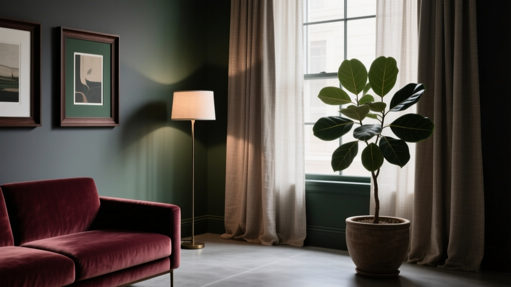 How to Create a Moody Color Palette - The Decor Mag
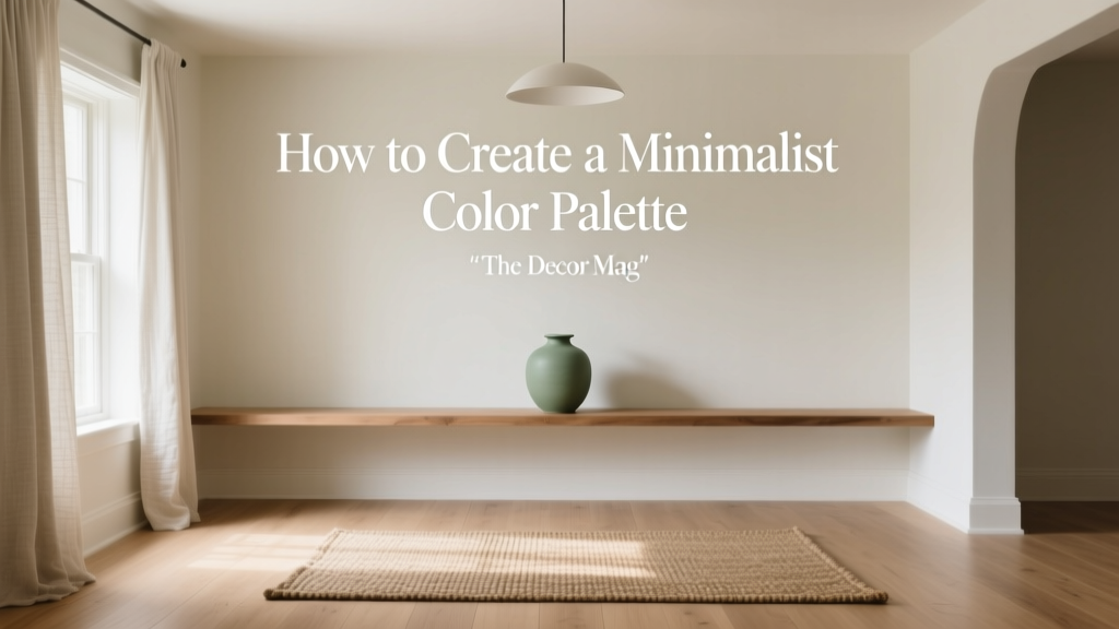 How to Create a Minimalist Color Palette - The Decor Mag
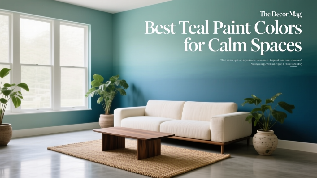 Best Teal Paint Colors for Calm Spaces - The Decor Mag
 Best Moss Green Paint Colors - The Decor Mag
 Cheap vs Premium Placement: What $0.12 CPM Really Costs Your Brand
 Studio Color Palettes That Expand Small Rooms
 Best Tomato Red Paint Colors - The Decor Mag
 Best Kitchen Design for Studio Apartments: Smart, Stylish & Space-Saving Solutions
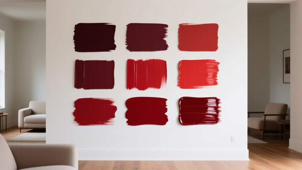 Best Crimson Paint Colors - The Decor Mag
 The Ultimate Reading Guide: Science-Backed Strategies for Faster Comprehension, Retention, and Lifelong Engagement