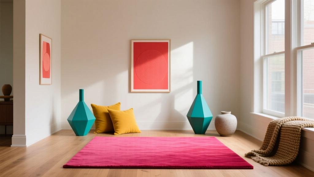
How to Create an Energizing Color Palette - The Decor Mag
An energizing color palette can change how your home feels within minutes—making mornings easier, social spaces more inviting, and hardworking rooms like kitchens and home offices feel sharper and more focused. Color isn’t just decoration; it’s a design tool that influences mood, perceived temperature, and even how large or bright a room appears. When a palette is well-built, it creates a sense of momentum: your eye moves comfortably from one surface to the next, and the room feels intentionally alive.
Many homeowners want “more color,” but end up with a space that feels chaotic, juvenile, or oddly flat. The difference comes down to color psychology, balance, and a clear plan. An energizing interior color design doesn’t mean painting everything neon—it means choosing confident hues, pairing them with the right neutrals, and using contrast strategically so the whole scheme feels cohesive and livable.
This guide breaks down how to build an energizing color scheme step by step, with paint color recommendations, room-by-room scenarios, and practical tips you can use right away.
What Makes a Color Palette Feel Energizing?
Energizing palettes rely on visual stimulation. In color theory terms, that usually means:
- Warm undertones (reds, oranges, warm yellows) or high-clarity cools (teals, saturated blues, yellow-greens)
- Higher chroma (cleaner, more vivid color) rather than dusty, gray-muted shades
- Contrast in value (light vs. dark) and sometimes temperature (warm vs. cool)
- Rhythm—repeating key colors across the room so the energy feels designed, not random
Color Psychology in Everyday Rooms
- Red and orange: Stimulating, social, appetite-friendly—best in dining areas, kitchens, entryways, and accent moments.
- Yellow: Optimism and brightness—great for low-light rooms, hallways, breakfast nooks.
- Green: Fresh, active, and restorative—ideal for home offices, kitchens, and workout spaces.
- Blue (especially teal or cobalt): Focus with a crisp edge—excellent for offices, bathrooms, and modern living rooms.
- White and light neutrals: Amplify light and make bolder colors feel intentional rather than overwhelming.
Start With a Simple Palette Framework (So It Stays Cohesive)
A reliable formula for an energizing interior color palette is:
- One main neutral (walls or large surfaces)
- One energizing hero color (accent wall, cabinetry, rug, or statement furniture)
- One supporting color (secondary accent that complements the hero)
- One grounding dark (black, charcoal, deep navy, espresso) for contrast and sophistication
- Metal + wood tone choices to control warmth (brass and warm oak = warmer energy; chrome and walnut = sharper energy)
The 60-30-10 Rule (With a More Realistic Twist)
The classic 60-30-10 guideline works well, but in real homes it’s more flexible if you think in surfaces:
- 60%: Walls + large upholstery (neutral base)
- 30%: Rugs, drapery, major furniture, cabinetry (supporting color or deeper neutral)
- 10%: Art, pillows, lampshades, accessories (hero color and high-contrast pops)
Choose Your Energizing “Hero” Color
Your hero color should be the one you want to feel immediately. Pick it based on the room’s function and light exposure.
High-Energy Reds and Red-Adjacent Corals
Use reds and corals when you want a room to feel social, bold, and warm.
- Benjamin Moore Caliente AF-290: A confident, spicy red that’s modern rather than traditional.
- Sherwin-Williams Coral Reef SW 6606: A lively coral that brightens without reading neon.
- Farrow & Ball Red Earth No. 64: A more grounded, earthy red for sophisticated warmth.
Best uses: dining room accent wall, powder room vanity, front door, breakfast nook banquette.
Optimistic Yellows (Without the “Highlighter” Effect)
Yellows energize by mimicking daylight. Look for creamy or slightly golden options for a more grown-up result.
- Farrow & Ball Babouche No. 223: A bold, sunny yellow that works beautifully with crisp white trim.
- Benjamin Moore Hawthorne Yellow HC-4: A classic golden yellow with depth.
- Sherwin-Williams Friendly Yellow SW 6680: Cheerful and clear, great in smaller doses.
Best uses: kitchens, hallways, laundry rooms, north-facing rooms that feel cool.
Greens That Feel Fresh, Not Sleepy
Green is a powerhouse for energizing color schemes because it bridges warm and cool. Choose bright, clean greens for pep.
- Benjamin Moore High Park 467: A crisp green that reads fresh and current.
- Sherwin-Williams Direct Green SW 6924: Punchy and athletic—great for gyms and playful spaces.
- Farrow & Ball Breakfast Room Green No. 81: Sunny green-yellow energy that pairs well with warm whites.
Best uses: home office built-ins, kitchen island, mudroom lockers, playroom feature.
Teals and Blues That Add Spark
Blue can be calming, but saturated blues and teals feel crisp and energized—especially with bright white and warm metals.
- Benjamin Moore Aegean Teal 2136-40: A balanced teal that feels lively yet sophisticated.
- Sherwin-Williams Oceanside SW 6496: Deep teal with drama—excellent for cabinets or an accent wall.
- Farrow & Ball Hague Blue No. 30: Inky and bold; energizing when contrasted with warm whites and brass.
Best uses: bathrooms, offices, kitchen cabinetry, living room built-ins.
Build Color Combinations That Feel Intentional
The fastest way to create an energizing color palette is to pair your hero color with a flattering neutral and one crisp accent. These combinations are designed to work in real homes with typical lighting.
Color Scheme Recipe Ideas (With Paint Names)
-
Sunlit Kitchen:
- Walls: Benjamin Moore Simply White OC-117
- Cabinet/Island: Sherwin-Williams Oceanside SW 6496
- Accent: Farrow & Ball Babouche No. 223 (bar stools, art, or a small pantry door)
- Grounding: matte black hardware or charcoal pendant lights
-
High-Energy Dining Room:
- Accent wall: Benjamin Moore Caliente AF-290
- Other walls: Benjamin Moore White Dove OC-17
- Trim: same as walls in a higher sheen for a modern look
- Grounding: walnut table + black iron chandelier
-
Motivating Home Office:
- Built-ins: Farrow & Ball Breakfast Room Green No. 81
- Walls: Sherwin-Williams Alabaster SW 7008
- Accent: saturated blue artwork (or a cobalt desk lamp)
- Grounding: deep charcoal rug
-
Bright Entryway Boost:
- Walls: Benjamin Moore Hawthorne Yellow HC-4
- Trim: Benjamin Moore Chantilly Lace OC-65
- Front door: Sherwin-Williams Coral Reef SW 6606 or a glossy black
- Grounding: black-and-white patterned runner
Real Room Application Scenarios
1) Energizing a Living Room Without Overwhelming It
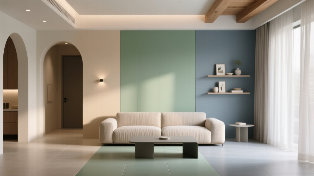
Living rooms often need to balance energy with comfort. The trick is to keep large surfaces calmer and concentrate saturated color in repeatable accents.
- Walls: warm white or light greige (e.g., Sherwin-Williams Alabaster SW 7008)
- Hero color: teal or coral in a rug pattern or large artwork
- Repeat the hero color 3 times: pillow, art, and a ceramic lamp base
- Add a grounding contrast: black coffee table, charcoal drapes, or a deep navy ottoman
Pro tip: If your room has lots of beige upholstery, energize it with a high-contrast combo like teal + brass + crisp white. Beige becomes warmer and more intentional when paired with clean, saturated accents.
2) A Kitchen Color Scheme That Feels Bright and Modern
Kitchens benefit from energizing colors because they’re activity hubs. If you’re nervous about bold walls, put the color on lower cabinets or the island.
- Island in a saturated color: Benjamin Moore Aegean Teal 2136-40 or Sherwin-Williams Oceanside SW 6496
- Perimeter cabinets: warm white (Benjamin Moore Simply White OC-117)
- Backsplash: white tile with a warm grout for softness
- Accent color: yellow (small doses) through textiles or art
Pro tip: Under-cabinet lighting changes color perception dramatically. Test paint samples with lights on at night, not just in daylight.
3) A Bathroom That Feels Awake, Not Sterile
Bathrooms are perfect for bold color because they’re smaller and often separated from open-plan sightlines.
- Try a deep, energizing wall color: Farrow & Ball Hague Blue No. 30
- Keep trim and ceiling crisp: Benjamin Moore Chantilly Lace OC-65
- Add warmth: brass mirror, warm wood vanity, or woven storage
- Balance with light: bright vanity lighting (2700K–3000K) to keep blues from going gloomy
4) A Bedroom With Morning Energy (That Still Lets You Sleep)
For bedrooms, “energizing” works best as a fresh, optimistic backdrop rather than intense saturation everywhere.
- Choose an uplifting but softer color: a bright green on a headboard wall or in bedding
- Keep most surfaces neutral: warm whites, pale sand, light oak
- Use energizing accents: terracotta pillows, coral throw, or a sunny print
How to Test Paint Colors So They Stay Energizing
A color can look energetic on a paint chip and fall flat on your wall. Testing is where good color schemes become great.
- Sample large: Paint a 2' x 2' area (or use peel-and-stick samples) on multiple walls.
- Check undertones: Compare your sample to a true white sheet of paper. You’ll see if it leans green, pink, gray, or yellow.
- Observe at 3 times: morning, afternoon, and after dark with lamps on.
- Match to fixed finishes: countertop, flooring, tile, and large upholstery should guide your palette.
Common Color Mistakes That Kill Energy (and How to Fix Them)
-
Mistake: Choosing colors that are too muted or gray-heavy.
Fix: Look for clearer hues or reduce the number of competing neutrals. Swap a cool gray wall for a warm white to let accents pop. -
Mistake: Using too many saturated colors at once.
Fix: Limit to one hero color and one supporting color. Let neutrals and natural materials do the rest. -
Mistake: Ignoring lighting temperature.
Fix: Warm LEDs (2700K–3000K) enhance reds, corals, and warm whites; cooler LEDs can make warm colors look harsh and blues look icy. -
Mistake: No grounding element.
Fix: Add black, charcoal, deep navy, or dark wood in small, repeated touches—hardware, frames, legs, or a statement light fixture. -
Mistake: A “random accent” that doesn’t repeat.
Fix: Repeat your hero color at least three times around the room (art, textile, accessory) for rhythm and cohesion.
FAQ: Energizing Paint Colors and Color Schemes
What are the best energizing paint colors for a low-light room?
Warm, light-reflective shades work best: creamy whites, golden yellows, and warm greens. Try Benjamin Moore Hawthorne Yellow HC-4 or a warm white like Simply White OC-117 paired with bright accents.
How do I make bold colors feel sophisticated, not childish?
Balance saturated hues with a refined neutral and a grounding dark. Add texture (linen, wood, stone) and use black or deep navy in small doses. A color like Farrow & Ball Hague Blue No. 30 feels elevated when paired with crisp trim and warm brass.
Can I create an energizing palette with neutrals only?
Yes—use high contrast and warmer undertones. Combine a clean warm white with a deep charcoal, then add energy through pattern and texture (striped rugs, graphic art, mixed metals). Even neutral-forward rooms benefit from one small dose of color.
What’s the easiest way to pick accent colors that match my wall color?
Use the color wheel: pair your hero color with a neighboring shade (analogous scheme) for harmony, or its opposite (complementary scheme) for punch. Example: teal pairs beautifully with coral for a lively complementary contrast.
Should energizing colors go on walls or in decor?
If you want a noticeable mood shift, put the hero color on a major surface (accent wall, cabinets, or built-ins). If you prefer flexibility, keep walls neutral and bring energy through rugs, pillows, and art—then repeat that color around the room.
How many paint colors should I use in an open floor plan?
Keep it tight: one consistent neutral for most walls, then 1–2 energizing accents that repeat across zones. This creates flow while still giving each area a distinct personality.
Actionable Next Steps for Your Energizing Color Palette
- Pick a mood: social warmth (coral/red), optimistic brightness (yellow), fresh focus (green), crisp energy (teal/blue).
- Choose one hero paint color and pair it with one dependable neutral (e.g., White Dove OC-17 or Alabaster SW 7008).
- Add a grounding dark through hardware, lighting, frames, or furniture legs.
- Test samples in your actual lighting and alongside fixed finishes.
- Repeat the hero color at least three times to create a cohesive color scheme.
Your home can absolutely feel more vibrant without feeling visually noisy—when color choices follow a clear plan rooted in color psychology, contrast, and balance. For more paint color ideas, color schemes, and room-by-room guidance, explore the color guides at thedecormag.com.
More Articles
 How To Organize Island: A Practical, Space-Smart Guide for Kitchens of All Sizes
 Best Forest Green Paint Colors - The Decor Mag
 How to Use Color to Define Spaces - The Decor Mag
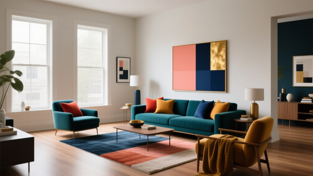 Complementary Color Pairing Ideas - The Decor Mag
 Best Midnight Blue Paint Colors - The Decor Mag
 How to Use Analogous Colors in Decor - The Decor Mag
 Best Living Rooms for STEP: Design, Layout, and Accessibility Standards for Seniors and Mobility Support
 How to Create a Grounded Color Palette - The Decor Mag
 How to Create a Transitional Color Palette - The Decor Mag
 Reading for Options: How Visual Literacy Drives Strategic Decision-Making in Design and Branding