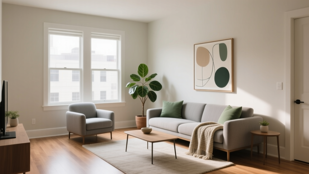
How to Choose Colors for a Rental Property - The Decor Mag
Choosing paint colors for a rental property sits at the crossroads of beauty and practicality. A well-chosen color scheme can make a home feel brighter, cleaner, and more updated—often without changing a single fixture. It also influences how quickly a unit rents, how well it photographs for listings, and how satisfied tenants feel living there. Color is one of the few upgrades that affects mood, perceived space, and value all at once.
Rentals come with special constraints: higher wear-and-tear, varied tenant tastes, and the need for easy touch-ups between leases. The goal isn’t to make the space bland—it’s to create a flexible, broadly appealing backdrop that feels intentional and current. With a smart plan grounded in color psychology and design principles, you can pick rental-friendly paint colors that look elevated, coordinate with common finishes, and stay timeless for years.
Start With the Rental Reality: Durability, Turnover, and Versatility
Before you fall in love with a bold emerald dining room, set criteria that match rental life. The best rental paint colors are:
- Easy to maintain: Scuffs and smudges happen. Mid-tone neutrals and washable finishes hide marks better than stark white.
- Simple to touch up: Consistency matters. Sticking to one wall color throughout reduces leftover paint stock and future matching headaches.
- Compatible with “builder basics”: Rentals often have warm or cool neutrals in flooring, counters, tile, and appliances. Your color scheme should harmonize with what’s already there.
- Good in varied light: A rental may sit vacant during showings at different times of day. Choose colors with stable undertones that won’t swing wildly from morning to evening.
Choose the Right Sheen for Each Surface
Sheen selection is a quiet workhorse of interior color design. It affects durability, cleanability, and how a color reads on the wall.
- Walls: Eggshell or satin for most rooms. These finishes balance washability and a soft look.
- Trim and doors: Semi-gloss for durability and easy cleaning. It also creates crisp contrast.
- Ceilings: Flat or matte ceiling paint to minimize glare and hide imperfections.
Tip: If walls are heavily textured or imperfect, a matte washable finish (offered by many brands) can reduce the appearance of flaws while still cleaning well.
Decide on a Color Strategy: One Whole-Home Neutral + Targeted Accents
The most successful rental color schemes rely on a consistent core palette. A single “main wall color” across living areas and hallways creates flow and makes the home feel larger. Then you can add limited variation in bedrooms or bathrooms if desired.
A Simple Whole-Home Formula
- Pick one main wall color (neutral, light to mid-light).
- Pick one trim color (usually a clean white).
- Choose 1–2 accent colors reserved for front door, built-ins, or a single feature wall only if the market supports it.
This approach supports faster turnovers and fewer “paint patchwork” moments between tenants.
Understand Undertones: The Difference Between “Nice Neutral” and “Off”
Two beige paints can look completely different depending on undertone—pink, yellow, green, or gray. Undertone mismatches are a top reason rental repaint jobs feel disappointing.
Use Existing Fixed Finishes as Your Guide
Stand in the space and identify what cannot easily change:
- Flooring (golden oak, gray LVP, warm walnut, beige carpet)
- Countertops (speckled granite, quartz with veining, laminate)
- Tile (cool white, creamy ivory, stone beige)
- Metal finishes (brushed nickel, black, brass)
Design principle: Create harmony by matching temperature. Warm finishes generally pair best with warm neutrals; cool finishes generally pair best with cool neutrals. If the space has mixed finishes, choose a balanced “greige” that bridges both.
Rental-Friendly Paint Color Recommendations (With Brand References)
Below are proven, widely appealing paint colors that work across many rental property styles. Always sample first—lighting and surrounding materials will change how the color reads.
Best Whole-Home Neutral Wall Colors
- Sherwin-Williams Agreeable Gray (SW 7029): A classic greige that plays well with both warm and cool elements. Great for open plans and hallways.
- Benjamin Moore Classic Gray (OC-23): A soft, light greige that reads airy without feeling stark. Excellent for smaller units.
- Benjamin Moore Edgecomb Gray (HC-173): Warm, inviting greige that flatters honey oak floors and beige tile.
- Sherwin-Williams Accessible Beige (SW 7036): A modern beige with a grounded feel—ideal for properties with warm wood tones.
- Farrow & Ball Skimming Stone No. 241: Elevated warm neutral for higher-end rentals; pairs beautifully with natural textures and linen tones.
Clean, Flexible Whites for Walls or Trim
- Benjamin Moore Chantilly Lace (OC-65): Crisp and clean; best in rentals with cool countertops, white tile, and modern finishes.
- Sherwin-Williams Pure White (SW 7005): Versatile “not-too-warm, not-too-cool” trim white that works in many settings.
- Benjamin Moore White Dove (OC-17): A soft, warm white that feels welcoming—excellent for trim, cabinets, or even walls in bright spaces.
Practical tip: For rentals, a slightly softer white on walls (like White Dove) often looks cleaner longer than a very bright white, which can highlight scuffs and shadows.
Accent Colors That Still Rent Well
Accent colors are best used sparingly in rentals: front doors, a powder room, a bedroom niche, or built-in shelving. Choose hues that feel calm and contemporary.
- Sherwin-Williams Sea Salt (SW 6204): A soft blue-green that reads spa-like in bathrooms and bedrooms.
- Benjamin Moore Hale Navy (HC-154): A deep navy that looks upscale on a front door or kitchen island. Strong contrast without feeling trendy.
- Sherwin-Williams Evergreen Fog (SW 9130): Muted green-gray; soothing and modern. Great for a single bedroom wall or office nook.
- Benjamin Moore Kendall Charcoal (HC-166): A warm charcoal that adds sophistication for feature areas without the harshness of pure black.
Real Room Examples and Application Scenarios
Scenario 1: Small Apartment Living Room With Low Natural Light
Goal: Make the space feel larger and brighter while staying renter-friendly.
- Walls: Benjamin Moore Classic Gray (OC-23) in eggshell
- Trim: Sherwin-Williams Pure White (SW 7005) semi-gloss
- Ceiling: Flat white ceiling paint
Why it works: Classic Gray reflects light and keeps undertones calm. Crisp trim adds definition, helping the room feel more finished. In listing photos, this palette reads clean and airy, which supports perceived square footage.
Scenario 2: Open-Plan Kitchen + Living Area With Mixed Warm/Cool Finishes
Common rental challenge: Gray flooring, warm wood cabinets, and a beige granite top in one space.
- Walls: Sherwin-Williams Agreeable Gray (SW 7029)
- Trim: Benjamin Moore White Dove (OC-17)
- Optional accent: Benjamin Moore Hale Navy (HC-154) on a pantry door or kitchen island (if applicable)
Design principle: A bridging greige reduces visual conflict between competing undertones. White Dove softens the contrast and feels more welcoming than a bluish bright white.
Scenario 3: Rental Bathroom That Feels Dated
Goal: Refresh without renovation.
- Walls: Sherwin-Williams Sea Salt (SW 6204) in satin
- Trim/vanity (if painting): Sherwin-Williams Pure White (SW 7005) semi-gloss
- Alternative for ultra-neutral bathrooms: Benjamin Moore Chantilly Lace (OC-65) on walls, paired with black hardware for a modern look
Color psychology: Soft blue-green tones signal cleanliness and calm—ideal for bathrooms. Tenants often perceive these hues as “spa-like,” which can make a basic bath feel more premium.
Scenario 4: Bedrooms That Appeal to the Most Tenants
Recommendation: Keep bedrooms quieter than common areas. A gentle neutral encourages rest and makes furniture placement easy.
- Option A (warm): Benjamin Moore Edgecomb Gray (HC-173)
- Option B (cool-neutral): Benjamin Moore Classic Gray (OC-23)
- Option C (subtle color): Sherwin-Williams Evergreen Fog (SW 9130) on one wall only, with neutral remaining walls
Color Psychology for Rentals: What Helps People Say “Yes”
Renters decide quickly, often during a short walk-through. Color can reduce friction by making a space feel easy to move into.
- Warm neutrals (beige, warm greige): welcoming, cozy, approachable—great for family rentals and traditional homes.
- Cool neutrals (soft gray, crisp white): clean, modern, minimal—great for city apartments and contemporary units.
- Muted greens and blue-greens: calm, restorative—ideal for bedrooms and bathrooms.
- Deep navy/charcoal accents: stable, sophisticated—best used on doors, cabinetry, or small features.
For broad appeal, aim for low to medium saturation (muted colors). Highly saturated hues can feel personal, which can unintentionally make a rental feel less flexible.
Smart Color Combinations (Ready-to-Use Palettes)
These coordinated paint color schemes create a cohesive rental look without feeling generic.
- Modern Greige + Soft White: Sherwin-Williams Agreeable Gray (SW 7029) walls + Sherwin-Williams Pure White (SW 7005) trim
- Warm and Inviting: Benjamin Moore Edgecomb Gray (HC-173) walls + Benjamin Moore White Dove (OC-17) trim
- Clean Contemporary: Benjamin Moore Chantilly Lace (OC-65) walls + Benjamin Moore Kendall Charcoal (HC-166) accents (door/built-ins)
- Spa-Inspired Bath: Sherwin-Williams Sea Salt (SW 6204) walls + bright white trim + matte black accessories
Common Color Mistakes to Avoid in a Rental Property
- Choosing a white that’s too stark for the finishes: A cool, bright white can clash with warm tile or oak floors, making the whole room feel “off.”
- Overcommitting to trends: Very cool grays, intense jewel tones, or bold color-blocking can date quickly and limit tenant appeal.
- Using too many different wall colors: A rainbow of rooms increases labor, paint storage, and touch-up complexity at turnover.
- Ignoring sheen and washability: Flat paint in high-traffic areas scuffs easily and can look worn fast.
- Skipping sample tests: Undertones can flip dramatically under warm bulbs, north light, or dark flooring.
Quick Test Before You Commit
- Paint two 12"x12" samples (or use peel-and-stick samples) on two different walls.
- View them in morning, afternoon, and evening light.
- Check the color next to flooring, counters, and inside closets (closet lighting reveals undertones).
Practical Tips for Landlords and Homeowners Painting Rentals
- Standardize paint across properties: If you own multiple rentals, use the same main wall color and trim color everywhere to simplify maintenance.
- Keep a labeled touch-up kit: Store a small jar of each paint with room name, brand, sheen, and date.
- Use quality paint where it matters: Higher-quality paints can be more washable and cover better, reducing labor over time.
- Coordinate with lighting: Warm bulbs (2700K–3000K) complement warm neutrals; cooler bulbs (3500K+) can make warm paints look dull or yellow.
- Photograph after paint cures: Fresh paint can look patchy before it fully dries; final photos will look more even and true.
FAQ: Choosing Paint Colors for a Rental Property
What are the best neutral paint colors for rental properties?
Versatile greiges and soft neutrals tend to rent well because they coordinate with many furnishings. Popular choices include Sherwin-Williams Agreeable Gray (SW 7029), Benjamin Moore Classic Gray (OC-23), and Benjamin Moore Edgecomb Gray (HC-173).
Should I paint a rental all one color?
Often, yes—especially for open-plan layouts and high-turnover rentals. A single main wall color creates flow, makes touch-ups easier, and reduces repaint costs. You can still add personality with one controlled accent (like a front door color) if desired.
Is white paint a good idea for rentals?
White can work beautifully, but choose the right white for the finishes. Sherwin-Williams Pure White (SW 7005) and Benjamin Moore White Dove (OC-17) are flexible options. Ultra-bright whites may show scuffs and can clash with warm materials.
What sheen is best for rental walls?
Eggshell or satin is the sweet spot for most rental walls because it’s more washable than flat while still looking soft. Use semi-gloss for trim and doors for durability.
Can I use dark colors in a rental property?
Dark colors are best as accents—front doors, built-ins, or a small feature area—because they show dust and touch-up marks more easily. Deep shades like Benjamin Moore Hale Navy (HC-154) or Kendall Charcoal (HC-166) can add a high-end feel when used strategically.
How do I choose colors that photograph well for listings?
Stick to light to mid-light neutrals with stable undertones, and keep the palette consistent. Balanced greiges and soft whites reflect light and reduce harsh shadows, helping rooms look larger and cleaner in photos.
Next Steps: Build Your Rental Color Plan
If you want a rental property that feels polished, photographs beautifully, and stays easy to maintain, take these steps:
- Audit your fixed finishes (floors, counters, tile) and decide if the overall feel is warm, cool, or mixed.
- Select one main neutral for most walls—start with a proven greige or soft neutral.
- Pick one trim white that works with your undertones and lighting.
- Add one optional accent in a controlled spot (front door or powder room) for a memorable, modern touch.
- Sample and confirm in multiple lighting conditions before painting the entire unit.
For more paint color ideas, color psychology breakdowns, and room-by-room color schemes, explore our latest color guides on thedecormag.com.
More Articles
 Best Midnight Blue Paint Colors - The Decor Mag
 How to Choose Bathroom Paint Colors - The Decor Mag
 How to Use Color to Create Balance - The Decor Mag
 How to Use Color to Change Room Perception - The Decor Mag
 How to Choose Colors for a Laundry Room - The Decor Mag
 How to Choose Colors for a Conservatory - The Decor Mag
 Best Taupe Paint Colors Compared - The Decor Mag
 How to Choose Colors for an Attic Room - The Decor Mag
 The Ultimate Reading Guide: Science-Backed Strategies for Faster Comprehension, Retention, and Lifelong Engagement
 Best Sage Green Paint Colors for Serenity - The Decor Mag