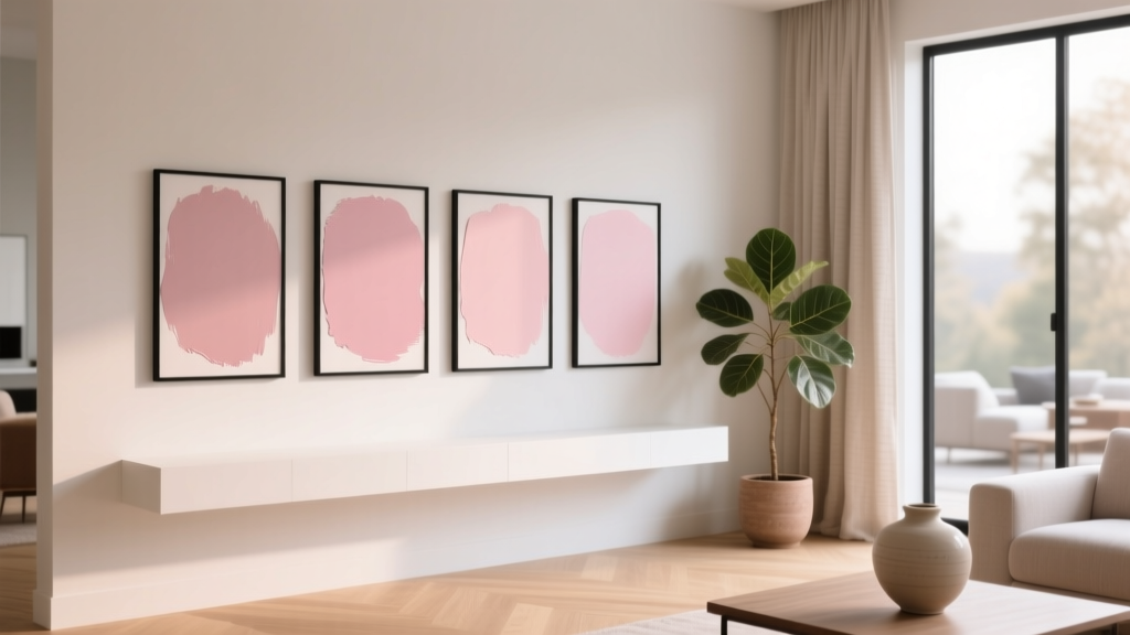
Best Blush Pink Paint Colors - The Decor Mag
Blush pink has quietly become one of the most versatile “new neutrals” in interior design. It’s softer than beige, warmer than white, and far more flattering than many cool grays—especially in real homes where lighting shifts throughout the day. When chosen well, blush creates an enveloping backdrop that feels calm, polished, and surprisingly timeless.
From a color psychology standpoint, blush pink sits in the family of gentle reds: it can feel nurturing, optimistic, and soothing without the intensity of true red. Designers love it for its ability to warm up a space, enhance natural skin tones, and pair beautifully with both modern and traditional finishes. Homeowners love it because it’s a simple way to add personality while still keeping an elevated, livable look.
This guide breaks down the best blush pink paint colors, how to pick the right undertone, where they shine in real rooms, and the most common mistakes that make blush look “too pink” or dated. If you’re searching for the best blush pink paint colors for walls, trim pairings, or a cohesive color scheme, you’re in the right place.
What Counts as “Blush Pink” in Paint?
Blush pink is typically a pale pink with enough softness (white and/or gray) to read as a subtle tint rather than a candy color. Most blush paints fall into one of these undertone families:
- Peachy blush (warm, sunny, flattering): often looks best with warm whites and brass.
- Rosy blush (classic pink): pairs nicely with crisp whites, black accents, and soft grays.
- Mauve blush (a touch of purple/gray): sophisticated, moody, great with walnut and stone.
- Beige-blush (pink meets taupe): the “barely-there” option that behaves like a neutral.
Design principle: blush is most successful when you choose it based on the room’s fixed elements—flooring tone, tile, countertops, and upholstery—then balance it with the right white, metal, and wood finishes.
How to Choose the Right Blush for Your Lighting
North-Facing Rooms (Cool, Gray Light)
North light can make blush look cooler or slightly dull. Choose blush colors with warmth (peach or beige undertones) to keep walls from feeling flat.
- Look for descriptions like: peach, warm, creamy, nude
- Avoid very gray-leaning blush unless you want a dusty, moody look
South-Facing Rooms (Warm, Bright Light)
South light amplifies warmth and can make blush feel more saturated. Choose a softer, slightly muted blush to avoid “bubblegum.”
- Look for: muted, dusty, soft, pale
- Test large swatches—sunlight can intensify pink undertones
East/West-Facing Rooms (Shifting Light)
Morning and afternoon light can swing blush from delicate to bold. Favor balanced blush colors—neither too peach nor too purple—unless you’re designing around a specific effect.
Quick Testing Checklist
- Paint a sample at least 2’ x 2’ on multiple walls.
- View it next to your trim color and flooring.
- Check morning, midday, and evening (artificial light matters).
- Compare with a white sheet of paper to see the undertone clearly.
Best Blush Pink Paint Colors (Designer-Favorite Picks)
These blush pink paint colors are widely loved for their livability—soft enough for whole rooms, but distinctive enough to feel intentional. Always confirm with a peel-and-stick sample or a painted test area in your own lighting.
Benjamin Moore Blush Pink Paint Colors
- Benjamin Moore First Light (2102-70)
A fresh, airy blush with a modern feel. Great for bedrooms, nurseries, and ceilings when you want a gentle wash of color. - Benjamin Moore Pink Damask (OC-72)
A romantic, pale pink that reads “soft vintage” in the best way. Beautiful in powder rooms and traditional spaces with polished nickel or antique brass. - Benjamin Moore Proposal (AF-260)
A deeper, rosy blush that works well for dining rooms, libraries, or an accent wall. Pairs nicely with cream trim and dark woods. - Benjamin Moore Tissue Pink (1163)
A warm, flattering blush that’s gentle and classic. Excellent for living rooms when you want warmth without beige.
Sherwin-Williams Blush Pink Paint Colors
- Sherwin-Williams Intimate White (SW 6322)
A barely-there pink that behaves like a warm neutral. Ideal for open-concept spaces, hallways, and anyone nervous about going “too pink.” - Sherwin-Williams Romance (SW 6323)
Soft, sweet, and pretty without being childish. Works well in bedrooms, dressing rooms, and cottage-inspired interiors. - Sherwin-Williams White Dogwood (SW 6315)
A balanced blush-beige that looks especially refined with warm whites and light oak. Great for living rooms and kitchens with creamy stone. - Sherwin-Williams Abby White (SW 7520)
Not a “pink” at first glance, but it often reads blushy in warm light. A smart pick for homeowners who want a subtle blush undertone.
Farrow & Ball Blush and Pink-Leaning Neutrals
- Farrow & Ball Setting Plaster (No. 231)
A cult favorite “plaster” blush with earthy depth. Gorgeous in living rooms, entryways, and bedrooms—especially with natural linen, plaster finishes, and oak. - Farrow & Ball Pink Ground (No. 202)
A cheerful, classic pink that feels grown-up when paired with crisp white trim and tailored furnishings.
Behr Blush Pink Paint Colors (Approachable and On-Trend)
- Behr Swiss Coffee (12)
A creamy off-white that often reveals a soft blush warmth in certain light. Great as a companion trim/ceiling color for blush walls, or for a “hint of blush” whole-house neutral. - Behr Breezeway (MQ3-21)
Not blush, but a top pairing color (soft sea-glass green) for blush pink color schemes—especially bathrooms and coastal-modern spaces.
Real Room Examples: Where Blush Pink Works Best
1) Blush Pink Bedrooms: Calm, Flattering, and Cozy
Blush is a natural fit for bedrooms because it supports rest while still feeling warm and personal. It also flatters skin tones under bedside lighting—especially when you use warm bulbs.
- Try: Benjamin Moore First Light on walls + warm white trim
- Pair with: oatmeal linen bedding, walnut nightstands, and a matte black reading sconce
- Pro tip: Use an eggshell finish for walls; it feels softer than satin and hides minor texture
2) Living Rooms: Blush as a Modern Neutral
In living rooms, the best blush pink paint colors read as sophisticated warmth rather than a statement. Think “soft clay” or “nude cashmere,” especially with textured upholstery and layered neutrals.
- Try: Sherwin-Williams Intimate White for a barely-pink backdrop
- Pair with: creamy white curtains, boucle or linen upholstery, and oak or travertine accents
- Color scheme idea: blush + warm white + camel + olive
3) Bathrooms and Powder Rooms: Elevated and Unexpected
Blush in a powder room feels boutique-hotel when balanced with the right metals and a grounding element (tile, stone, or dark vanity). In full baths, keep blush airy and pair it with clean whites.
- Try: Benjamin Moore Pink Damask with polished nickel and white marble-look porcelain
- Bold option: Benjamin Moore Proposal with a high-gloss finish for drama
- Lighting tip: Choose a warm LED (2700K–3000K) so blush looks inviting, not gray
4) Kitchens and Dining Rooms: Soft Color That Still Feels Crisp
Blush can be stunning in dining rooms, especially with deeper woods and warm metals. In kitchens, blush usually works best as an accent—on an island, pantry door, or banquette wall—unless the shade is very subtle.
- Try: Farrow & Ball Setting Plaster in a dining room with walnut furniture
- Kitchen-friendly approach: blush on a breakfast nook wall + warm white cabinetry
- Pair with: unlacquered brass, natural oak, and creamy zellige-style tile
5) Nurseries and Kids’ Rooms: Softer Than “Baby Pink”
Blush avoids the overly sweet look of traditional baby pink. It can grow with the room when paired with neutral furniture and playful accents you can swap out.
- Try: Sherwin-Williams Romance with white trim and natural wood
- Make it timeless: add graphic black frames, woven textures, and a patterned rug in muted tones
Blush Pink Color Schemes That Always Look Polished
The fastest way to make blush feel designer-approved is pairing it with the right supporting colors and finishes. These combinations work across many styles, from modern to traditional.
- Blush + Warm White + Brass
Cozy, luminous, and classic. Great for bedrooms and bathrooms. - Blush + Charcoal/Black
Adds contrast and a modern edge. Ideal for living rooms and entryways. - Blush + Sage/Olive Green
Earthy and calming; a favorite for organic modern and vintage-inspired interiors. - Blush + Terracotta + Cream
A warm tonal palette that feels Mediterranean and sunbaked. - Blush + Navy
Crisp, tailored, and high-contrast—great for dining rooms or offices.
Trim and Ceiling Pairings
- For warm blush: creamy whites (think “soft ivory” rather than stark bright white)
- For cool/mauve blush: clean whites or soft grays to keep it fresh
- Ceilings: a gentle white usually works best; a tinted ceiling can be beautiful in small rooms for a cocoon effect
Common Blush Pink Paint Mistakes to Avoid
Blush is forgiving, but a few missteps can push it into “too sweet,” “too beige,” or “mysteriously lavender” territory.
- Skipping undertone testing
A blush that looks perfect online can turn peach, purple, or gray in your home. Always sample in your actual lighting. - Pairing blush with the wrong white
A cool, blue-white trim next to a warm blush can make the walls look more pink (and less sophisticated). Match warmth levels. - Overdoing pink throughout the room
If walls, rug, art, and bedding all lean pink, the room can feel one-note. Add grounding neutrals and contrast. - Ignoring fixed finishes
Pink next to orange-toned floors or very cool gray tile can clash. Choose blush that harmonizes with what you can’t change. - Choosing the wrong sheen
High sheen can make blush feel shinier and more saturated. For most walls, eggshell or matte looks more refined.
Practical Application Tips for a Professional Finish
- Use two coats minimum for even color, especially with pale blush pigments.
- Prime strategically: if you’re covering a bold color, use a tinted primer recommended by the paint store.
- Coordinate your bulbs: warm LEDs (2700K–3000K) typically flatter blush; very cool bulbs can make it look icy or gray.
- Balance with texture: linen, boucle, rattan, oak, and plaster-like ceramics keep blush from feeling flat.
- Think in layers: blush walls + neutral upholstery + one dark anchor (black, walnut, or deep green) creates depth.
FAQ: Best Blush Pink Paint Colors
Is blush pink a good whole-house paint color?
It can be, if you choose a very subtle blush that reads as a warm neutral. Options like Sherwin-Williams Intimate White are popular for hallways, open-concept areas, and transitional spaces because the pink stays understated.
Will blush pink look dated?
Blush tends to stay timeless when it’s muted and paired with classic materials—warm whites, natural wood, stone, and tailored lighting. Avoid overly sweet “cotton candy” pinks for large areas if you want a long-lasting look.
What colors go with blush pink walls?
Blush pairs beautifully with warm whites, greige/taupe, sage and olive greens, navy, charcoal, and soft browns like camel. For metals, brass and polished nickel are reliable choices depending on the undertone.
How do I keep blush pink from looking too pink?
Choose a blush with beige or muted undertones, use warm white trim, and ground the room with contrast (black accents, walnut, or deep green). Also avoid cool, bright lighting that can exaggerate undertones.
Is blush pink better in matte or eggshell?
Matte and eggshell are the most forgiving and sophisticated on walls. Satin can work in high-traffic areas, but it may make blush appear more reflective and slightly more saturated.
What’s the difference between blush pink and dusty rose?
Blush is generally lighter and more neutral, often with creamy or beige softness. Dusty rose usually has more gray or mauve depth, making it moodier and more “antique” in feel.
Next Steps: Find Your Perfect Blush
Start by choosing two or three blush pink paint colors from the lists above that match your room’s lighting and fixed finishes. Order samples, test them on multiple walls, and compare them next to your trim, flooring, and textiles. Once you land on the right undertone, build a simple color scheme—blush plus a warm white, a grounding neutral, and one accent color—for a space that feels intentional and easy to live in.
For more paint color ideas, color schemes, and room-by-room guidance, explore the latest color guides on thedecormag.com.
More Articles
 Best Terracotta Paint Colors for Warmth - The Decor Mag
 How to Use Color to Change Room Perception - The Decor Mag
 Best Hydrangea Blue Paint Colors - The Decor Mag
 Split Complementary Color Palette Ideas - The Decor Mag
 How to Choose Colors for a Butler Pantry - The Decor Mag
 How to Use Undertones to Match Colors - The Decor Mag
 Best Forest Green Paint Colors - The Decor Mag
 Reading for Options: How Visual Literacy Drives Strategic Decision-Making in Design and Branding
 Best Candy Apple Red Paint Colors - The Decor Mag
 Color Wheel Basics for Home Decorating - The Decor Mag